Starbucks has met its match – in tea. Gourmet brand Heytea continues to woo the Asian market, in 2019 reportedly selling more than 2,000 cups of tea per day across its then-170 locations. With such a dedicated fan base, Heytea’s new retail venture should come as no surprise: its latest space in Shenzhen, China is a flagship, a distinction which warranted a 1,200-sq-m, two-storey spatial execution by Tomo Design.
Heytea’s founder, 28-year-old Neo Nie, made Forbes 30 Under 30 list last year. But he insists that his intention in opening Heytea was never to mimic major beverage competitor Starbucks. ‘I am trying to make tea-drinking cool among Chinese millennials’, he says in a South China Morning Post interview. To do so, Nie and his team are smartly taking cues from retail, and the ways in which the sector’s main players have learnt to attract millennials – namely, to offer experience and engagement.
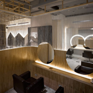
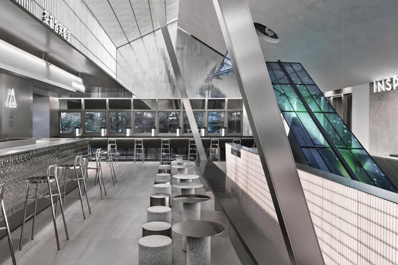
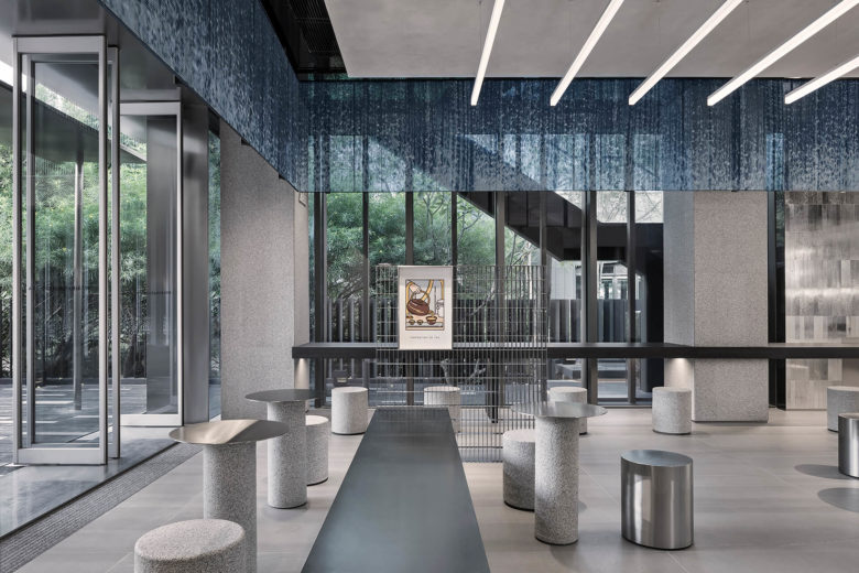
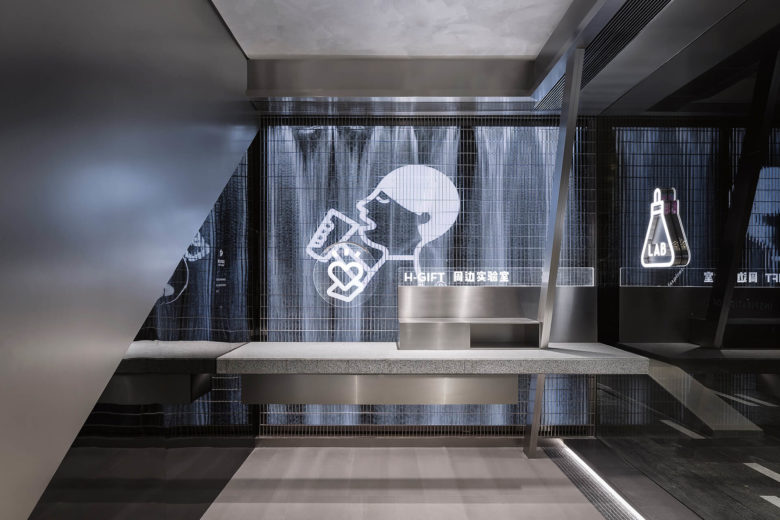
The Shenzhen flagship focuses on experiential-based ‘labs’ – bars in off-brand speak – interspersed across two storeys. Each exhibit their own visual identities and offer unique programmes, presenting a multitude of ways for customers to engage with the Heytea brand. Together, the spaces establish the ideal tea-drinking experience that Nie aspires to popularize amongst Asian youth.
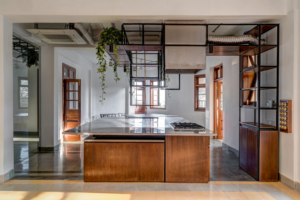
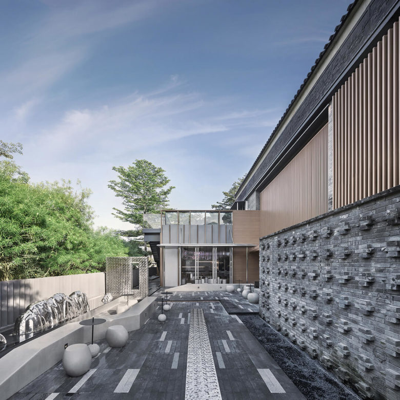
On the ground floor, customers can browse for Heytea-sponsored merchandise at the gift lab. An ice-making lab invites visitors to view its drink-making demonstrations, while the nearby dessert bar keeps cravings at bay. Illustrations depicting China’s beloved tea-making rituals grace the walls of the illustration lab. Here, Tomo Design arranged seating in a communal circular grouping, as opposed to the more autonomous, segregated seating normally found in the hospitality sector. At the top-most floor – the geek lab – LED screens run animations. Off a second side entry, a landscaped outdoor courtyard invites guests to continue the Heytea experience outside.
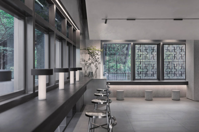
Tomo Design primarily worked within a palette of neutral metals, stone and volcanic rock. The overall effect is sleek and futuristic, though Tomo also took the time to incorporate traditional Chinese references into its detailing, from metal grates in the dining hall to mixed clay-and-metal-brickwork on the façade.
Designed by Tomo Design
Images Courtesy of Tomo Design

Add to collection
