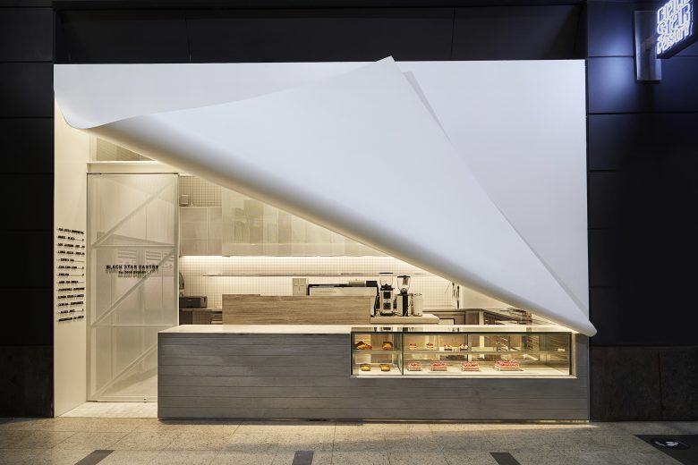
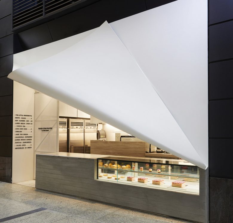
Our client’s brief was simple- “A Hole in a Wall”
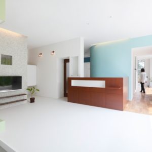
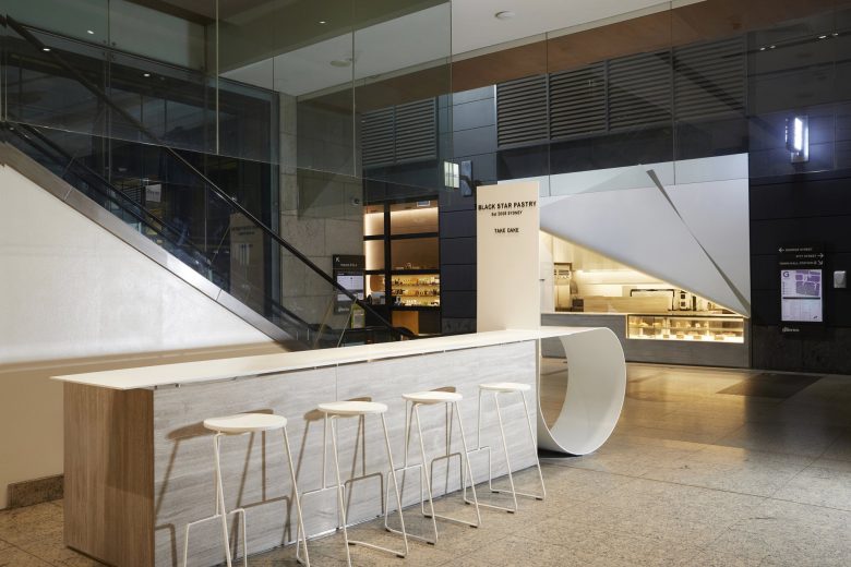
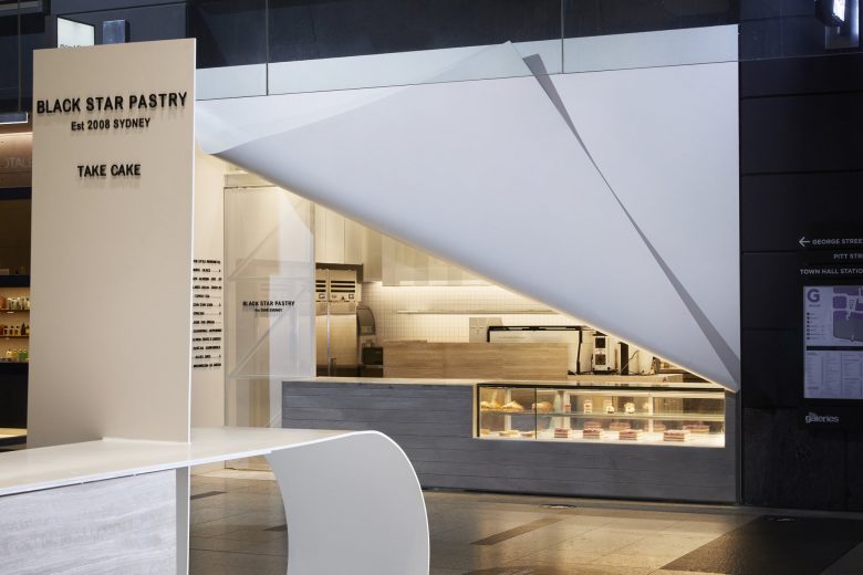
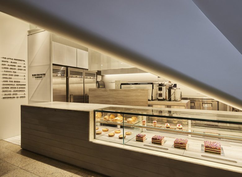
A visual minimalistic approach was taken by first applying a stark white base palette and allowing the architectural shape & form to play a major role.
The white canvas folds opens and creates “A Hole in a Wall” which continues through to its sister kiosks both adjacent and above the space. A visual connection of the three spaces was created through the eyes of its patrons
http://www.seungrok.com/
Design Company: StudioMKZ (http://www.studiomkz.com.au/)
Designer: Han Lim
Add to collection
