
Add to collection
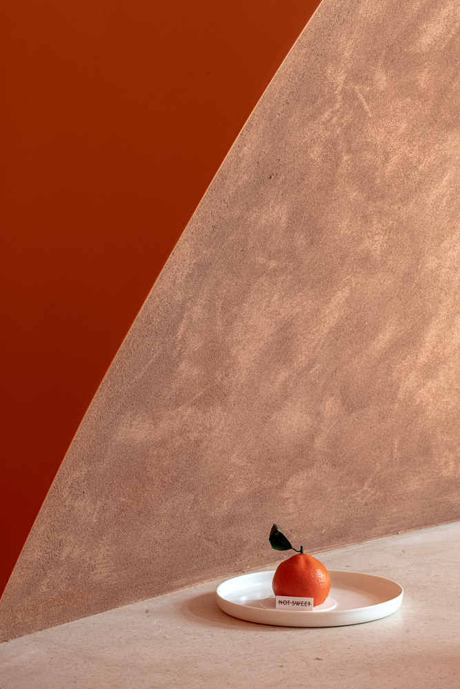
We use ambiguity and conflict to express the sweetness and non-sweetness of “NOT SWEET”. Community commerce is a part of our life, but the machine-made form is without any splendidness, we ignore such existence around us as always. The appearance of “NOT SWEET” is designated to break such status, hide around us with an ordinary and quiet pose, and integrate into our daily without mincement.
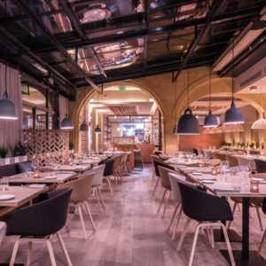
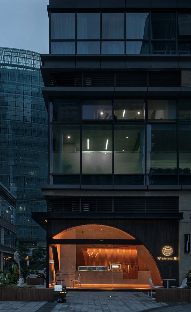
The brand “NOT SWEET” under Xiaolanju is a dramatic shop name. in face of the conflict between sweet and not sweet, new requirements are proposed for what kind of method should we use to intervene and the consideration for space.
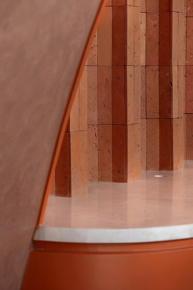
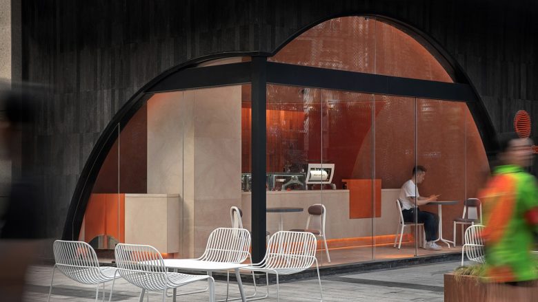
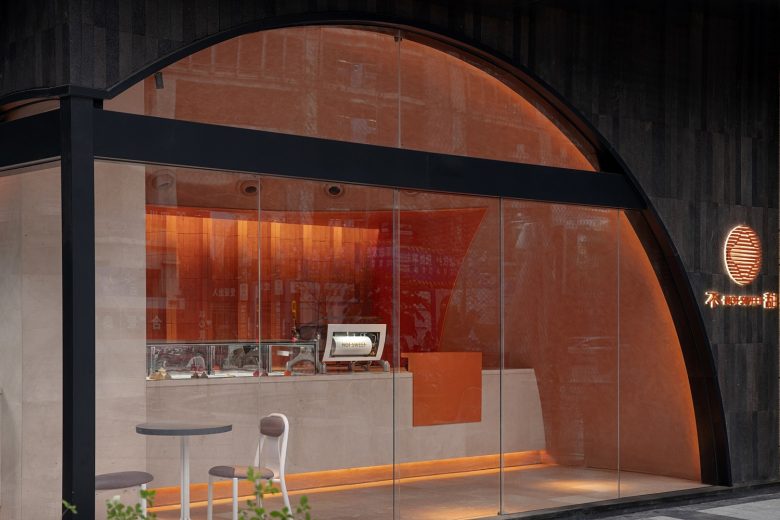
Internally, within the space less than 50m2, it will not only meet all functions possessed by the dessert shop, but also resolve the interference caused by the bearing column with unilateral length of 1m for the space. Externally, it should not only reflect the brand awareness but avoid the conflict with the surrounding environment as much as possible.
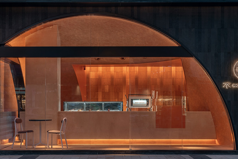
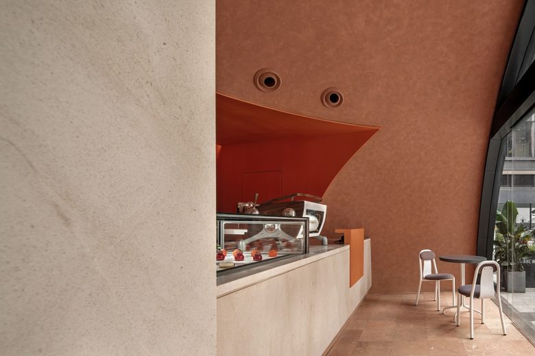
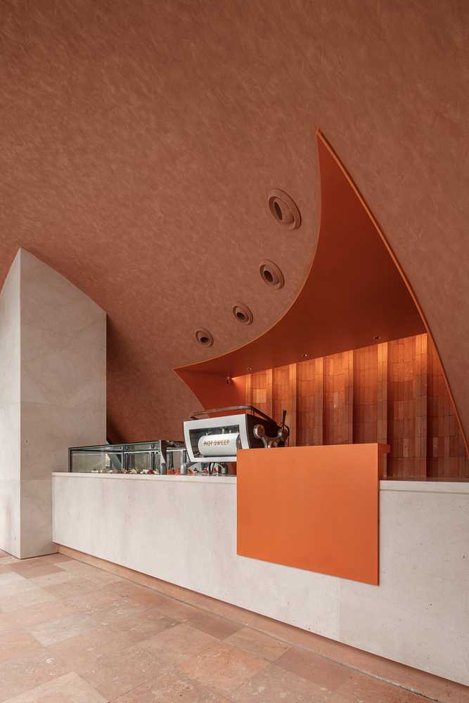
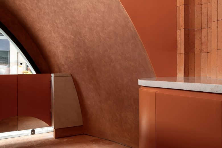
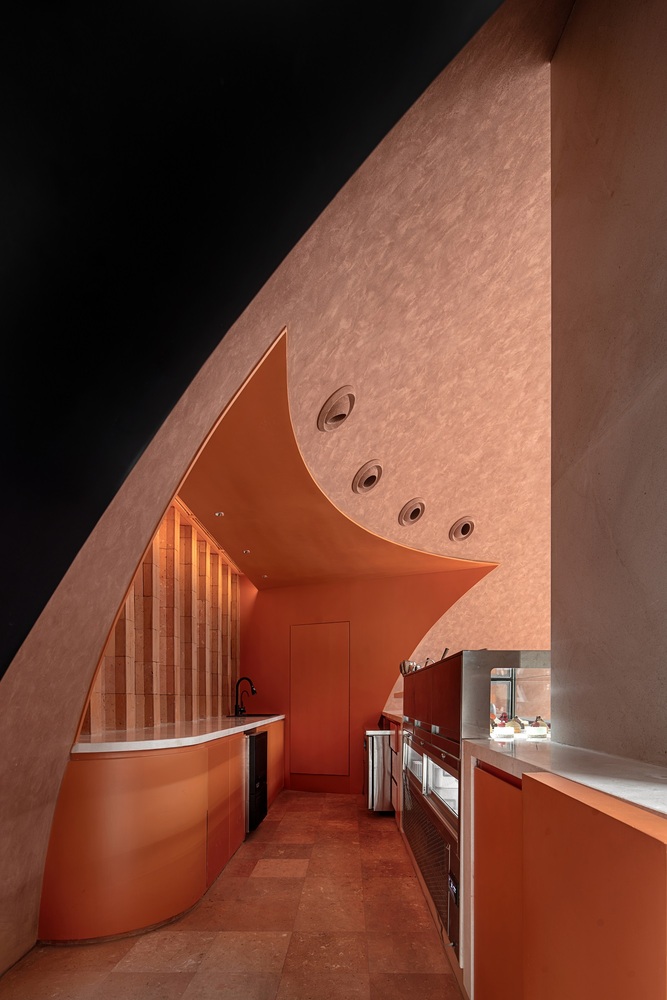
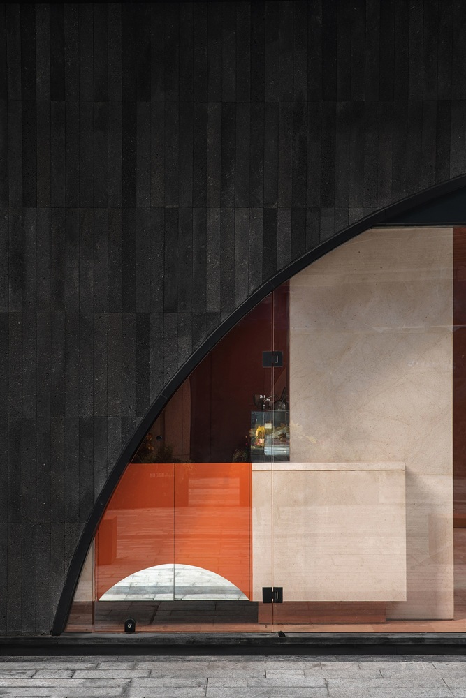
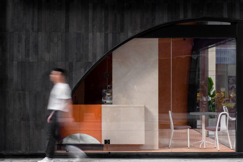
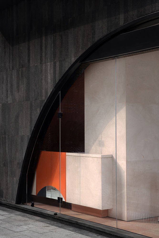
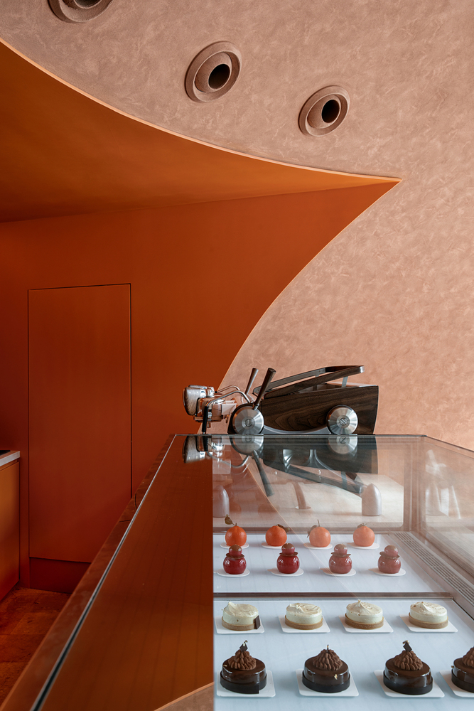
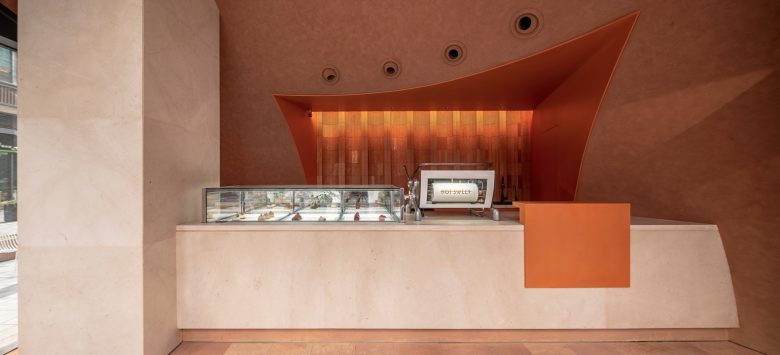
We conceive to form the expression of signalization from our own brand and with the specific geometric shape of “orange” in the space. The space takes a small-scale simple and open box as basis, takes “orange” as another geometry to embed into the box, and makes it into a new use space by hollowing the overlaps part between the two geometries.
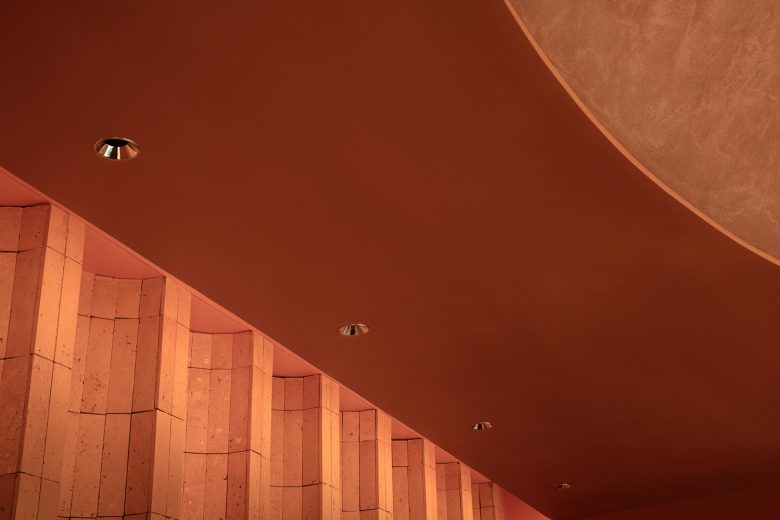
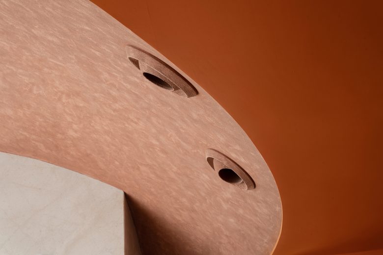
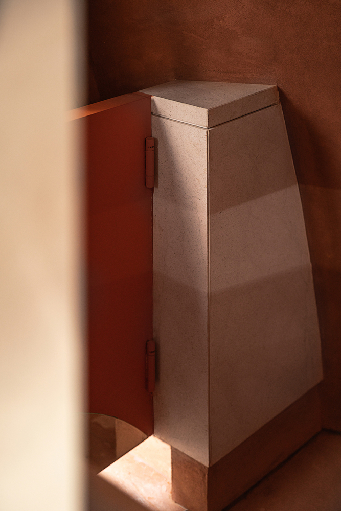
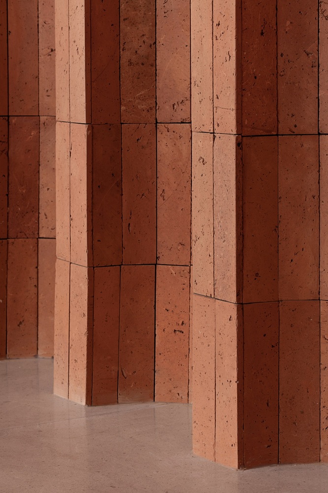
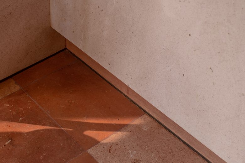
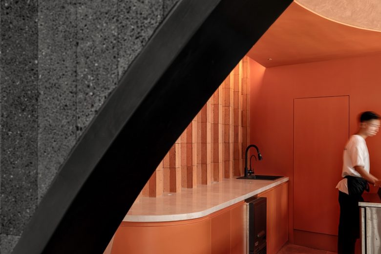
The dessert exhibition, coffee machine and service counter are joined into a harmonious whole. The bottom internal retreat will form impending horizontal blocks, and then they will cross with the vertical bearing column, to form a new structural body in space, with the sculpt suspended into the air as light as silk ribbon. It not only solves the function demands, increases the third dimension in vision, but also resolves the interference of bearing column for space. After completing the shaping of space, we use light, material and color to imply the ambiguity and conflict of NOT SWEET.
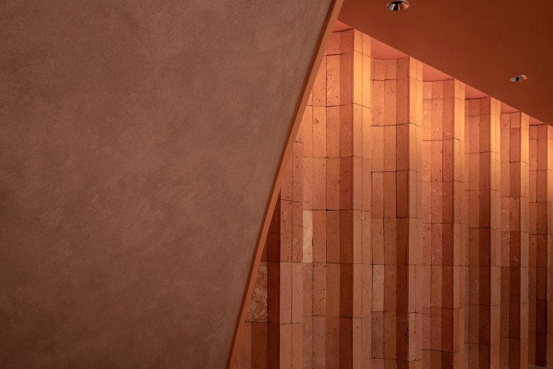
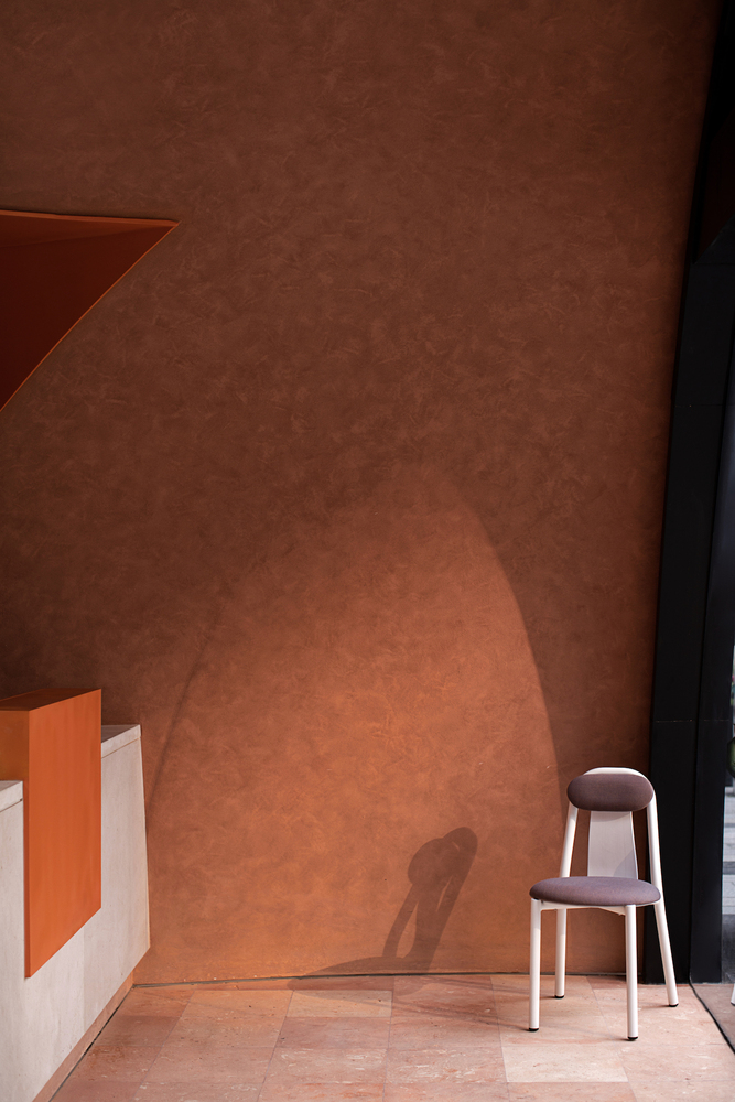
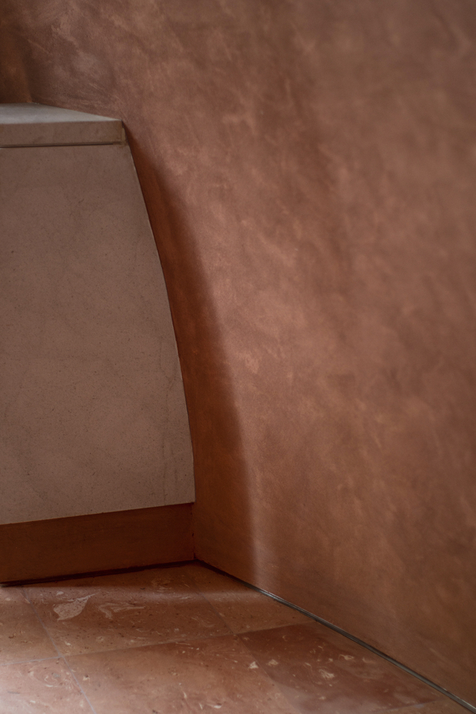
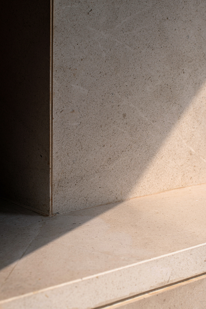
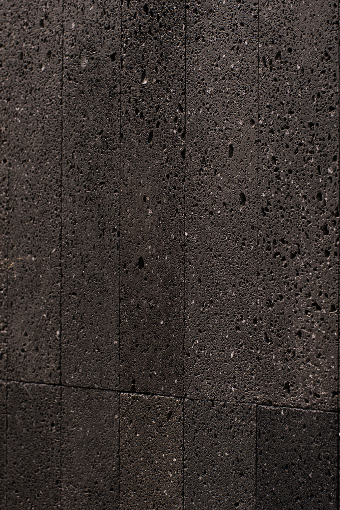
The warm light in the spherical space makes the structural blocks and texture become vague sometimes and clear sometimes along with the change of people’s angle of view through the diffusion generated by the wall surface with orange texture, the space atmosphere will become gentle and ambiguous, to form conflict with the black lava external wall surface.
Architects: Geemo Design
Architect In Charge:Chaosi Shi, Yi Yi
Design Team:Chaosi Shi, Yi Yi, Qiao Yang
Photographs: Pianfang Photography
Add to collection