
Ashitano Shokupan by Stamp works
posted by retail design blog on 2020-11-18
Add to collection
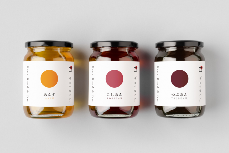
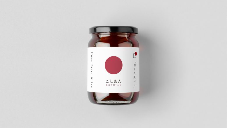
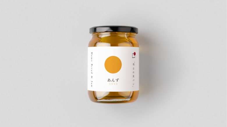
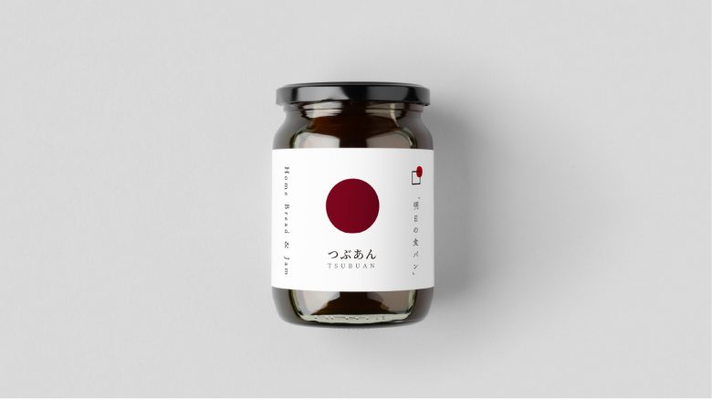
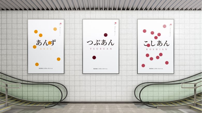
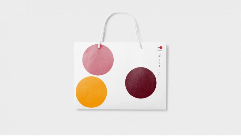
Tomorrow’s bread focuses on only making Organic Jam and bread using only ingredients from Japan for their customers. They specialise on only one kind of bread, simple bread. the philosophy of the owner of company is that, if he focuses on too many kind of breads, he cant master any. So he decided on focusing on one kind of bread, and perfecting it, mastering it. That philosophy, we wanted to convey through our design. We tried to be very simple yet sophisticated. So we pick up circle from their logo which symbolised the rising sun of Japan.
The sun is essential elements for all the ingridients that are used in our jam, so we thought it would make sense fro us to use it as design driver. The design came out just as simple and humble j as the owner’s philosophy toward making best food.
What’s Unique?
The simplicity of design, which can stand out alone, also very functional when it comes to differentiate each product.
Designed by Stamp works

Add to collection