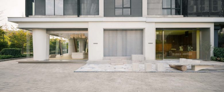
This project is a very complicated design but with very little intention of creating a particular space. The final outcome is more about arrangement instead of designing.
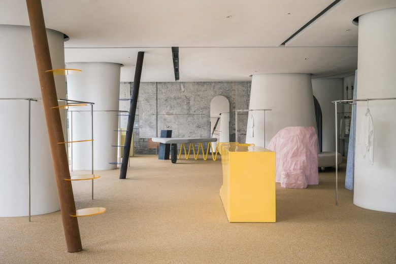
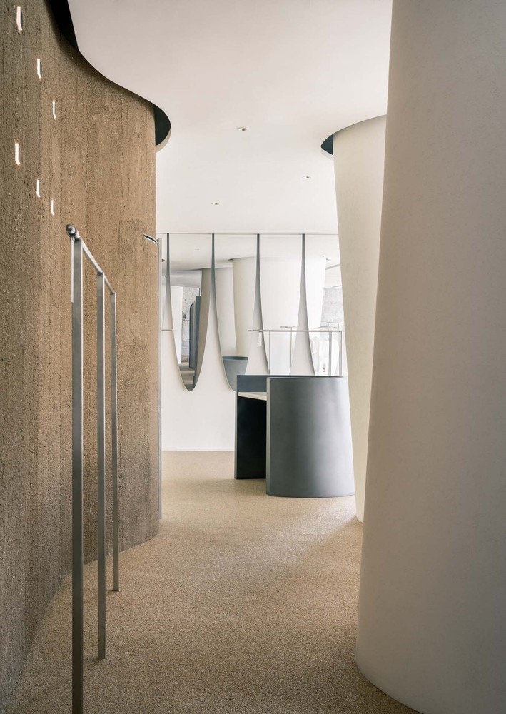
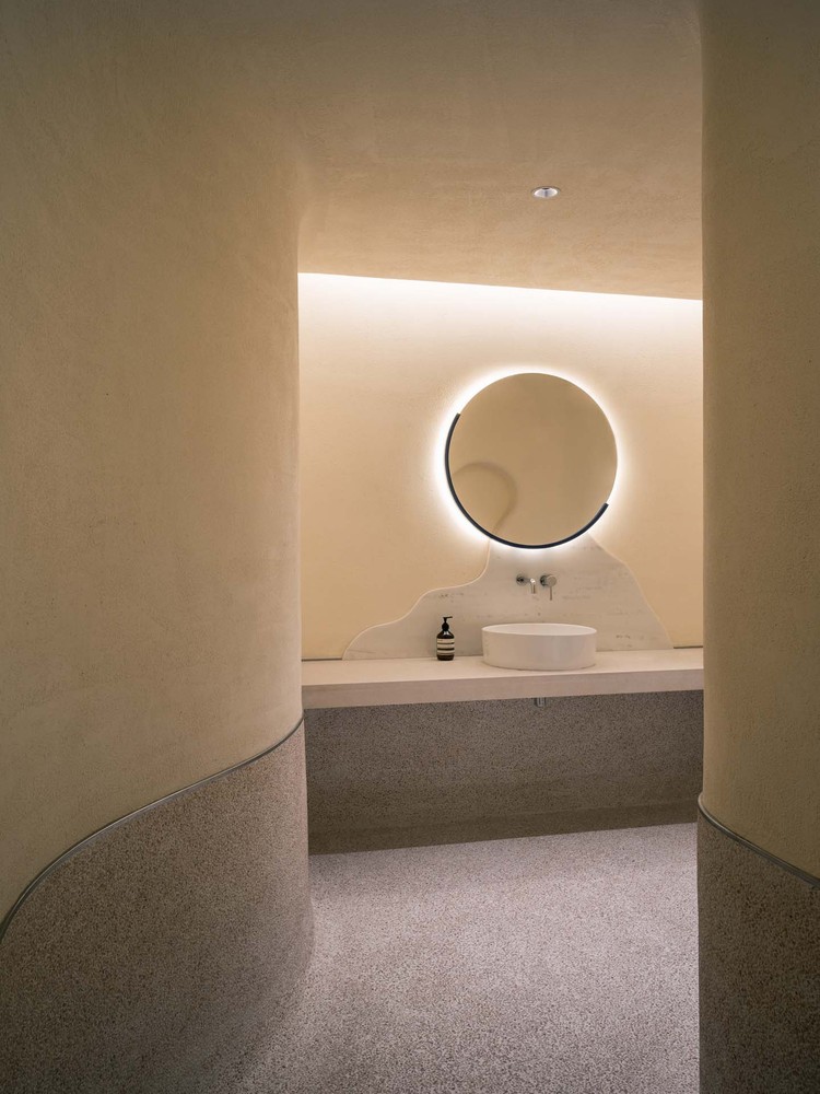
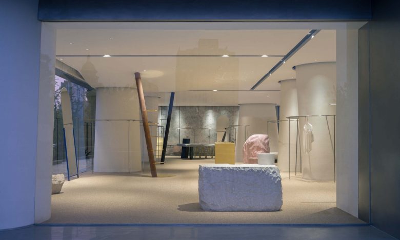
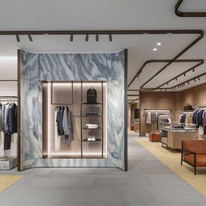
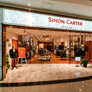
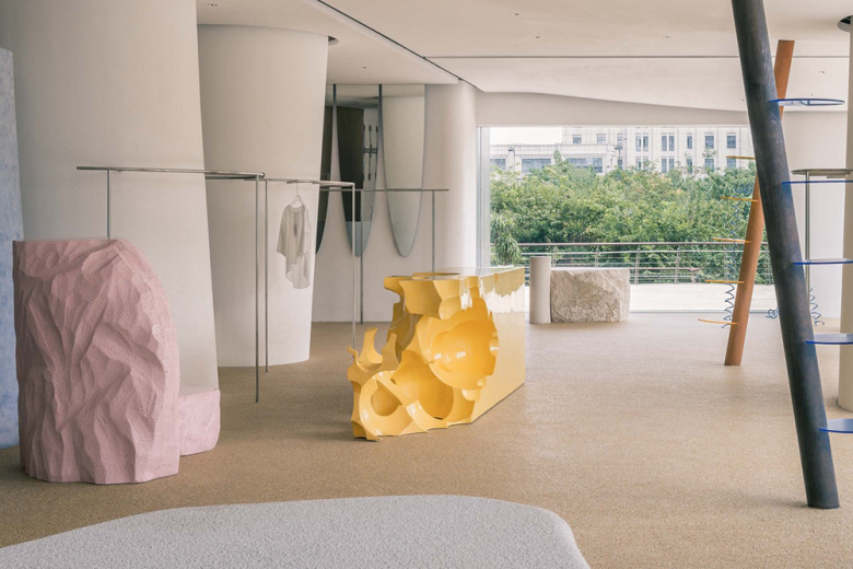
DSC is a select store with multiple fashion brand, the goal is to design a space fit them all, and the client have a very diverse preference. Understanding there will be different elements indoor and outdoor which are different material and style, we want to achieve a harmony atmosphere in spite of that. We wrapped up the existing massive column to be irregular random shape, these shapes will change while you walk inside the space. Around the deformed columns are clothe racks. The ceiling was deformed too to have a relationship with the columns, they are pulled down when intersect with the column.
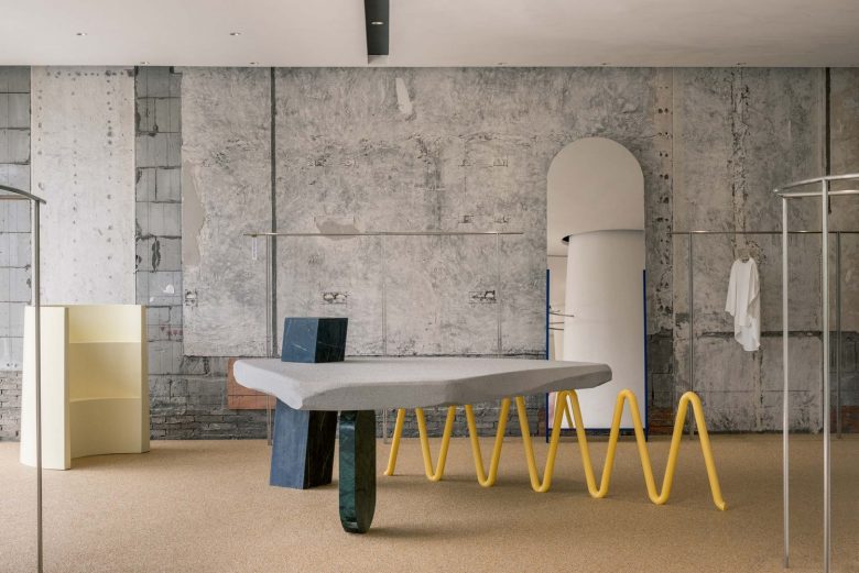
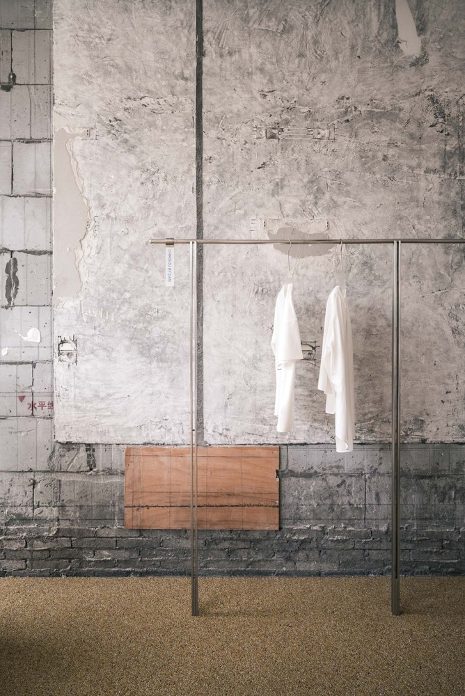
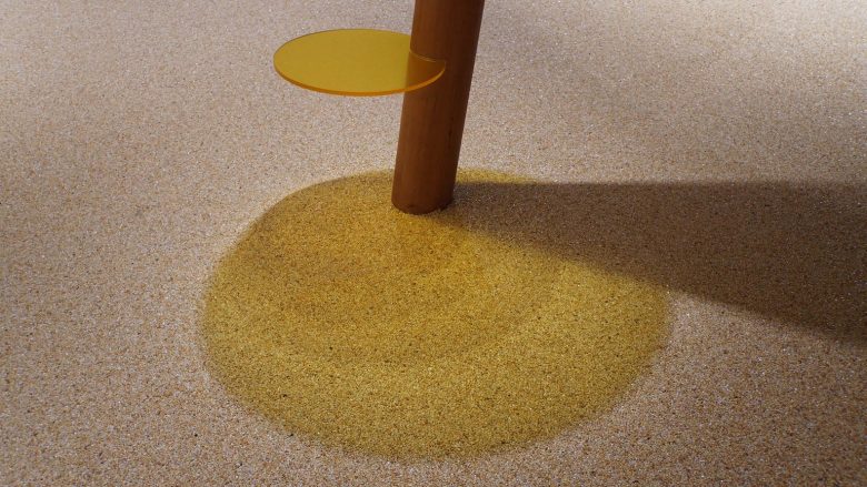
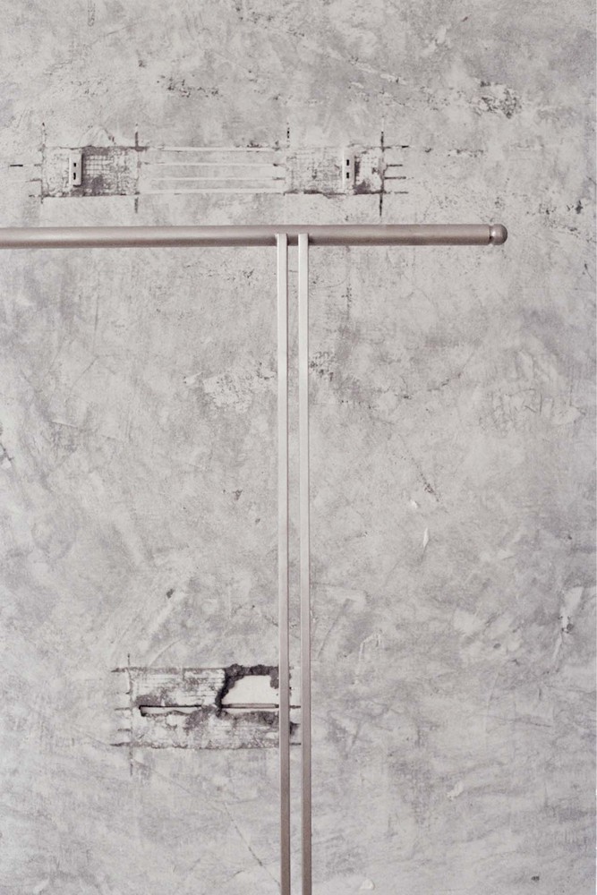
Two wood pillar like shelf penetrate through the ceiling and hits the floor, several different color tinted glass grip the column facing different direction to hold objects. The back wall is a absolute leftover of the demolishing before the construction, the top finish of the dirty leftover wall was of course handled, we are not barbarians. The stainless steel clothe hanger in front of the wall are straight and clean, creating a very nice contrast. Furnitures inside are more like installation or a hybrid of different elements and material. The furniture are generated from intuition and a intention of chaotic but interesting.
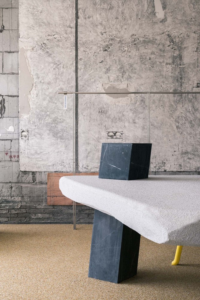
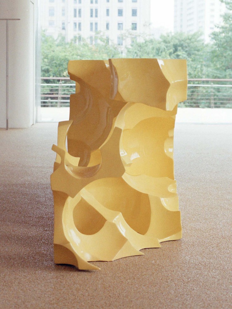
The cheese-like table in the center made its existing very clear and obvious with its quirky shape and bright color. The accurate position of this table was finalized on site with tiny nudge here and there. A 1 ton sandstone (we went to the stone factory to choose personally and only sand the top and bottom to level it so it becomes a table ) was placed next to a full size window as a table. It took 8 masculine guys to put this stone on position.
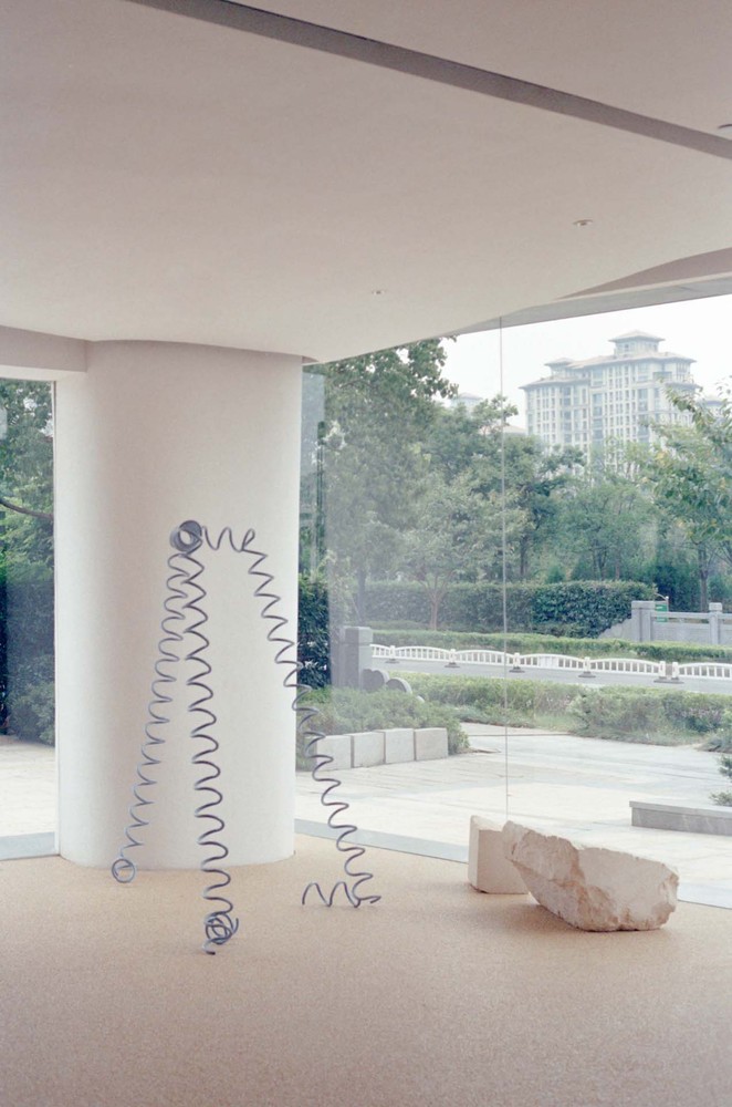
A spring-like clothe hanger next to two piece of sandstones are put together creating a interesting scene, these two stones only took 4 guys to move and place them. The deformed ceiling and column shape a very irregular and interesting space experience.
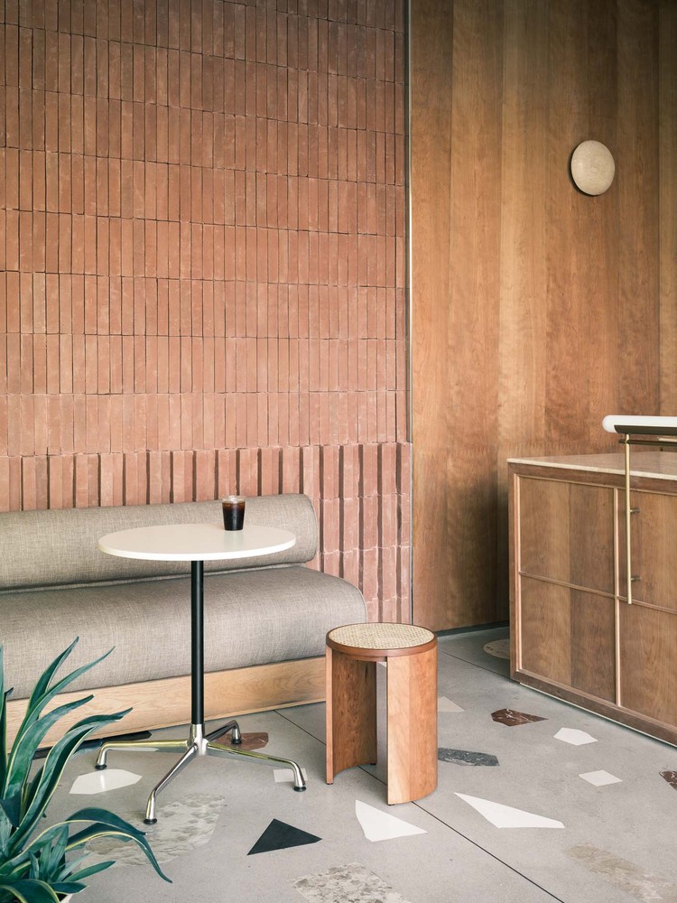
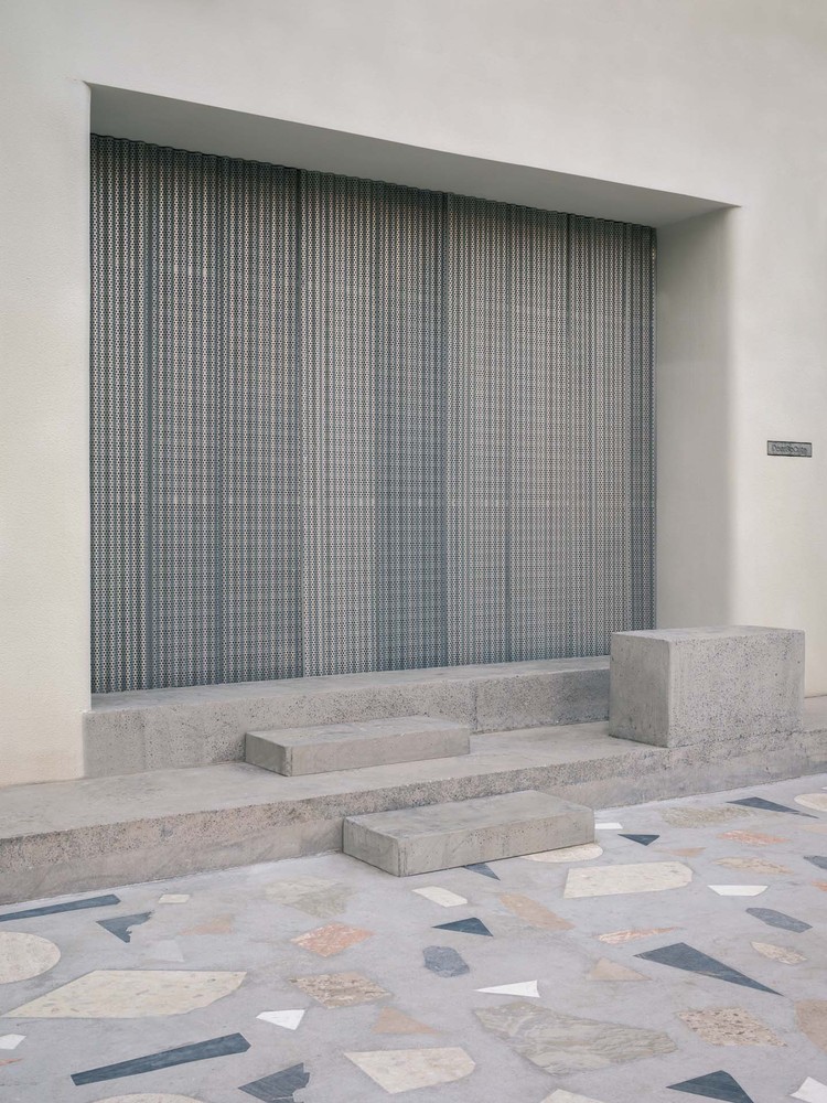
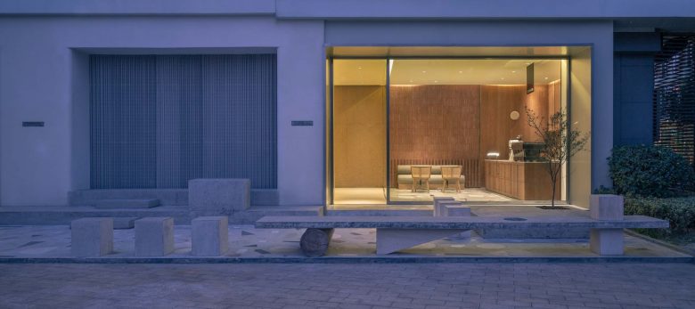
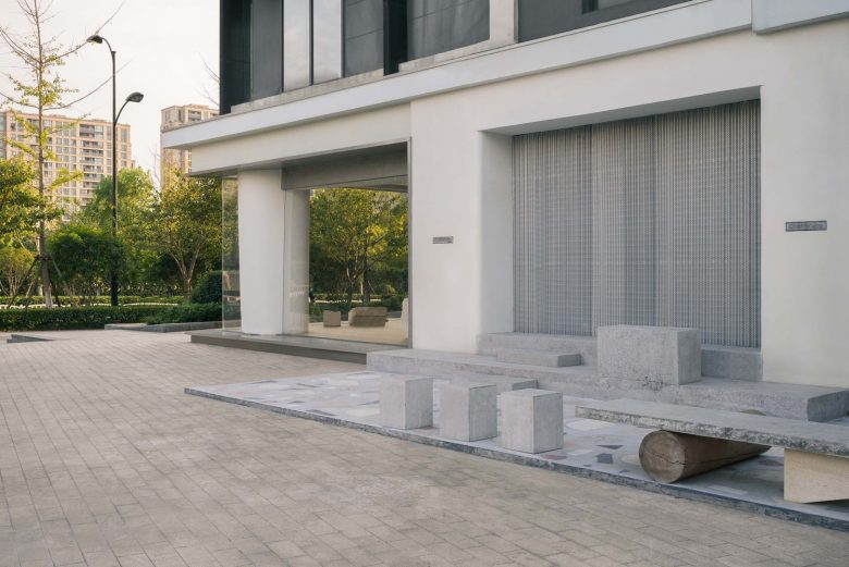
There is a small coffee shop, regular and vintage designed, attached to the select store. I think we spend much more time design the coffee shop during the whole design process. The floor of the coffee shop is a customized terrazzo floor made from the relics of the previous design of the store. The coffee shop was separated with exterior and the select store with yellow tinted glass, and have a small garden extension. The floor is the same customized terrazzo with the interior.
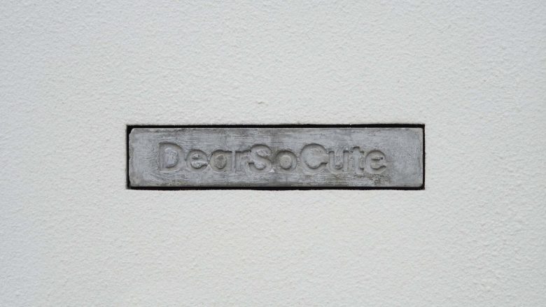
We home-made a block of concrete as the logo of the store, it was very rough and unclear, but somehow I think it represent the general character of DSC, a very rough and child-like interesting space, very chaotic but in a weird sense of harmony. I would very much like to say this store is a design without design, it’s a arrangement of ideas and elements, a constant certain of uncertain. Design without design, certain uncertainty, inharmony with harmony.
Interior Designers: say architects
Design Team:Yawen Fan(PM), Sheng Hang, Jiaming Zhu
Photographs: Minjie Wang, Yawen Fan, Yan Zhang
