
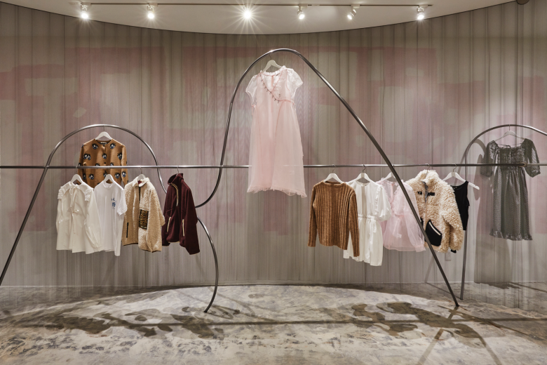
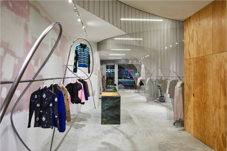
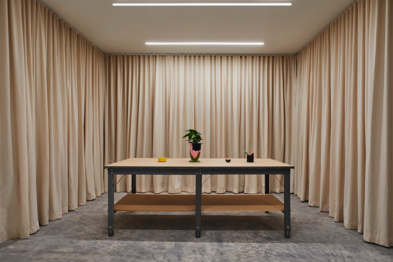
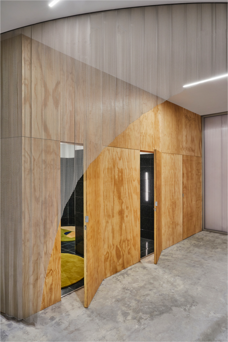
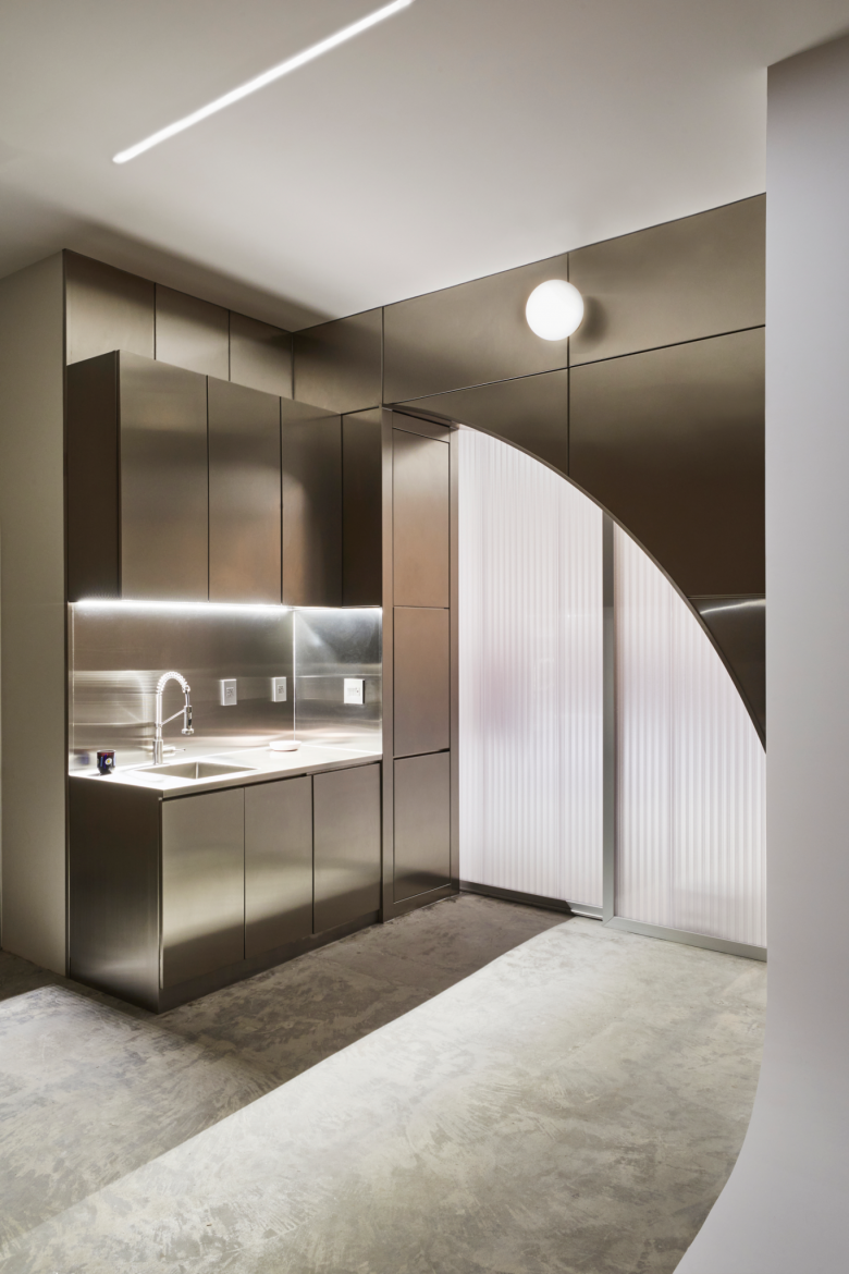
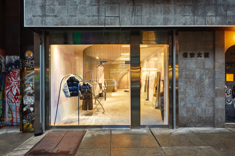
Unashamedly taking cues from her childhood in the Bayside area of Queens and Chinatown grandmothers, it isn’t surprising Sandy Liang has become New York City‘s coolest kid on the fashion block. Since launching her women’s fashion brand in 2014, the Parsons School of Design graduate has garnered a growing fanbase with her quirky and highly street-cred urban silhouettes. The young designer has now take her operations to the next level by opening a flagship store on the edgy Lower East Side, another New York City neighbourhood she knows like the back of her hand. Mind you. Liang’s father owns a popular Chinese diner in the area since the 1970s, while it’s also home to her grandmother’s home and atelier. Situated on Orchard Street, the boutique occupies a 1,500 sq.ft. (approx. 139 sqm.) ground floor unit of a low-rise structure built in 1900. Liang tapped local design practice Almost Studio to create a fitting interior, and not surprisingly, it’s one that playfully blends the quirky aesthetic of her collections with the elements of the neighbourhood’s industrial legacy. As such, The elongated space of the Sandy Liang flagship store flaunts an eclectic palette with a bit of a fun factor as well. Against a backdrop of exposed walls and concrete flooring, swirling metal mesh curtains with elegantly curved cut-outs divide the premises into three sections—a display area, a point of sale, and lastly, fitting rooms. Wildly meandering metal rods, presenting Sandy Liang‘s latest creations, are paired with playground furniture which tie in with the designer’s nostalgic designs, while a sales counter clad in polished green marble adds a luxury accent to the setting. Two fitting rooms, concealed by timber panelling and featuring a contrasting tiled up interior, further boost the store’s eclectic palette. A polycarbonate sliding door and a thickened, arched threshold divides the public shopping area from the private back-of-house kitchen and office.
Designed by Almost Studio
Images © Sandy Liang
Photography: Jonathan Hökklo

Add to collection
