Less is more, that’s what they say.
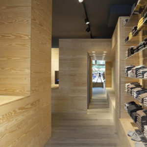
It’s certainly a memorandum operandi that Mulberry go by. I photographed this store on Multrees Walk in Edinburgh a few years ago, and having reviewed the interior photography recently it certainly stands up to the test of time.
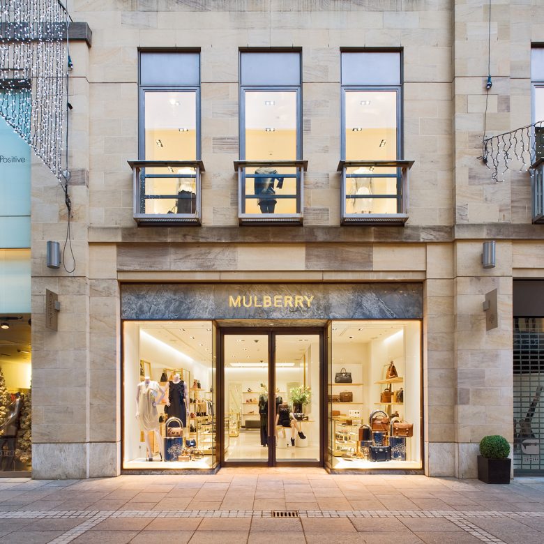
A simple contemporary stone facade with marble fascia and illuminated brass signage together with frameless glass and bronzed framed doors hint at what lies within. Like most shops, photography at dusk shows off the interior fit out from the outside in.
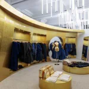
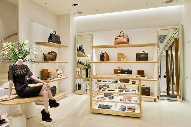
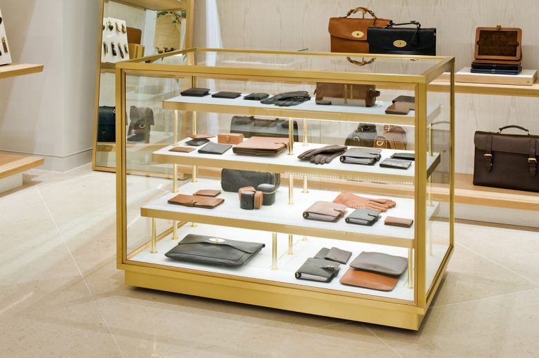
Inside the shop, simple brass framed cabinets and wall mounted shelves show off the products beautifully and reflect the high quality status of the merchandise (and the price tags…).


Add to collection
