![](https://retaildesignblog.net/wp-content/uploads/2014/12/Chez-Margot-by-Studio-Studio-JANREJI-Paris-France-300x300.jpg)
![](https://retaildesignblog.net/wp-content/uploads/2021/03/Vegeria-Napoleon-cake-by-Igor-Nechytailenko-00-780x519.png)
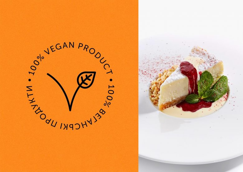
The aim of the VEGERIA brand is to bring to the market a product that inspires the consumer to a healthier diet and change the way they look at food.
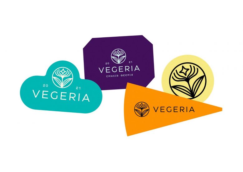
Together with the client we’ve come a long way from pop icons to Vedic culture, dived deep into category semantics, and came up with a pearl – a well-rounded name that fits the product perfectly, VEGERIA — the galaxy of vegetarian sweets, pastries, cakes, and pies.
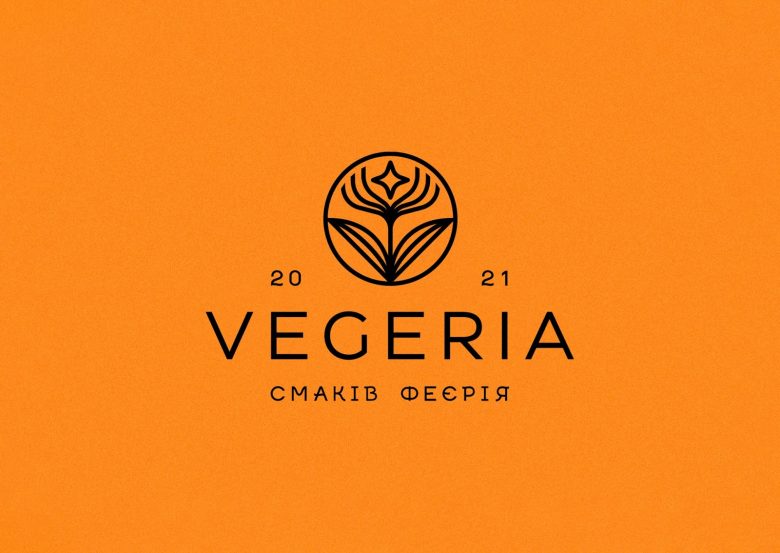
The logo combines the birth of a new star over a flower as a symbol of the emergence of a new brand in harmony with the world.
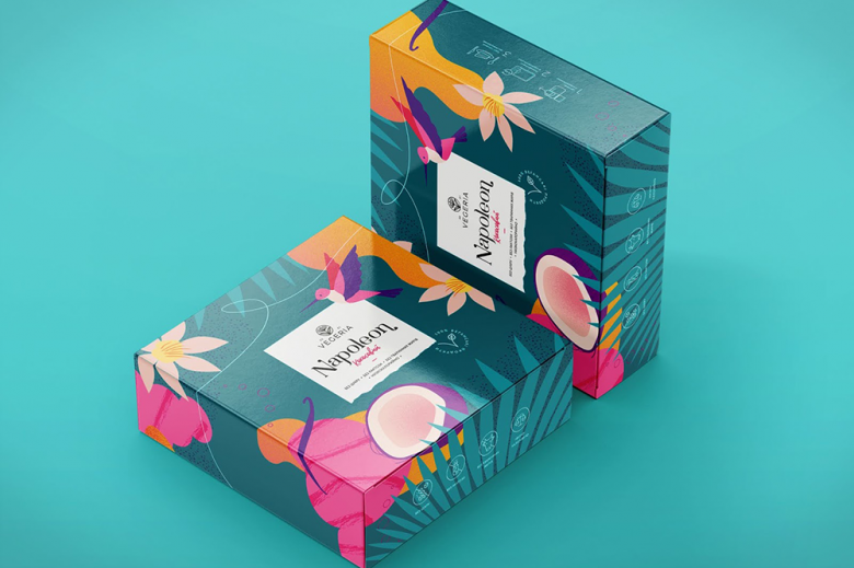
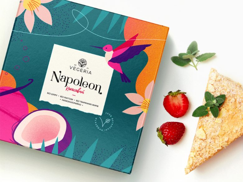
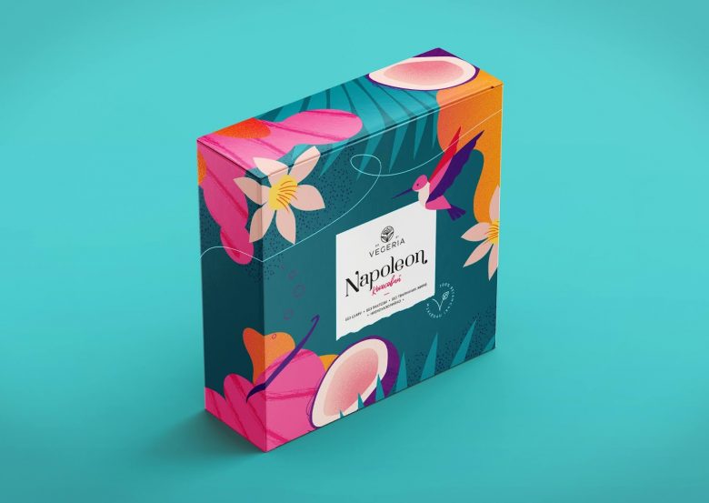
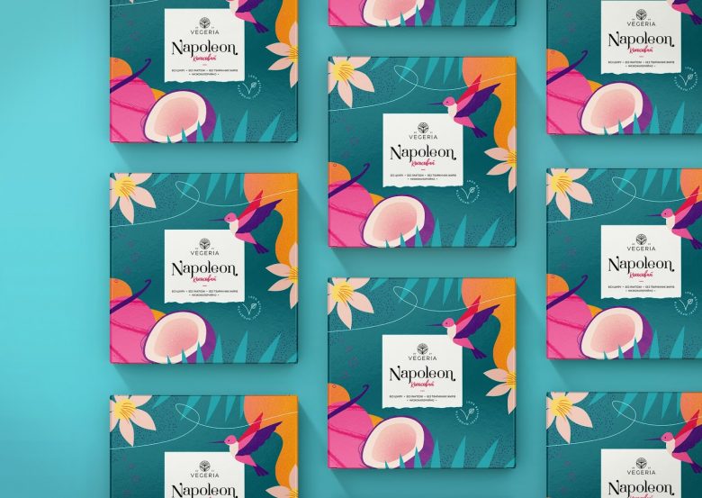
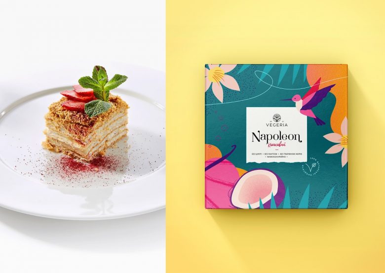
The client set the task to develop a bright and memorable packaging for the Napoleon cake with coconut flavor. The proposed design has rich colors and a reference to the tropical garden paradise. The vibrant colors of VEGERIA packaging keep a playful mood.
Designed by Igor Nechytailenko
![](https://retaildesignblog.net/wp-content/uploads/2021/03/Vegeria-Napoleon-cake-by-Igor-Nechytailenko-01-780x585.jpg)
![](https://retaildesignblog.net/wp-content/uploads/2021/03/Vegeria-Napoleon-cake-by-Igor-Nechytailenko-03-780x553.jpg)
![](https://retaildesignblog.net/wp-content/uploads/2021/03/Vegeria-Napoleon-cake-by-Igor-Nechytailenko-04-780x553.jpg)
![](https://retaildesignblog.net/wp-content/uploads/2021/03/Vegeria-Napoleon-cake-by-Igor-Nechytailenko-05-780x553.jpg)
![](https://retaildesignblog.net/wp-content/uploads/2021/03/Vegeria-Napoleon-cake-by-Igor-Nechytailenko-06-780x553.jpg)
![](https://retaildesignblog.net/wp-content/uploads/2021/03/Vegeria-Napoleon-cake-by-Igor-Nechytailenko-07-780x553.jpg)
![](https://retaildesignblog.net/wp-content/uploads/2021/03/Vegeria-Napoleon-cake-by-Igor-Nechytailenko-08-780x553.jpg)