

Add to collection
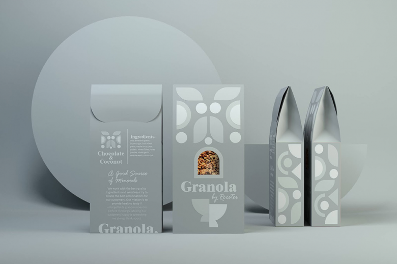
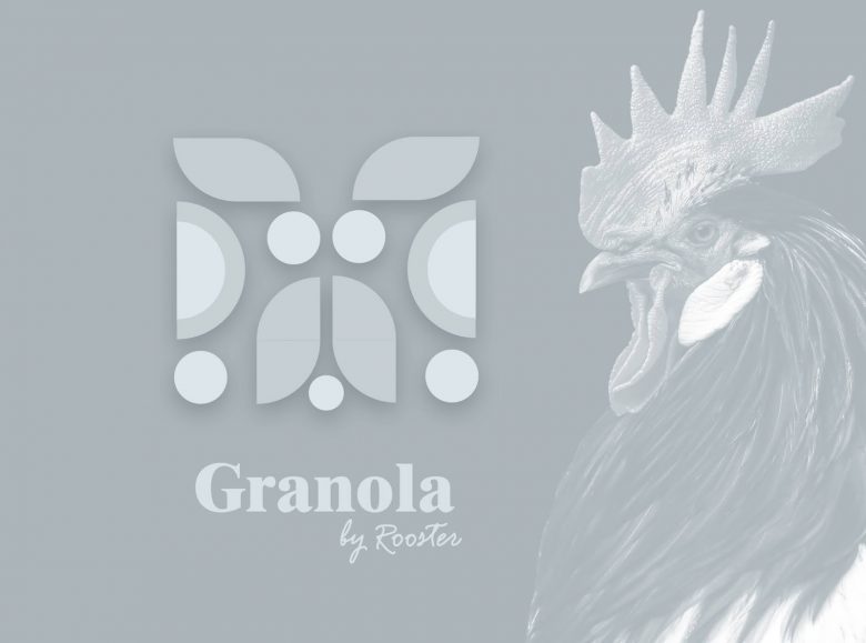
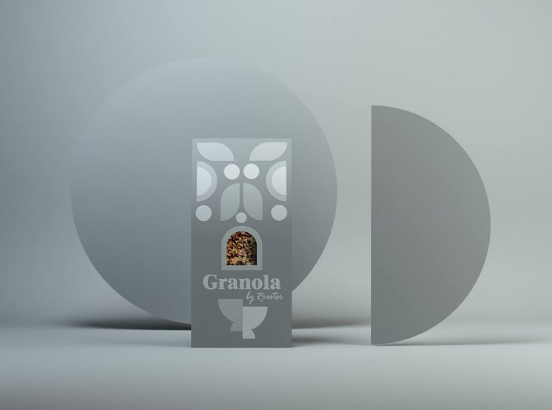
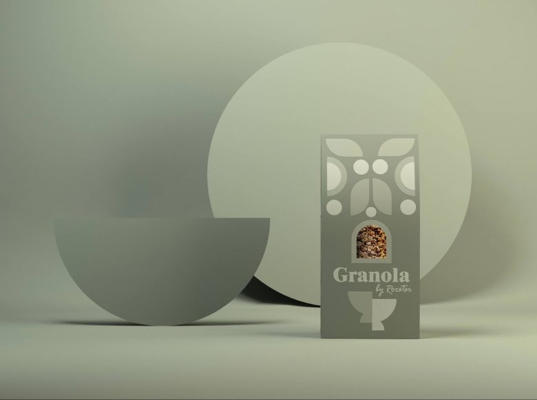
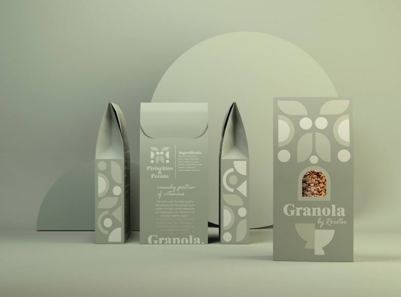
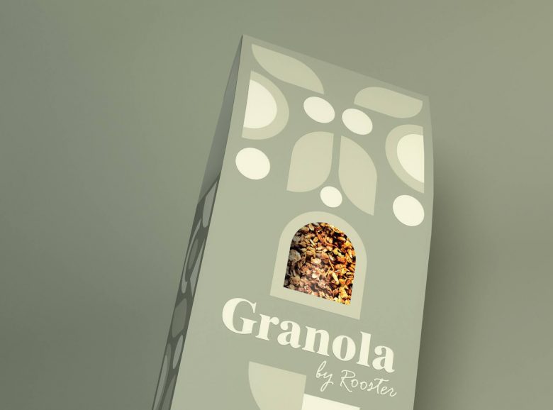
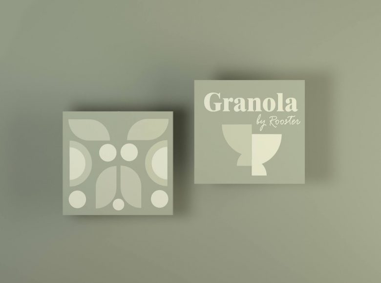
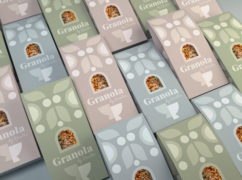
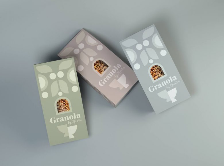
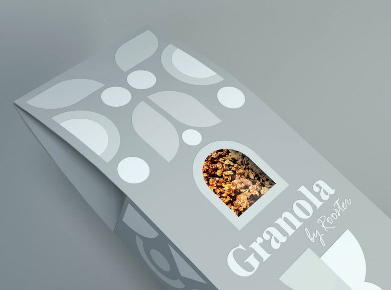
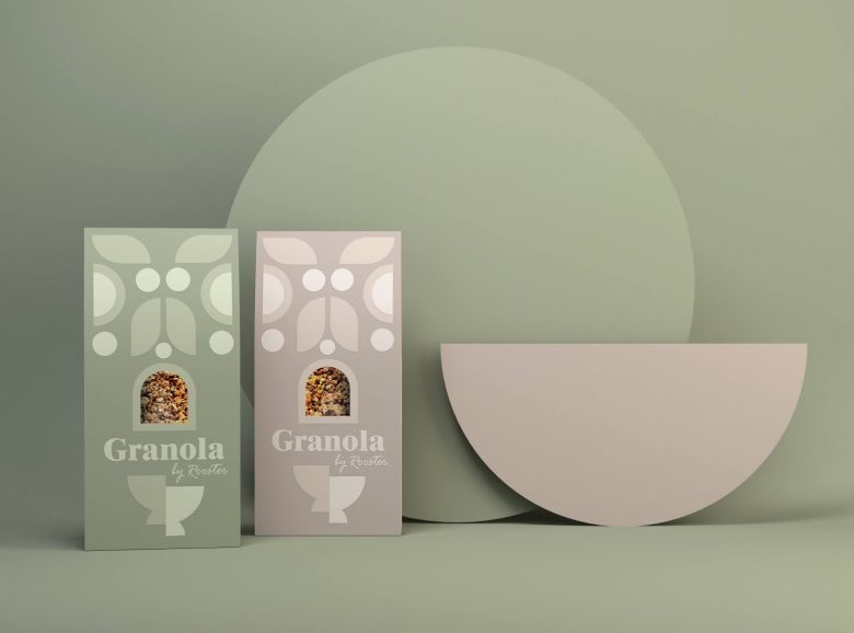
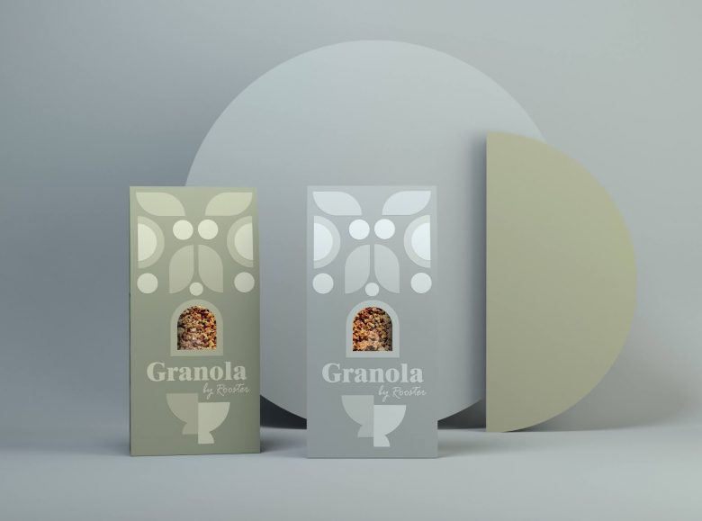
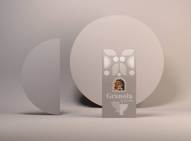
Our approach for the Granola packaging is all about a playful, modern crafted solution that visually speaks to the customer about peaceful, balanced mornings. The sophisticated branding design of the Granola describes a high-quality product. In the existing busy market, the proposed cereal packaging aims to bring a disruptive insertion. When creating the name for this cereal packaging we enjoyed the playful letter similarity between Rooster and Roasted.
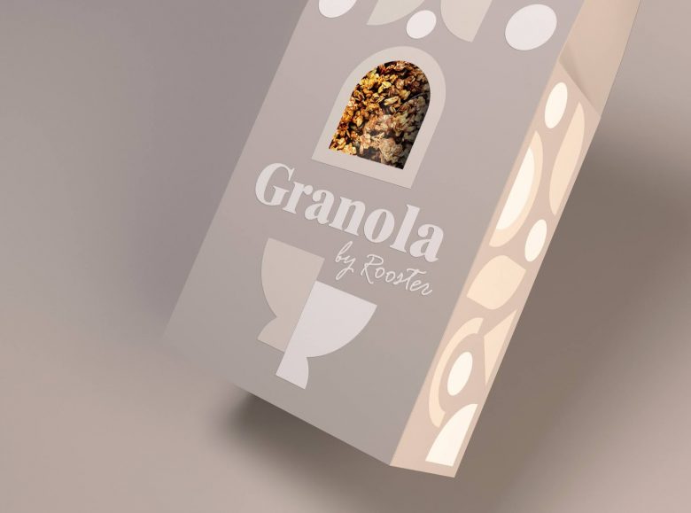
The branding design is using a contemporary earthy color pallet that is both fun & engaging with a touch of refinement. Granola is a product mostly dedicated to a feminine audience, however, the proposed cereal packaging keeps a slightly neutral visual style. The minimalist aesthetic of earthly tones achieves coherence and harmony in this Granola packaging. The modern image of the Rooster is composed using a fun display of geometric shapes. A related geometric pattern was created for both the right & left sides of the Granola packaging. The idea of the branding design was to stimulate the customer’s mind while bringing a little bit of joy and creativity by using this playful geometric game that creates different illustrative elements.
Designed by creativebydefinition


Add to collection