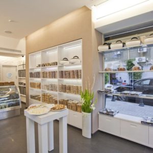
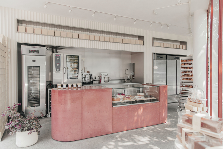
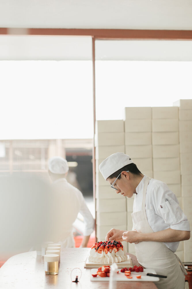
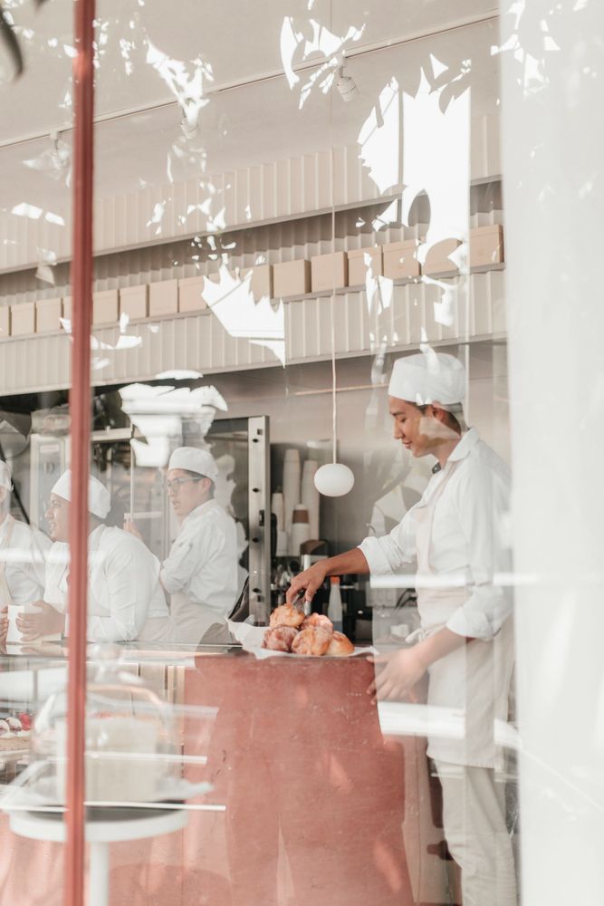
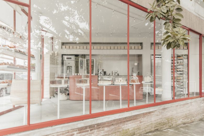
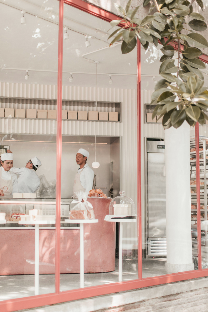
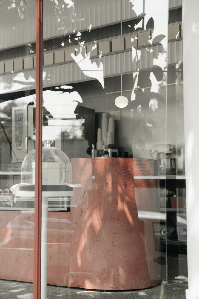
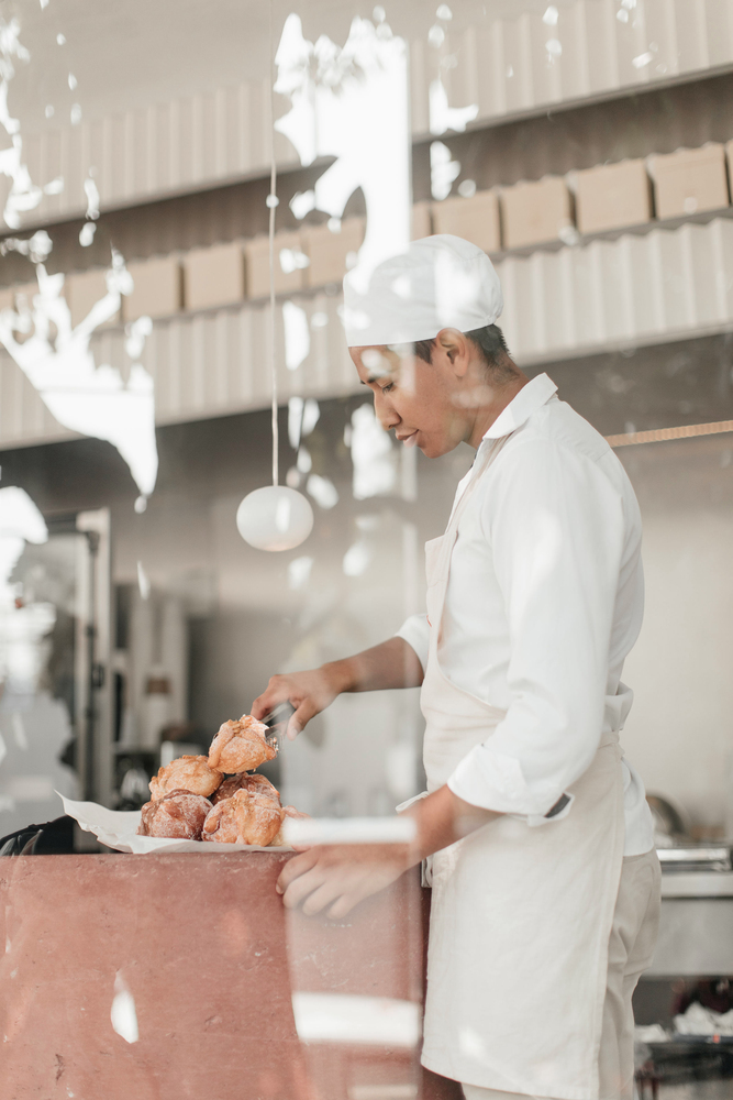
This small space with a reduced triangular plan of 35 m2, is located in a privileged location within an area with great pedestrian flow. For this reason, the bakery project was based on creating a fusion between kitchen, shop, and sideboard, allowing not only the visitor to appreciate the different stages of the bread production process, but also the pedestrians who circulate through the street can do the same. Based on this notion, the transparent façade becomes the central element of the project, that contains but at the same time allows visual interaction, the dialogue between the interior space and the street outside.
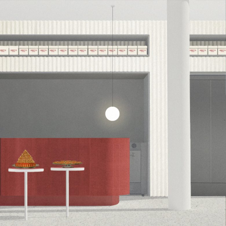
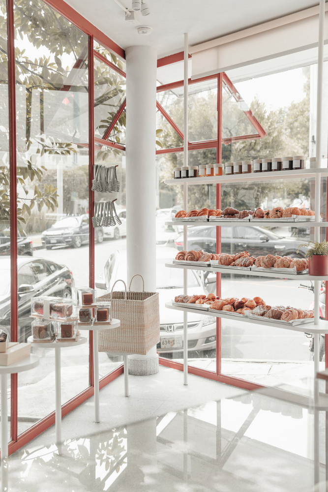
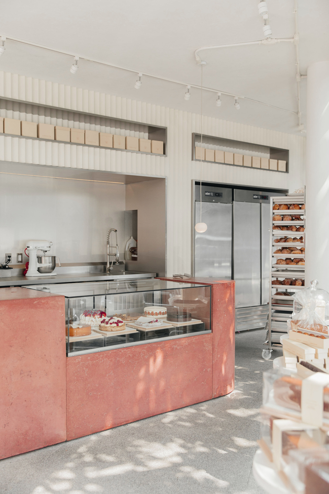
To make the most of the space, the longest side of the triangle was used to locate elements such as ovens and other kitchen equipment, concentrated in a linear space. In addition to this, a simple concrete bar was left in the center of the premises, this divides the kitchen from the store and creates a surface to display the product. By having glass on the other two sides of the triangle that makes up the space, a series of white shelves of different shapes were proposed that allow the product to be displayed directly to the street. This is how, due to its distribution, the interior of the premises becomes an efficient and pragmatic space, conditions that are immediately reflected by its visual clarity. The aesthetics of the bakery are very simple; with an industrial appearance but made with neutral-colored materials that allow a feeling of spaciousness and order.
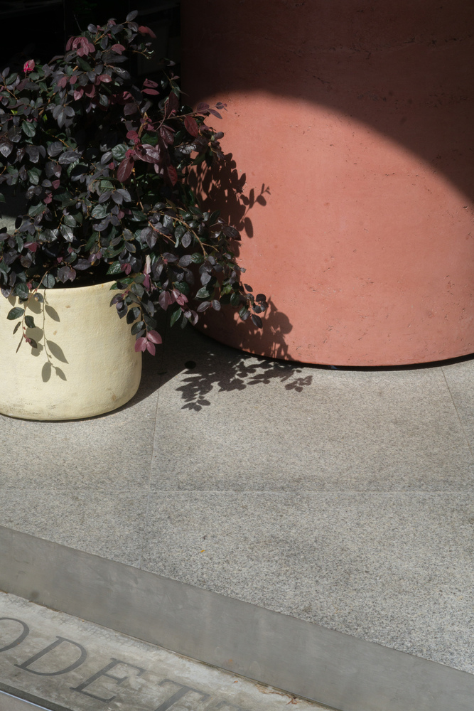
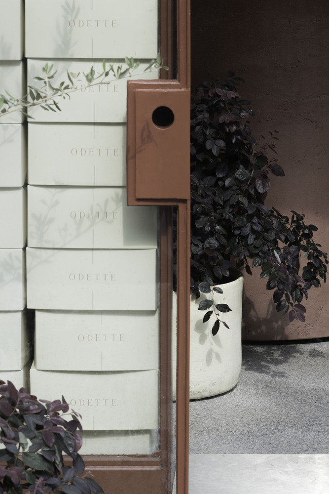
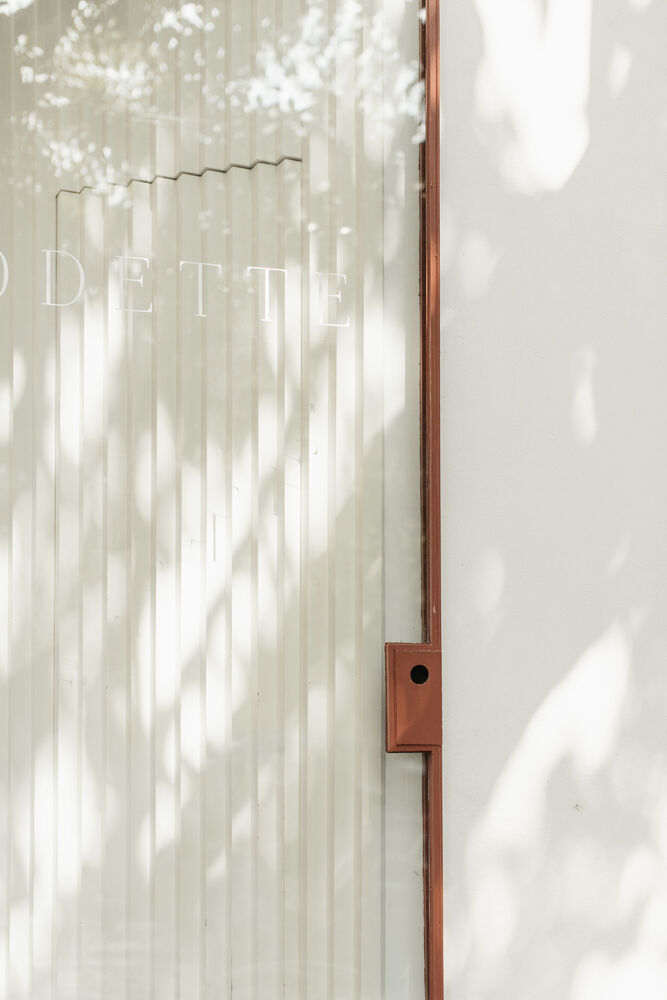
To balance this, the presence of the terracotta color, which covers the ironwork and was used to pigment the concrete of the central bar, unifies the design and, in a very subtle way, gives a touch of warmth. The wall on which the kitchen services are arranged is a continuous panel with a white triangulated texture, to which certain openings were made to house and frame the different processes of the kitchen and storage of products. All this allowed that through simple gestures guided by the programmatic design and constructive ease, it was possible to emphasize not only the importance of the final product but also that of the process of making it.
Architects: Naso
Design Team: William Eaves, José Ignacio Vargas
Photographs: Maureen M. Evans, Renata Gerdes
Add to collection
