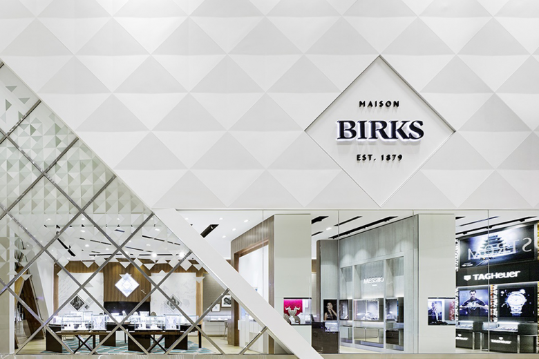
A crystal clear concept by Ædifica aims to attract millennials to a jewellery store in Toronto.
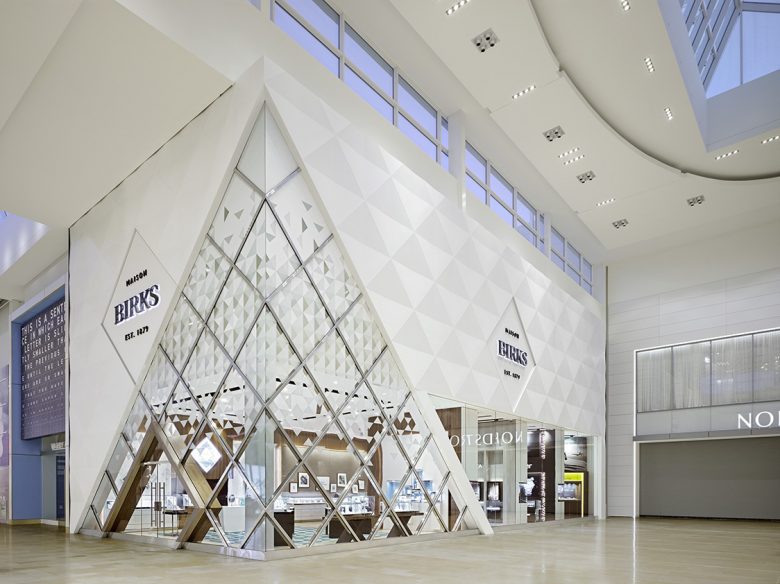
Birks is one of Canada’s most famous jewellers with a proud history stretching back to 1879. Aware that many young people can be put off by the reserved formality of a traditional jewellery store, Birks wanted to offer millennials a more welcoming environment. Therefore, Montreal-based studio Ædifica conceived an open design that removes any barriers between sales staff and customers.
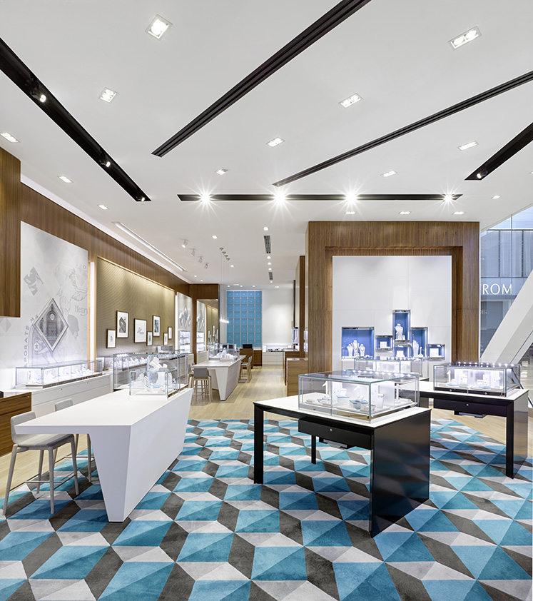
The first step was to ensure that passers-by could see directly into Maison Birks. Large windows straddle two corners of the diamond-like facade to offer a clear view into almost every part of the store. Once inside, the store layout has been organised to put customers immediately at ease. Staff don’t stand stiffly behind high counters but move freely around to engage with customers. A variety of themed pods and stations (a bridal bar, a wall of pearls) offer casual seating options for visitors to sit down and view jewellery in comfort.
There’s still space for some traditional touches – natural oak, walnut, stone and steel feature prominently in the decor – especially to highlight Birks’ heritage. As much as informing customers about the brand’s story, it’s necessary to create a strong visual identity. Retail areas in the store are divided between third party shop-in-shops and Birks’ own products. The latter are given prominence and context with a display of vintage photos highlighting the company’s history and a wall featuring a collection of the brand’s iconic blue gift boxes.
