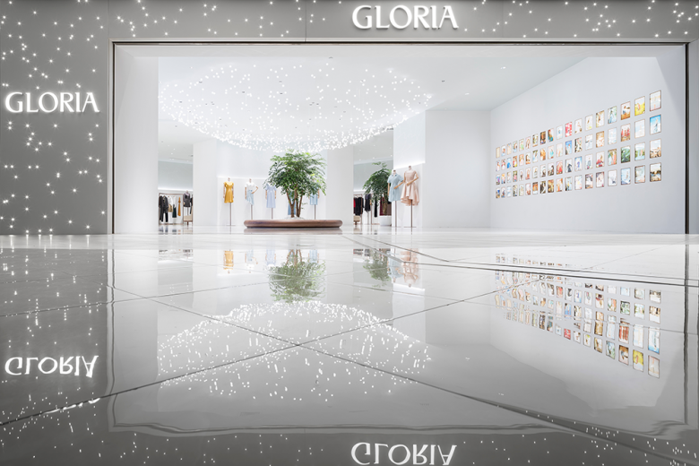
The studio’s far-out statement for a mall store’s entrance is all the introduction the fashion label needs.
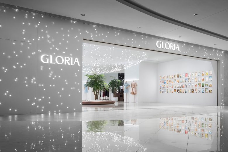
This 290-sq-m concept shop was designed to introduce Chinese women’s clothing brand Gloria to the world. Japanese studio I IN accomplished this with a strong, atmospheric visual statement visible from the store’s entrance in a shopping centre corridor.
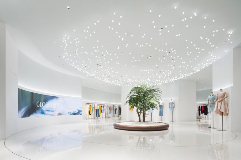
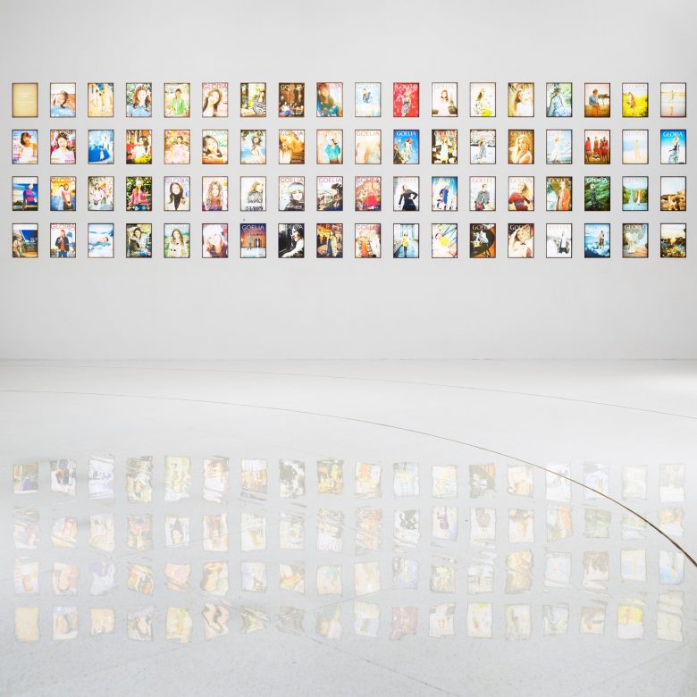
The store is composed of three areas. The first – the entry area – introduces customers to the brand identity. Here, a sprawling chandelier made up of many small spherical pendant lights clustered into a hemisphere above a living tree hints at a voyage beneath a starlit sky. A wall display of backlit brand visuals narrate its history and visual DNA, completing the introduction.
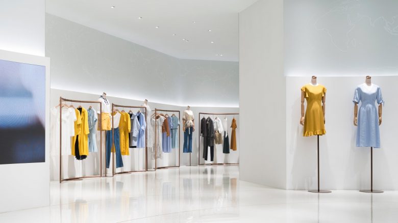
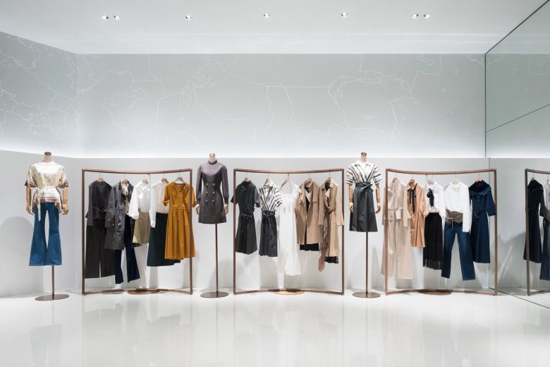
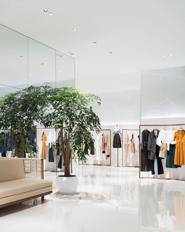
The second part of the design is the product display. A horizontal light set into shallow ledges at eye level extends around the walls of the entire space, representing the Earth’s horizon and guiding customers deeper into the store. On the upper wall, graphics, painted by the Japanese illustrator, Chalkboy, depict parts of the world map. Even the gently arching wooden display bars showcase the clothes within a softened frame, emphasizing the feminine sophistication of the space.
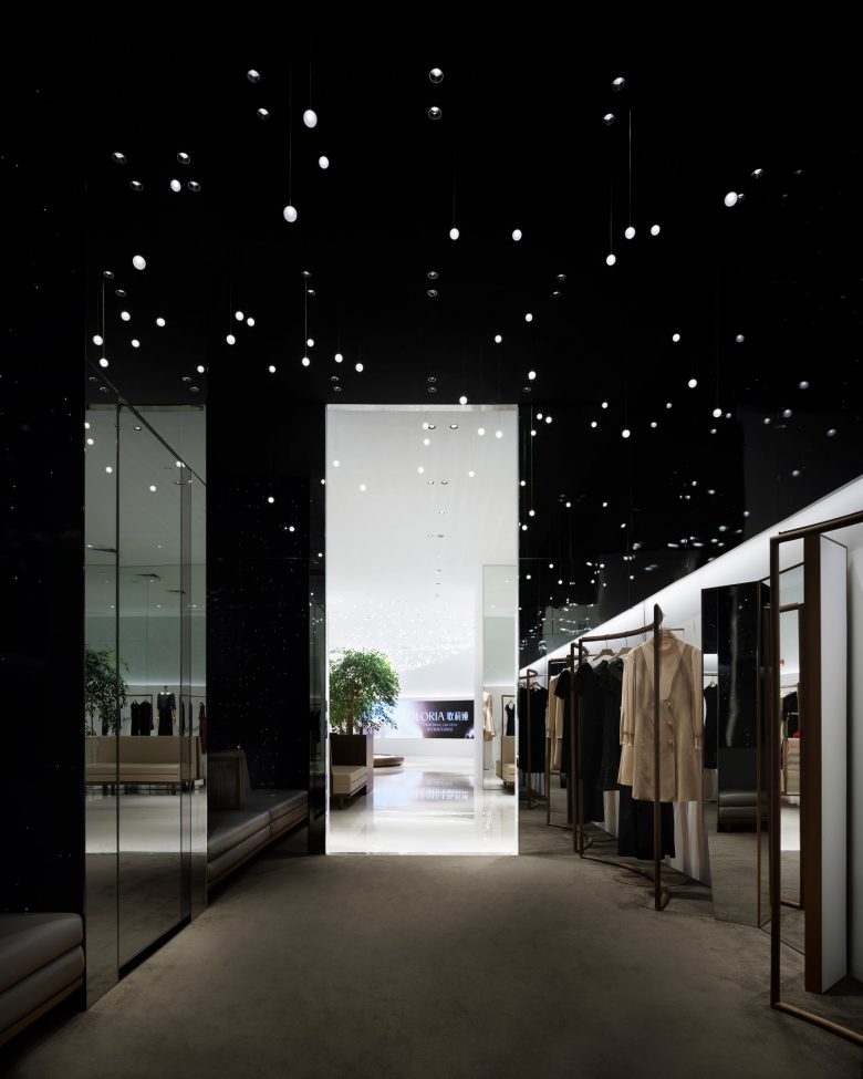
Finally, in the VIP room at the rear of the store, lights are scattered at different heights and distances from one other. Here, too, the lighting gives the dim chamber a dream-like atmosphere, as if visitors were, themselves, suspended amongst the constellations.
Add to collection

