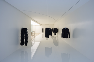
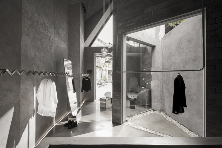
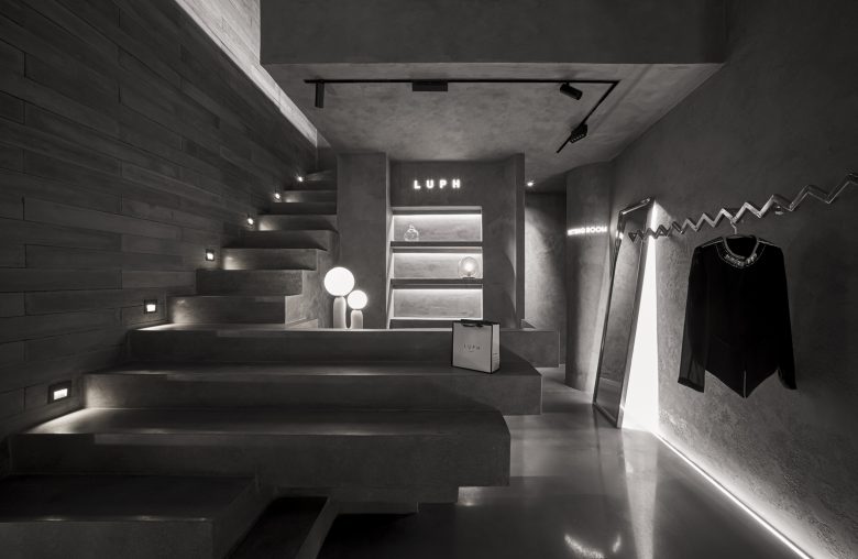
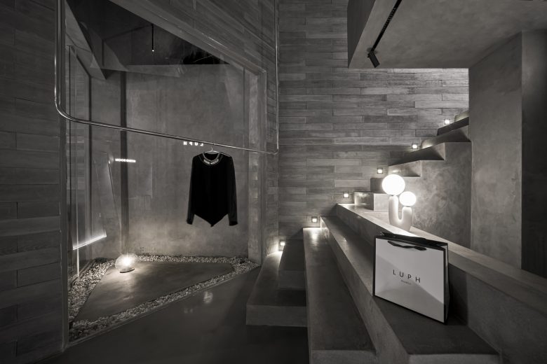
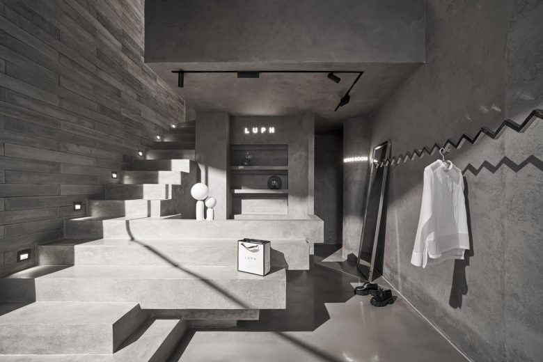
On an area of 40m2 of floor space, we want to create a compact showroom that could point up the quality of a particular product line – elegant clothes for ladies. To accomplish this aim, we built the design concept focusing on two aspects: creating blocks and using light. The main materials are concrete, and tempered glass, and the main color is metallic colors are also thought of from the beginning.
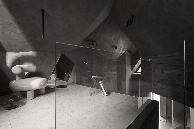
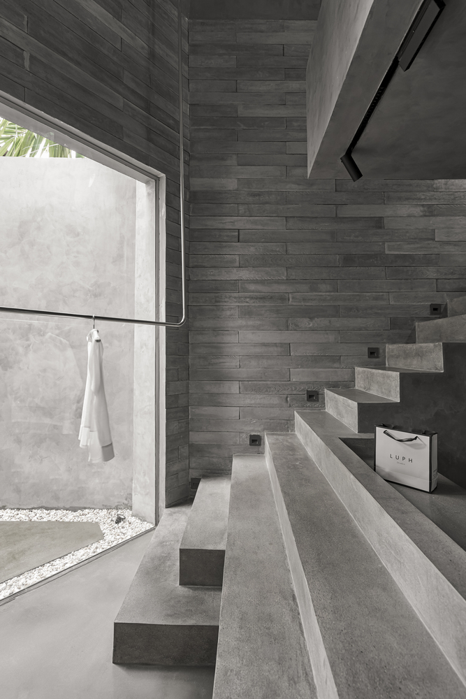
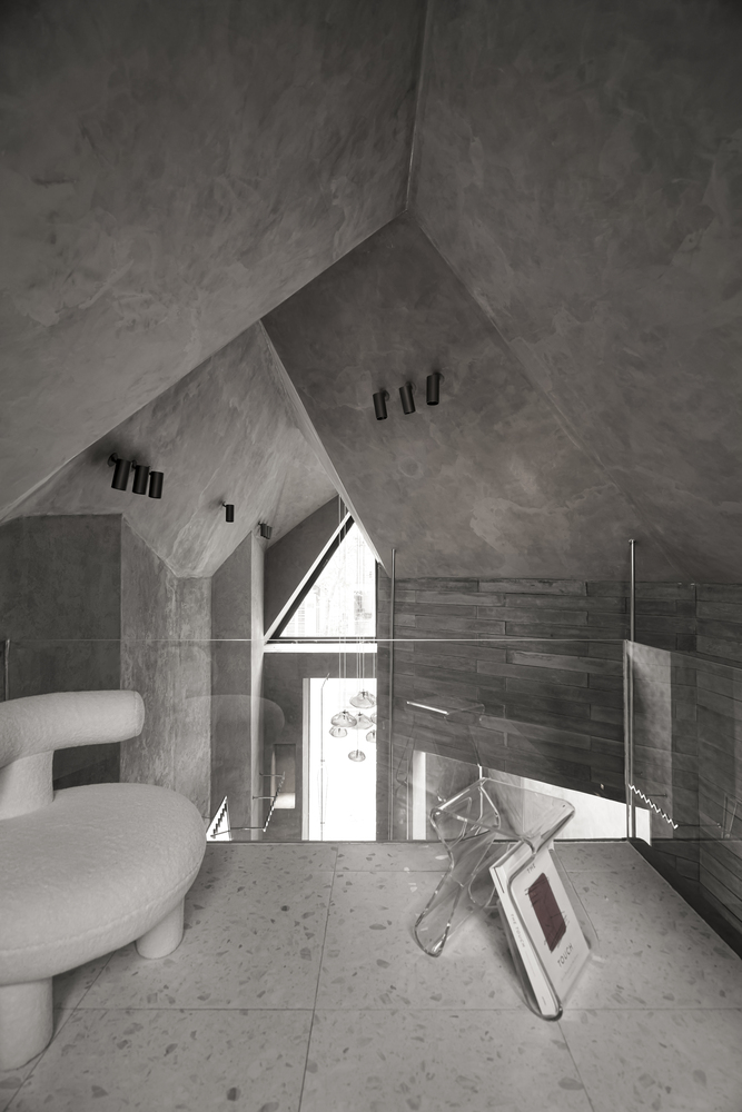
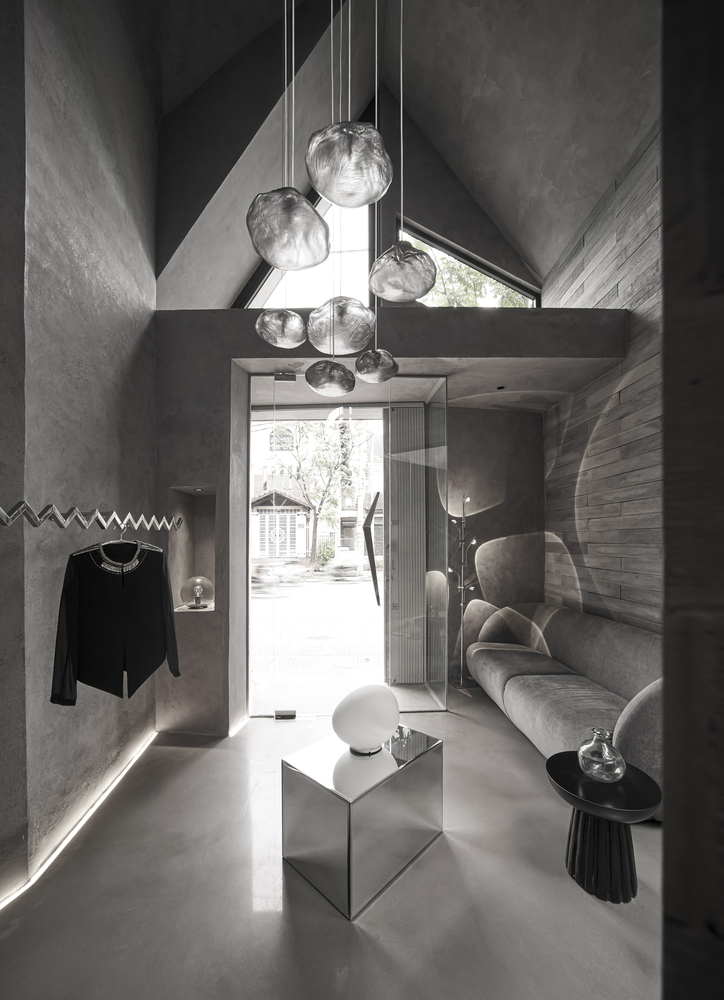
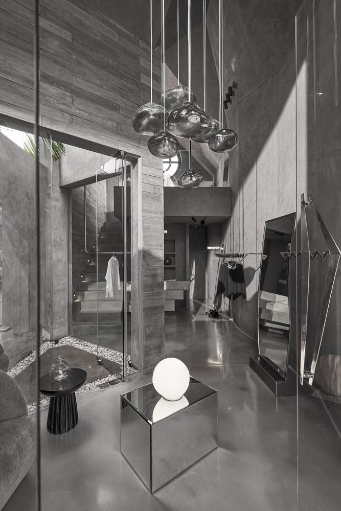
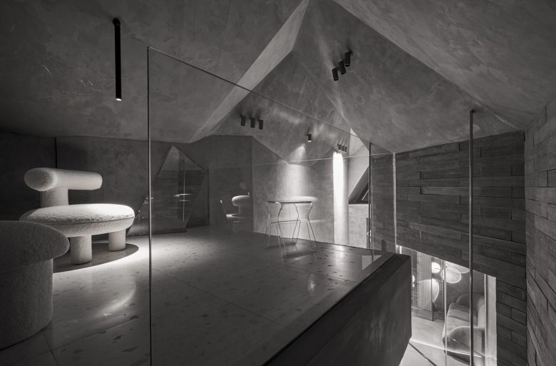
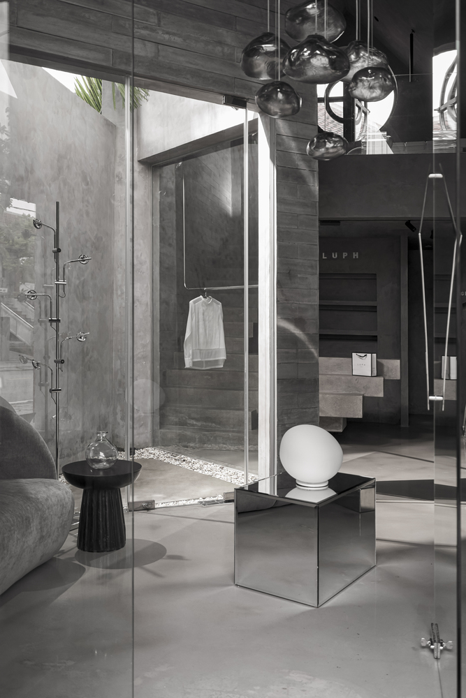
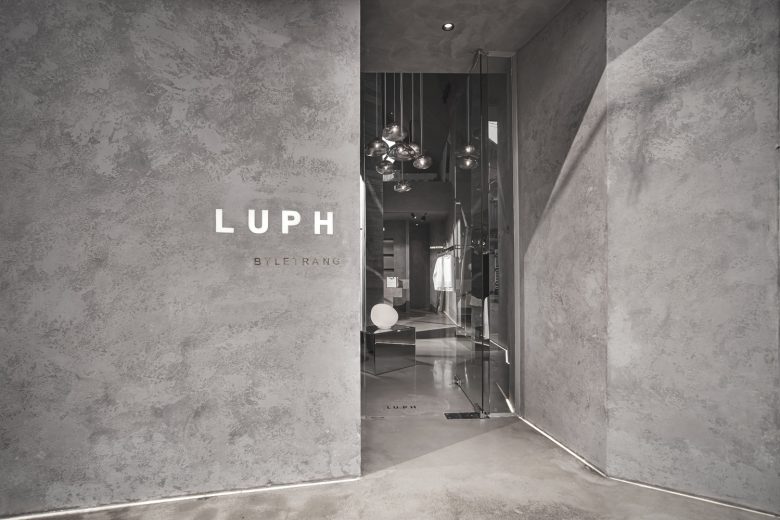
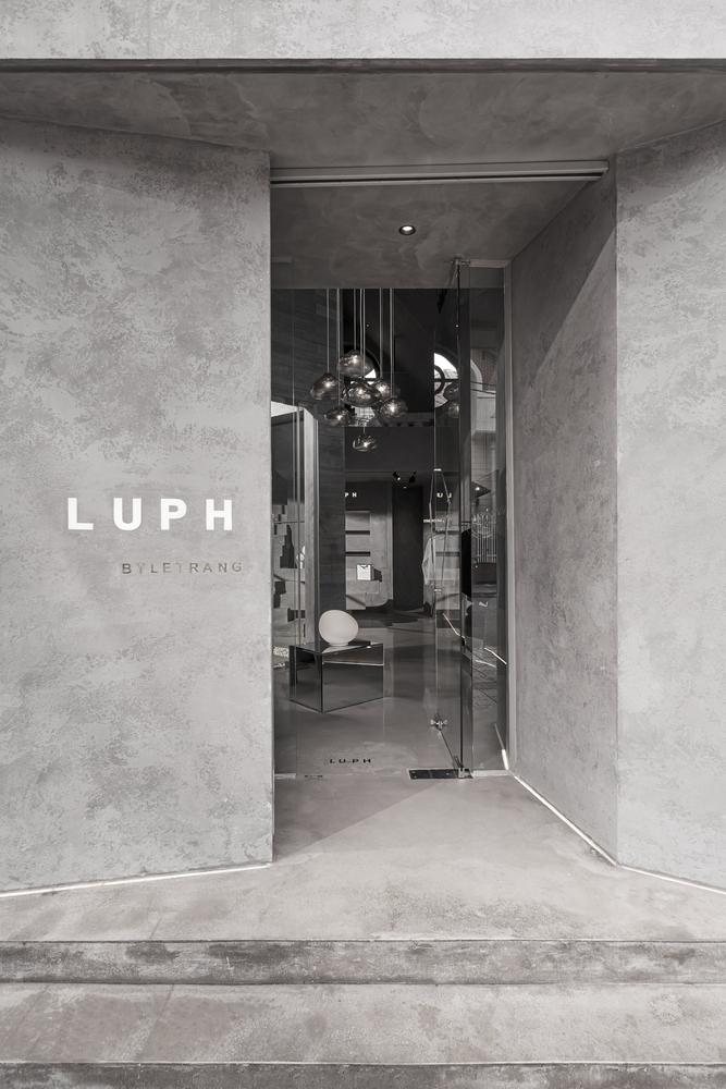
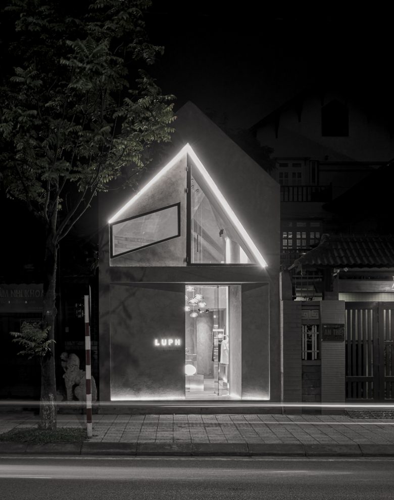
The store’s facade is treated with a fancy design that both creates privacy and stimulates the curiosity of passersby. In the interior, a triangular courtyard is arranged in the middle of the building to allow natural light from here to reach the corners of the shop, creating a sense of openness in a limited area. To optimize the function, we designed the mezzanine floor to help increase the usable area while creating a sense of high visibility. The large circular doorway on the mezzanine floor has the purpose of creating the necessary air convection while playing the role of visual balance with the straight, blocky elements in the overall design of the store.
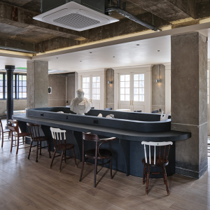
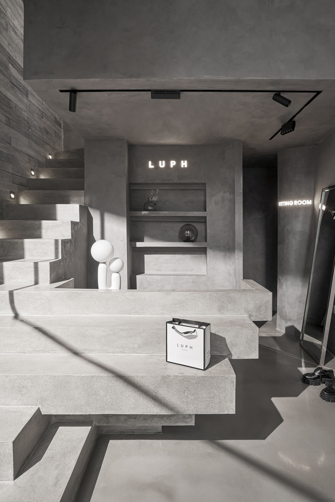
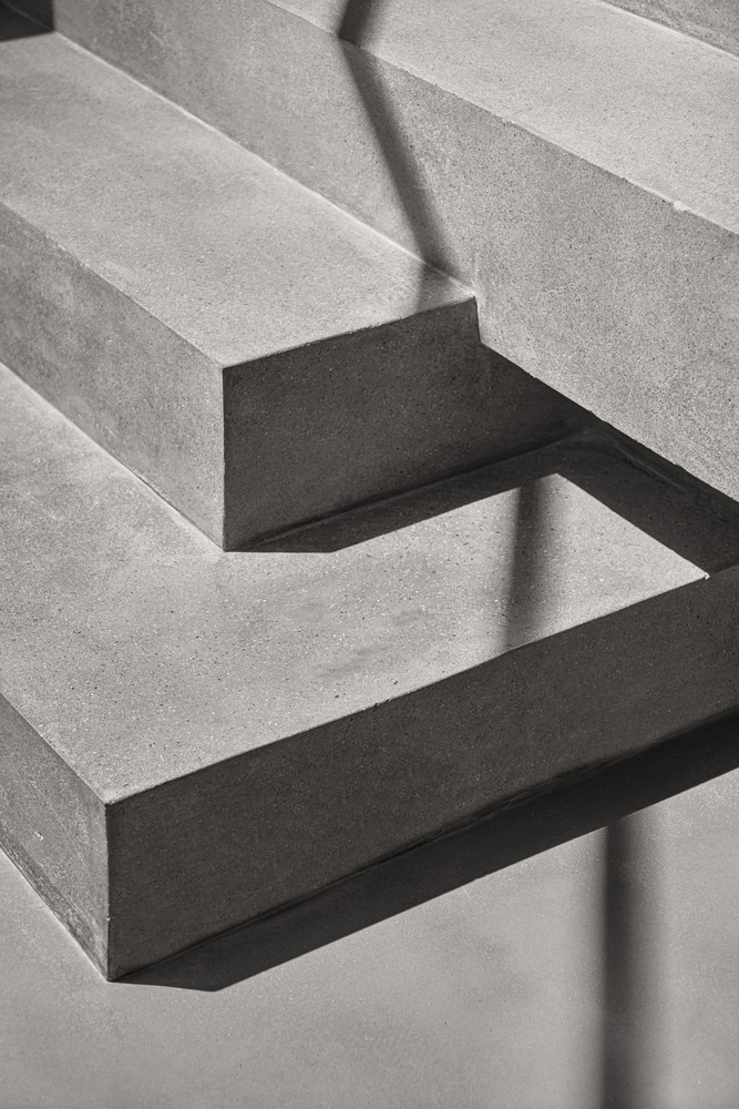
In the ceiling area, we aim to give emphasis on blocks and arrays while keeping the common design language of the whole building, which is interwoven with large blocks into each other. Some of the stairs at the beginning are designed in the form of “floating”, which are extended to become a reception desk. This helps to erase the boundary between interior details that are next to each other, thereby making the design seamless, and making the space feel more spacious.
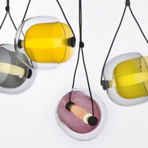
For fashion display purposes, light is an important criterion. Prominent in the space are the lines that create the main-sub-effects, clarifying the spatial geometry and evoking the feeling of a performance stage. In addition, the LED system placed under the floor at the base of the wall helps to emphasize the bends along the perimeter of the building. The ceiling light system draws attention to the center of the reception hall while the mirror table below makes a strong impression on customers from the moment they set foot in the store. To clarify the details of the fashion products on display, we arranged the Spotlight and Downlight systems to be used with sufficient intensity. And finally, at the tables, reception desks, mirrors, … are decorative lights that help customers get beautiful photo angles when trying out the store’s fashion products. And we believe that those images, along with the beautiful impression of a space, will stay with them even after they step out of the store.
Architects: Limdim House Studio
Lead Architects: Tran Ngo Chi Mai
Design Team: Tran Ngo Chi Mai, Ho Nguyen Dang Khoa, Hoang Dao Khanh Linh, Doan Minh Huan
Photographs: Do Sy





Add to collection
