Cesilia Rosé and Blanc are two of the wines with the greatest impact in the history of the Casa Cesilia winery at a commercial level, representing a true before and after after their launch almost a decade ago. In 2010, under the guidance of its head oenologist of french origin, Sebastién Boudon, Casa Cesilia launched a rosé wine of clear Provençal inspiration on the market in a pioneering action in the world of wine at Spain, as has been shown by the slow growth but unstoppable that this type of wines has had over the last few years.
Rosé and Blanc had been updating a design line inheriting the original approach created in 2010, with the consequent presence in the market of designs inspired by the same concept. On the other hand, the increase in rosé wines on the market and their demand has driven their escalation towards the high range, where oenological perfection is offered in increasingly sophisticated bottles with suggestive labels. In the last 10 years, the wine design has returned to the path of sobriety and sophistication. The return to these visual principles opened up the possibility of placing Cesilia Rosé and Blanc on a new level of product perception, combining modern, sophisticated, and even original airs mixed with classic provençal airs.
If there is another category that represents sophistication is perfume. Although the greatest boast is made in the packaging design itself, the graphic codes of the perfume, with avant-garde, sober and timeless airs, as well as the material finishes with tactile sensitivity in the appropriate dose and balanced color load, are the basics that serve as starting points for the new approach of Cesilia Rosé and Blanc. The result is a sophisticated and timeless style that translates into a set of common characteristics that will be responsible for establishing the aasets not only for Blanc and Rosé but for the entire wine portfolio of the winery for the coming years. The challenge ranges from form to graphics, material and texture, to typography, color and finishes.
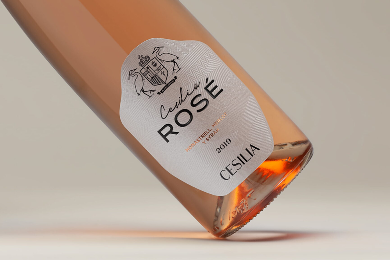
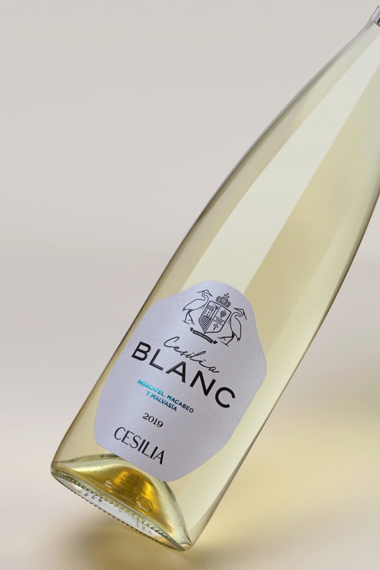
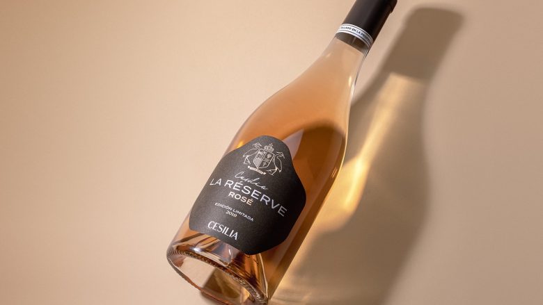
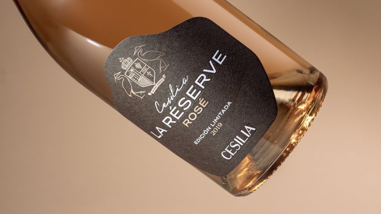
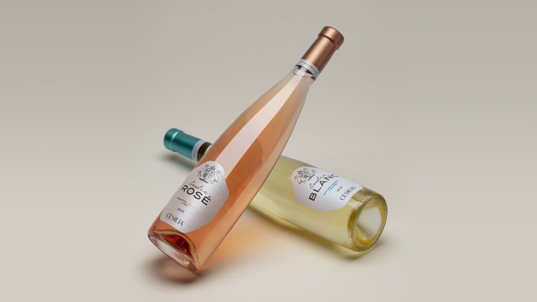
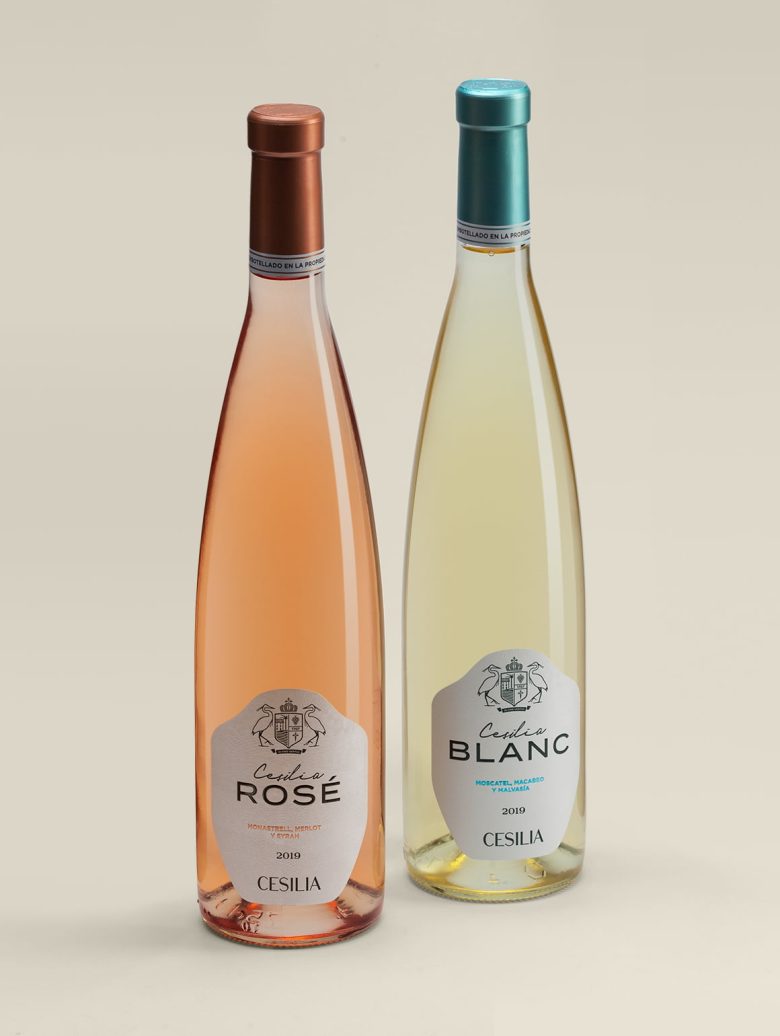
We develop a proprietary and original die is developed that sinuously defines the contour of the label, emphasizing its texture with an original and delicate emboss, on which the rest of the graphic elements are superimposed, combining different finishes and materials such as stamping or volumetric screen printing. The label is placed on a rhin-type bottle, with a slender, elongated and elegant line that is finished off with a personalized capsule in metallic inks and an encircling ring marked with the anagram of the winery.
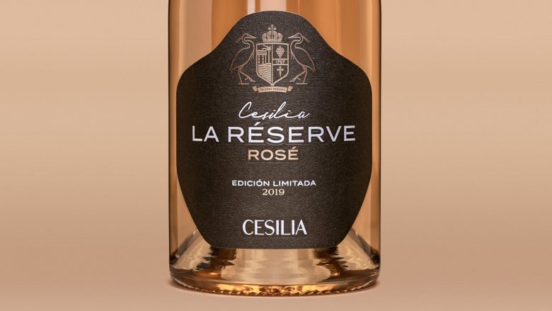
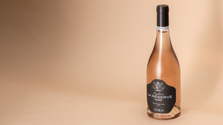
Finally, La Réserve represents an evolution of the initial concept adapted to this limited edition of Rosé, in wich we propose move one step higher just by playing with materials and finishes keeping the same design assets.
Materials: Rosé: Fedrigoni Manter Sirio Pearl Oyster Shell Ultra WS Blanc: Fedrigoni Manter Sirio Pearl Ice White Ultra WS La Réserve: Fedrigoni Manter Materica Pitch Ultra WS. Finishes: Blind bas-relief, Stamping, Embossed varnish.
Designed by Feroz Estudio
Add to collection

