Persol, the eyewear brand synonymous with quality and Italian design, has opened the doors of its first ever concept store in Europe.
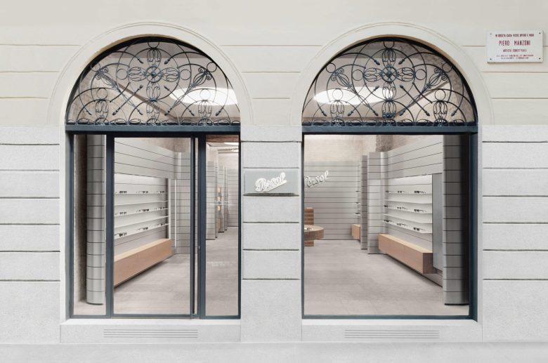
Following on from the first on Rodeo Drive in Los Angeles, Persol has enriched itself with a second store in the historic centre of Milan in via Fiori Chiari 16, in the heart of the Brera district. With its cobbled streets, secret courtyards, prestigious buildings and famous Art Gallery, Brera is a neighbourhood, which exudes a refined and distinctive elegance, renowned as the city’s meeting place for art and culture.
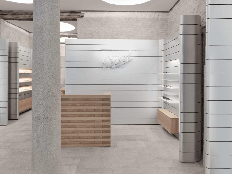
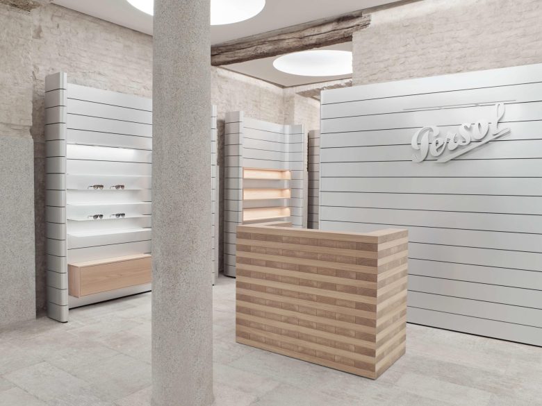
Designed by David Chipperfield Architects Milan, the concept store occupies a 120 m2 site and showcases the Persol lifestyle, the brand which has become a symbol of authenticity and contemporaneity. The store reflects these opposite characteristics and re-proposes them as complementary elements, on the one hand reinterpreting architecture as archaeology and on the other hand, the set-up as technology.
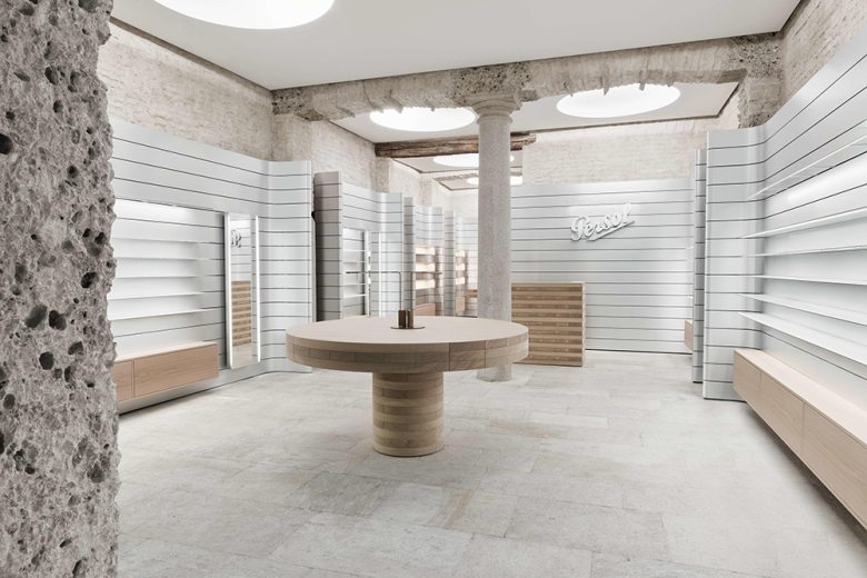
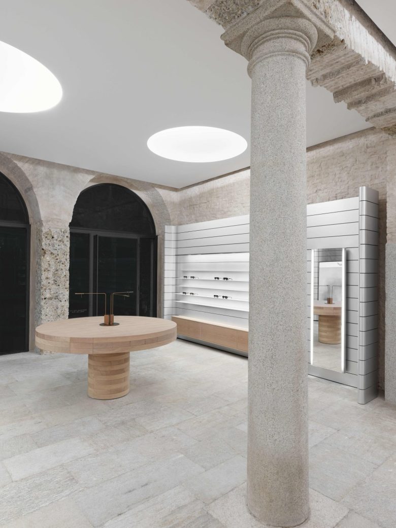
The idea at the heart of the Concept is to unveil the site’s authentic architecture, by means of a recovery process, returning stratified parts of the building to the surface, rather than concealing them with new renovation works, thus building a bridge between the unveiled architecture of the store and the neighbourhood, a link between the Brand’s and the city’s soul. Renovated architecture thus becomes the historic container of a contemporary set-up consisting of a series of scenery flats for the exhibition of the Persol product.
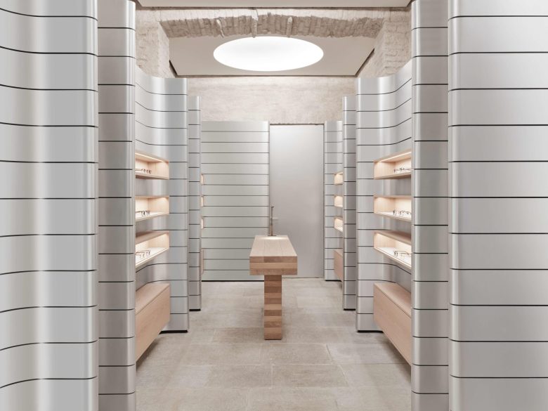
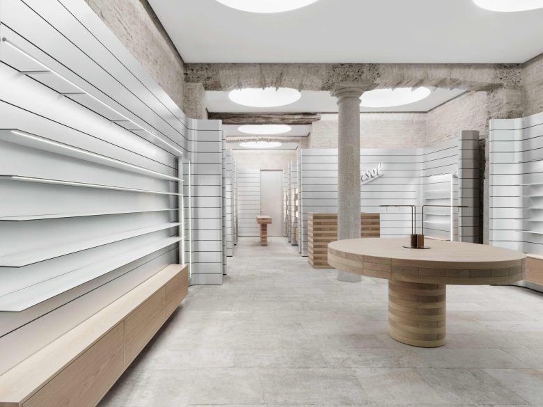
The architectonic shell, a sequence of four interiors divided by three portals, is maintained to generate a temporal and spatial rhythm inside the store, enabling the organisation of the Persol product in a different way according to spaces, with a syncopated rhythm.
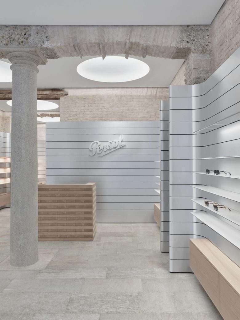
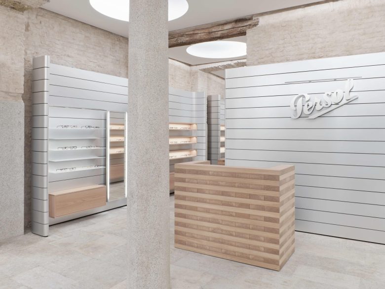
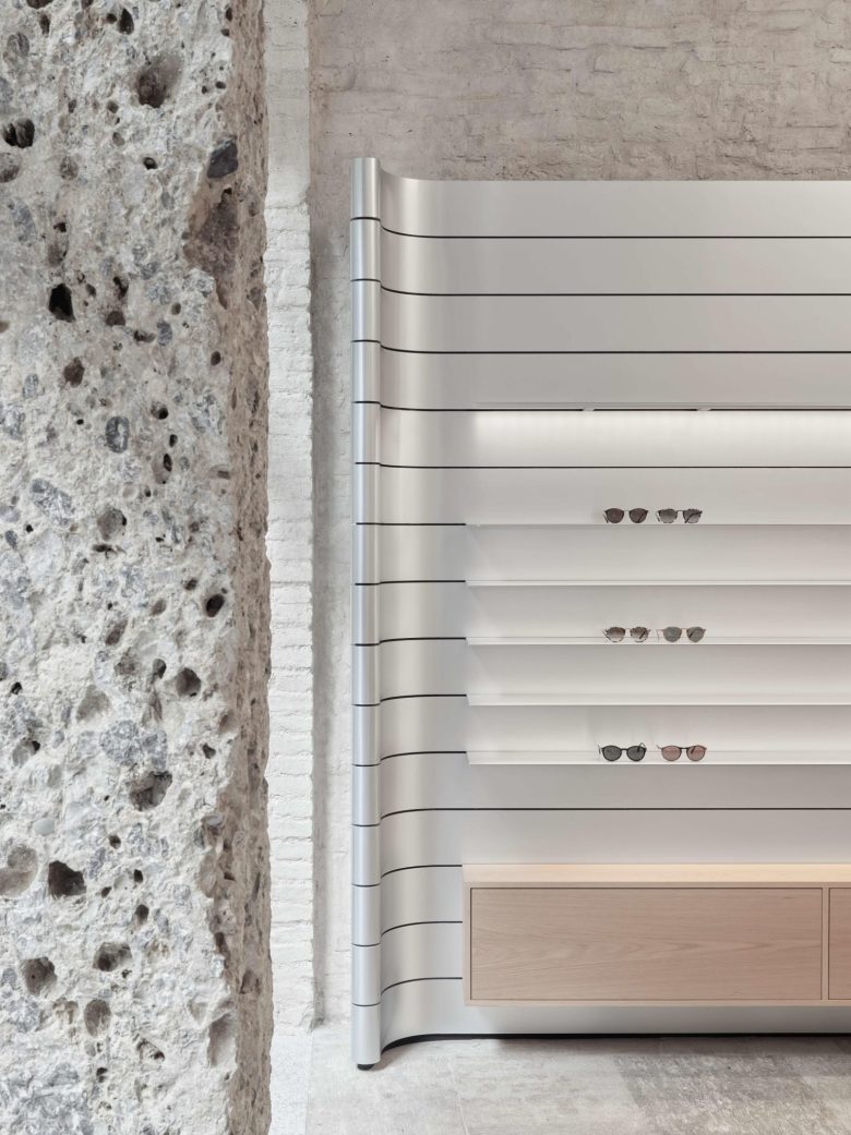
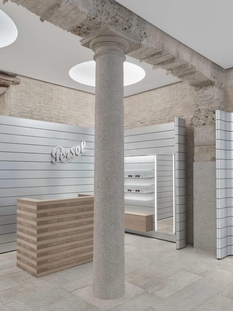
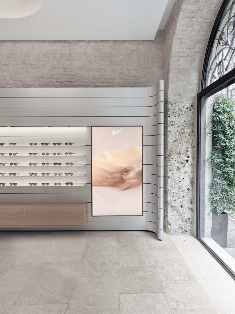
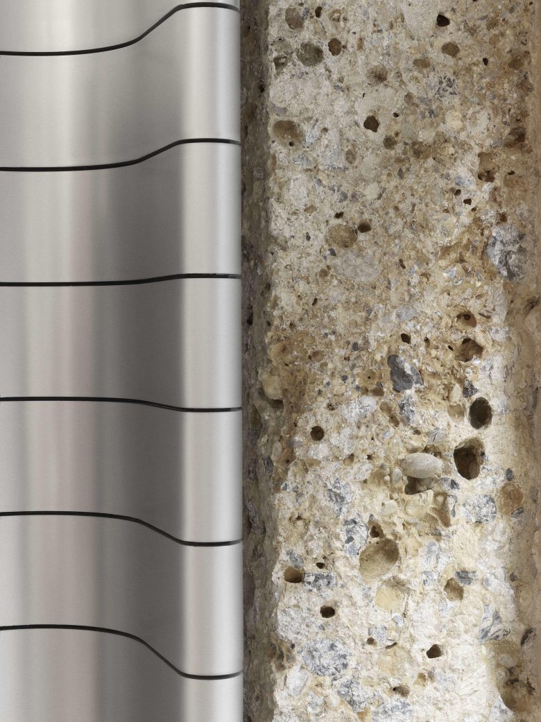
Materials of all horizontal and vertical surfaces throughout the interiors are shown in all their essence, to the greatest possible extent. Brick walls are unveiled and whitewashed, beola stone flooring is uncovered and bush hammered, the granite column and stump elements are uncovered and enhanced, with the aim of characterising the architecture as a multi-material and multi-expressive element.
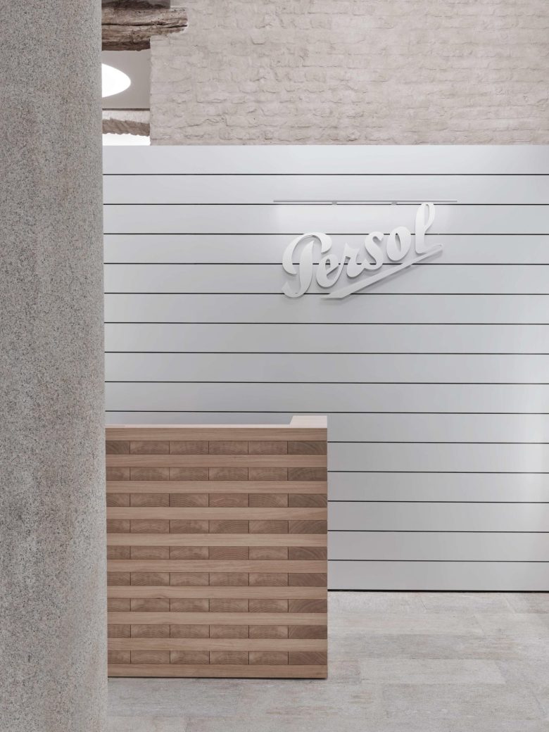
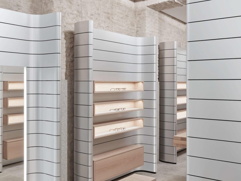
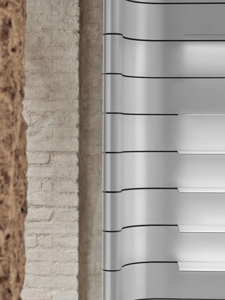
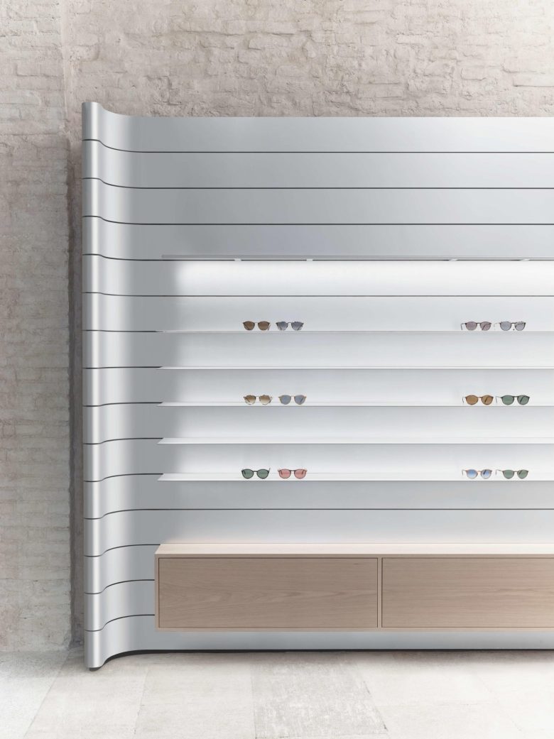
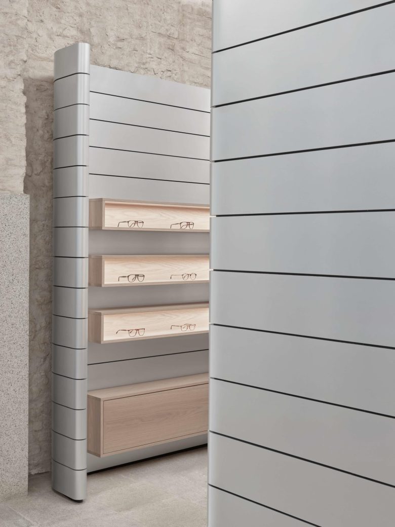
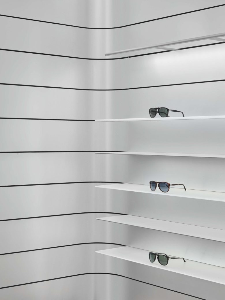
Self-supporting aluminium fittings form a series of flats juxtaposed with the historic architecture and, mid-way between furnishing and architecture, the scenery flats create a theatre setting offering behind-the-scene glimpses, supporting the shelves, mirrors and lighting, conveying a sense of technology in contrast with archaeology.
Furnishings generated by the stratification of solid oak wood are at the centre of interiors syncopated with the intention of guaranteeing a sense of craftsmanship in contrast with industrialism.
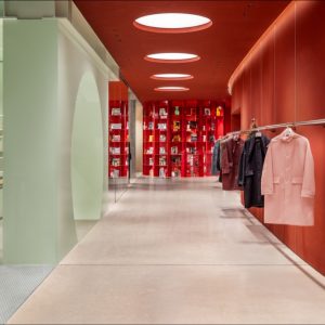
Archaeology and technology, craftsmanship and industrialism characterise spaces, dimly and uniformly lit by artificial round skylights which do not disturb the ceiling surface with devices, as opposed to what usually happens in stores.
The theme of opposites is highlighted by the Concept, which features a series of contrasts between craftsmanship and industrialism: rough and smooth surfaces, discontinuous and continuous surfaces, history and contemporaneity. A blend of tradition and innovation, which undoubtedly characterises the Persol Brand.
Designed by David Chipperfield Architects
Photography by Gerhardt Kellermann
Add to collection
