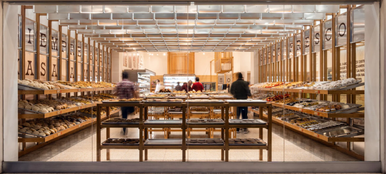
Interdisciplinary collaboration studio Concèntrico designs Mi Pan Bakery in Mexico City as an ode to the bakers and the bakery traditions in Mexico. The cafe-like design of the architecture in Mexico carries a sense of wood-clad construction, thanks to the use of pinewood throughout the space. Before working on the project, the studio analyzed typical Mexican bakeries to understand their values, experiences, and essence and combined their research with the 40-year lifeline of Mi Pan, whose tradition lies in baking for thousands of families throughout generations. The studio likens the visit to the bakery to living the memory of all Mexicans as the space and the creation process reflect the people who visit the location. It also claims that people are not used to buying in stores that invest in design, a finding that nudged the design team to investigate the context.
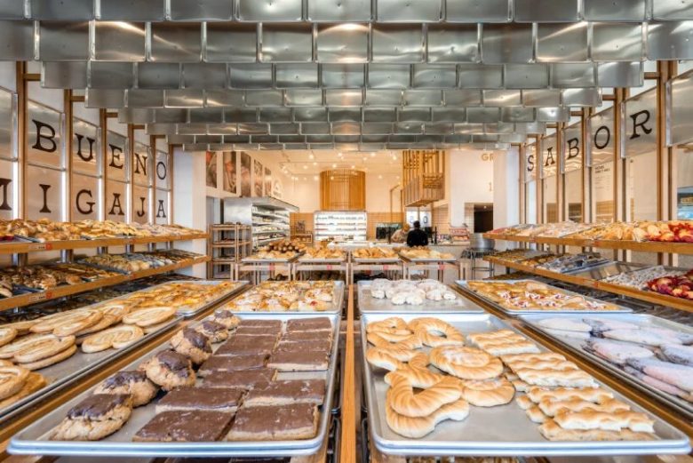
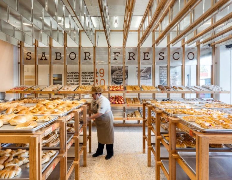
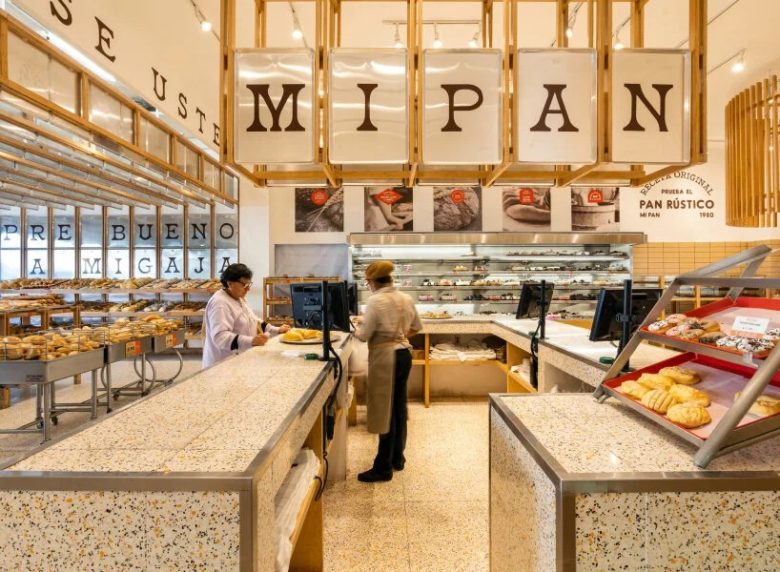
As the team walked through the streets, they witnessed a uniform pattern in colors and thousands of handmade signs and messages used to identify the individual store. From here, the design phase began. The self-serve layout of Mi Pan retains the original bakery experience and the goal to invite customers to linger in the bakery and carefully select their bread and delicacies to buy and take home without rushing. Around the space and dangling from the ceiling, metallic baking trays link the baking process with the shopping experience and create an instant signature for the bakery. The design makes it clear that everything revolves around the bread and its process, and the team complements these trays with pinewood boards and shelves to add a warm balance to the coldness of the metallic trays.
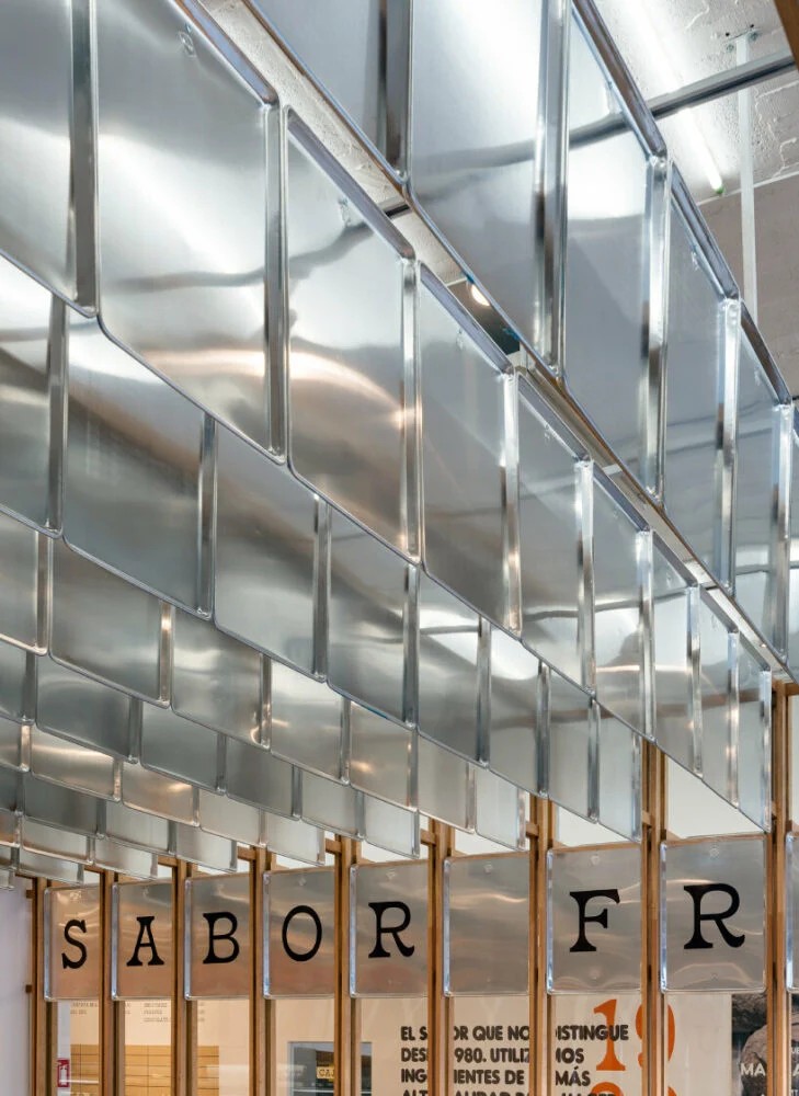
Hanging metallic trays diffuse ambient light
Alejandro Peña Villarreal, the Director of Concèntrico, states that the concept of Mi Pan is derived from its kitchen as he and the team conversed with each baker to get the overall vibe of the place. ‘Throughout the bread baking process, trays are used to reflect the freshness of the product, so we incorporate them into the store,’ he says. Ceramic tiles for the terrazzo floor thread the bakery to the local supermarkets and shops that bear the same design, and the design team added the brand’s orange color into the mix to let Mi Pan’s identity stand out on its own. By combining all of these materials, the studio thinks Mi Pan exudes a warm environment without intimidating the customers who visit.
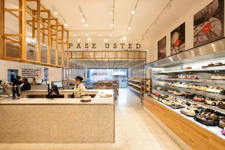
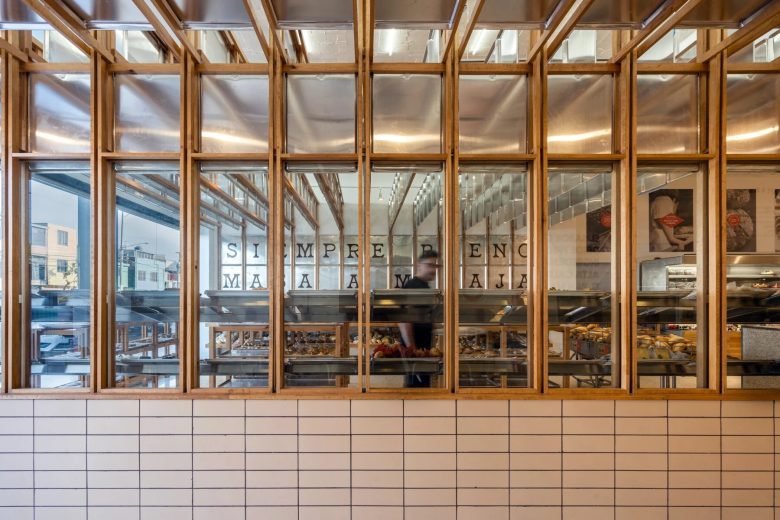
While one may think that the metallic trays in the ceiling were added for aesthetic purposes, the studio deflects this by stating that they help lower the scale of the space and reflect the ceiling lighting that creates diffused ambient light. Crossing the other side of the space, the bakery’s display of cakes and other sweets and treats recline in the fridge, a seemingly last invitation to the customers to halt and grab one or two to take home along with their bread. Another feature that marks the openness and airiness of the bakery pivots to the glass-clad four walls, allowing the outside to trespass the inside and vice-versa.
Handmade signs for traditions of mexican bakeries
The pinewood shelves also gather by spaces to afford customers a spacious walkway without bumping into one another. The sweets and treats are laid down on each metallic tray, out in the open to please the eyes of the customers and immediately piqued their senses with their flavors and aromas. Following the layout of the bakery, the design team installed lateral access from the inside to the coffee shop beside the bakery to form a sense of symmetry and separation as opposed to including the tables and chairs inside the shop.
There, the route begins with the selection of bread and ends at the checkout counter. The space also includes custom-made metallic furniture inspired by designs used in local restaurants in 1980, the year the bakery opened. Handmade signs bakeries within the neighborhood possess appear in Mi Pan as they adorn the walls, each tray bearing its own letter, number, or sign. The studio says that some of the phrases incorporated into the project include ‘always good from dough to crumb’ and ‘40 years later and our bread is still as it always was, authentic. Mi Pan is the bakery that makes real bread.’
Design studio: Concèntrico
Design team: Alejandro Peña Villarreal, Ana Rebeca Mata, May Cisneros, Jose María Cuevas
Images courtesy of Concèntrico
Photos by Jose Miguel Gonzalez of Apertura Arquitectónica

