Sò Studio used freestanding spatial interventions to transform a historical building in Wuhan for multi-brand retailer Looknow, without compromising its original architectural integrity.
Key features
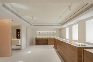
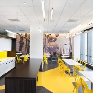
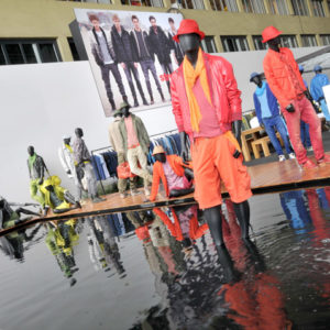
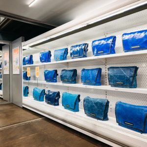
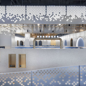
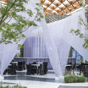
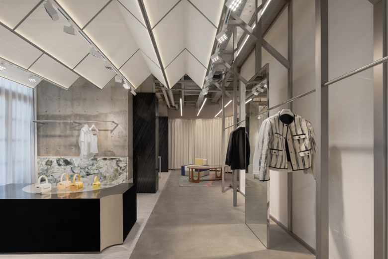
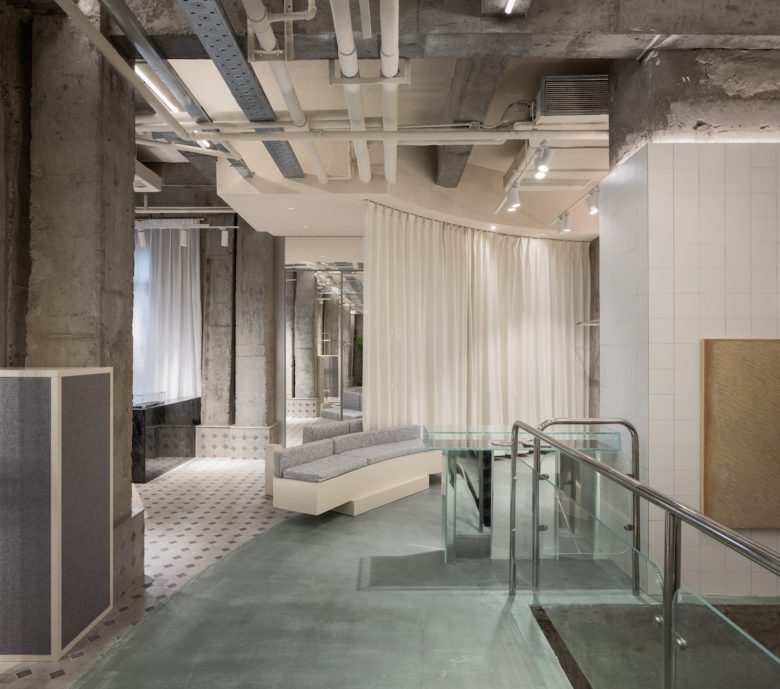
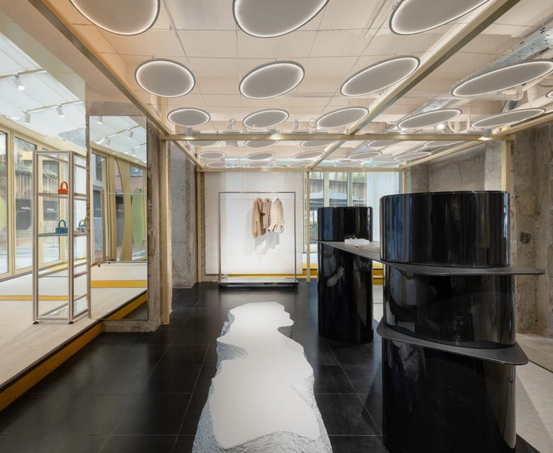
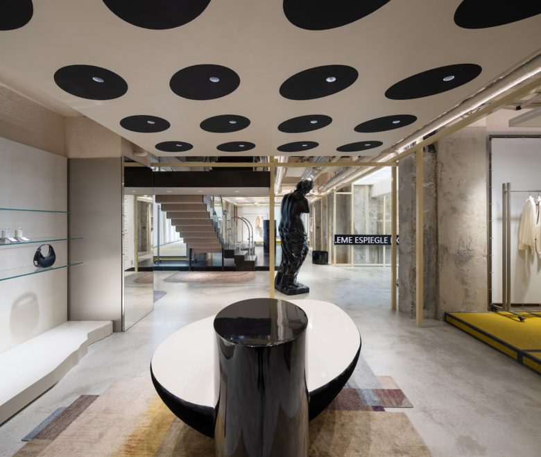
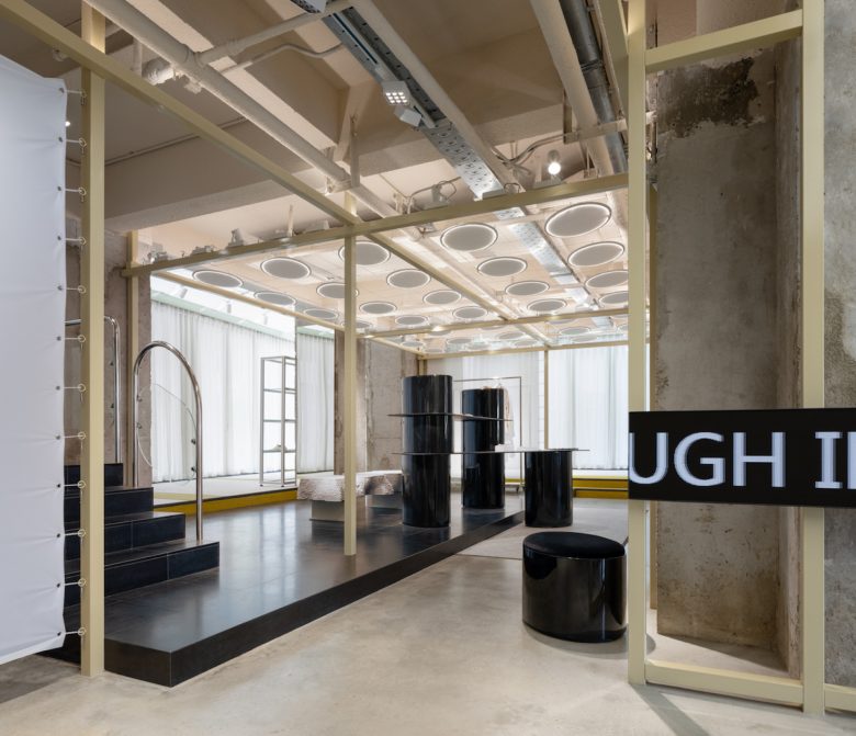
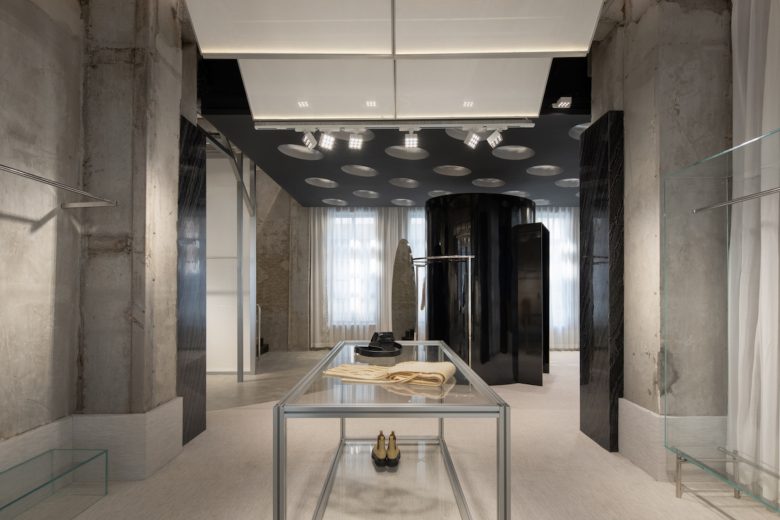
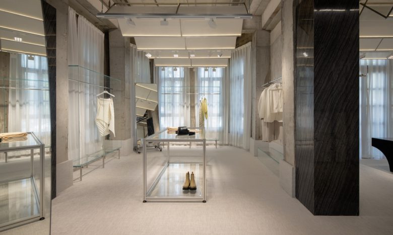
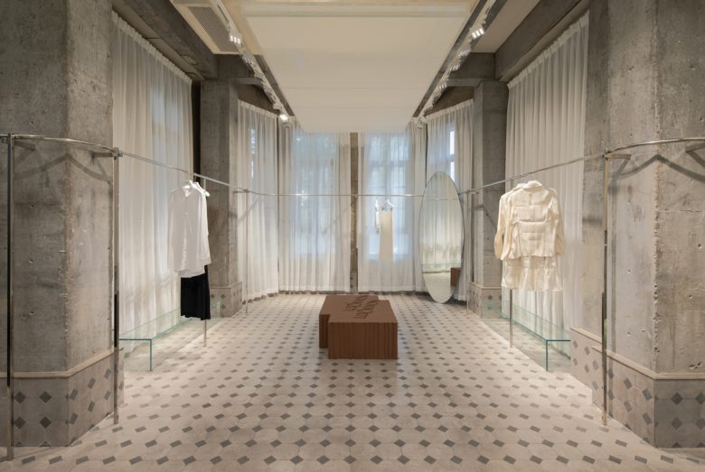
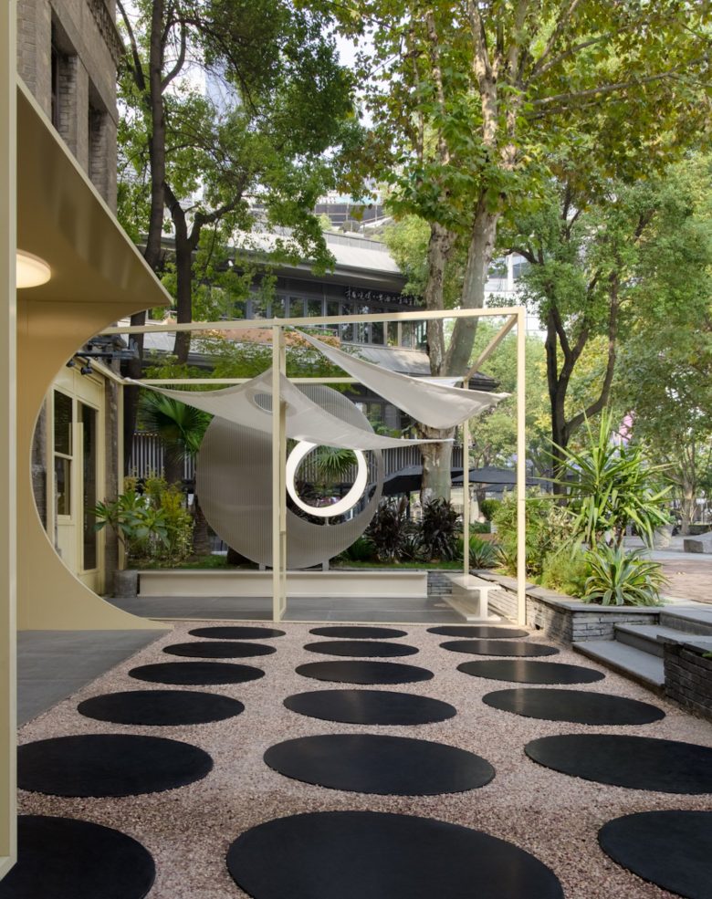
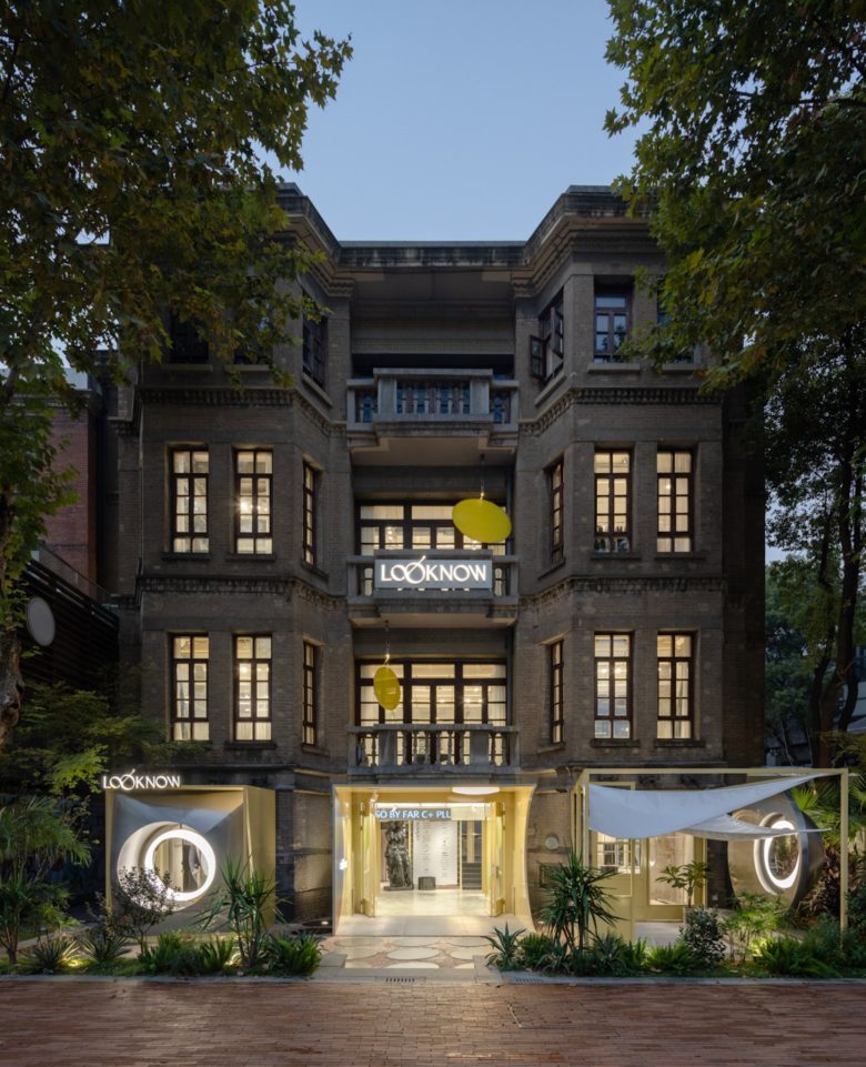
The Wuhan flagship of multi-brand retailer Looknow occupies the former home of a revolutionary army general, adjacent to the city’s Japanese Concession. Sò Studio headed the renovation of the historical four-storey building and was restricted to interventions that would not compromise the original architecture of the building and could be detached from the structure itself. The spatial intervention drew inspiration from the follies comprising Bernard Tschumi’s Parc de la Villette, and other deconstructionist architecture. The store follows the organization of the original home, becoming increasingly more private with each level, but different spatial insertions help to create a varied interior landscape. The sculptural follies originate in the garden, and continue inside. Oval-shaped black ceramic tiles in the garden also are represented in the interior on the ceiling, framing overhead lighting.
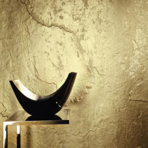
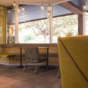
One of such deconstructionist ‘folly’ structures is a glass annex connecting the garden and the ground floor that provides additional natural light. Adjacent is a multifunctional pop-up event space. Tatami mats were incorporated as a reference to the Japanese influence on the surrounding architecture. Marble-covered decorative walls and columns were inserted to balance with the originals and contrast with the tactile carpet for a domestic touch. Three independent structures on the third floor host different display areas and colourful furniture, carpets and other decorative elements.
FRAME’s take
For most, taking a walk on an organically formed path in the woods is more interesting than around an oval-shaped running track. The former provides an experience that’s not as predictable as the latter; the participant can determine their own next step. Sò Studio paid mind to this when designing the Wuhan Looknow flagship. By creating a topographically diverse retail space, the designer provides constant opportunity for discovery. The unexpected introduction of different forms, materials and colour is motivation for spatial exploration. Such an environment also defies users’ archetypal expectations, prompting a sense of intrigue sure to translate to success at the cash wrap.
Add to collection
