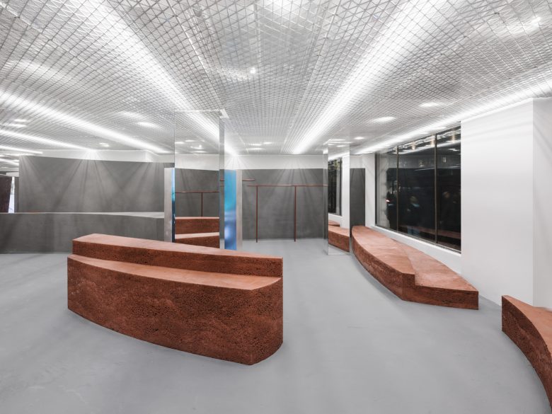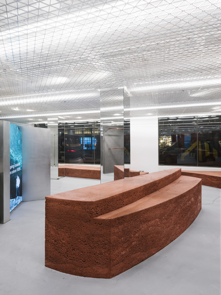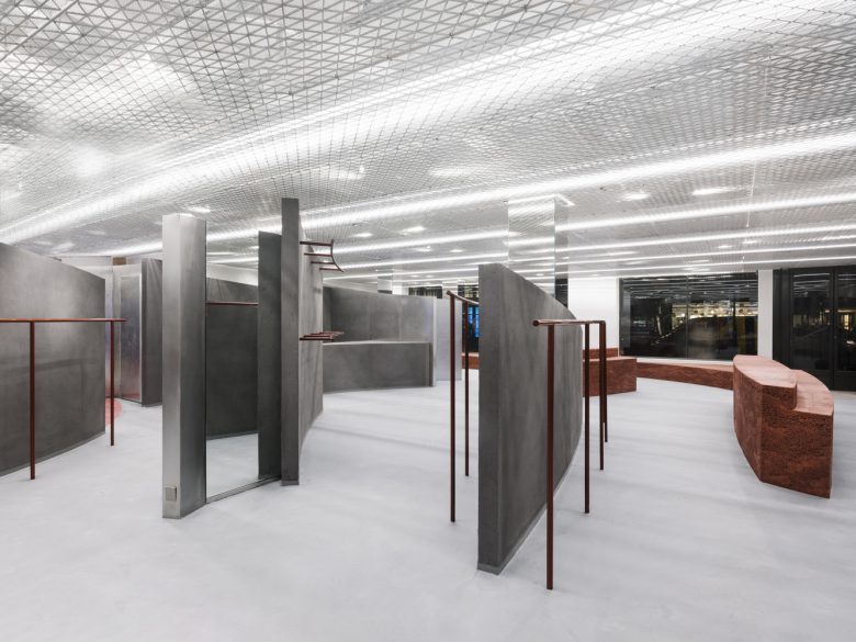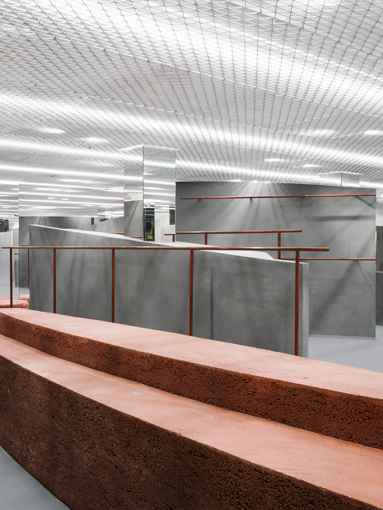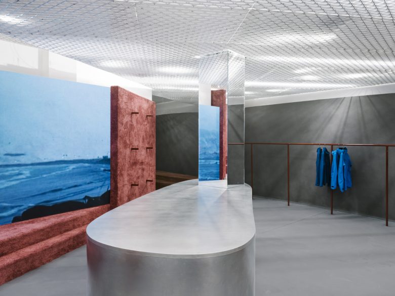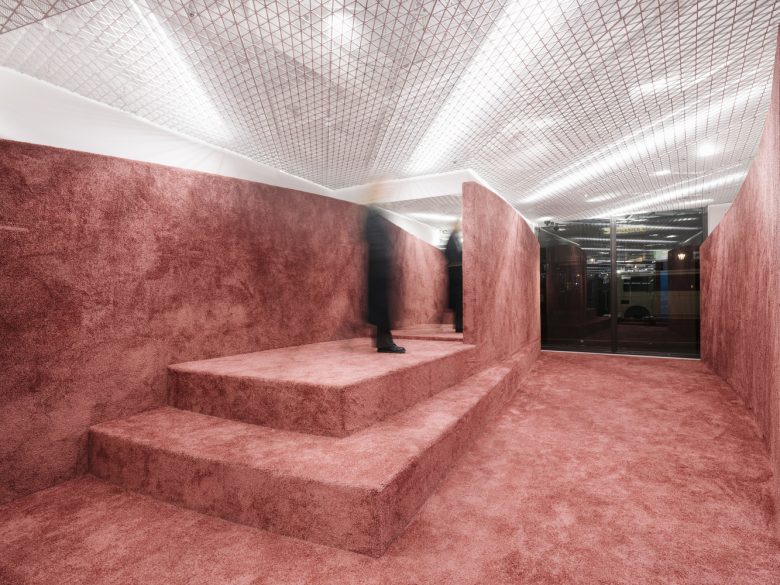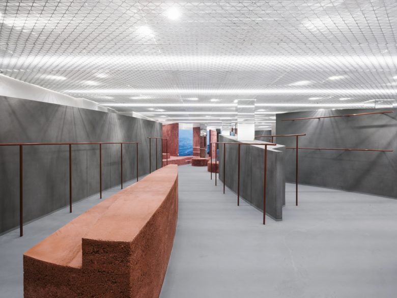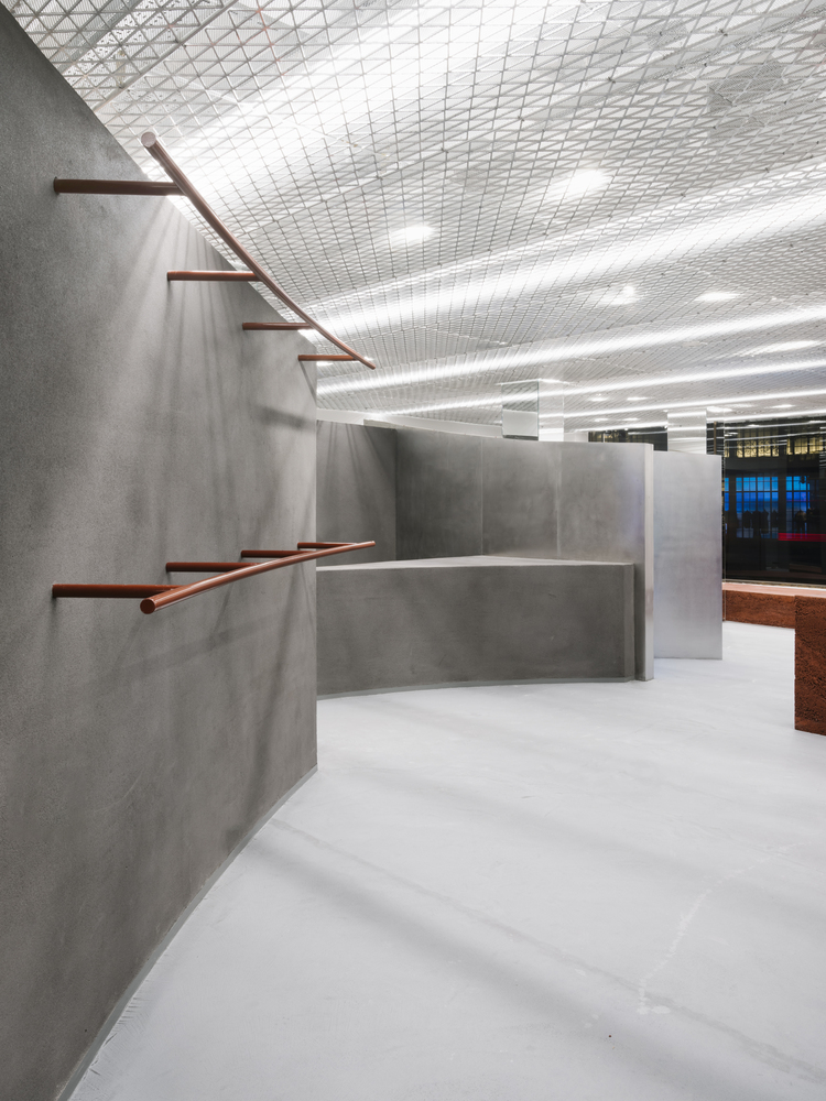
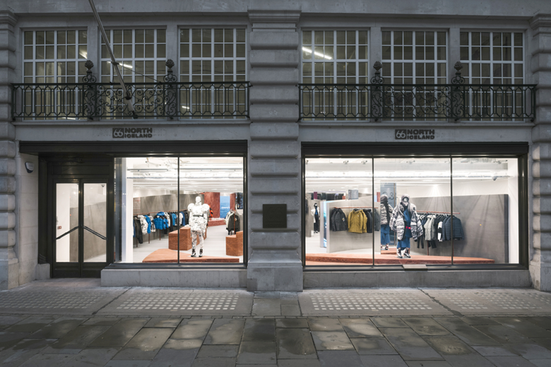
The holistic concept of the project revolves around the ethos and ideals of Iceland. We wanted to capture the essence of Iceland without being stereotypical. The weather in Iceland is a very real and prominent feature in the land and we classified this as static (the island) and forever changing (the weather). These dynamic changes are what we wanted to capture in the project. The static island of Iceland stands still in comparison to the constantly evolving and adapting weather but this influences the perception of the island.
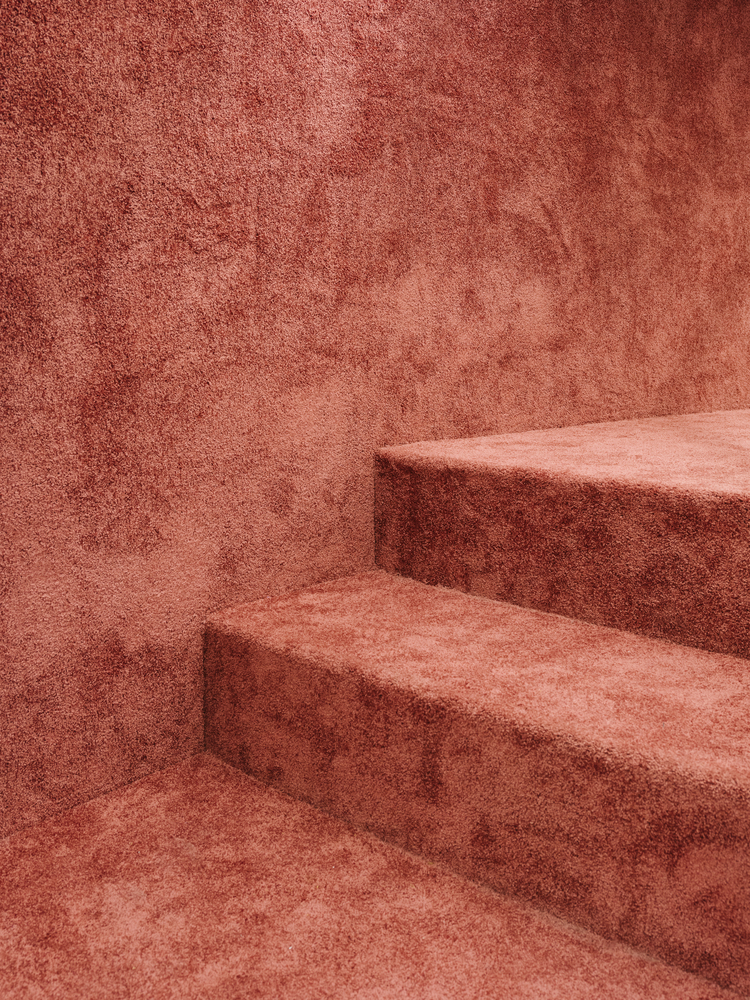
We are interested in this nuance. We look at the bi-chrome from black to white as movements of the weather. The immaterial, movement, changing, blurry and informal. As we started to analyze the colors of the weather and its effects on the island, we found there is always a darker and lighter grey, the bi-chrome. These non-static elements are always different. Therefore the grey is connected to the principal of the store and the newly added color as an evolution. Each color is an aspect of the islands. Each color can be a new store, with a new material.
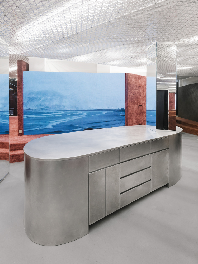
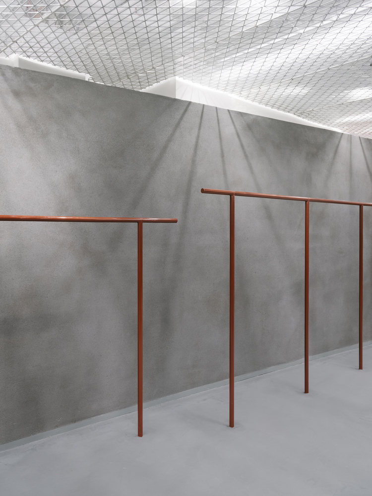
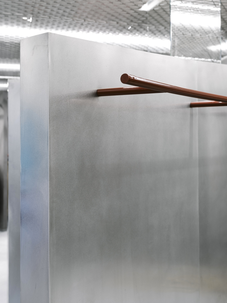
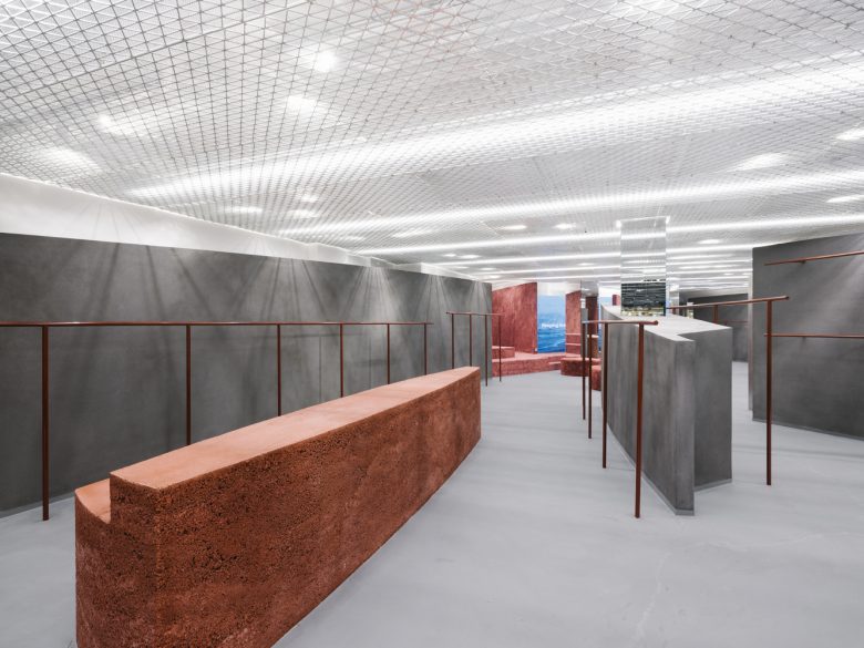
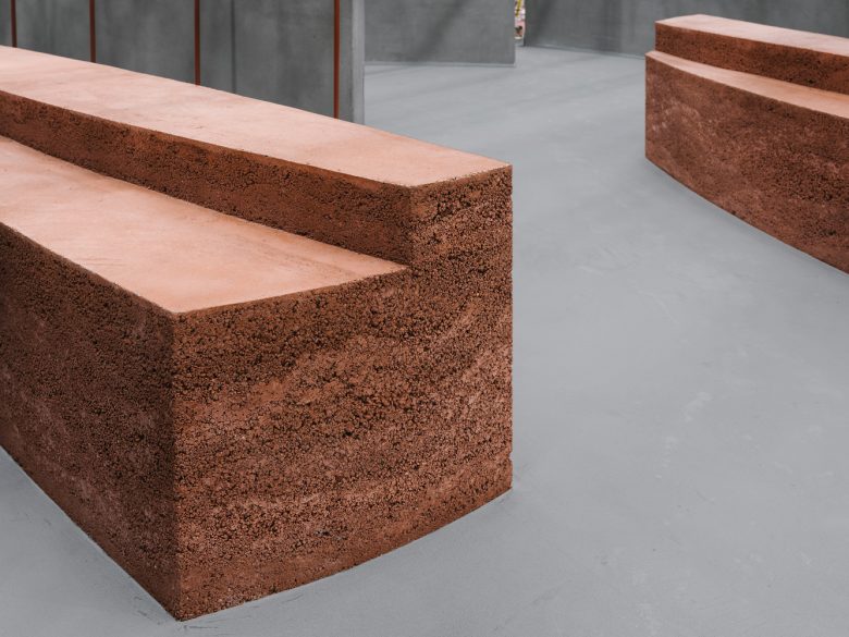
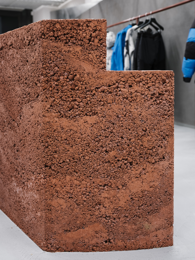
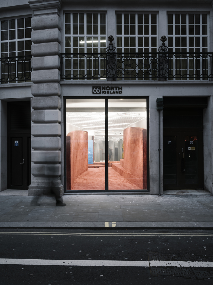
We used natural sustainable materials to create a specific look and feel. The grey curved walls are locally sourced natural pigmented clay from Cornwall, UK. The rammed earth islands are cast with different-sized aggregates and various types of lava rocks to compose the layered effect. Specially crafted and sculpted by an artist/sculptor from Berlin. The earth itself is pigmented aggregate and sand. The rammed earth islands themselves are earth and magma-looking objects that look like they have been carved from the earth.
The curved walls are monumental and straightforward. Walls can be higher and lower depending on their position as this frames the view. The clay’s rustic texture adds a layer of tactility to the space and brings out the feel of the clothing. These curved walls create different perspectives and atmospheres. They sit in front of the existing white walls to create a dramatic foreground of rolling soft curves. The wall at the entrance is almost 18 meters long and slightly curved. This long curve makes a new perspective and plays with the light in different shades. Already as you enter your perception is transported into this experiential tactile world.
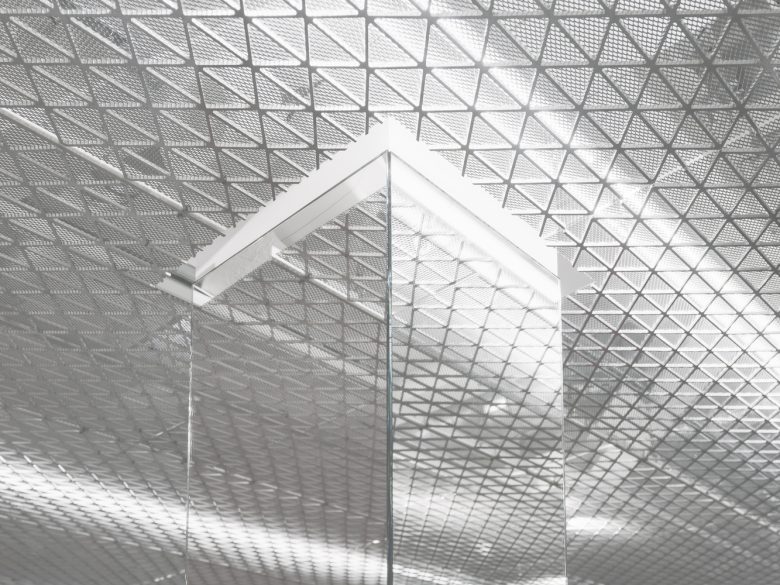
The idea of screens and mirrors is to insert them in between two walls. In between the walls they act as a connection, division, and separation. The custom-made bespoke ceiling mesh glows like the misty white sky that casts lights and mysticism on the rest of the space below. With the mesh at the ceiling, we achieve a bright, glowing light that supports the multiple varieties of the weather and scenes in Icelandic nature. The technical equipment is hidden on top of it. The flow of the space using these curved walls guides and moves the customers through the space in a playful discovery. Here the space unfolds to the customer as they move further within the space.
Architects: Gonzalez Haase Architects
Photographs: Ostkreuz Photography
