
Reception on Three Terraces Hostel by Continuation Studio
posted by retail design blog on 2023-03-01
Zhoushan
Add to collection
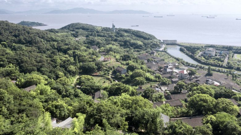
At the beginning of 2018, Continuation Studio was invited to design a 200-square-meter hotel reception center in a seaside village in Dinghai, Zhoushan. The owner required the center to accommodate basic arrival check-in, as well as breakfast and afternoon tea events for about 20 to 30 guests, and the condition to be used as a temporary showroom. The project site is a plateau at the highest point of the mountain village, leveled out from the high northeast and low southwest slopes. The plan is a sub-square shape that is slightly longer in the north-south direction, with an area of about 400 square meters. The foundation of the ruins is arranged in a straight line, occupying nearly half of the site on the north side, leaving the vacant land on the south. The west side is adjacent to the continuously descending village road in the long direction and forms a height difference of about 2-4 meters from north to south, and is connected to the road by a ramp projecting northward from the southwest corner. The site is separated by a footpath into the village. The tall tree canopy below the shoulder of the road and the two-story houses along the trail together nearly obscure the seascape on the west side, revealing only the canopy light of some trees further down the hillside between the tree trunks in the southwest corner. In other directions, the rolling hills and miscellaneous trees form a tall, tight natural barrier that encloses the site and gathers it overhead, framing a square of the sky. The whole site not only shows a “directionality” towards the road to the west (and the invisible sea in the distance) but also its elevation relative to the road and sinking relative to the mountain forest, presenting a special “stratigraphic sense” of a horizontal slice of the mountain. Variable function means a universal and conventional plan form. Confronting the flat base with only vague feeling and the almost featureless mountain environment, how to make the building fit the temperament of the site while satisfying the function, and at the same time obtain a rich spatial experience beyond the daily, and also maintain and enhance the architectural quality we insist on, becomes the question we need to answer.
Break up the whole into parts. According to the lessons learned from previous practice in the village, when a new building enters the village, it is necessary to avoid presenting a strong volume and scale compared to the village house, as a way of improving harmony with the indigenous people during the construction process and later operation. In addition, our site is located on the road into the village with a high position, so we need to respond to the issues of volume and scale. First, we use the height difference between the site and the road to sink the auxiliary functions such as bathrooms and kitchens that need to be separated in the form of rooms in the interior, so that the remaining functions of reception, catering, and exhibition are basically common, allowing for a freer spatial layout and shape organization in the upper part. In this way, the freedom of upper space operation is obtained, and the volume and area exposed to the “ground” are reduced.
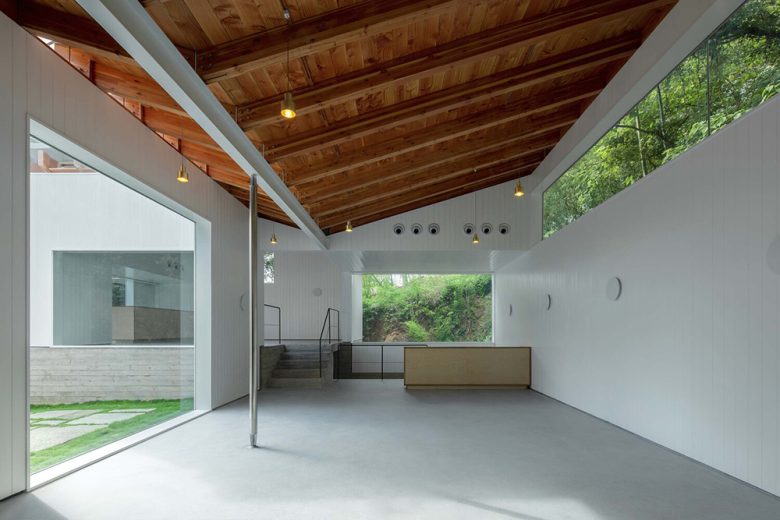
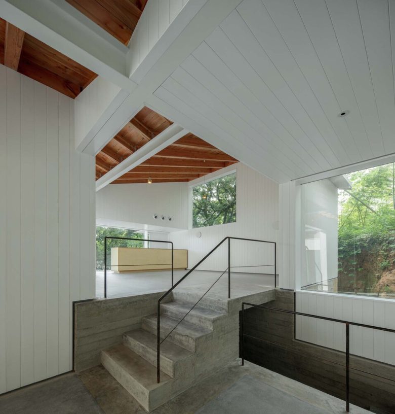
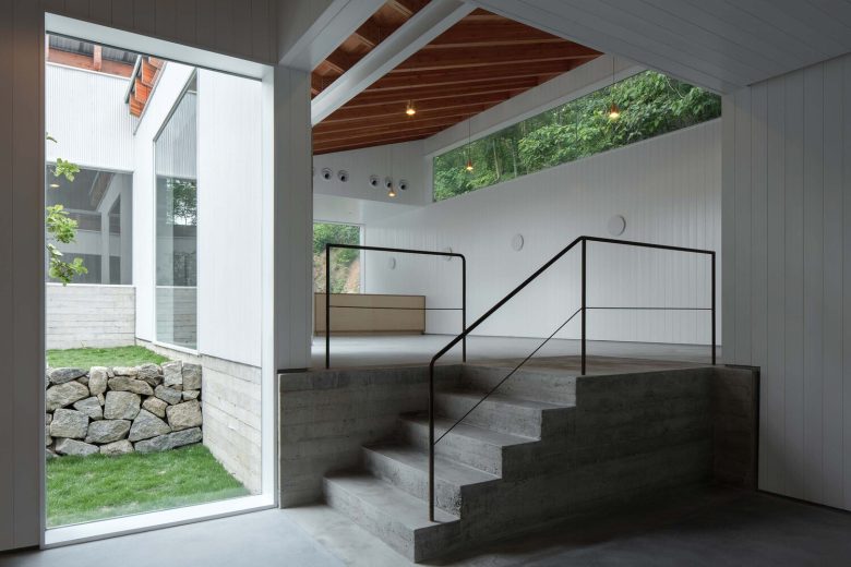
After that, we further break the up space into three small rectangular volumes of daily room scale, and then diagonally bite one by one into a string of whole. Each of the three volumes has a smaller plan outline than the conventional farmhouses in the village, and the facade is wrapped by vertical corrugated metal panels similar to the factory buildings in the nearby light industrial district. The narrow wavelengths allow them to escape from the usual memory of industrial buildings and produce a multi-layered sense of abstraction and subtlety. The three volumes protrude in the north-south direction and recede in the middle, enclosing the “empty courtyard” facing the sea to the west and clarifying the main orientation of the building volumes. The southern volume is further set back then the northern one, giving way to a row of miscellaneous trees and establishing an entrance space together with the original ramp. The overlapping makes the building’s boundary curvy and rich, and the originally straight external natural landscape of the mountains and forests can be viewed from the interior with various sight distances. Vertically, the three volumes are elevated level by level, each on a terrace of different elevations. The horizontal pattern of the concrete thin timber formwork on the sides of the interior terraces continues and reinforces the feeling of mountainous terrain. Below the highest terrace are the kitchen and bathroom concealed in the plinth. The terraces are connected to each other by steps at the occlusal part of the plan, while the exterior masonry terraces have steps directly from their edges to form a continuous “mountain path”. The three elevations of the terraces correspond to each other indoors and outdoors so that the “stratigraphic sense” of the site continues inside and outside. The three terraces are raised continuously from south to north, like “complementary hills”, reducing the huge difference in height between the original site and the steep hill on the north side, and as a base, creating conditions for the volume above to gain more light and a more open view.
Butterfly roof. The mere occlusion of three ordinary volumes in plan and section was not enough to support our expectations of the richness of the interior experience. We also wanted to find a holistic strategy that could integrate the external and internal spatial experience at the structural level. In the end, we found a special idea for the “butterfly roof” which is composed of reverse long and short double slope roofs. Undoubtedly, the butterfly roof can give the building a sense of strangeness and recognition from its outline, allowing the image of the building to spread easily, but what is more surprising is its visual expression in the interior and the integrated role it plays in the continuous feeling of the inner and outer space. The butterfly roof spreads along the long side of the volume, with the ridge beam diving down and running longitudinally over the rooms. The continuous diagonal glued laminated wooden rafters on both sides of the beams and the plank sheathing together form the most attractive visual object in the light white space. At the same time, the sense of inward convergence created by the traditional double-slope roof or single-slope roof enveloping the space below is reversed into a sense of outward expansion that naturally squeezes the front and back facades and the exterior. When the three volumes bite together in a long direction, the continuously turning roofs seem to rotate. The penetration of the inner courtyard landscape into the building and the centrifugal force of the interior into the outer mountains would appear at the same time. As a result, a strong sense of indoor-outdoor intermingling is established.
We further correlate the vertical beams that dip in the space with the plan contours of the adjacent volumes in alignment. Eventually, the lower interior longitudinal beam in each of the two adjacent volumes extends all the way to the facade wall of the higher volume; while the other vertical beam, combined with the previous longitudinal beam, encloses the facade to form the ceiling surface of the air conditioning equipment. At the same time, this beam also extends into the other facade wall of the higher volume. The interior and exterior are more tightly woven together through the formal integration of the linear longitudinal beam in the interior space with the faceted facade wall.
Fenestration. Because of the versatility of spatial functions, the fenestration can be at will, and it seems to be able to shape extremely complex and rich internal and external interfaces at will. What is difficult is the intention of each element behind the richness and the readability of the relationship between them. At the same time, we also believe that the more simple elements produce richness, the more enjoyable the experience can be. Therefore, we first set the approximate locations of the window and door openings on the facade based on the relationship between the interior space and the exterior topography and landscape. After that, planar modulus and inductive height difference were applied. The size, location, and proportion of the openings were precise one by one. First, vertically, the ground height difference between the three volumes was set at 0.9m, which is the height of both fixed furniture such as bar islands, and the regular height of window sills and railings. The height of both the downward probing vertical beam and the equipment ceiling in the space is set at 3m, so that at the intersection of adjacent high and low volumes, the height of the vertical beam above the ground gradually changes from 3m to 2.1m as the steps rise, thus triggering a distinct feeling of physical interaction. Therefore, based on the three dimensions of 0.9m, 2.1m, and 3m, we have formulated five rules for the vertical opening of the facade: the floor-to-ceiling door and window with a height of 2.1m or 3m, the window sill with a height of 0.9m, the window top with a height of 3m, the high window from the window sill with a height of 2.1m to the top, and the high window from the window sill with a height of 3m to the top. With the change of the height difference of the terrace, an unusually rich correspondence of elevation will be produced between various floors, railings, window sills, cavity tops, beam bottoms, and suspended ceilings. Secondly, from the plan, we set a modal grid of 1.5m to control the boundary between all the external openings and the internal floor, which makes the experience often aware of the alignment relationship between a series of boundaries far apart during the internal movement.
The control of vertical elevation and the modulo alignment of the plan allows the seemingly irregularly scattered openings and other architectural elements in the three-dimensional space to be united in a hidden web of order so that the experience is constantly aware of some distant but subtle echoes inside. This allows them to gradually discover new visual layers implied in the simple volume and increases the experiencer’s pleasure in reading the space. At the same time, for these openings, we have stripped the conventional ventilation function (ventilation by electric opening fans between the upper rafters) and then weakened their expression by refining the fixed glass structure, so that the materiality of the glass as an air interface almost disappears. Thus, the interior and exterior seem to be completely connected. Although the walls are still thick, the remaining walls appear almost as abstract white “panels” due to the common limitation of the edges of the windows and the volume of the ceiling. The de-constructed “lap” relationship between walls, walls and roofs, and floors further weaken the existence of the opening itself (the opening becomes a residual after the lap of the wall panels). The contrast between the inside and outside is so great that the whole house appears unusually light and transparent on the inside, and the true depth of space becomes blurred.
Structure, explicit/invisible. The main body of the building is in the form of a steel frame structure, and the simple volume of a single span and story allows almost all the beams and columns to be covered by multiple layers of material inside and outside the façade, allowing them to be hidden within the walls. However, in the upper part of each space, there are two steel beams that span the room horizontally from the long direction and the short direction respectively, the short direction being the main beam and the long direction being the secondary beam. They are of similar width with a significant difference in height. In the design, we chose to connect the bottom of the long and short beams flush, so that the bottom of the ceiling is also at the same height level as them. Then we strip the seams and paint them uniformly white. the secondary beam as a whole is exposed in the space, while the sides of the main beam are covered with white wall panels and integrated with the side walls of the down-hanging piece of wall and equipment space. This allows the structural role of the primary and secondary beams to be reversed in visual effect: the primary beams disappear into the wall panels and ceiling, revealing only the width of the bottom surface, while the longitudinal secondary beams become the dominant structure in the space, which further elongates and enlarges the sense of the scale of the room. This type of operation is not simply a force or structural consideration, but a further abstraction and refinement of the material and formal aspects of the structure, and a reweaving into a new system of meaning that unifies and influences the overall effect of the space.
Below the longitudinal beam of the intermediate volume of air, we set an ultra-thin solid stainless steel column, which not only acts as a swing column to help hold up the longest beam in the whole interior space but also even serves to pull the roof down during typhoons. In addition to its concrete structural role, it also connects the flying beam overhead to the flesh of the experiencer, transforming the abstract visual experience into the tactile sensation of holding the column in the hand. More essential is the relationship to the only square fixed window on the facade – when an experiencer faces the window, standing against the pillar, he faces the direction of the sea beyond the tree canopy.
Architects: Continuation Studio
Lead Architect: Jiujiang Fan
Design Team: Jiujiang Fan, Wenting Zhai, Xiaowei Yang, Hongyi Yu, He Huang, Yingying Zhang, Shengtao Wang
Photographs: Zhi Xia, Haiting Sun


Add to collection