This freedom is worth its salt: Ohmybrand agency updated Atlantika, a brand of sea salt
About:
Salina Trade company has been producing sea salt Atlantica for several years. In 2021 the company surveyed the market and chose to broaden its portfolio, integrate new products, freshen up obsolete designs and change the packaging itself, as the closing flap turned out to not be functional enough and often make customers upset. Salina Trade addressed Ohmybrand with the task of reimagining the brand’s design.
Tasks:
Work on the new Atlantica salt packaging required:
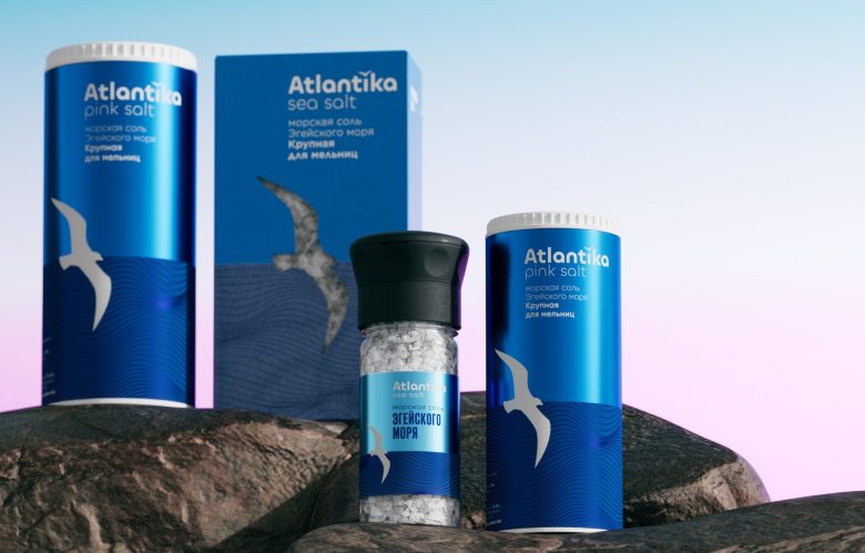
Complete reinvention of the brand and a smooth inclusion of the new salts and spices line of products.
Reinforced perception of the brand in the mid-price segment opposed to the solely mass-market perception previously.
A way to be distinguished from the already existing contestants that have been prevalent on the store shelves.
Increase in prominence and audience following the brand reinvention, engaging younger audience and those, who use salt for culinary experiments.
Idea and realization:
Atlantica salt is gathered in pollution-free zones of the Aegean Sea. It is gently processed and purified from the admixtures, so that it preserves all its minerals.
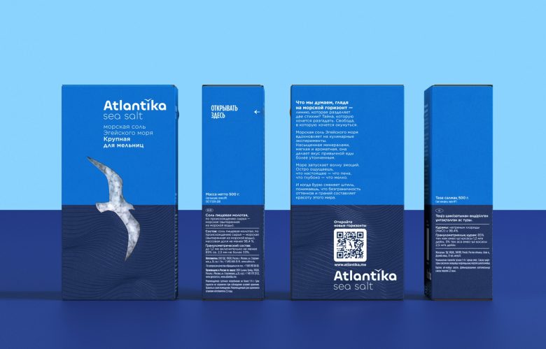
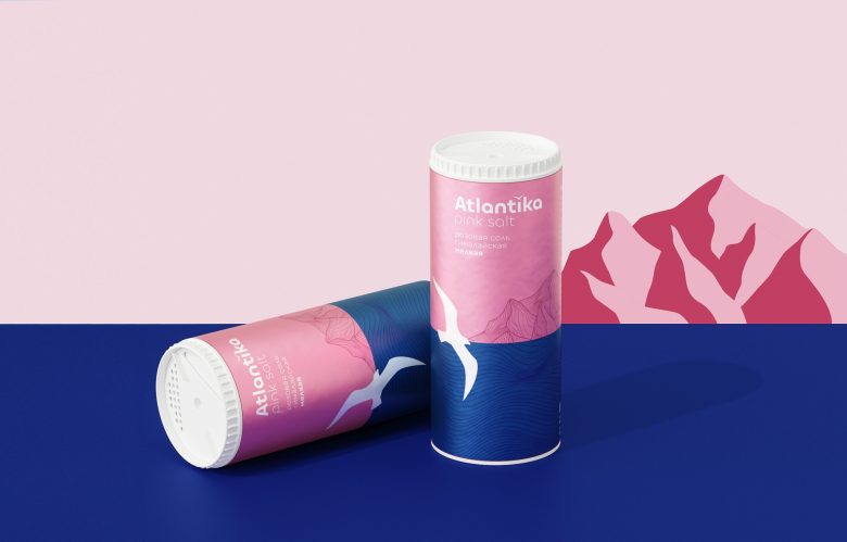
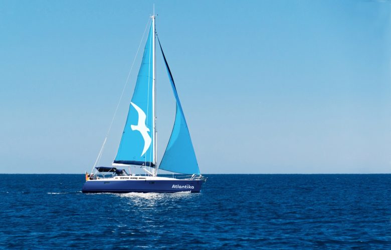
The main graphic elements of the new brand are seagull, sea and horizon. All of them evoke emotions and serve as a metaphor for the endless creative possibilities, boundless energy and obstacle crossing.
The sea is always the same and infinitely diverse. This is why the Atlantika sea salt gives inspiration for new culinary experiments, gives freedom to try new things and change the old ones.
What did the Ohmybrand agency do:
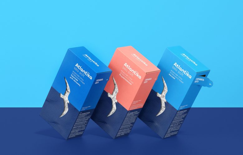
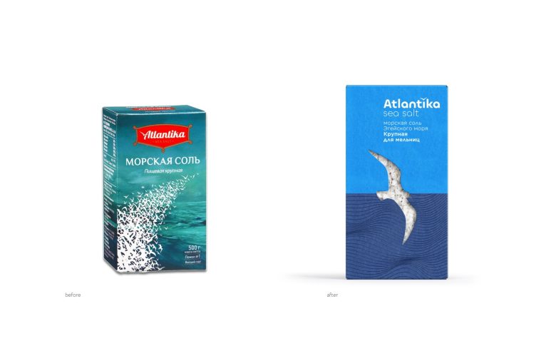
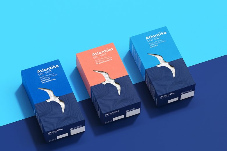
We reworked the structural design: changed the flap, making it more accessible in practice, changed the package’s proportions and made its design more elegant overall while maintaining the same weight.
We outlined the brand’s legend based on the origin of the salt.
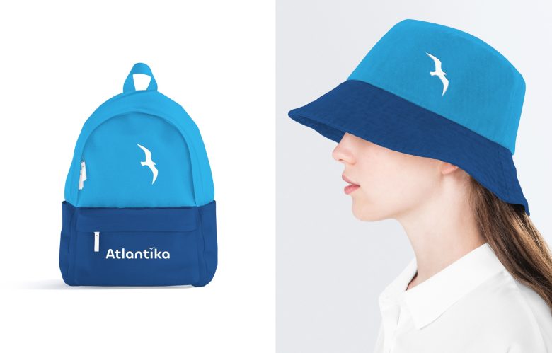
We reimagined the visual language and updated the brand, providing it with a fresh interpretation while keeping it recognizable through the brand’s symbol — a seagull.
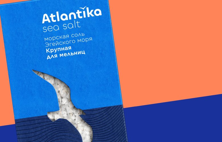
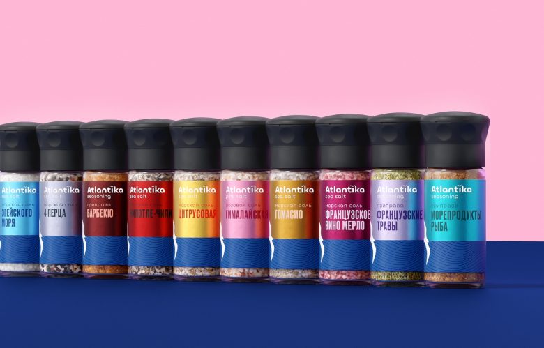
We implemented a new differentiation of various types of salt by color, which will prevent confusion among the shopping customers. We made the product more visible on the shelf. One of the lines of packaging has a window for customers to see the product prior to buying.
Result:
In January 2023 redesign of the Atlantica salt packaging received one of the prizes on the international competition WBDS — special jury notice.
