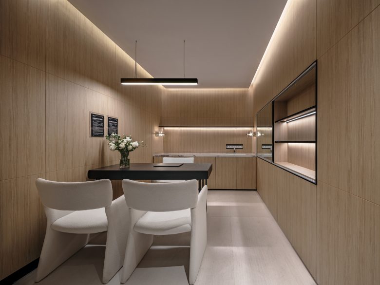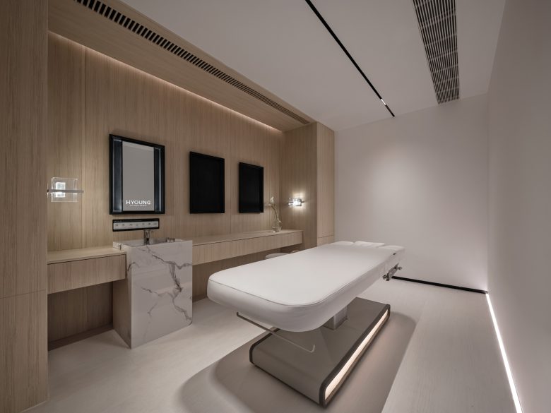
HYOUNG is a high-end medical beauty chain institution located in Ningbo. It has a team of senior professionals in the industry, focusing on a high-quality and high-service medical beauty brand. This time, HYOUNG has teamed up with Jacky.W Design to explore the possibility of technology-based beauty with a focus on people, while emphasizing taste and texture. Together, they have created a refined aesthetic space that combines technology and beauty, with elegance and warmth.
Project name: HYOUNG
Project location: Ningbo, Zhejiang Province, China
Project area: 580㎡
Completion time: January 2023
Chief designer: Jacky Wang / JACKY.W Design
Collaborative designer: Piaolei Huang, Yuxiu Wu, Qianqian Xu /JACKY.W Design
Lighting design: LH Lighting Design
Construction company: INNERFIX
Photography: WYAP
01 Flowing rhythm
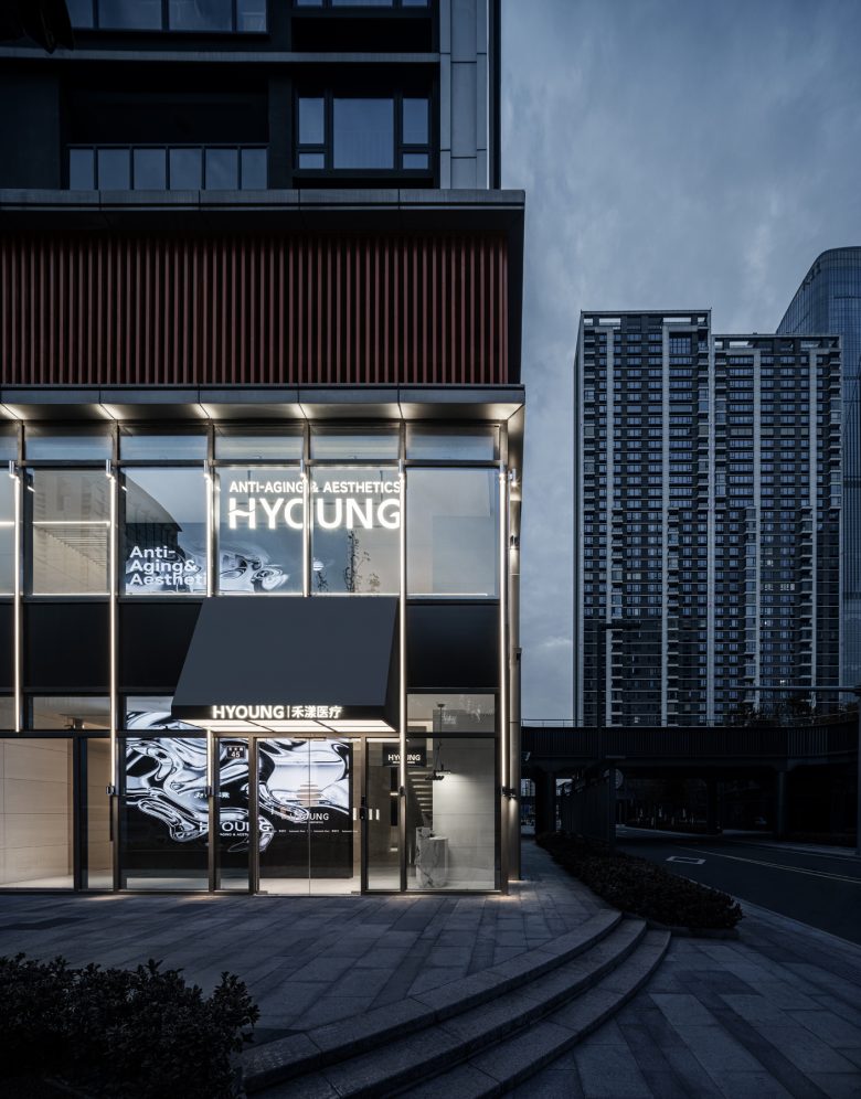
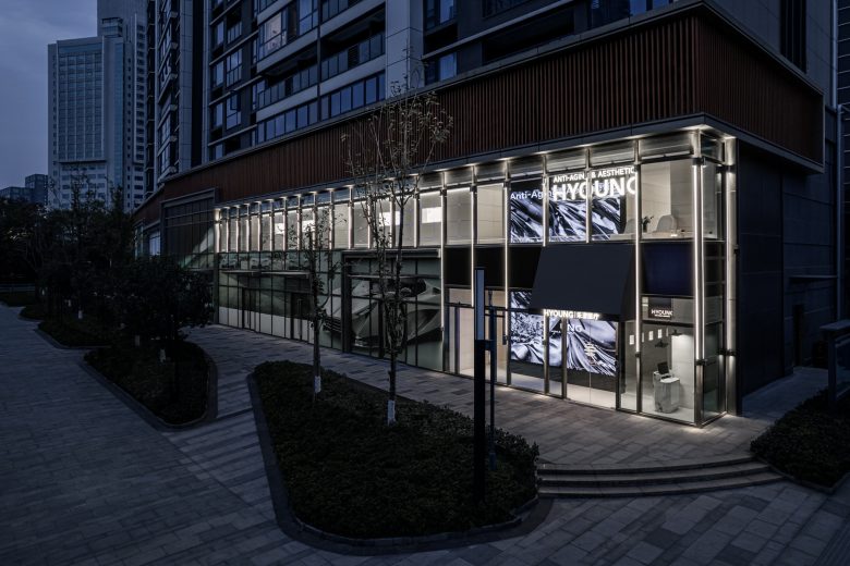
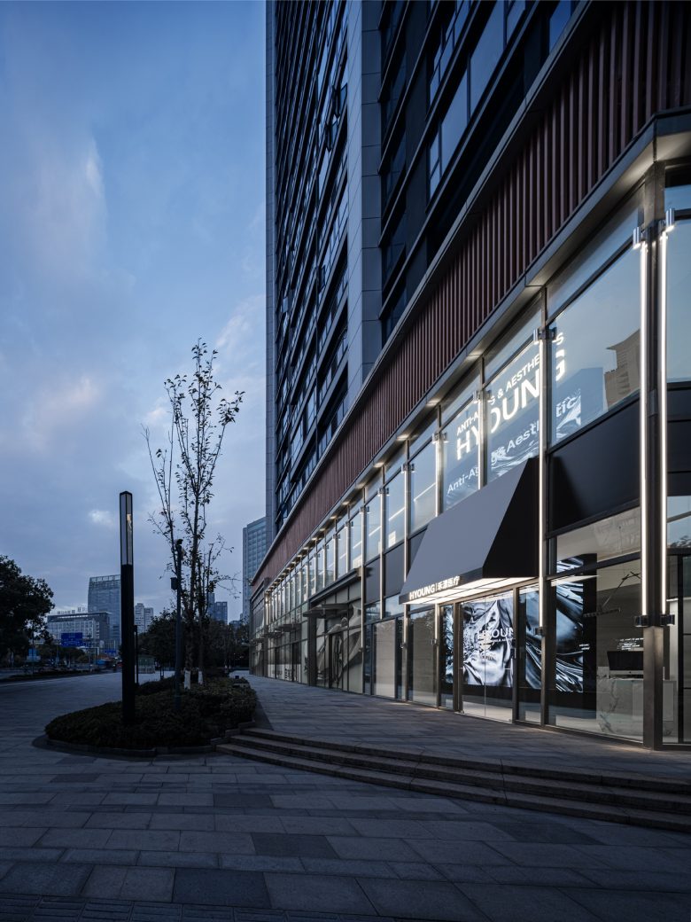
In the bustling city, a transparent and huge floor-to-ceiling window allows the gentle sunlight to pour in, eliminating the sense of confinement and medical tension in the indoor space, injecting a soft breath into the space, making both body and mind relaxed, and naturally welcoming every visitor.
By designing the boundaries, extensions, suspensions, blank spaces, transparency, and interlocking elements to be presented in space one by one, a sense of future and technology is created while also maintaining warmth and comfort. The texture flows with each breath, rising and falling with the emotions of the visitors.
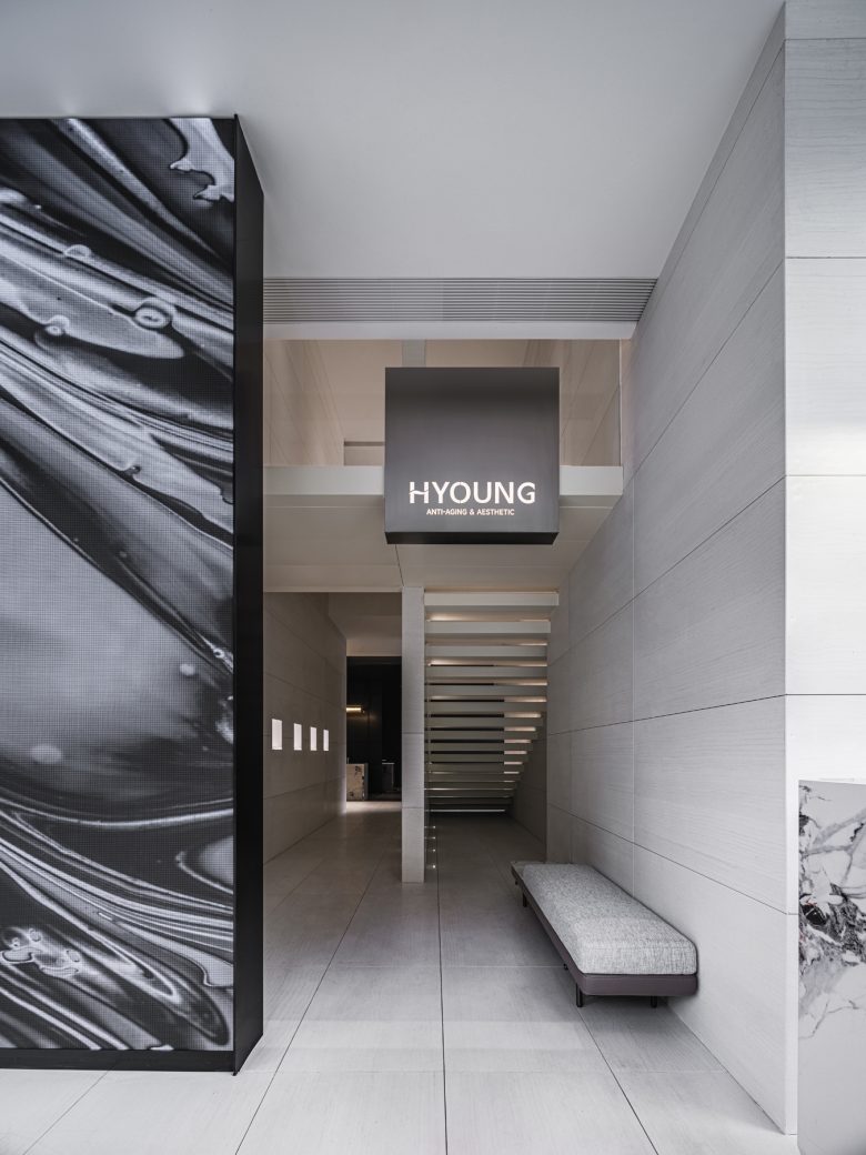
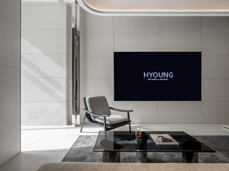
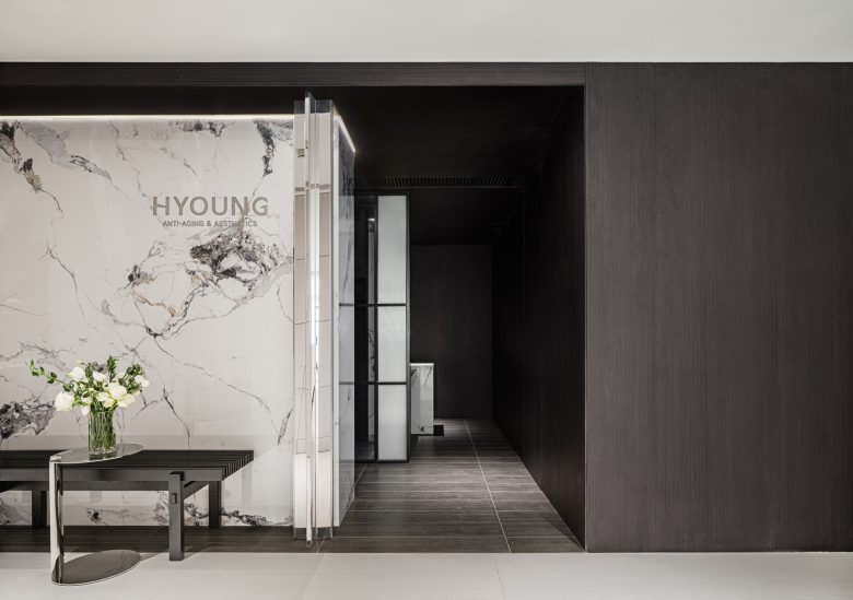
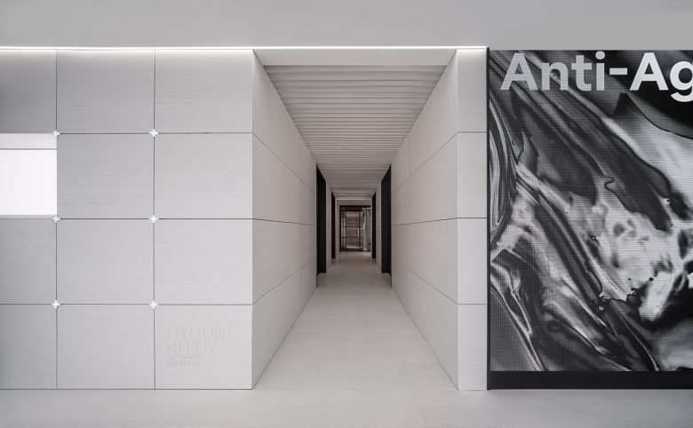
Upon entering the space, a large dynamic LCD screen vertically penetrates, instantly launching an immersive visual symphony and giving visitors boundless imagination. It’s like the light flowing slowly in front of their eyes, symbolizing the fight against the rapid passage of time with technology. The dynamic screen penetrates up and down and takes on the role of buffering and natural diversion, giving rise to two channels leading to the salon area and the more private VIP area on the second floor, forming a simple and clear spatial division.
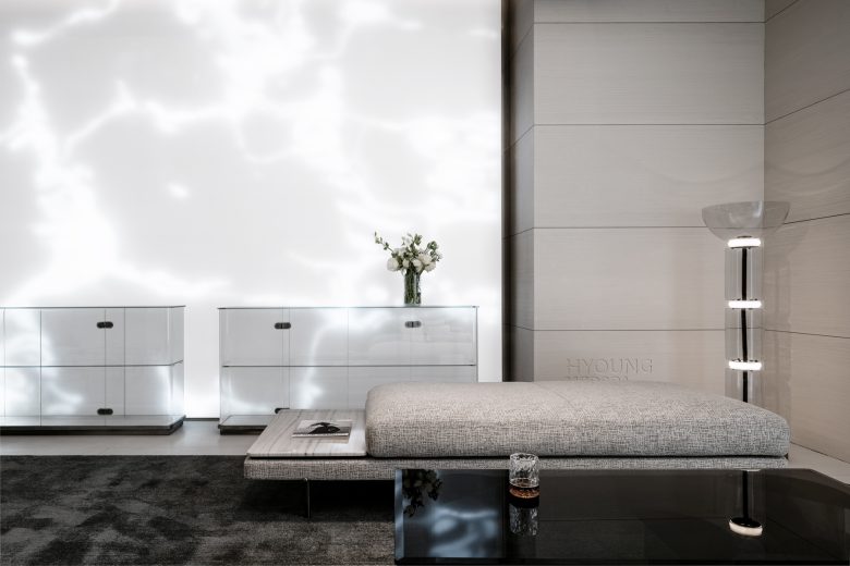
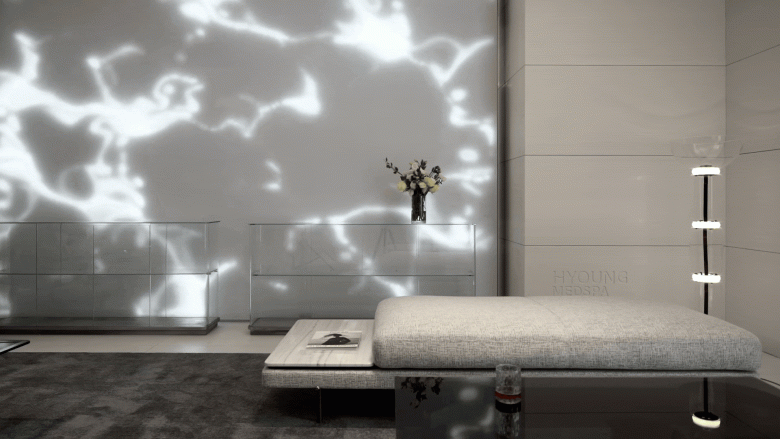
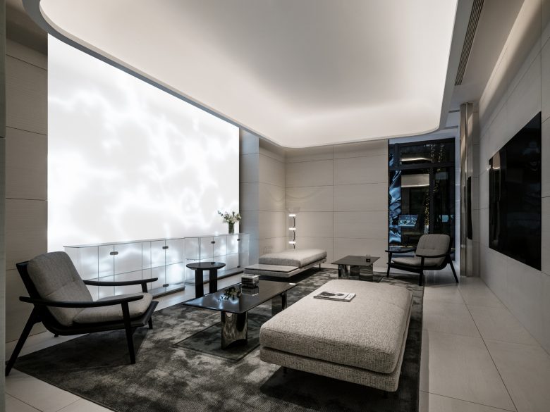
Surrounded by light-colored stone, the salon area creates a tranquil enclosed space. The combination of exquisite and elegant furniture creates a comfortable and secure rest area, providing relative privacy amidst the flowing light on the first floor. The large areas of white space are light and elegant, echoing the futuristic technology sense created by materials such as glass and stainless steel mirrors, symbolizing new life and agility.
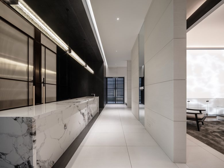
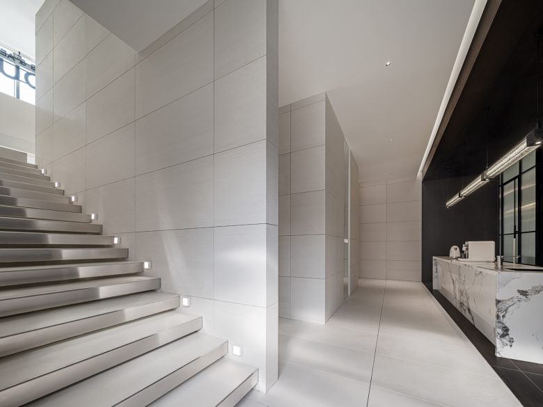
The bar area acts as a transition, making the space more fluid and diverse in levels. From material to color, there is a sufficient sense of neatness and likeability here. The exquisite refreshments provide a comfortable and cozy service experience, complementing the enclosed salon area, creating an elegant and tranquil atmosphere, easing any impatience that may arise while waiting.
The staircase leading to the second floor is illuminated by sunlight, displaying a soft and transparent feeling of honesty. Following the guidance of the light, it dynamically and progressively extends upwards, opening up this sensory journey and unlocking deeper explorations.
02 The integration of hardness and softness.
As a medium for physical matter, space accurately conveys brand will, showcases the internal power of women through design expression, and reflects upon the relationship between rigidity and softness as well as the original field. Space is versatile and infinite, drawing inspiration from user needs and utilizing changes in relationships to create contrasting levels.
The overall space is primarily black and white, minimizing unnecessary color segmentation within the space, creating a sophisticated and elegant atmosphere. Simplicity and purity are the best expressions of luxury.
Soft furniture that is elegant and low-key injects a gentle power into the space, achieving a balance of overall harmony and a touch of spontaneity. The combination of strength and softness highlights the unique beauty of women’s toughness. With the help of technological lighting installations, it creates a unique sense of order.
03 Restrained aesthetics
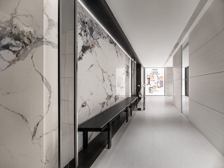
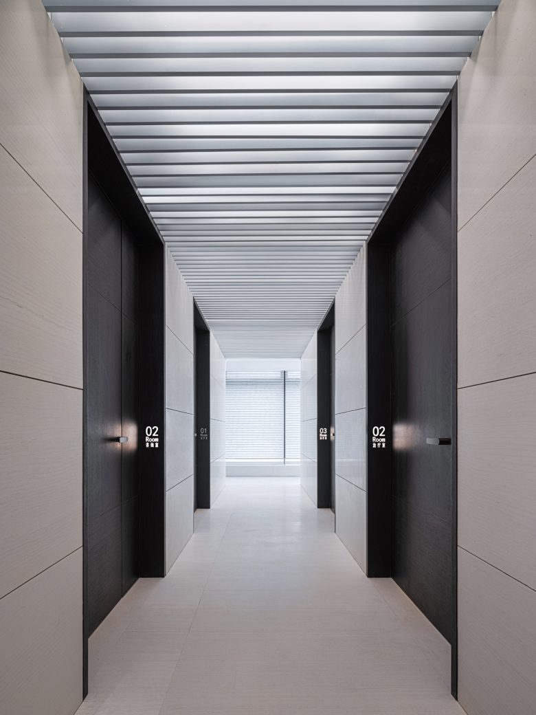
The second-floor corridor serves as a transitional area between the public area and the VIP exclusive skin management space. With the help of technological lighting and linear natural light and shadow, the sense of space is stretched out, revealing a streamlined and clean atmosphere. It assists space users in a subtle and calm emotional transition.
Every touch of black adds a sense of sophistication and restraint to the space, and every room number seems to become a code for an independent exploration of technology.
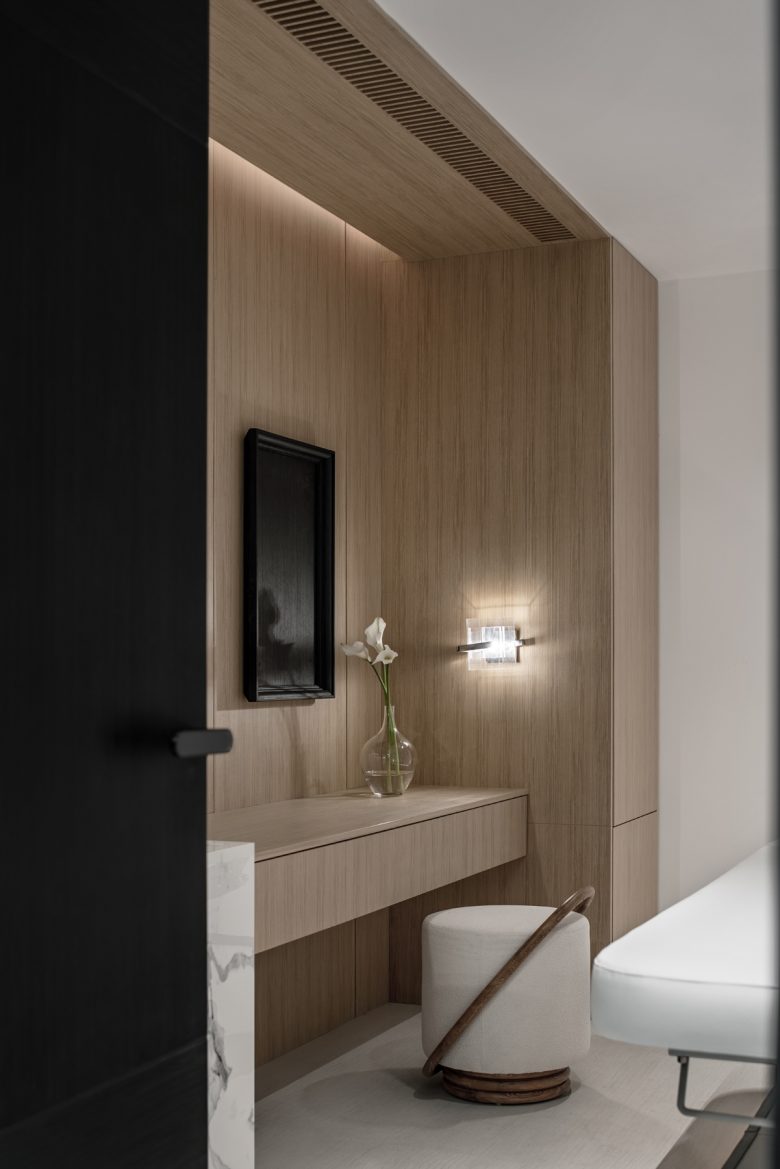
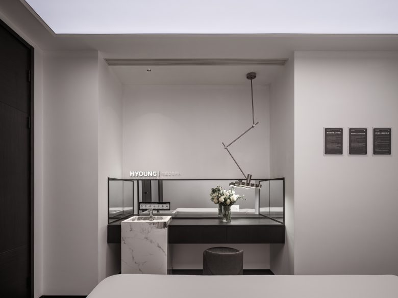
Continuing the elegant temperament of the overall space, the black, white and gray tones and the shining of the technological lighting highlight the beauty. The thoughtful details are comparable to the texture and experience of a five-star hotel.
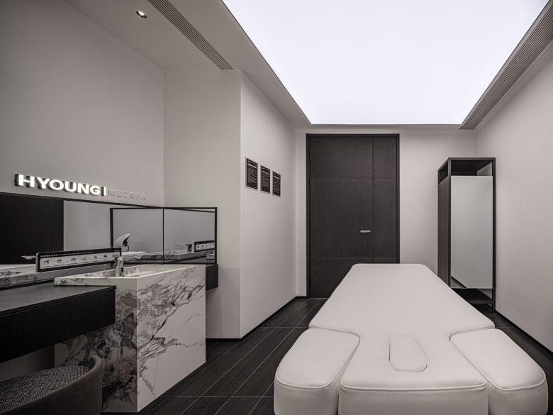
Creating details with thoughtful emotions, thus envisioning the possibilities of space. In the design of private spaces, attention is paid to the user’s feelings, extending the sense of technology and focus along the edge of light, and obtaining a more professional mind and body healing.
Through a professional and exquisite aesthetic experience, a dialogue with oneself slowly unfolds in the space, allowing people to feel relaxed and a sense of ritual.
