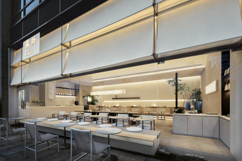
TEA WELL is dedicated to creating innovative space experiences based on pure tea and a unique Oriental aesthetic lifestyle. Whether it’s the physical spaces or the products, they convey the founder’s passion for and exploration of contemporary Oriental aesthetics. The essence of the brand lies in the acceptance of time. RUHAUS STUDIO has taken on the design of TEA WELL’s fifth store, and synchronously reimagined and upgraded the space style to complement the updated product line. Creating spaces in the urban environment that integrate Oriental aesthetics and natural experiences requires us to trace back to the origins of traditional Chinese painting. We strive to rediscover the Eastern way of observing nature that resonates with the Eastern mindset. By bringing this approach into the lives of today’s young people, we aim to establish a harmonious connection between space and emotions and reconstruct a better Oriental world that invites exploration.
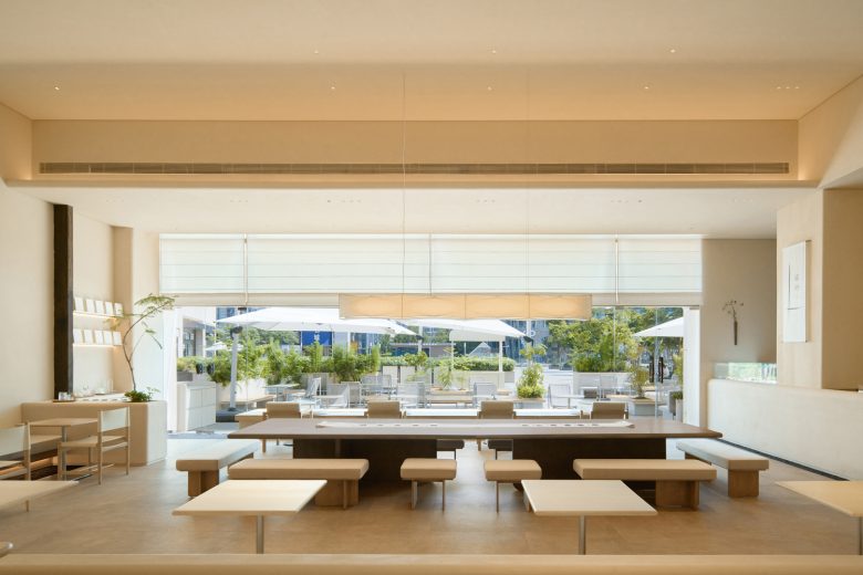
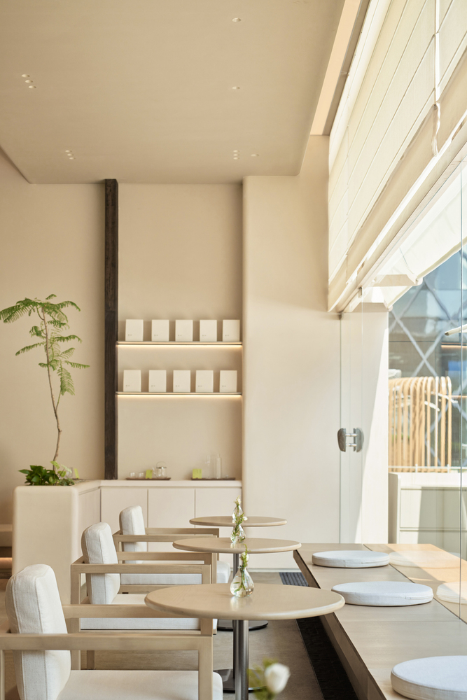
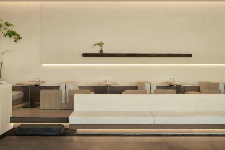
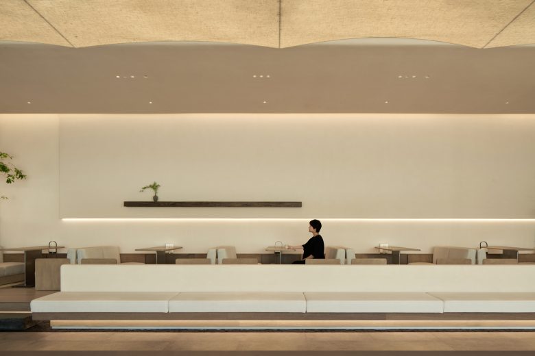
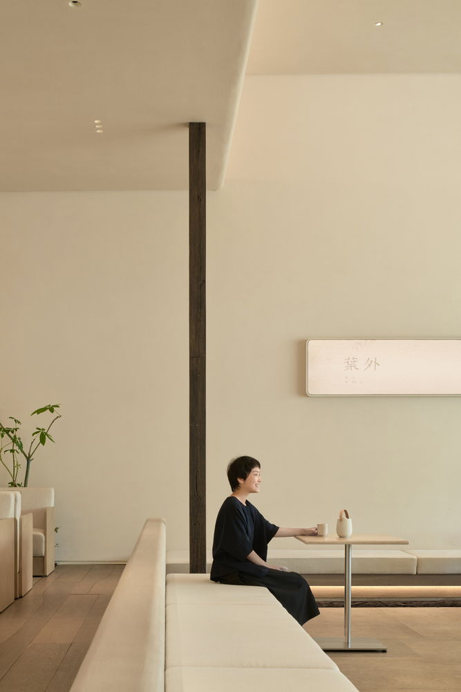
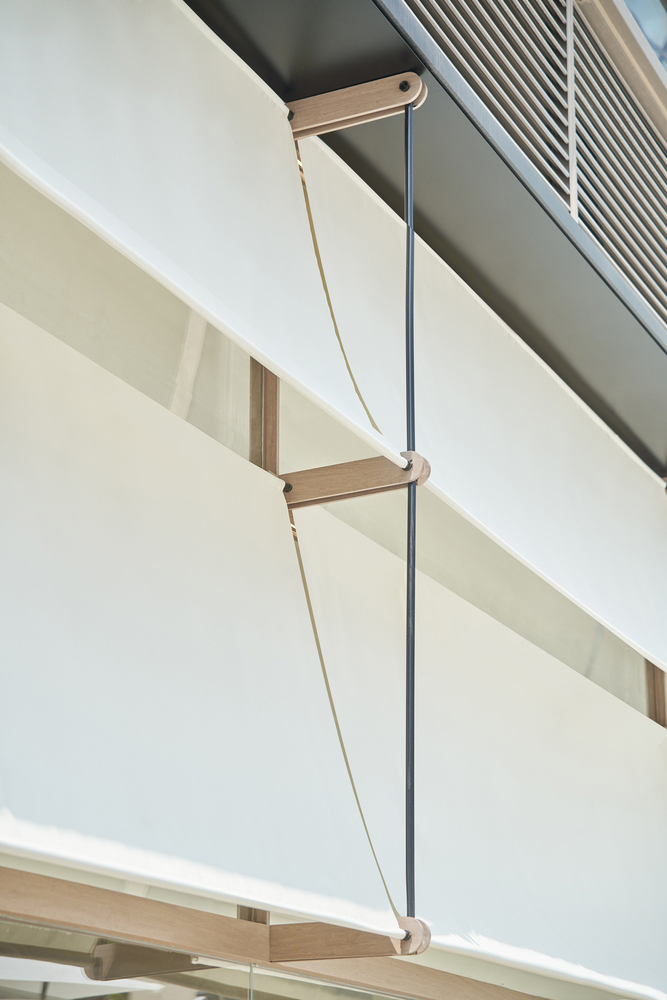
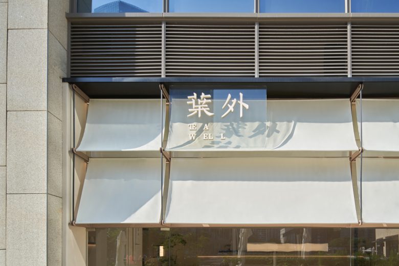
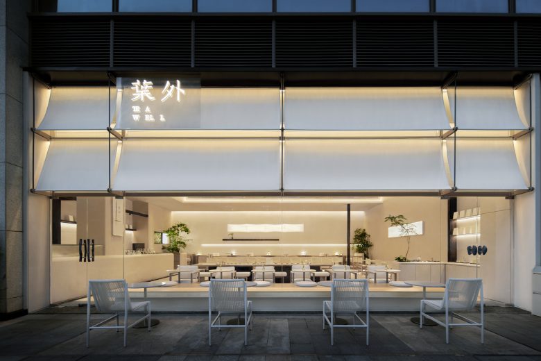
Eave & Terrace – TEA WELL COASTAL CITY store is located in a prominent position within COASTAL CITY. After observing the bustling and lively surroundings on-site, we chose a restrained approach to respond and express ourselves. Our intention was not to create a completely “new” spatial form but rather to evoke the beautiful scenes that exist within our hearts. Through the construction of the space, we aim to make it enduring and constantly rejuvenating. The design of the double eave serves two purposes. On one hand, it filters and controls the abundant summer sunlight in Shenzhen. On the other hand, it creates a framed view, evoking a sense of transcendence. The suspended design conceals the structural forces, ensuring unobstructed views both inside and outside. At the same time, it shields the external high-rise buildings, leaving only a horizontal axis as the prominent visual focus. At the far end of the interior space, a raised and more exclusive seating area is set up, allowing guests positioned deeper inside to enjoy the selectively framed outdoor scenery. The placement of natural stone steps in the foreground serves as a hint of stepping into a more intimate world.
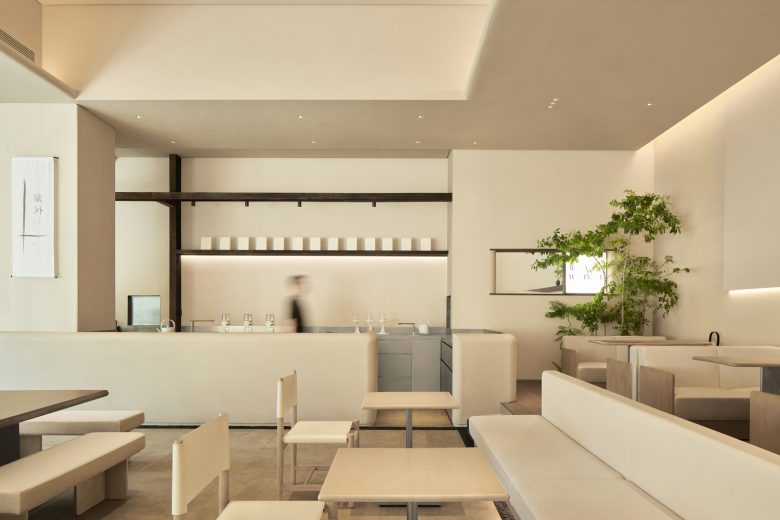
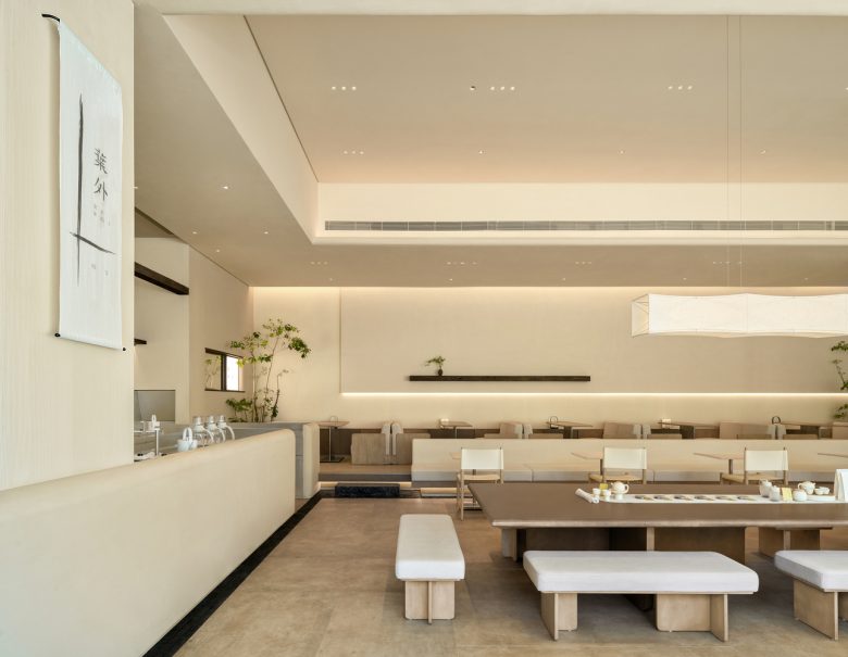
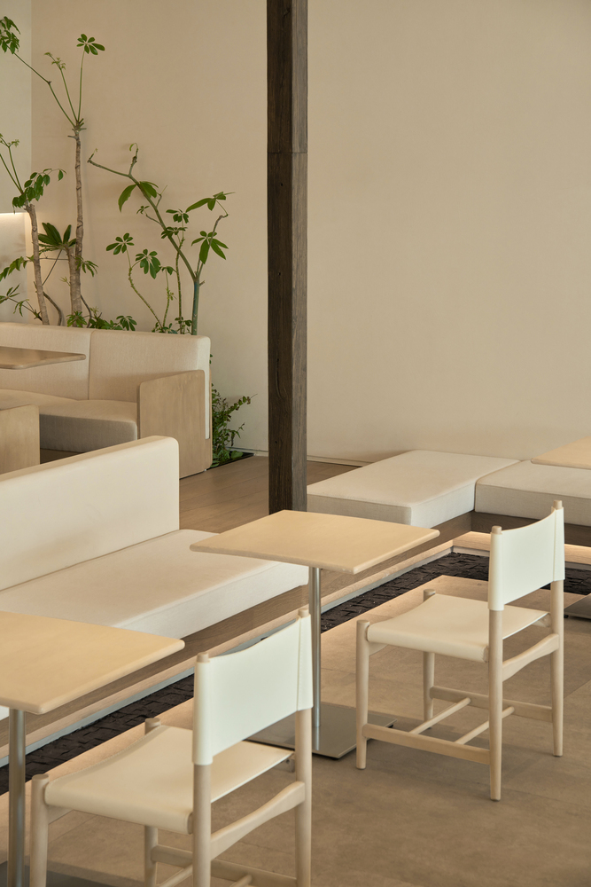
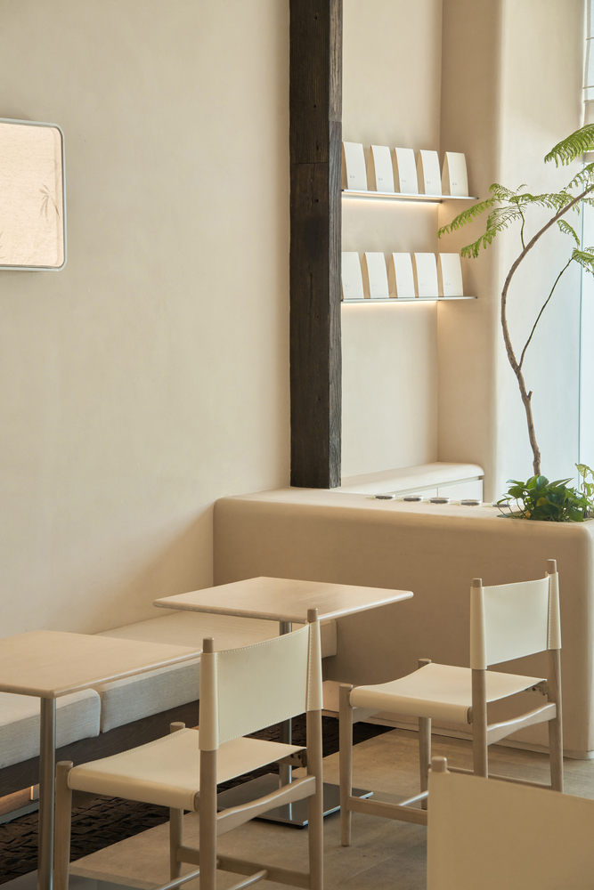
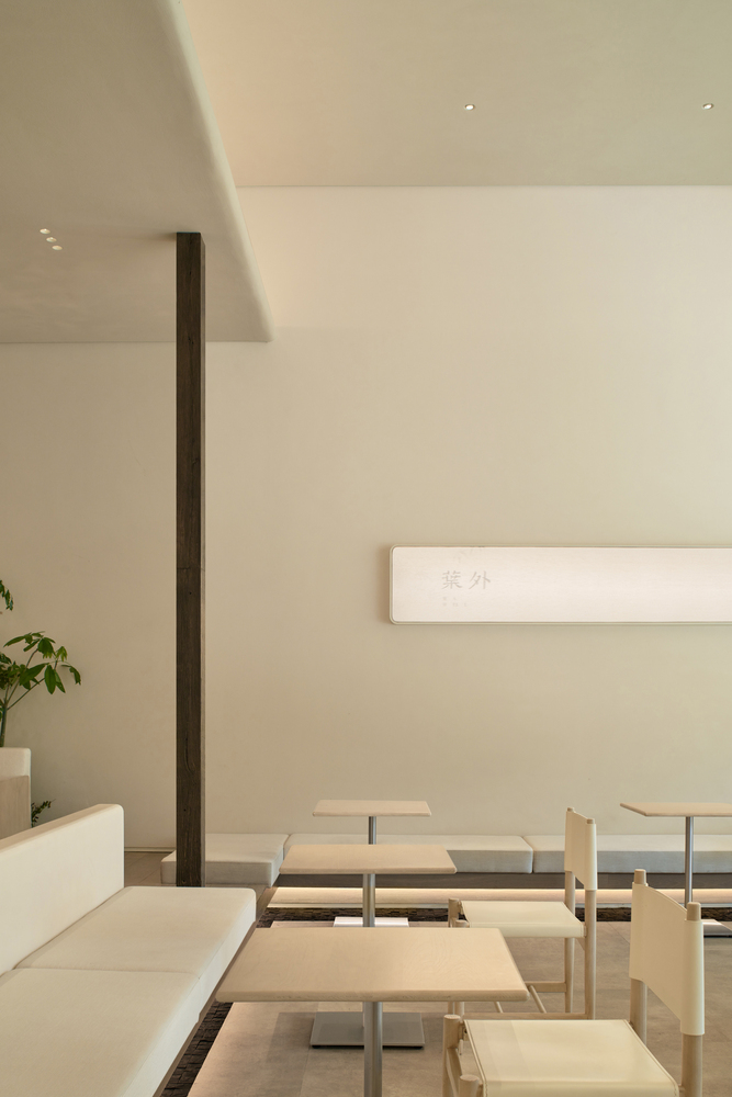
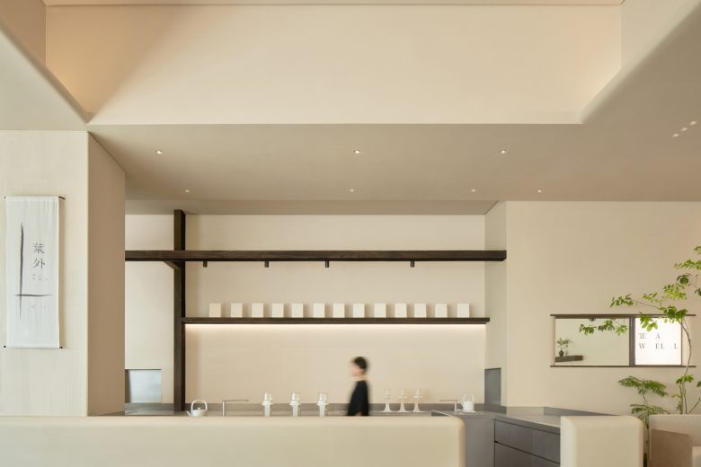
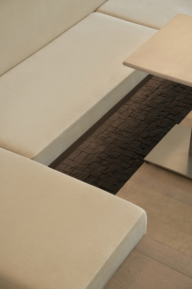
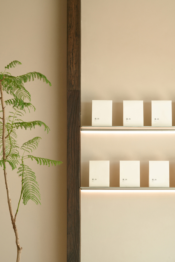
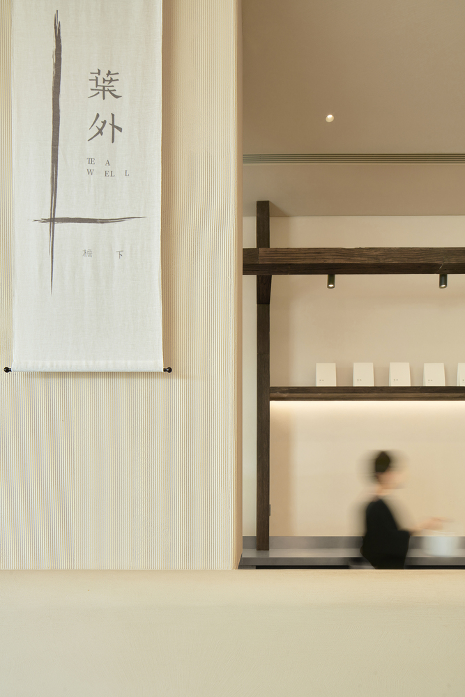
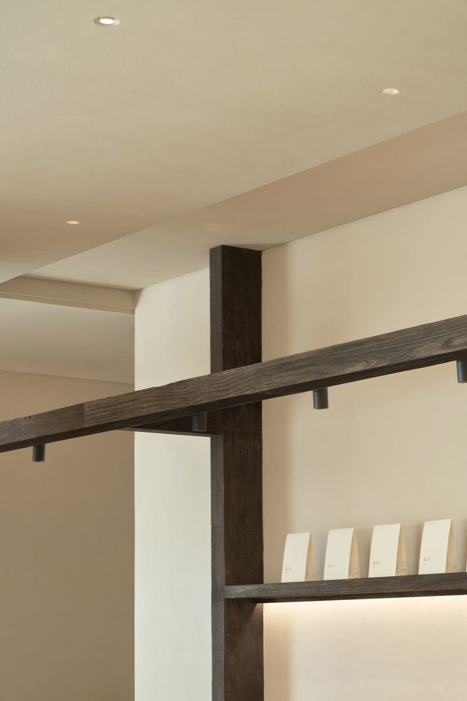
Visual Focal – The essence of painting lies in each brushstroke being honest to itself, neither adding nor subtracting. We strive to approach this state in our spatial design. The bar counter is an essential visual focal point in the space and also the busiest area of daily operations. The folded design minimizes the exposure of bar equipment, ensuring a clean and tidy appearance. By precisely designing hidden equipment and structures, unnecessary visual distractions are reduced, allowing the space to breathe. The brand’s output is represented by a few striking strokes, prominently displayed on the wall, leaving a lasting impression. We Intentionally establish bold color accents in the space and create focal points for wandering gazes. The presence of weathered wood and black cobblestones paradoxically enhances the space’s sense of relaxation and breathability, allowing people to forget the noise just beyond the wall and immerse themselves in the tranquility of the present moment.
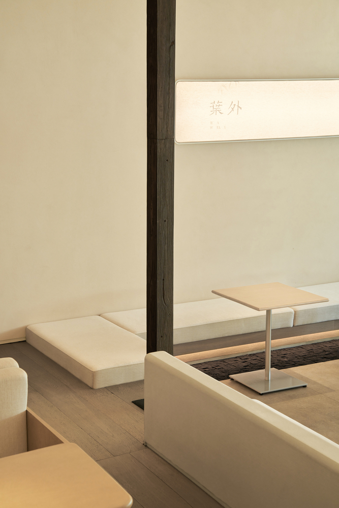
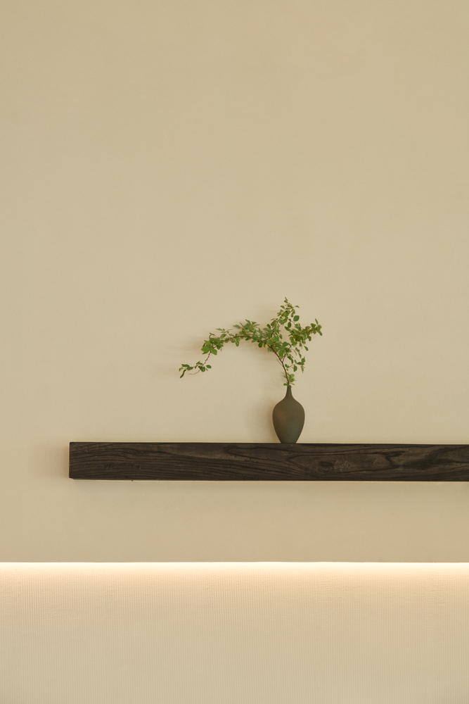
Texture – Using various textures to depict the same temperament, allowing the space to maintain purity while preserving intriguing details. Main color paint as a base texture, the wall is treated with partial grooves, complemented by the cotton and linen textured cushions and the natural edge wooden floorboards underfoot, creating a unified and rich ambiance reminiscent of the layers in Chinese ink paintings.
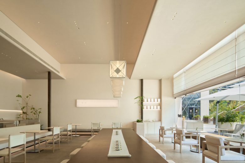
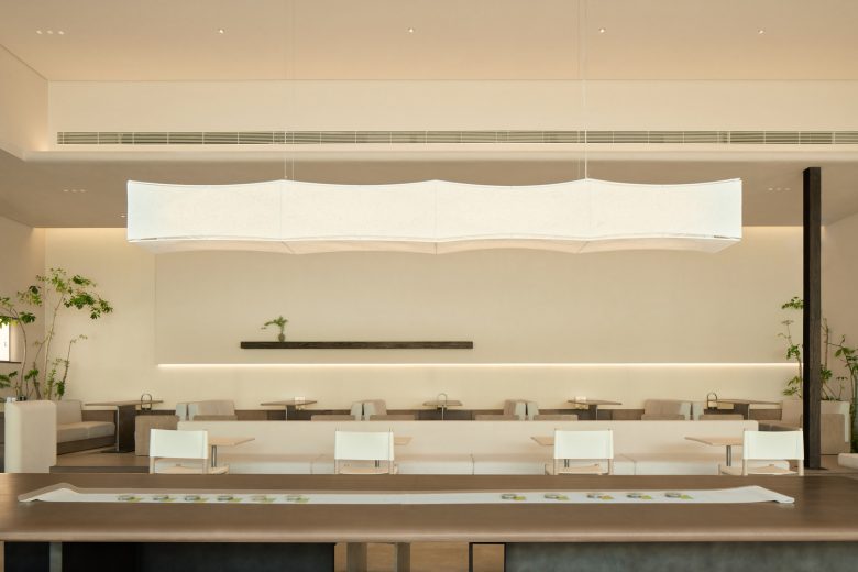
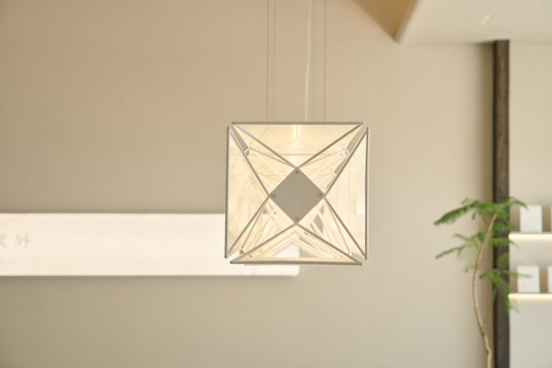
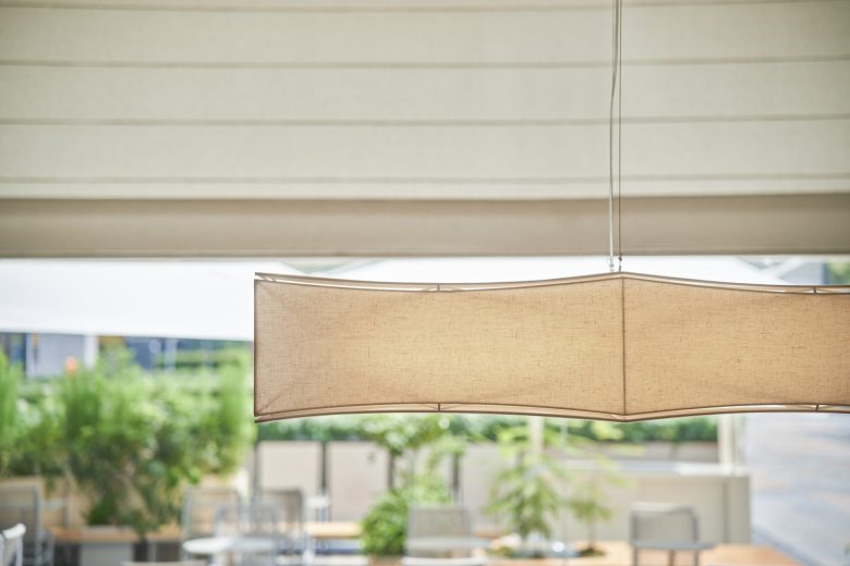
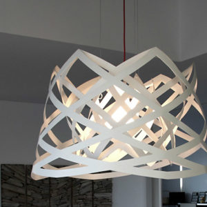
Tea Theme – In the central position, A tea table of extraordinary scale is placed, aiming to enhance the tea-drinking experience with a sense of ceremony derived from traditional aesthetics. Echoing the tea terrace is a suspended long lamp, drawing inspiration from the structure and form of traditional lanterns, but with an unconventional size. The interplay between its surface and structure creates a sense of “space” that makes it appear light and ethereal as if leaping from a paper. The subtle curves of the lines add a touch of charm to the wide horizontal expanse.
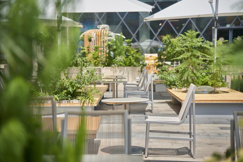
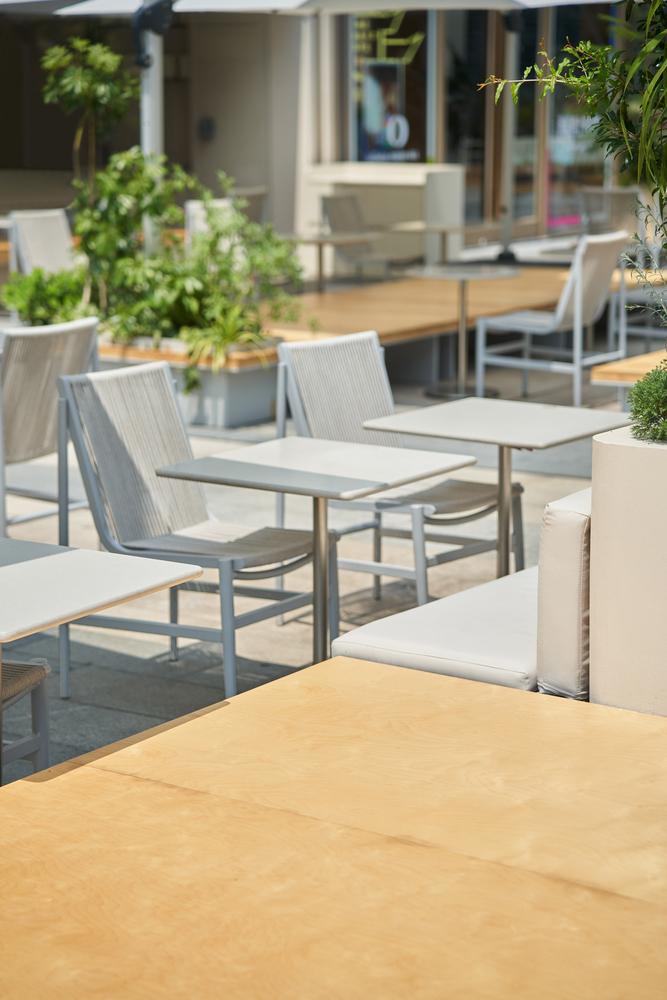
Zen Yard – The outdoor courtyard seeks to recreate the leisurely scene of literati and scholars sitting on the ground in nature, free and unrestrained, enjoying tea and conversation in a carefree manner. The design of outdoor furniture reinterprets the ancient “榻” (tà), with a row of oversized long benches in the center, adorned with Zen-inspired landscapes. Along the sides are relaxed and comfortable seating cushions, backed by lush greenery, together creating a unique and distinctive courtyard.
Architects: Ruhaus Studio
Lead Architects: Dandan Zhu, Yiru Wang
Design Team: Shiting Lin, Xiaodong Liang, Min Zhou
Photographs: yuuuunstudio
