
Krai Zemli by omsky
posted by retail design blog on 2023-08-29
Add to collection
“Krai Zemli” is a place where time flows in its own way, as nature disposes. We do not rush the fruits to ripen, and the bees to collect honey faster. We are sure everything has its own time.
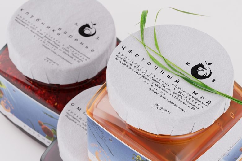
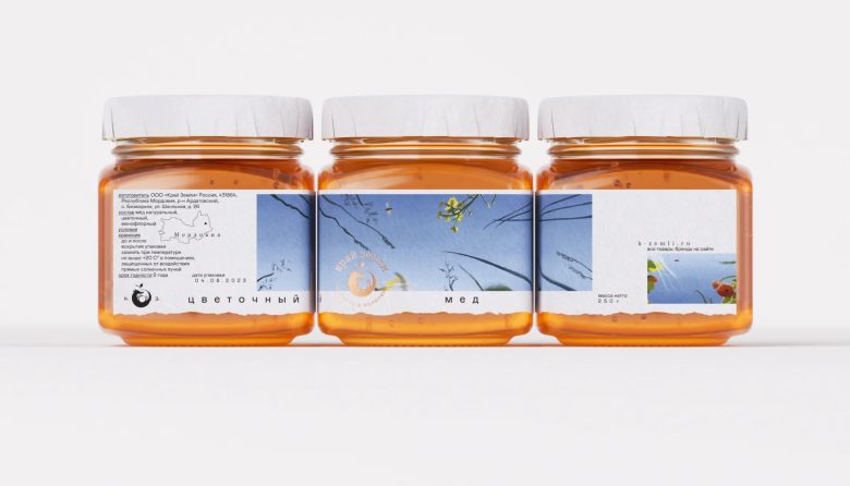
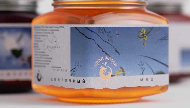
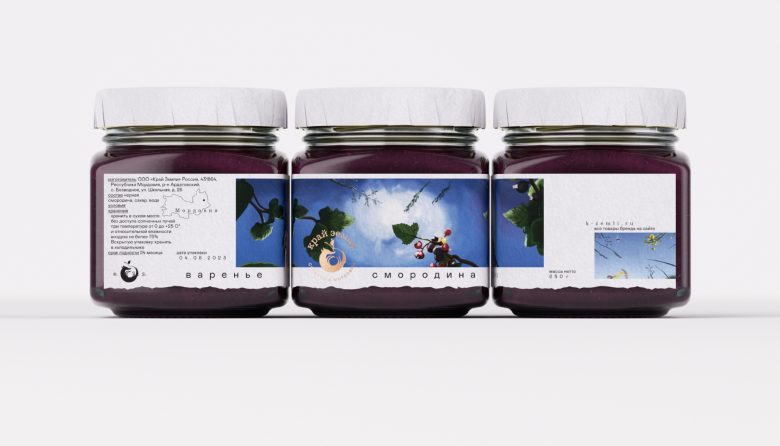
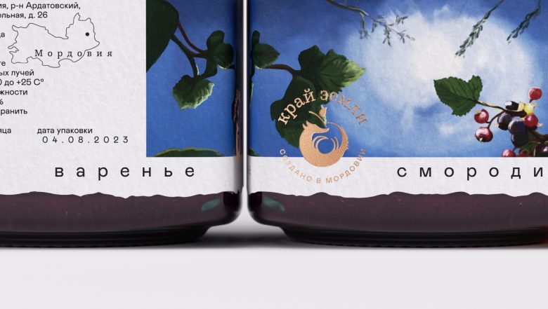
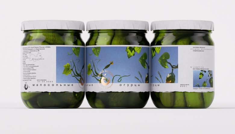
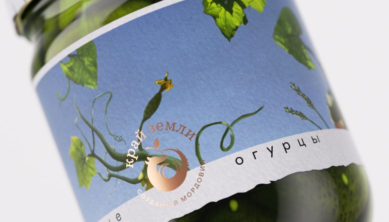
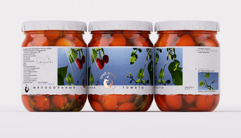
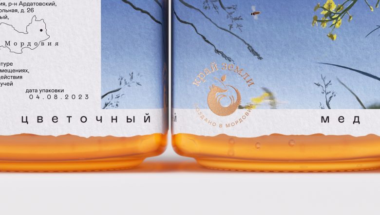
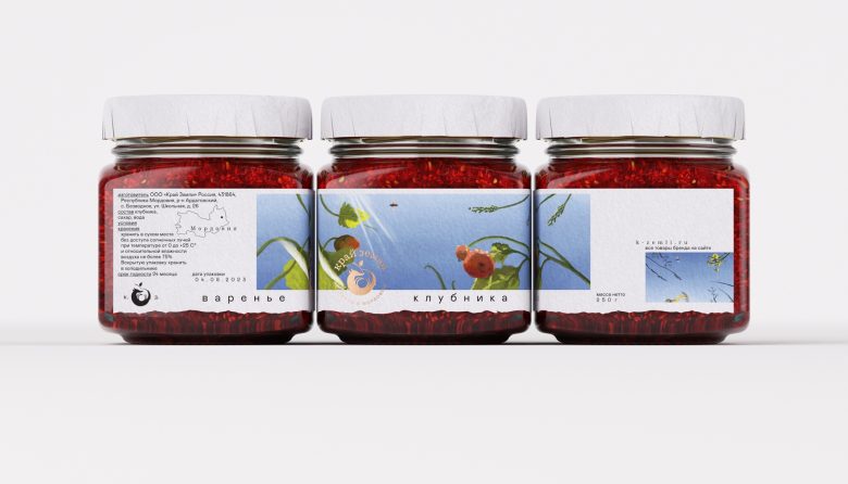
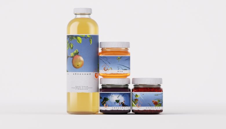
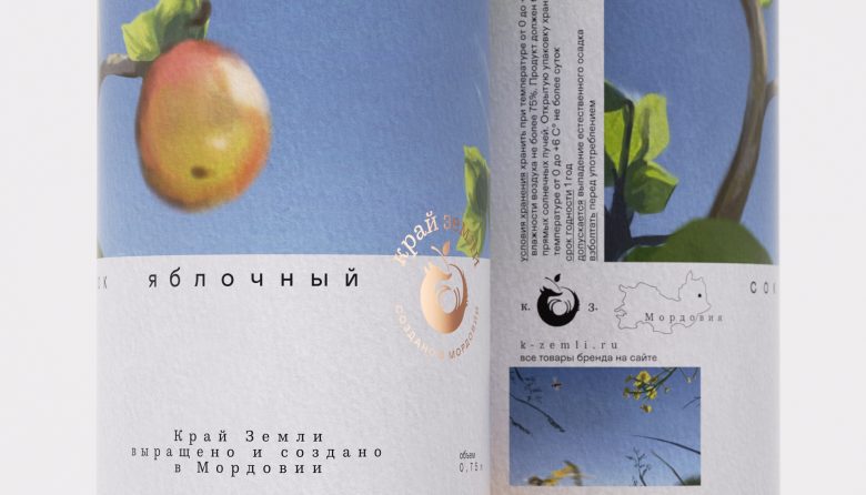
“Krai Zemli” is a brand of a small family production in distant Mordovia. Products prepared with great care, slowly grown fruits in natural conditions.
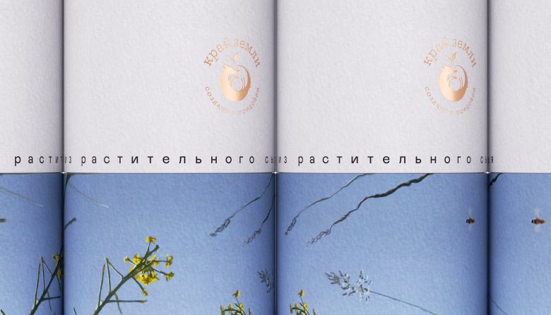
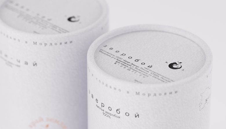
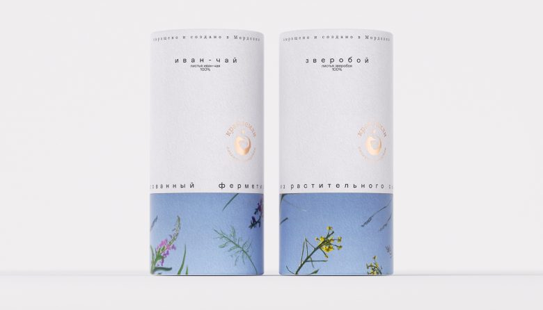
The design concept is inspired by those warm memories of carefree days, when you take off your shoes and run barefoot on the green grass, when you want to fall and just look at the sky, enjoying that elusive moment of contemplating nature, when time slows down and its value increases. We have designed labels and packaging for all products. The illustrations underlying the brand image are united by a common composition — a look at the sky, through fruits and plants. Each fruit corresponds to a particular product in the jar. The brand logo combines two concepts — a fox, as a symbol of the Republic of Mordovia, and an apple, which occupies a prominent place in the culture, gastronomy and mythology of Mordovia.
Add to collection