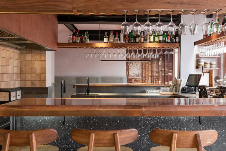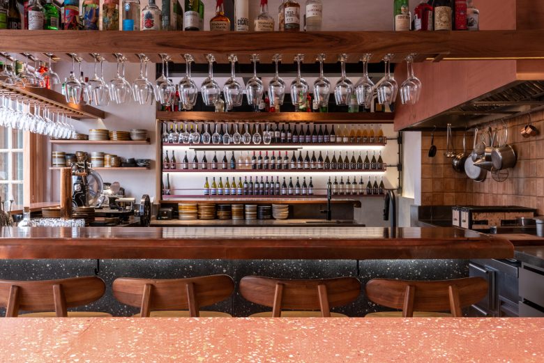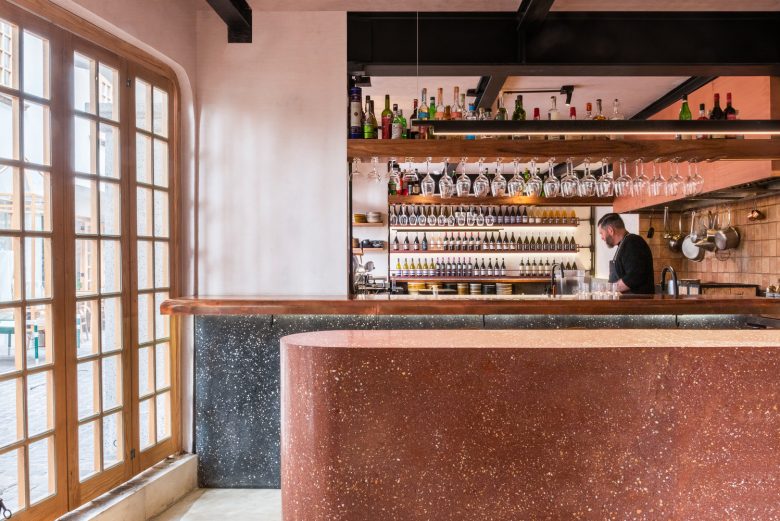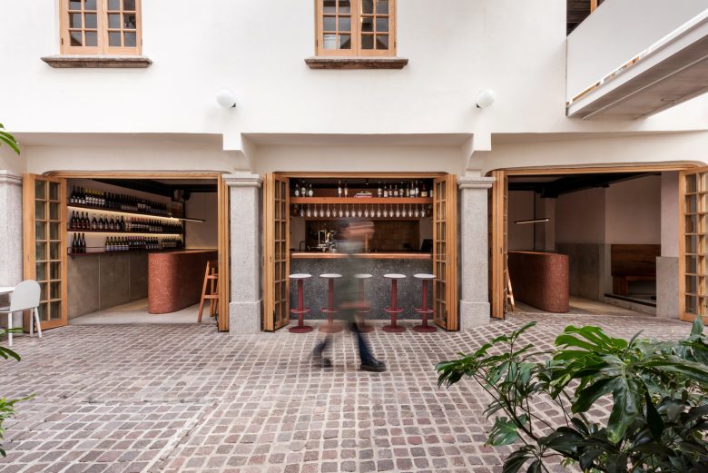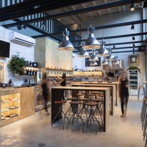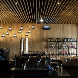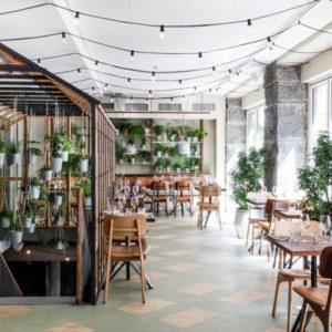
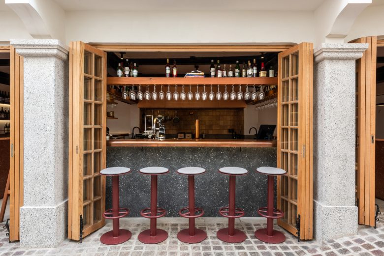
The project is located within the recently restored commercial passage El Parián, an eclectic-style building cataloged by the National Institute of Fine Arts and Literature (INBAL), whose name comes from the Tagalog “parian” which means “market” in Filipino. Open to the public in 1926, El Parián was the first shopping center in Colonia Roma. Polpo is a gastronomic bar that explores the concept of tapas. The spatial design is inspired by the historical typology of a market, where there is a dynamic atmosphere, a certain informality, and open kitchens to the public, which determine the use of space, with people standing and eating something quickly and moving on to the next thing.
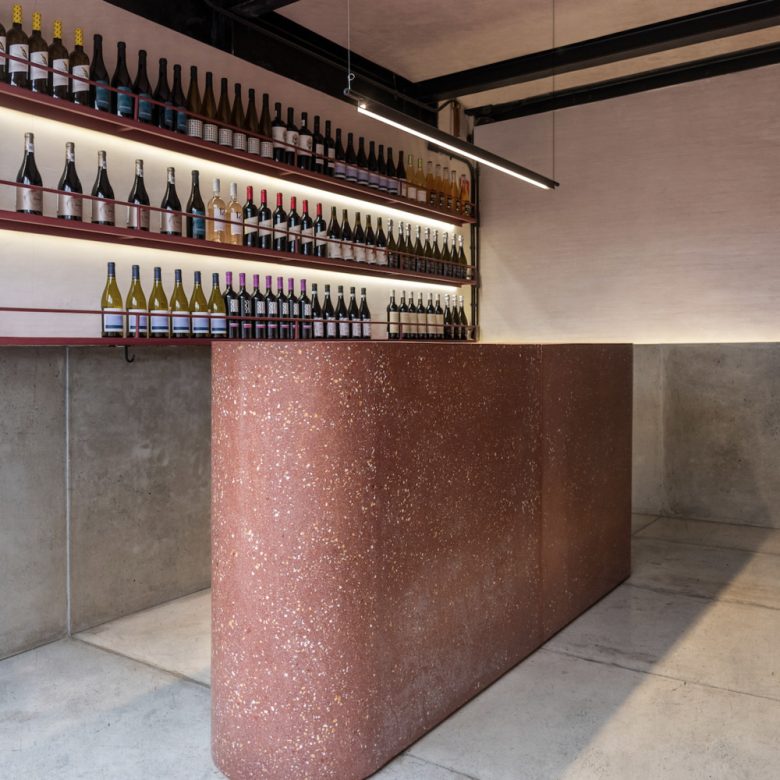
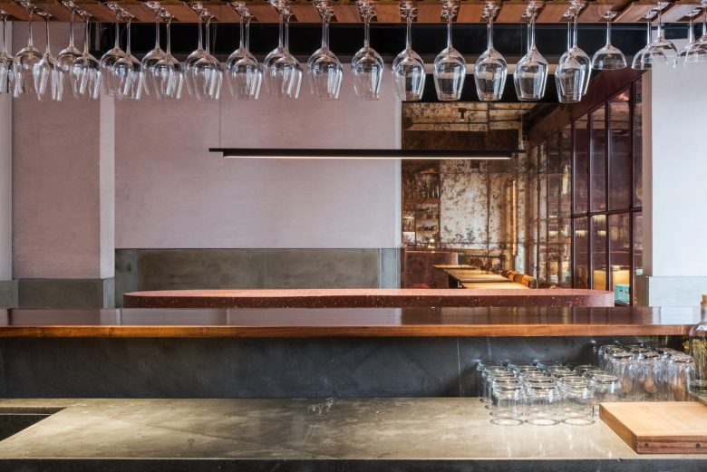
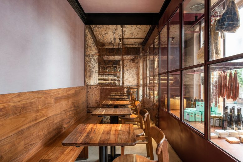
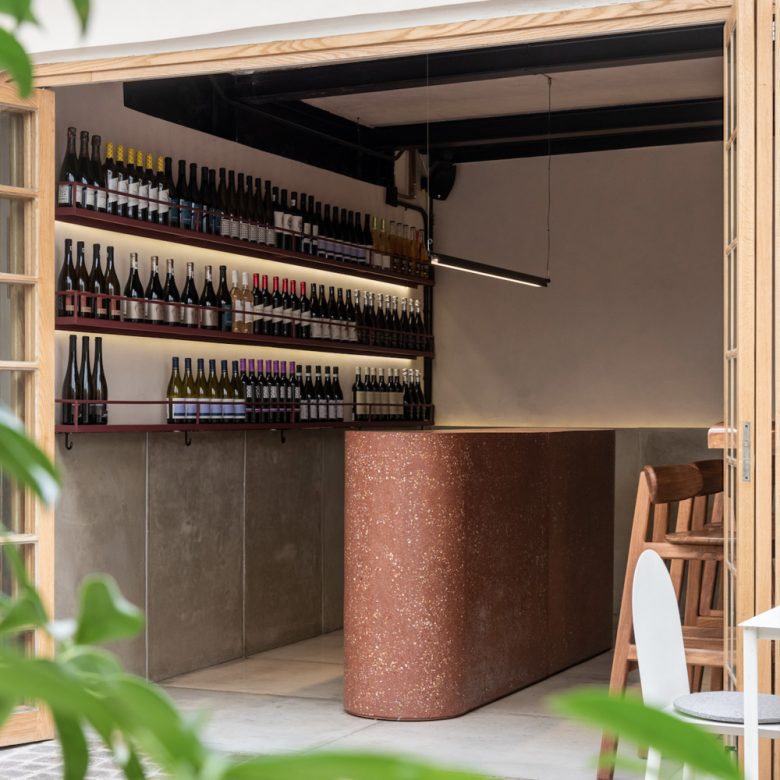
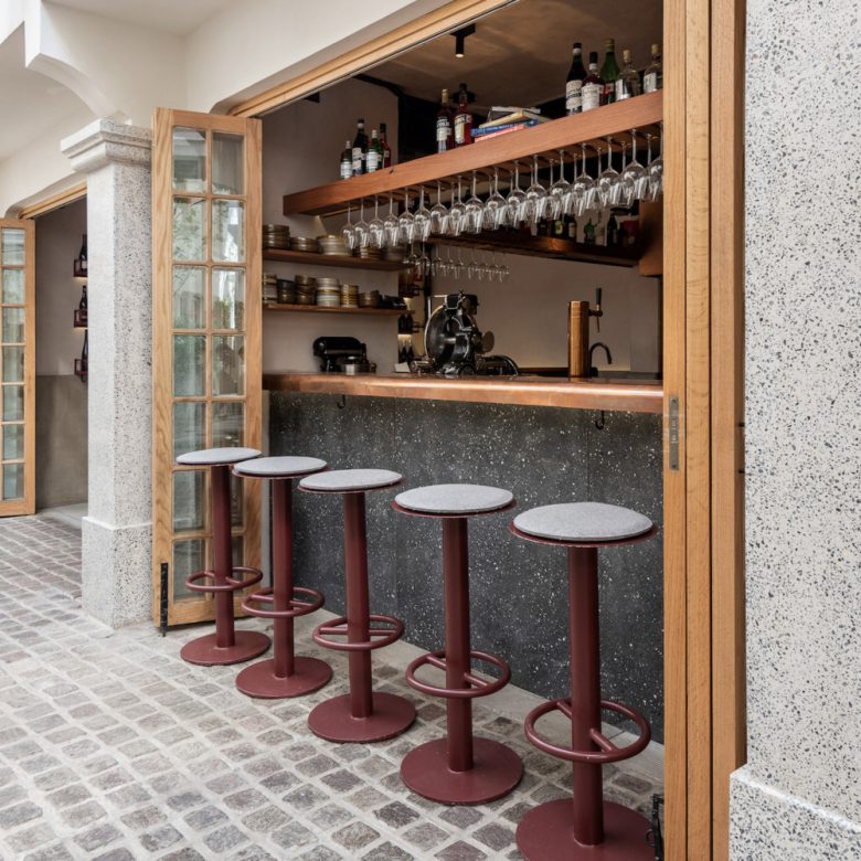
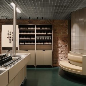
The floor space consists of four bays subdivided by existing columns, each space taking on a particular identity. The central space becomes an open kitchen with preparation bars inside and dining bars outside. The spaces on either side of this have central bars, sculptural monolithic pieces that serve as gathering places to eat or drink while standing, and spaces for consumption and socializing. A fourth space serves as an intimate area with tables and a product display case. The different kitchen and dining bars create a continuous horizontal visual axis along the space, which is reinforced on the walls of the premises with prefabricated concrete at the same height, and which in turn continues from the floor. All of this is a strategy to create visual and spatial continuity in a premises that was previously divided into four parts.
This division is reinforced with the use of materials and colors: above-the-line, warm colors, orange tones in copper details, Tzalam wood, and ceramic pieces made of clay, with wine red details in ironwork, benches, and terrazzo bars. Below the line, are dark colors, with Santo Tomás marble for the bars, prefabricated concrete for floors and walls, and black terrazzo bar fronts. Selection of durable traditional materials with a warm appearance, and dim and welcoming lighting.
Architects: Sofía Betancur
Team: Andrea Garin
Photographs: Arturo Arrieta
