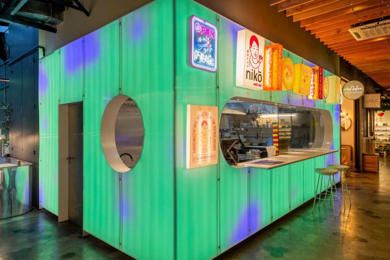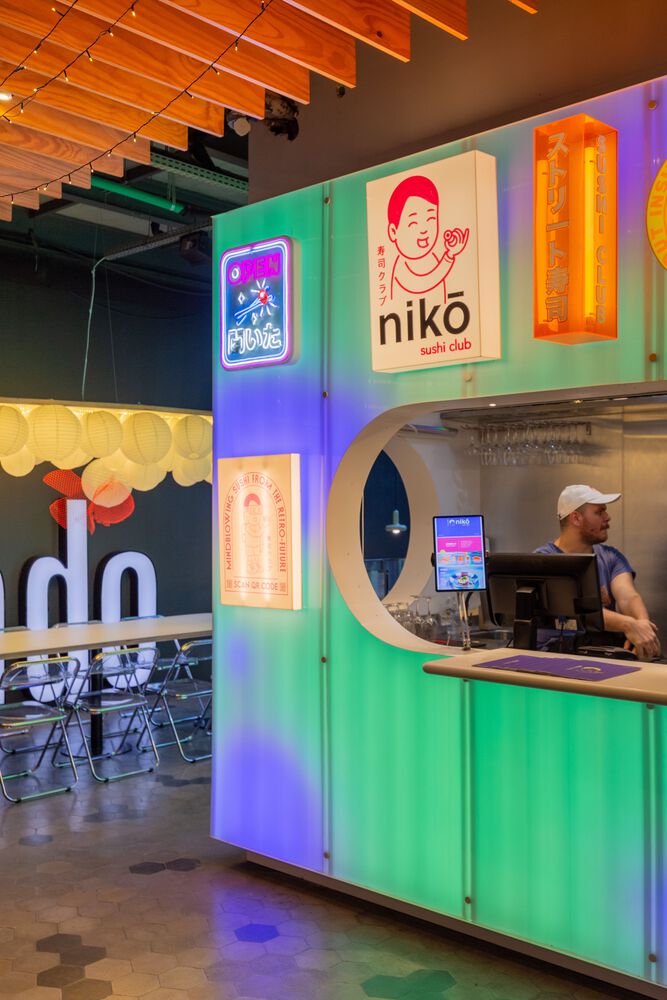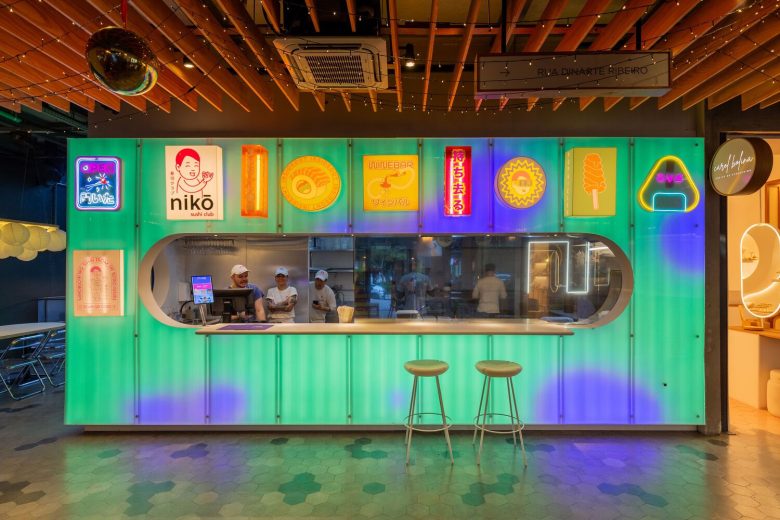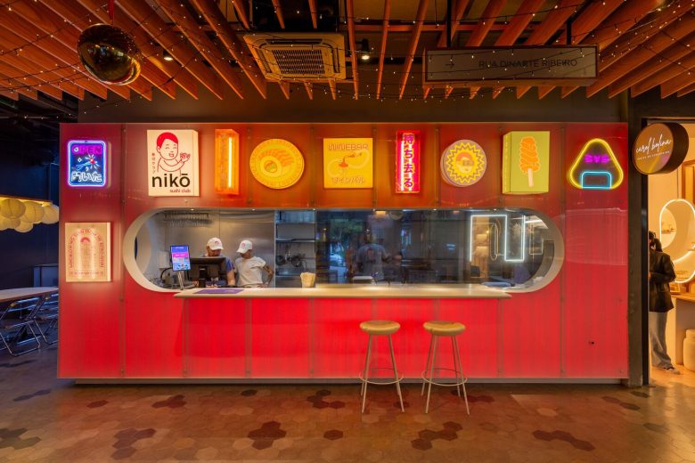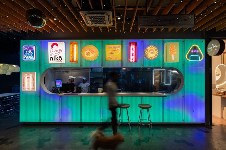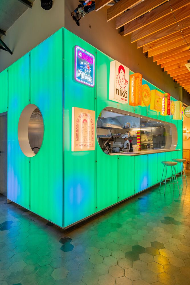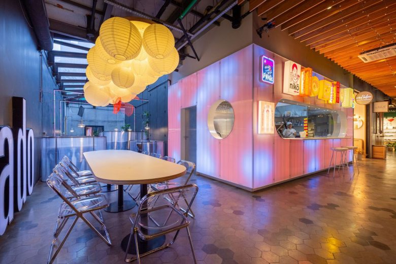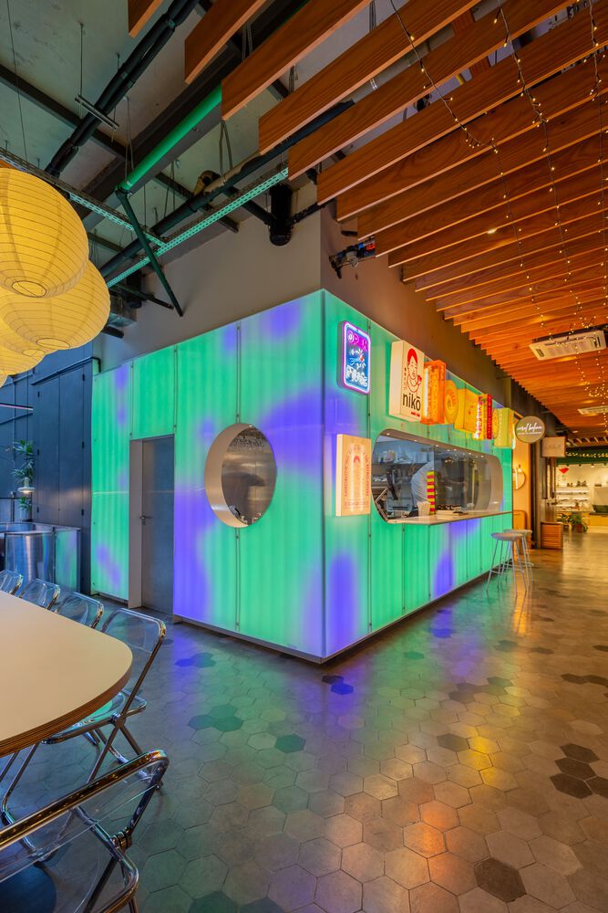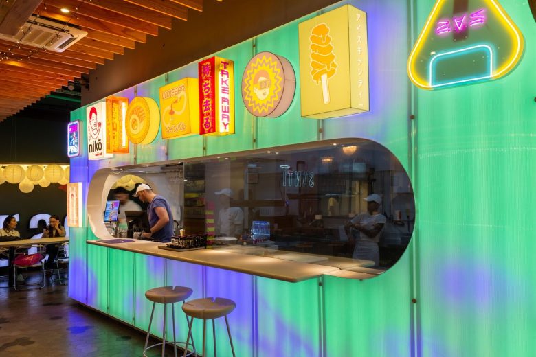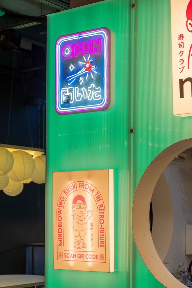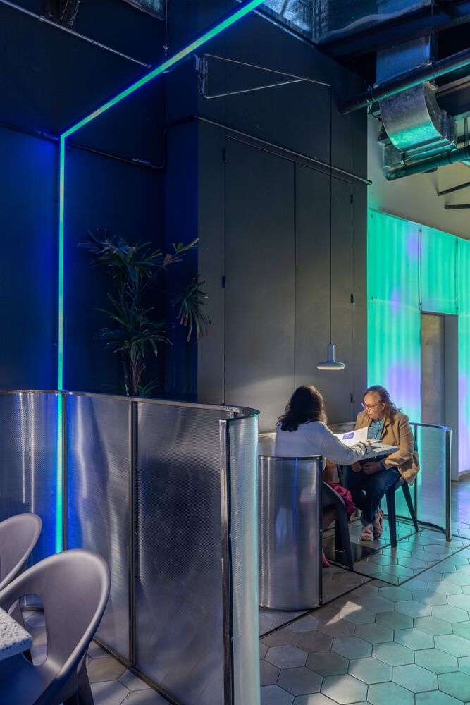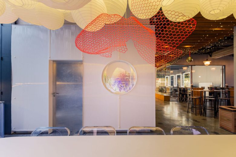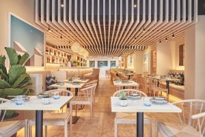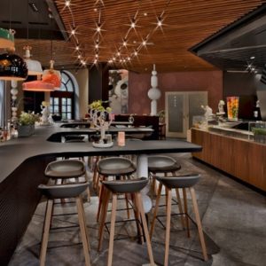
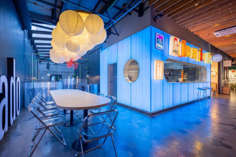
Niko is a small Japanese restaurant, between tradition and the future. It was up to architecture to give materiality to this contradiction. On the one hand, it refers to street commerce, the lights, the signs, and the colors in contrast with the city’s concrete. On the other hand, offering dynamics through technological possibilities, projecting what this business would be like in the encounter of different times.
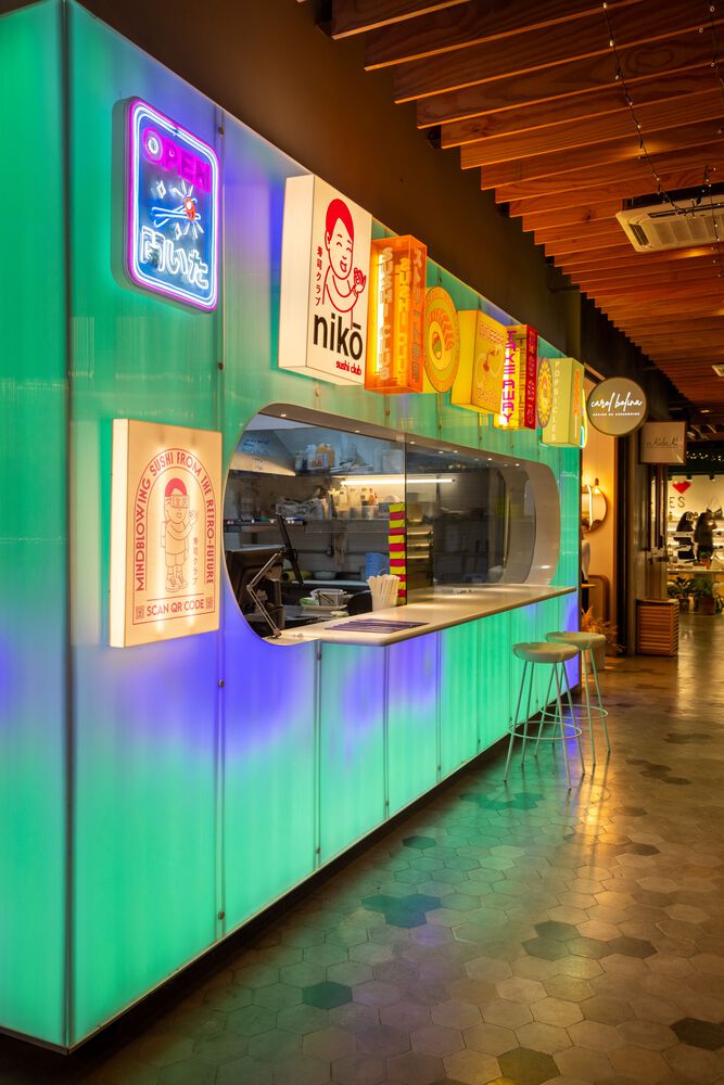
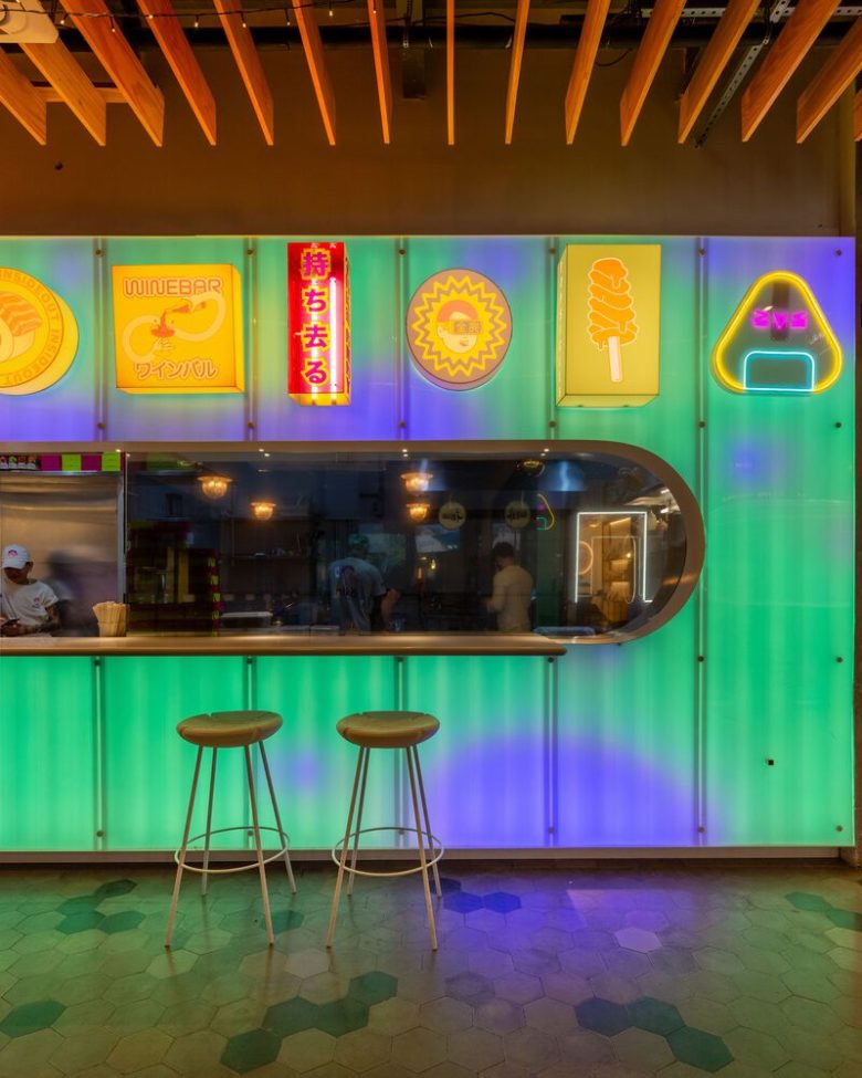
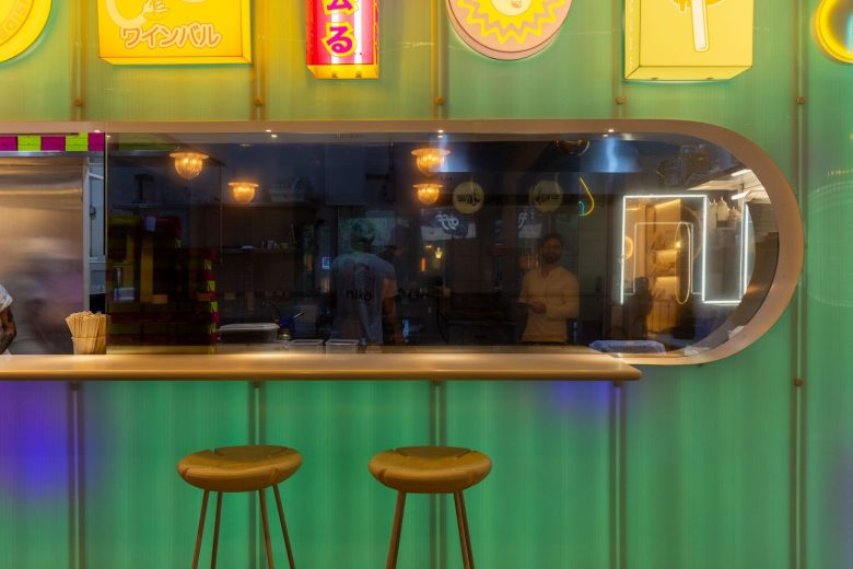
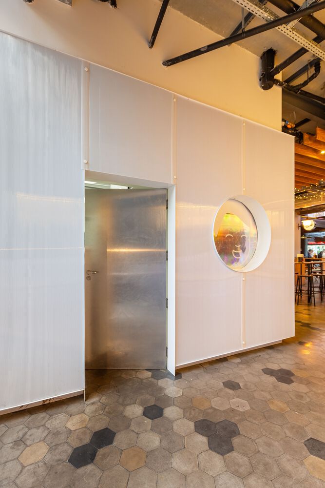
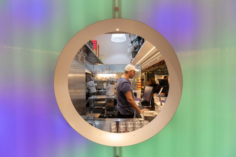
The store is located inside a shopping gallery, which has two accesses from the street. Niko’s main facade, which has an elongated opening — a kind of eye — faces one of the entrances. This opening reveals almost the entire small store: on the left is the client service area and, on the right, protected by filmed glass, is the kitchen. On the smaller side facade, there is the employee entrance and another circular opening that dialogues in alignment with the main one.
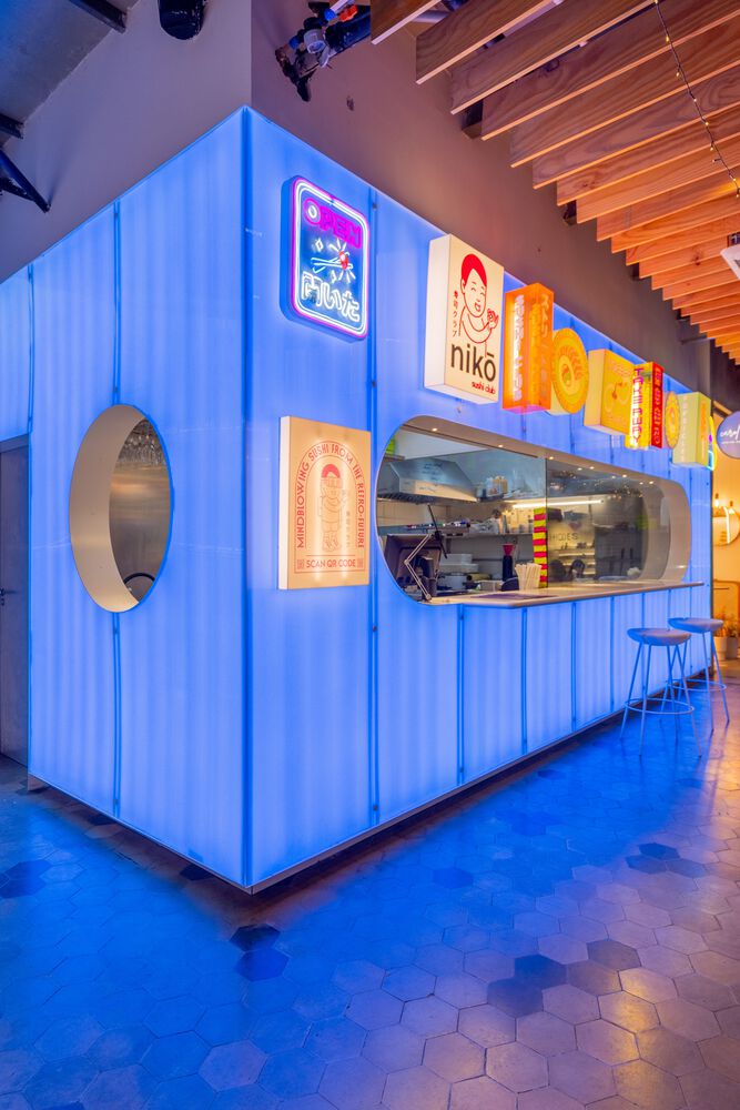
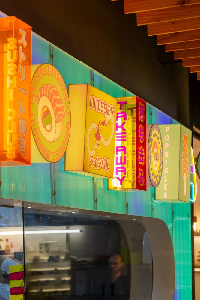
We wanted the store to have a quality minimalist design — as in Japanese contemporary design — but also have the “over” aspect of the streets, which is visually charged. Therefore, we chose to use polycarbonate throughout the facade, which is fixed and suspended from the ground thanks to metallic elements designed exclusively for the project. We use LEDs behind the polycarbonate with app-controlled programming. To reinforce the “over” aesthetic, we superimposed small luminous boxes along the larger opening. The boxes are not aligned with the marking of the polycarbonate module, as we seek to reinforce the layer of clutter in the minimalist design.
In terms of materiality, we would like to explain how the facade works. A drywall structure forms the entire “L” of closure, but the drywall does not have two plaster faces. Only the internal facade is made of plaster as it would be clad in tiles in the kitchen (and would facilitate the passage of electricity), the other side of the system has MDF as a closure. We came to the conclusion that the MDF would give more support to the polycarbonate that would be suspended. The polycarbonate sheets are fixed by metal tubes with lids and we have metal sheets covering all the openings, aiming to provide a high-standard finish. The light boxes are fixed by a system that resembles a TV panel. Everything was designed exclusively for the project.
Architects: URBANODE arquitetura
Lead Architect: Eduardo Paiva Ribeiro
Project Team: Alessandra Fassina, Eduardo Paiva Ribeiro
Photographs: Marcelo Donadussi
