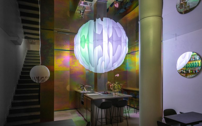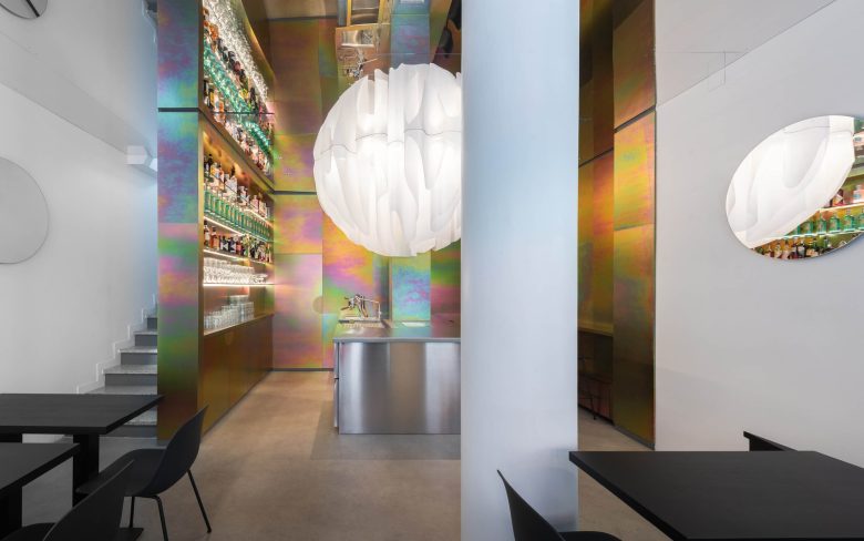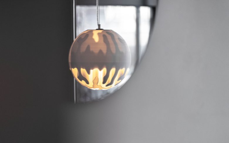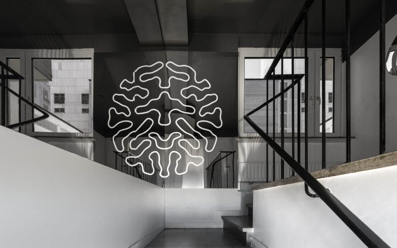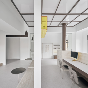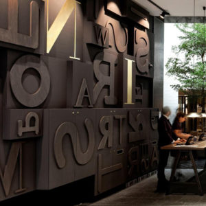

How to maximize the use of limited space? Both conceptually and visually, differential growth is used as a key element in the bistro. The growth pattern follows a clear mathematical system, even when it appears to be random. This system is based on an algorithm modeled after natural occurrences and simulated using parametric software. The mathematical understanding of growth evolution was used not only for the light installation as the centerpiece, but also for smaller artifacts located on both floors.
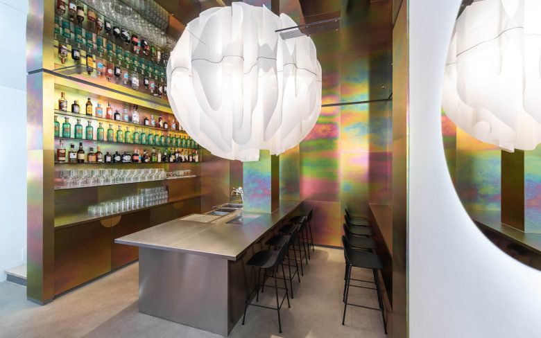
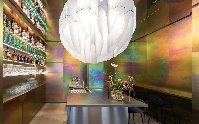
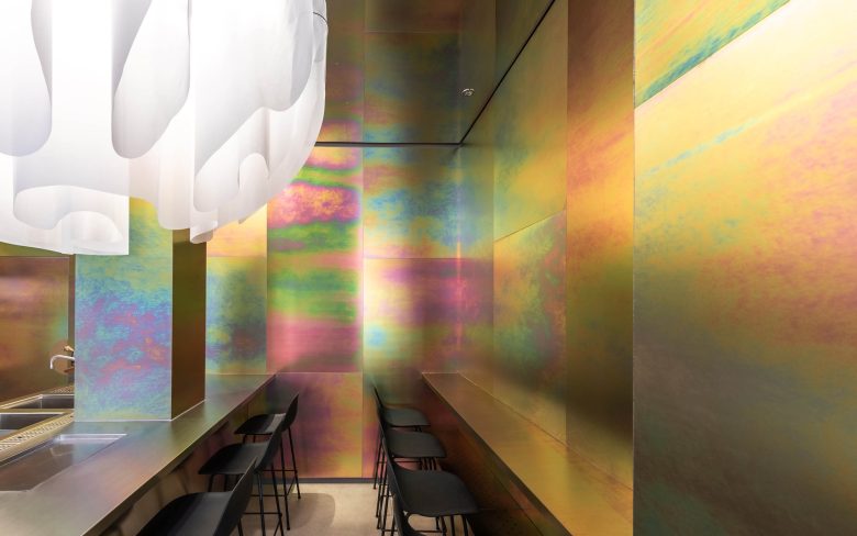
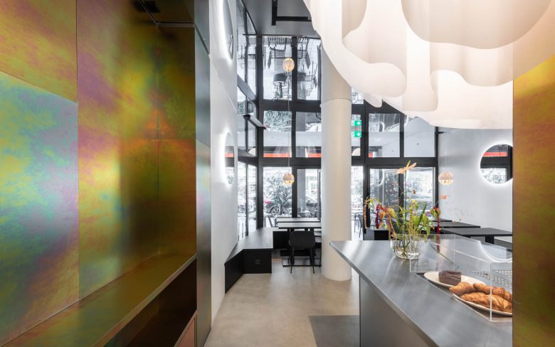
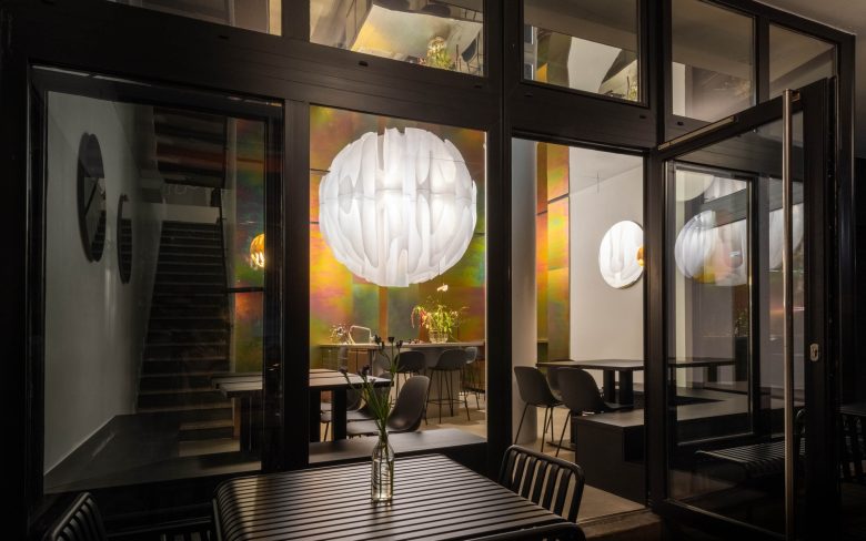
A similar idea is applied to the interior cladding around the counter. Random patterns or streaks in vivid color variations are created through the chromatization of steel panels, making the contours of the space disappear. The ground floor public area is divided into three zones: a covered outdoor terrace, a dining area by the façade that opens to the outside, and a sociable open bar.
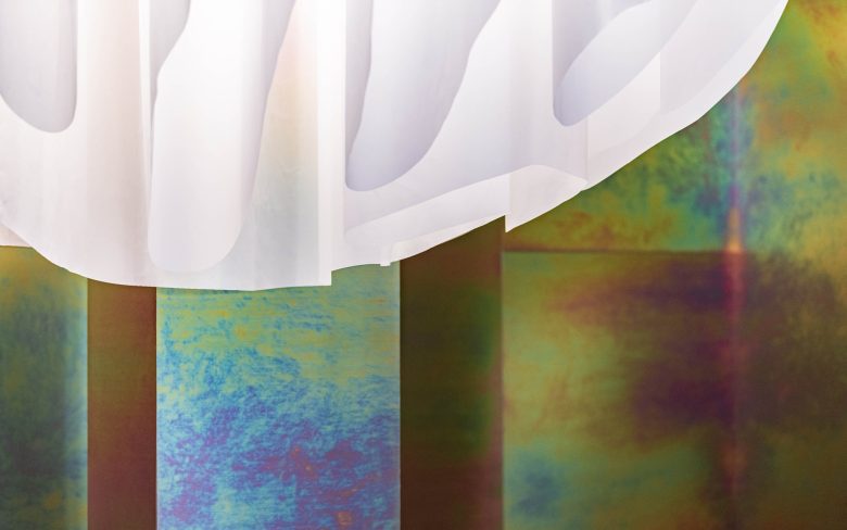
Since there is little daylight at the back of the bar, a clear spatial separation was created between the two interior zones. The “room within a room” replaces the missing natural qualities with a unique ambiance. The chromated steel panels have gradients and colors that result from the manufacturing process and add to the uniqueness of the material. The wall cladding turns the back room into a place with numerous spatial experiences through an explosion of colors as the only non-monochromatic element of the project.
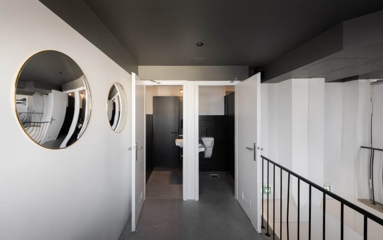
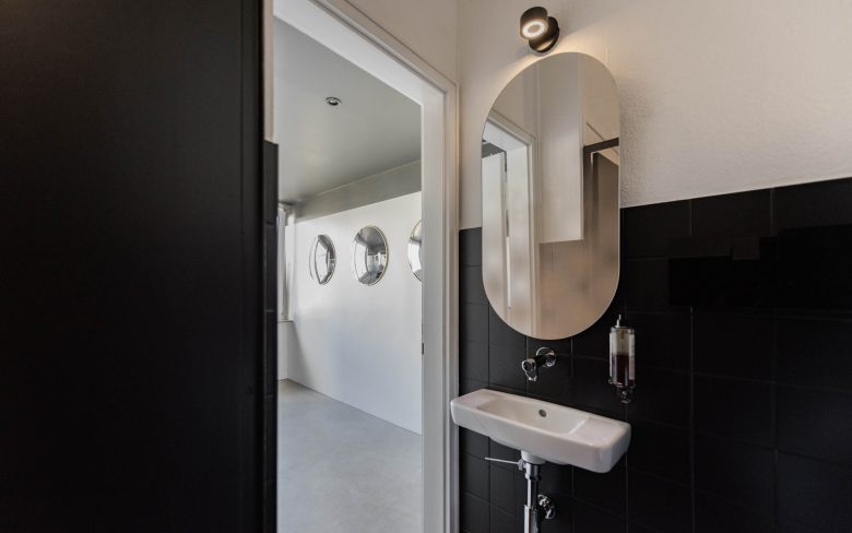
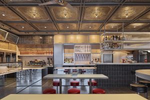
In addition, the bistro plays with space, views, and reflections. Mirrored surfaces and artefacts are installed to visually expand the compact footprint. Different angles, reflections and counter-reflections create endless variations of views, experiences and interactions.
The combination of the stainless-steel counter and the light installation above, which is surrounded by chromate steel panels, is the centerpiece of the design. The hemispherical light installation placed above the “open bar”, together with its reflection, appears as a sphere. Guests recognize a whole sphere and so the illusion of a room with double height works seamlessly. The sphere is created from a 28-meter-long, specially cut fabric, which is mounted along a plan also following a differential growth pattern.
Three integrated light sources create individual lighting moods. The counter is placed longitudinally to the space, abolishing the boundary between guests and staff. The atmosphere created in the day bar has a pronounced impact on its immediate surroundings: a welcoming and relaxed atmosphere during the day, a mysterious and intimate ambiance at night.
Designed by Martino Hutz Architecture
Design team: Martino Hutz, Andras Peter Domokos (Design Lead), Charlotte Huber
