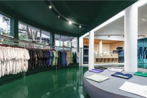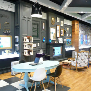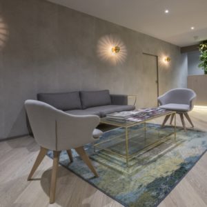
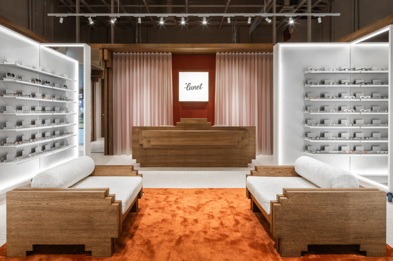
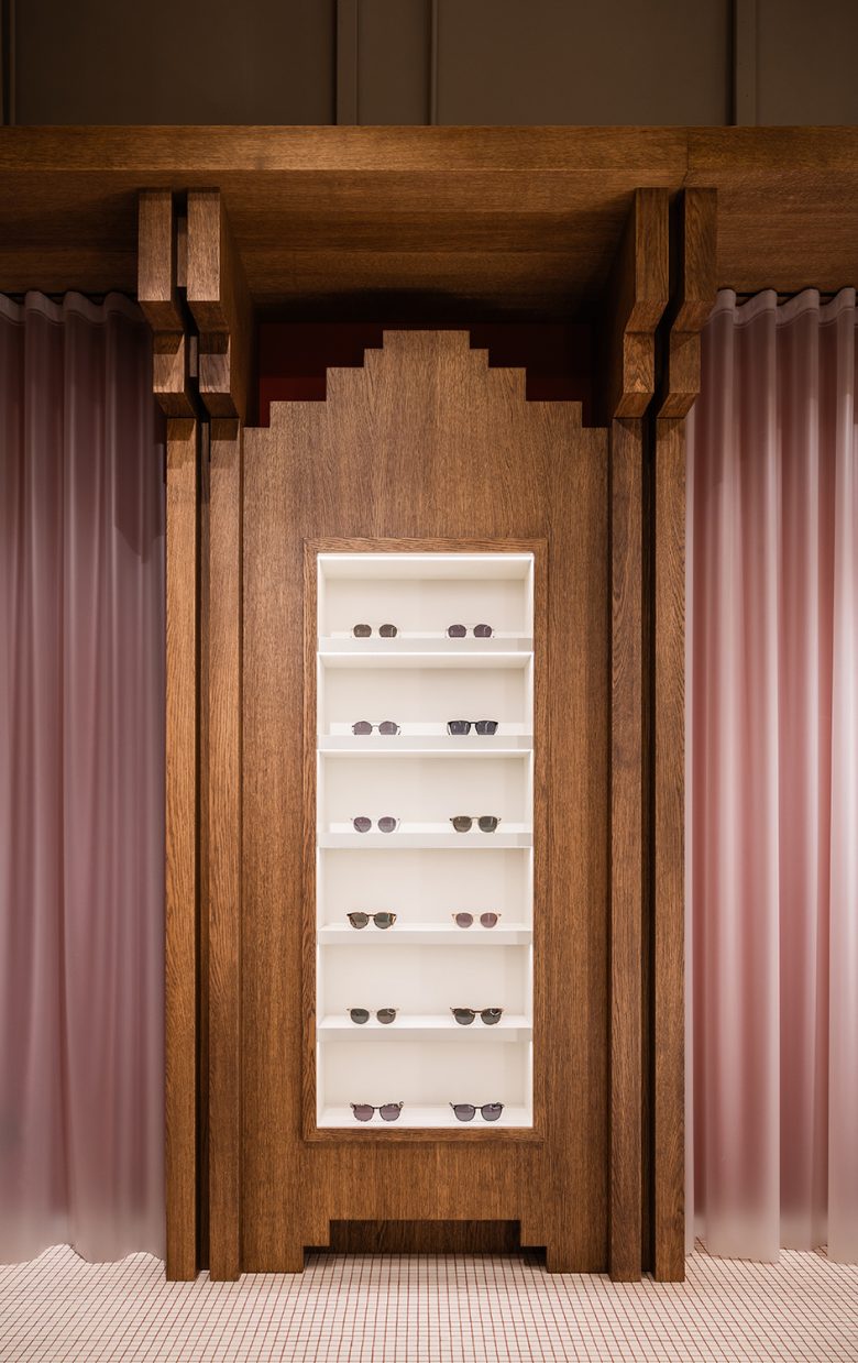
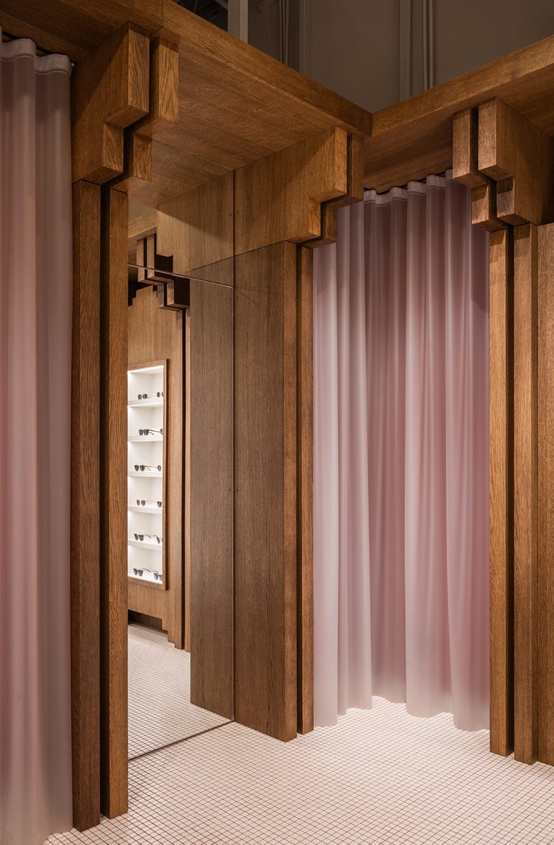
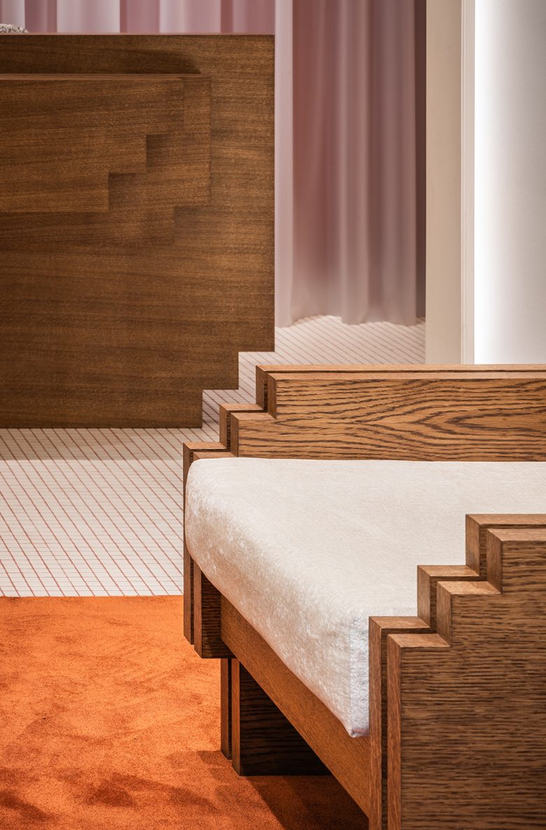
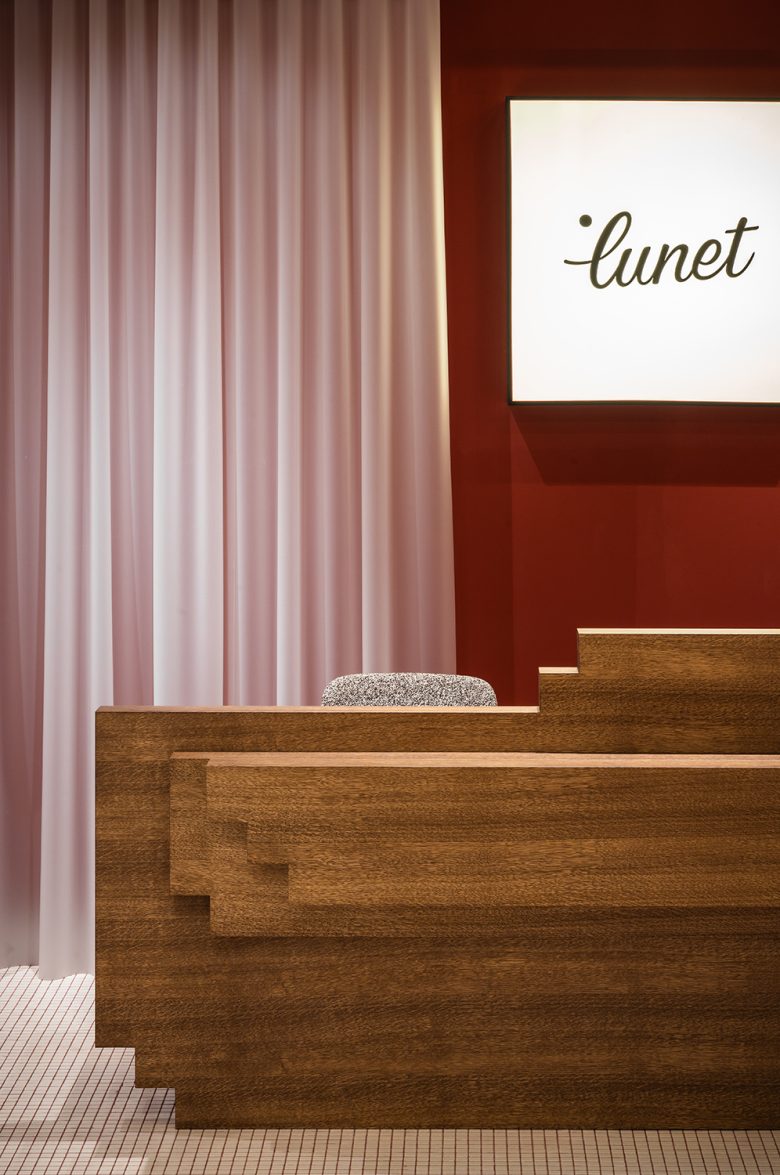
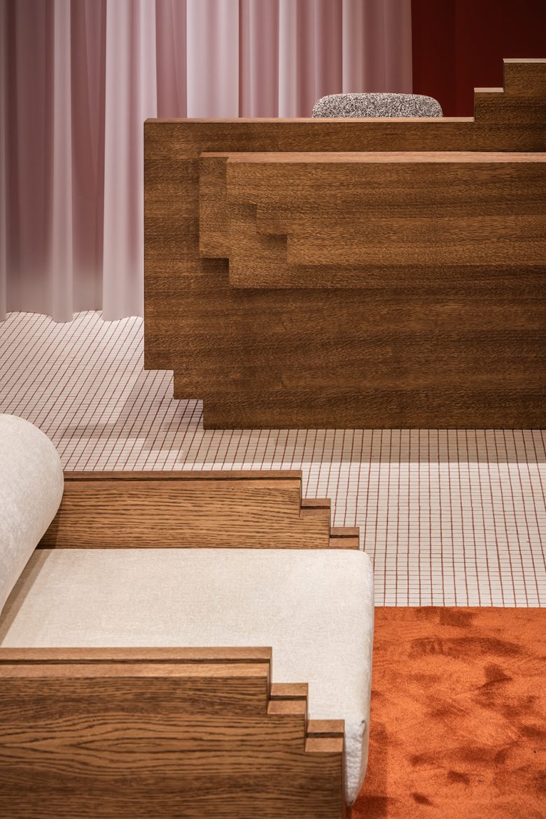
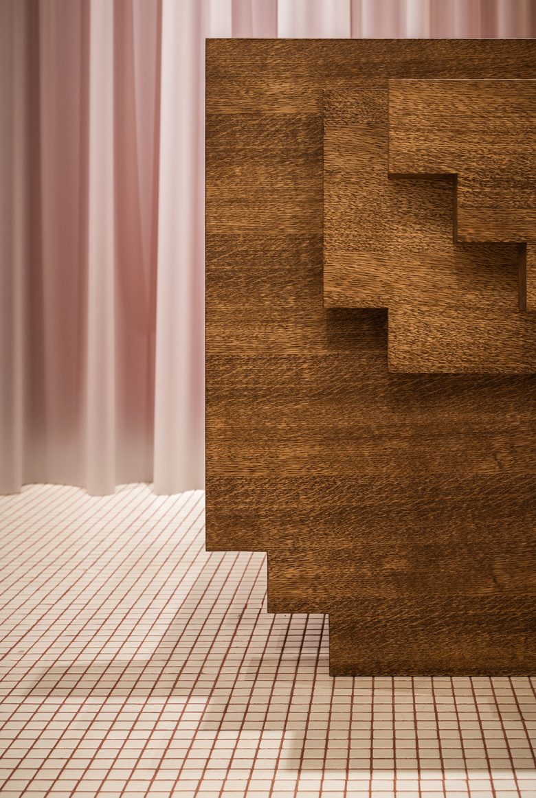
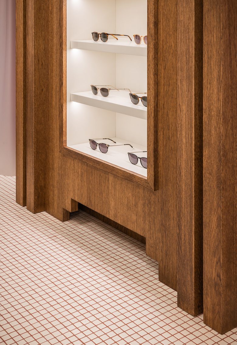
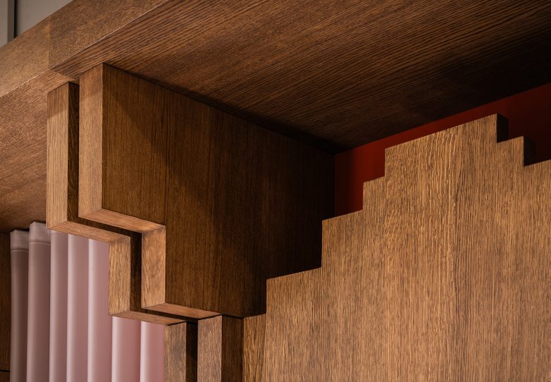
The store is a node, an homage to old style eyewear stores, reinterpreted and recontextualized in a contemporary way. All the shapes and volumes are stylized and synthesized to their essence, stripped of unnecessary information so that they become almost low resolution images, containing only the vital information, thus making up for a playful and pixelated environment.
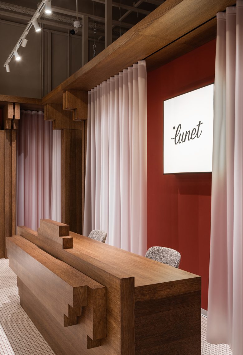
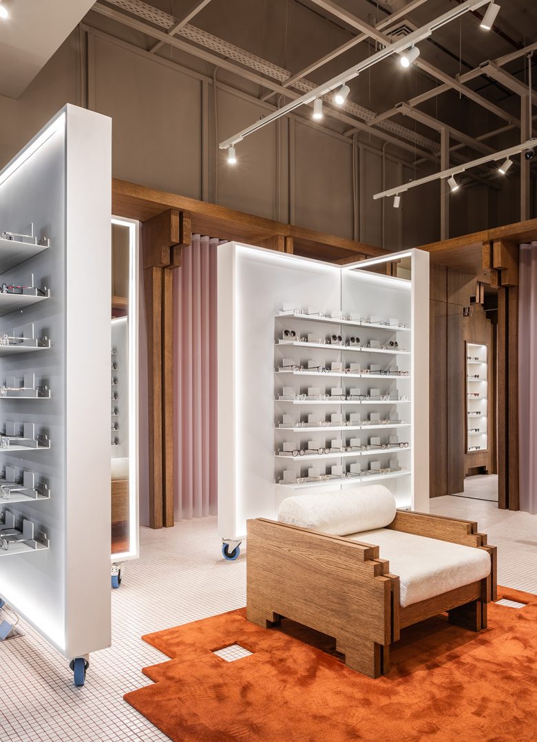
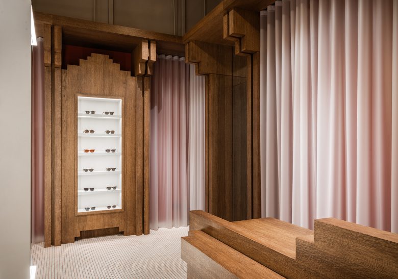
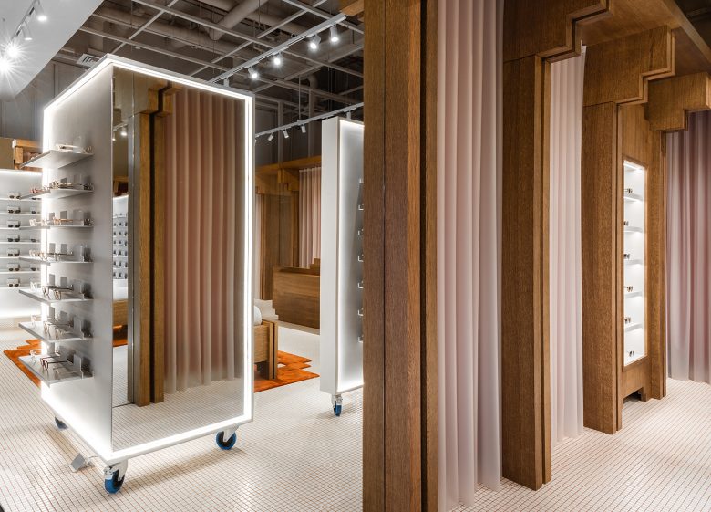
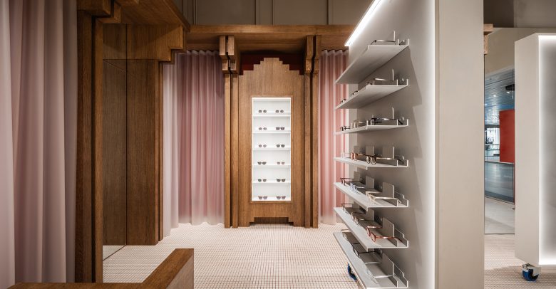
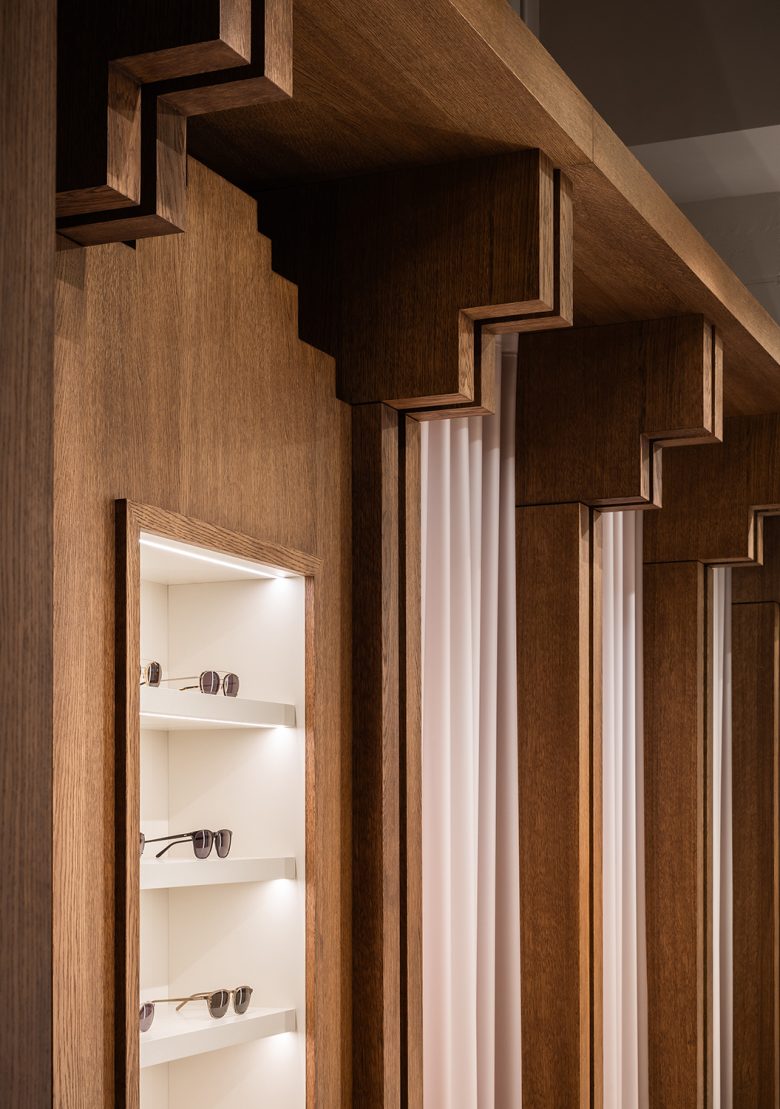
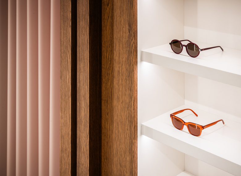
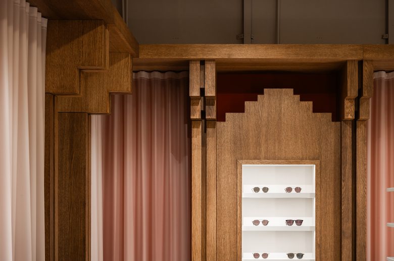
The central display modules balance the otherwise warm space with a touch of industrial aesthetic, mix of brushed metal and mirror cladding, keeping in line with the original concept of the first Lunet store, that of individual trying station, that offer a more intimate experience to the customer. The wooden vertical pieces, almost mimicking structural elements, are pixelated versions of columns infusing the space with a whimsical playfulness. The pixel pattern is found throughout the entire space, in the rug details and also the reception desk.
In between the wooden pillars the walls are painted in a burnt sienna color with a translucent latex curtain in front giving depth and texture to the otherwise straight walls, granting it almost a blurry vision like effect. The optometrist examining room is minimalist, austere, with colorful walls and a mural that serves as backdrop for the projection of the letters.
The new Lunet space continues the tradition of promoting quality design and creating a special environment for the clients with the human user at the center of its focus. The store aims to educate customers on what interior architecture can offer when done correctly at the same time producing a room that feels contemporary, comfortable and welcoming.
Designed by Bogdan Ciocodeica Studio
Project team: Bogdan Ciocodeica, Adelina Cucoranu, Cristina Iordache, Ines Junger
Photo: Vlad Patru
Add to collection
