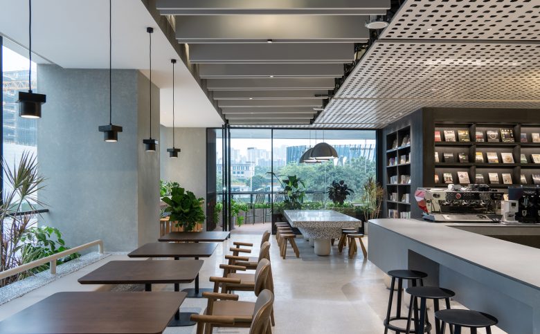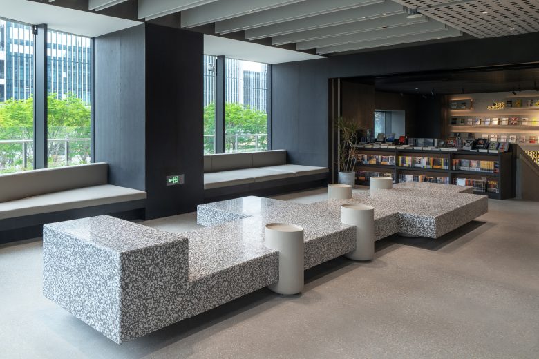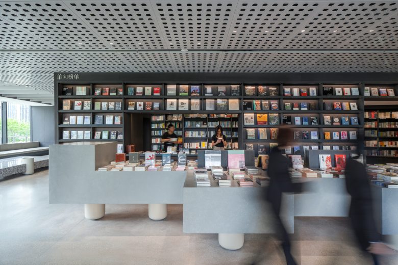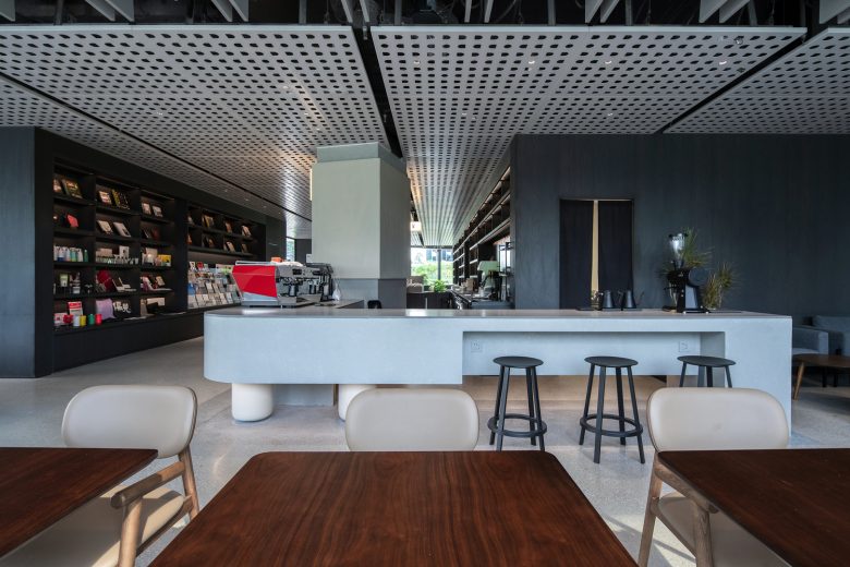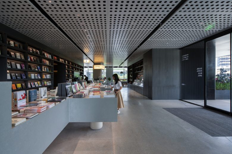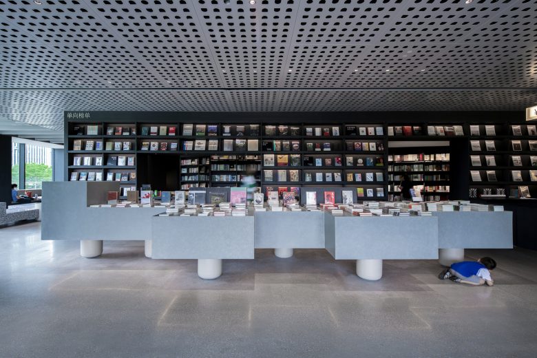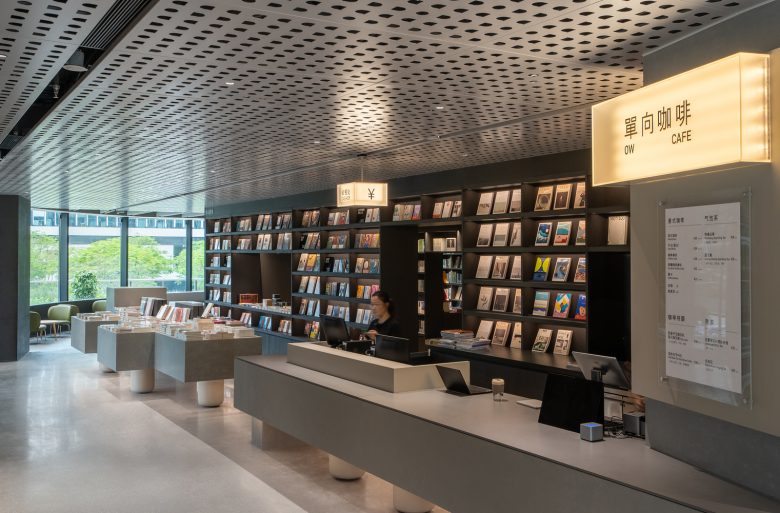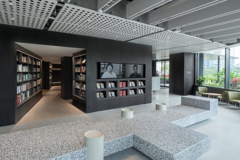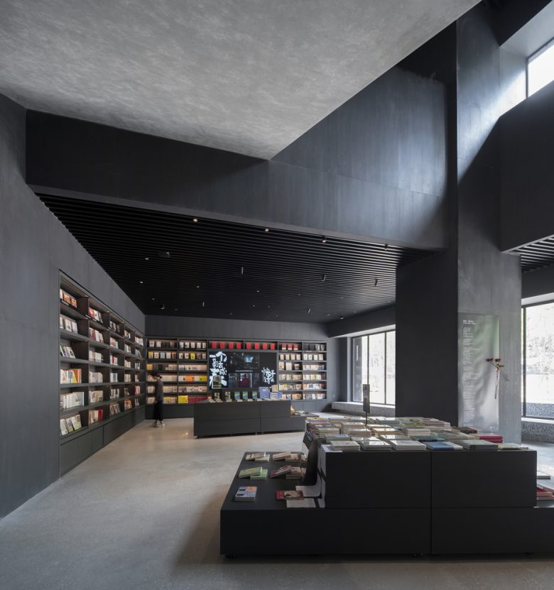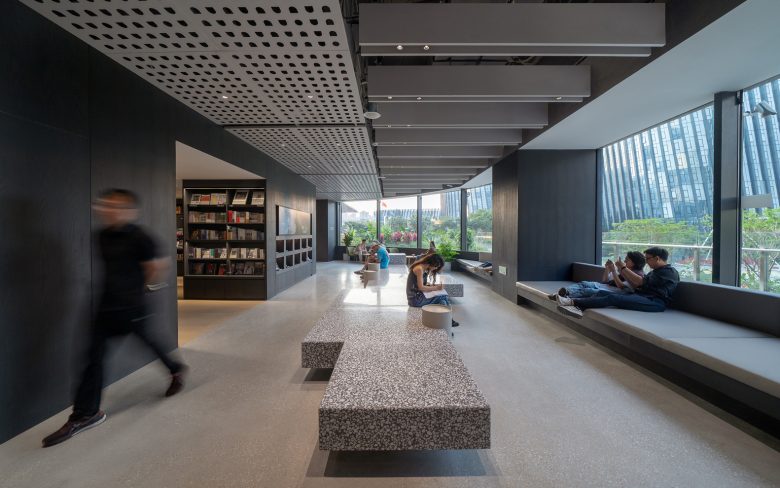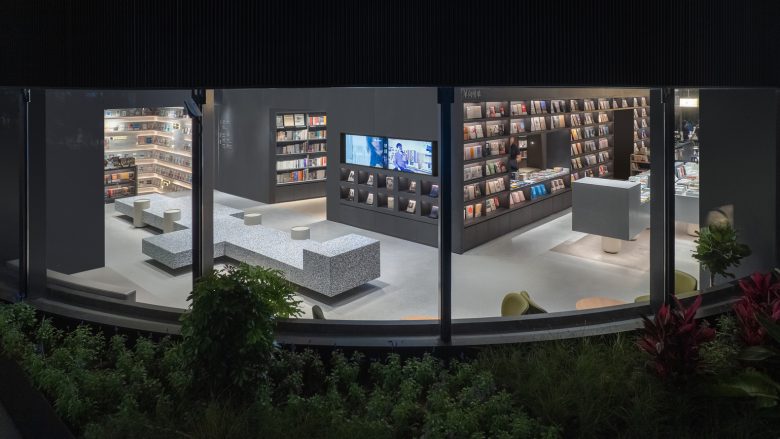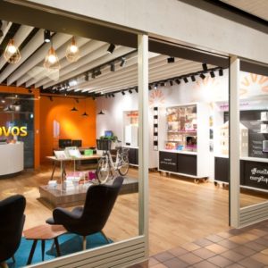
There are five “Monsters of Wisdom” wandering around the OWSPACE in Foshan. We designed 5 pieces of large-scale furniture in the OWSPACE, for example a 7m long display table for books and goods, and a large bench that can accommodate 20 people at the same time. Each piece of furniture has stubby steel legs, giving the impression that it is about to start walking, like some kind of animal. We decided to call these pieces of furniture “Monster of Wisdom”. The cafe’s large table stands on three legs arranged in a row, defying the laws of gravity, giving it a floating feel, reminiscent of an umbrella monster standing on one leg. Visitors to the OWSPACE will be excited by the curiosity brought by the monsters, and will also smile because of the playfulness expressed in the design.
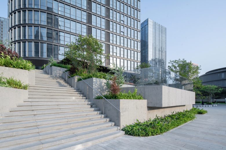
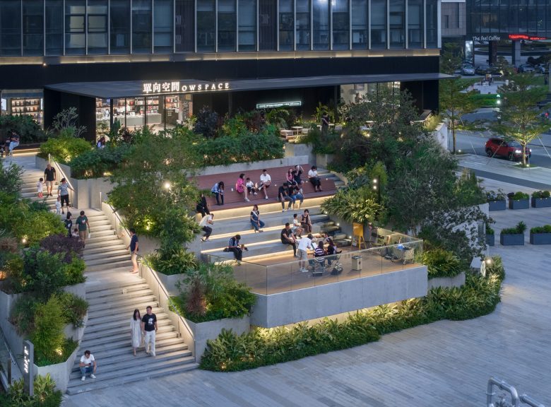
Background. In addition to some media activities represented by Thirteen Invitations, OWSPACE also has physical spaces, where it operates bookstores and cafes, sells cultural and creative products, and holds regular events. Since opening its first store in 2005, OWSPACE has continuously updated its store model according to social changes. The first generation is street stores, the second generation is stored in commercial complexes, and the third generation prefers to go into communities. This project is the first physical store in the southern region, located in a corner of an open urban block within Foshan Midea Corporate Town. Based on a community of thirty thousand Midea employees, it is indeed considered a third-generation model. Our goal is to create a community’s living room. Midea has built a new headquarters and a corporate town covering a few urban blocks in Shunde, Foshan. One block is called “Shunde ALSO”, designed for young employees having apartment towers, sports and cultural facilities, and a commercial podium. Our project is located at the entrance of this urban block. It has an area of 150m2 on the ground floor and 500m2 on the second floor. Across the road to the south is the He Art Museum, designed by Tadao Ando. In front of the store on the second floor are the stairs and a barrier-free ramp leading up from the public square. The ramp turns 6 times with a total length of 90 meters. It lacks a sense of design and is inappropriate for the landscape of ALSO’s main entrance. There are public elevators just behind the store, and this outdoor ramp is rarely used. After discussions with Midea and the OWSPACE team, we decided to transform this area into a public space matching the needs of the community.
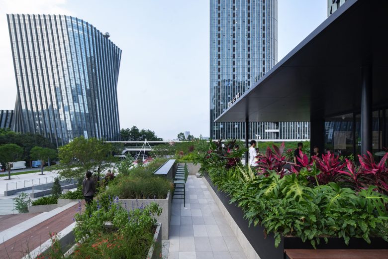
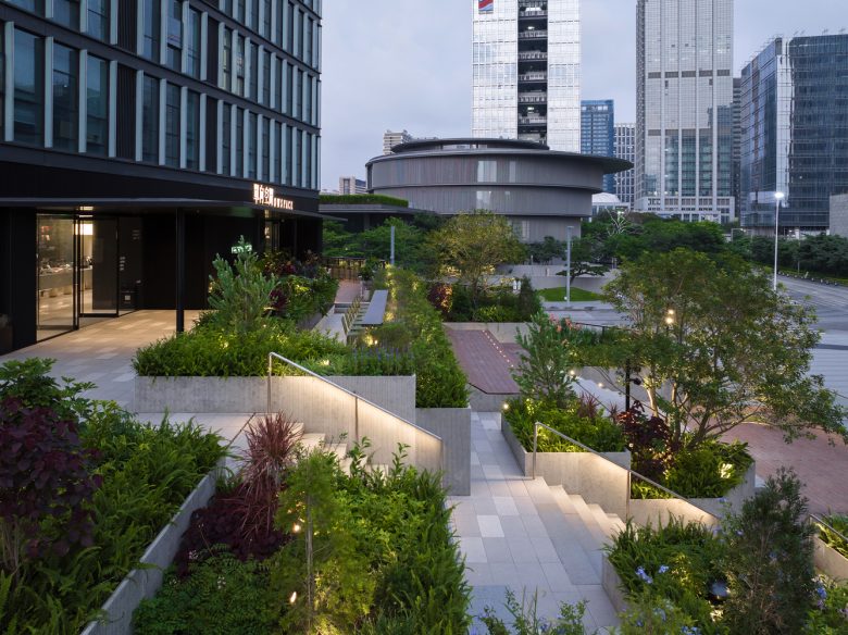
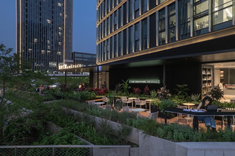
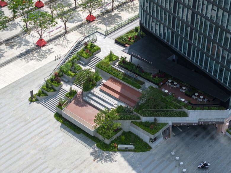
Terrace-style community garden. We did not touch the existing structures when transforming the ramp, but through minimal spatial layout adjustments, we designed a terrace-style community garden. To have a relaxing walking destination, we took into account the size of the space, the views from the terrace, the texture of the materials, and the lighting effects. A stage and seating were designed for small events such as music performances. The upper half is a deck covered with outdoor bamboo panels where you can lie down on the inclined backrest and stare at the sky in a daze, or you can gather with friends for a picnic. Surroundings are the lush and diverse green garden suitable for the southern region, and prefabricated cement boards were used for the outer surface of the flower bed, echoing the existing off-white granite of the square.
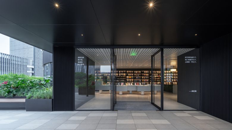
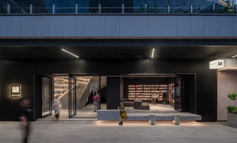
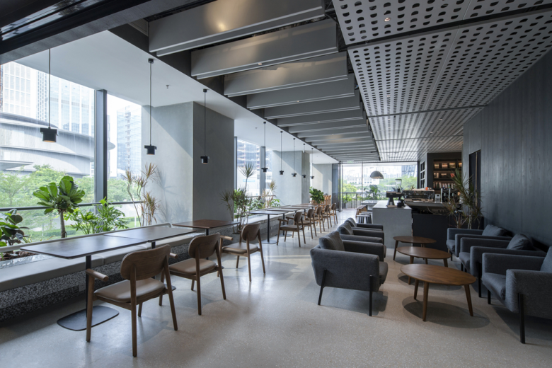
Entrance. The main entrance of the OWSPACE is on the second floor. The exterior wall of the store is made of black corrugated aluminum, which is consistent with the black color of other OWSPACE stores in Hangzhou and Qinhuangdao Aranya, inheriting the brand image. Upon entering the store, you will be greeted by an iconic 16m-long bookshelf display wall, which divides the cafe area on the right, the community living room on the left, and the bookshelf area behind the wall, forming a clear spatial layout. Although the ceiling is not very high, we customized a patterned perforated aluminum ceiling and integrated lighting to create a simple and soft space.
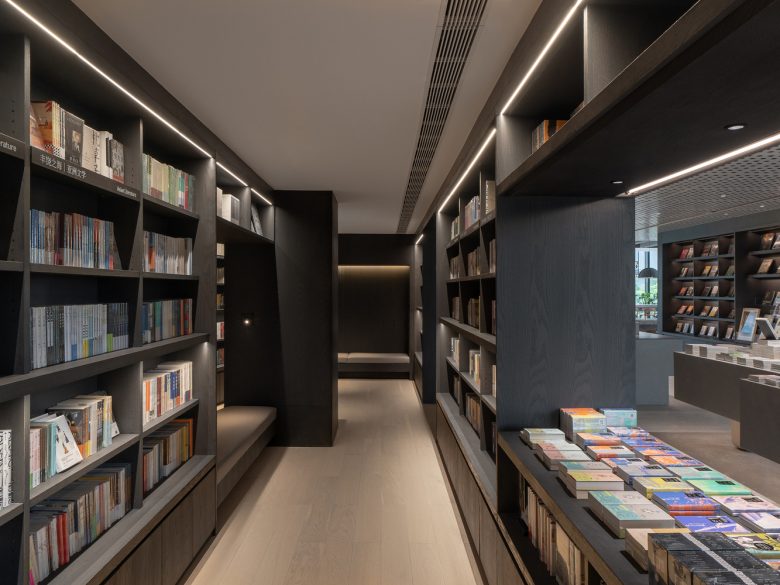
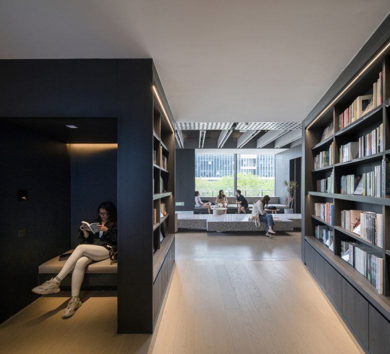
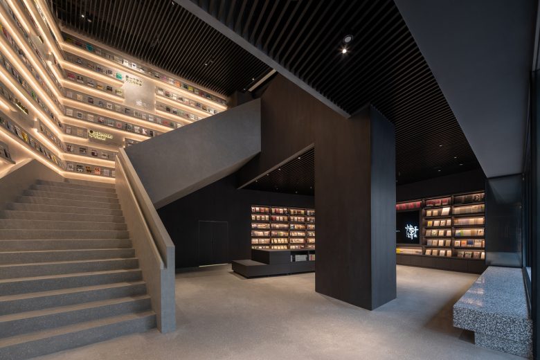
Bookshelf area. The bookshelf area is planned one step away from the main passage so that it can be kept quiet. There are several seats embedded in the area and equipped with wall lamps, making it easy to pick up a book and sit down to read it.
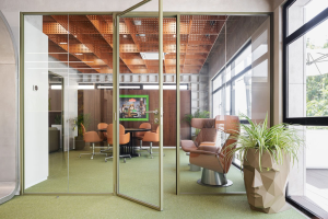
OW Café. The OWSPACE is divided into a community living room where you can chat with friends and a quiet seating area where you can read books or using own computer. The entire south side of the cafe is lined with continuous large glass windows, making the space high and bright. Along the low window sill, green planters, seats, and a bar are designed. If you sit at the bar counter facing outward, you can see The Art Museum right in front of you.
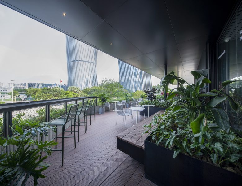
Cafe terrace. The customers can walk out to the terrace area directly from the café. The area is full of greenery, and there is a large eave to provide shade from the sun and rain. A few steps down, there is a bar table where you can enjoy the view of Media’s twin towers in the distance.
Community living room. There is a built-in couch with a depth of 1 meter by the window of the community living room, and in front of it is a long bench that can accommodate 20 people at the same time. Both are large and have abstract designs that are suitable for a variety of uses, making the place ideal for casual visits by neighbors and for a relaxing place to chat and make new friends.
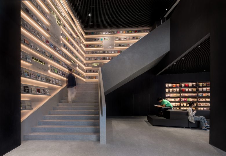
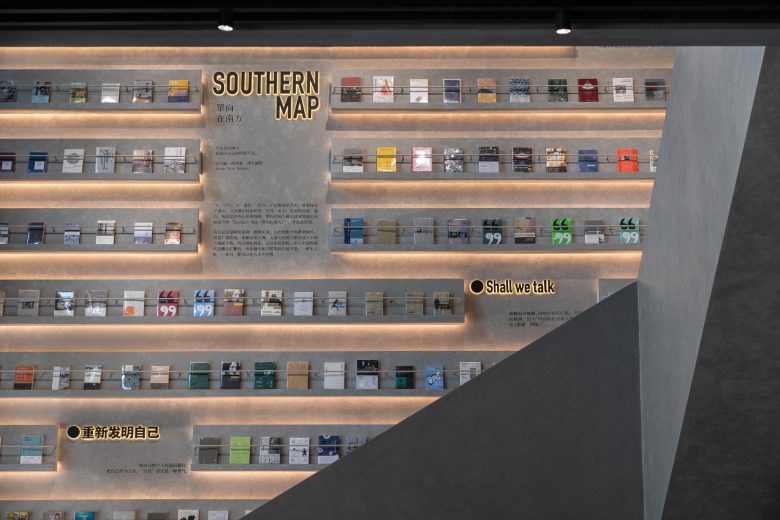
Atrium. The deepest part of the store has an atrium connecting the first and second floors. In this tall space, we designed a highlight of the store using two walls and sculptural stairs. On the wall, we worked with the OWSPACE team to design a literary map called “SOUTHERN MAP”. People who are well-versed in reading know how to grasp the author’s true intentions “between the lines.” This SOUTHERN MAP expresses another world that spreads between the lines.
Ground floor event space. The ground floor is an event space. Usually, movable exhibition stands are used to display books and goods. But by placing chairs, it can be transformed into a lecture hall with a capacity of 100 people. Opening the folding doors facing ALSO square makes the space even larger. The design deliberately blurs the boundaries, allowing vitality to transcend the space and overflow to the.
Architects: 11ARCHITECTURE
Lead Architects: Jing XIE, FUJIMORI Ryo, Minggang LUO
Design Team: Zihao Zhou, Yajuan Yang, Shixin Fu, Yaxiang Li
Photographs: Siming WU, Chao Zhang
