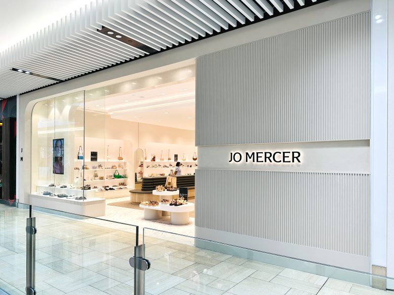
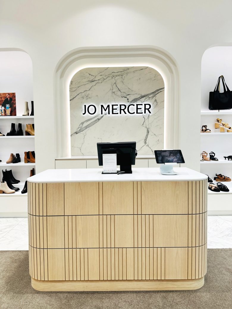
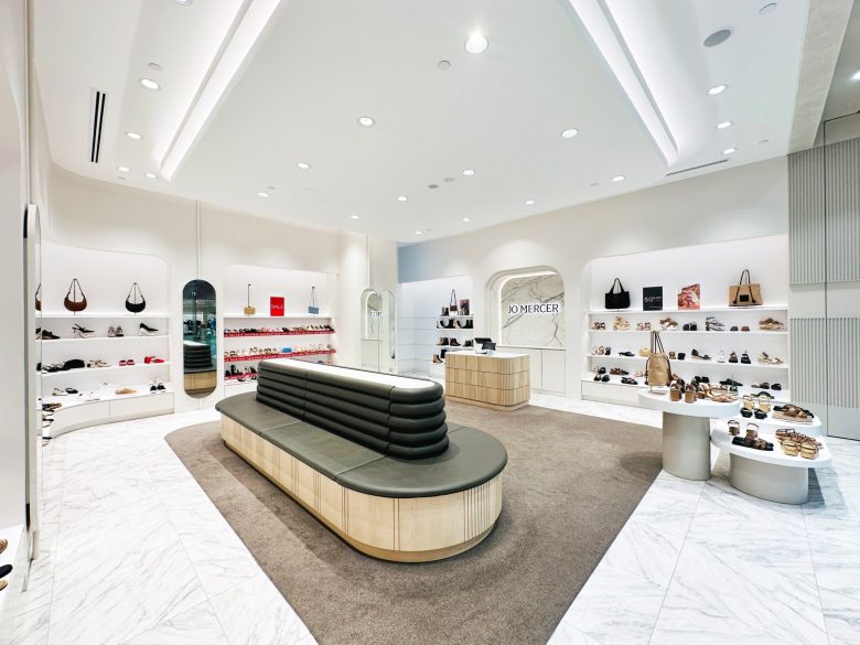
Jo Mercer’s new store at Melbourne Emporium breathes fresh life into its brand with a redesigned identity. Our role in this brand update was to seamlessly integrate the new brand elements into the existing store concept, maintaining a timeless design.
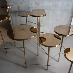
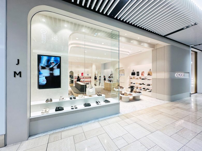
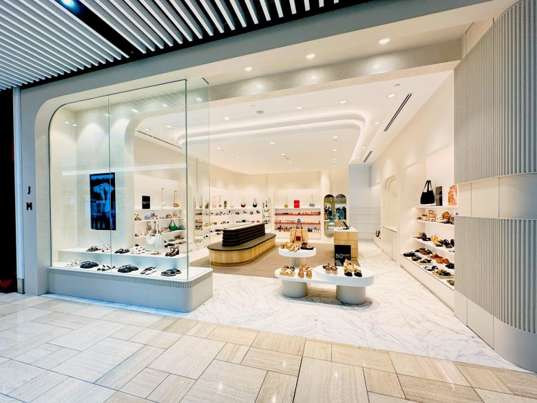
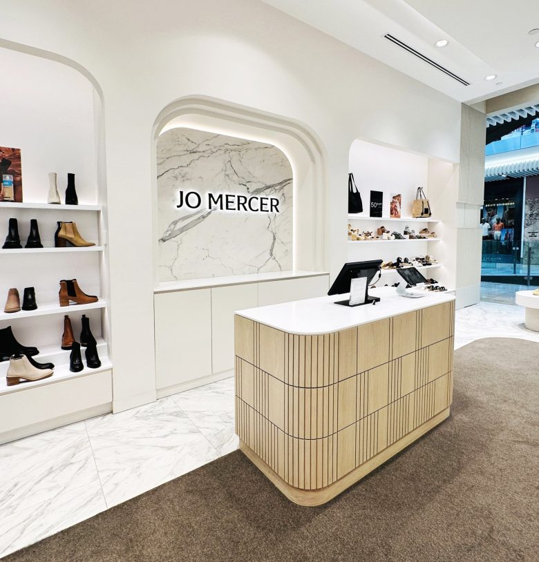
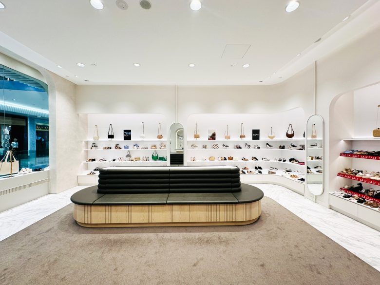
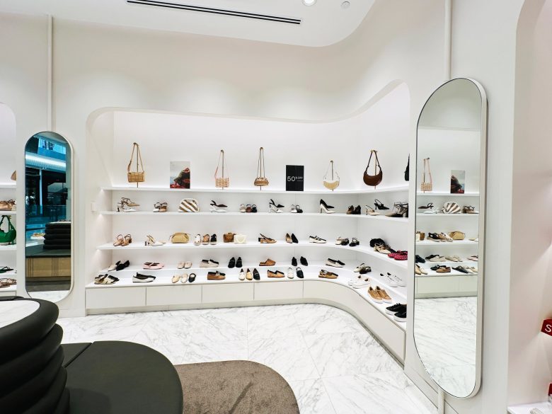
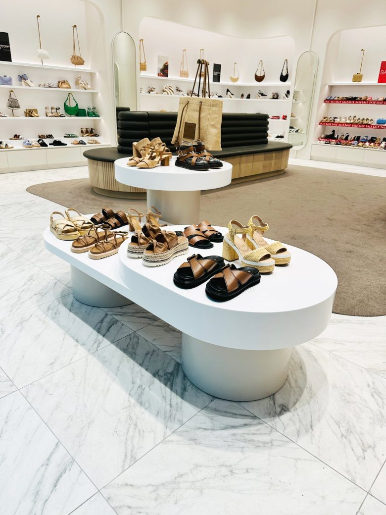
To achieve this, we focused on retaining the store’s core design features while incorporating new brand guidelines for colours and graphic elements. The shopfront and display areas now feature three-dimensional cladding with linear brand patterns, creating a cohesive and recognizable look. Inside, a geometric display table and soft neutral tones enhance the product showcases, complemented by meticulously designed joinery details and subtle textures that embody the essence of the refreshed brand.
Shopfit by https://kruegerprojects.com.au/
Interior Design by https://www.studiograyscale.com.au/

Add to collection
