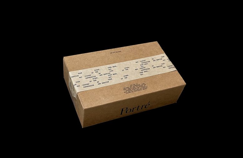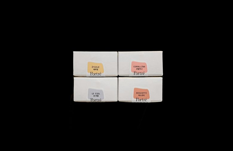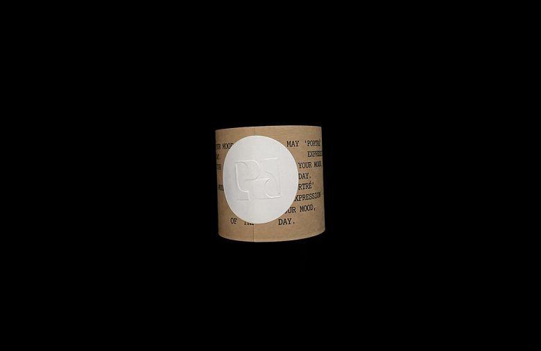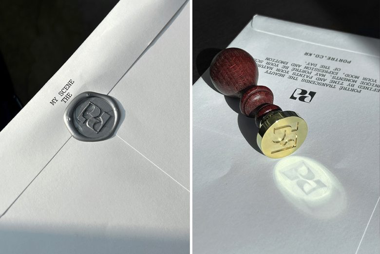

Portré’s Packaging: A Quirky Canvas for Your Beauty Story
Hey there, packaging design lovers! In this Curator’s Insight, let’s peek into the world of Portré, a beauty brand with a seriously cool twist on nail polish.
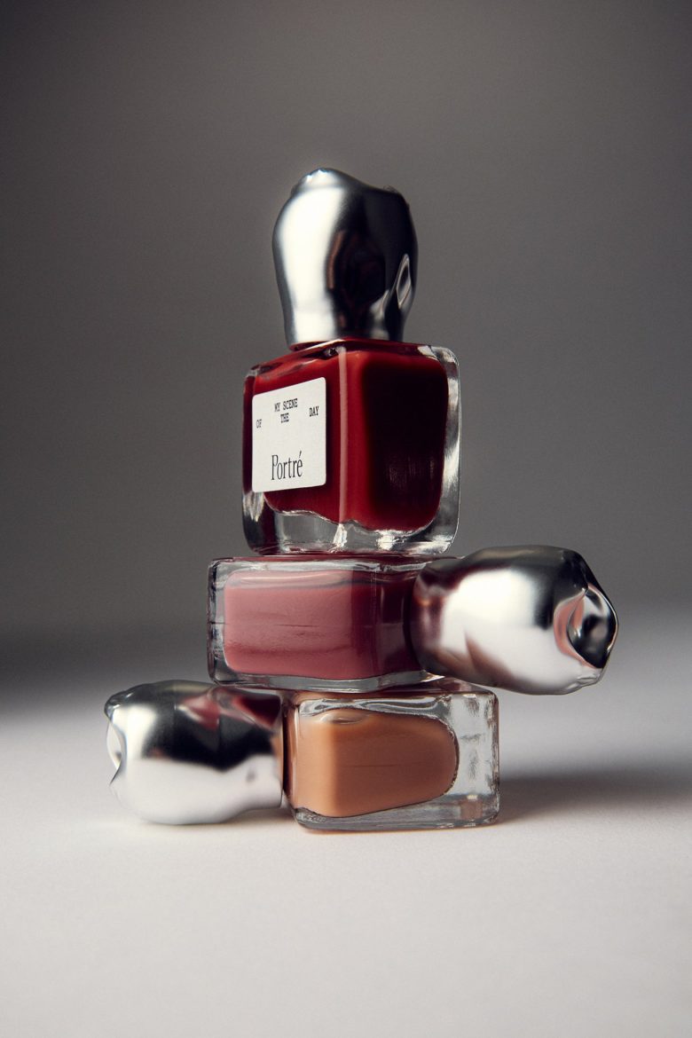
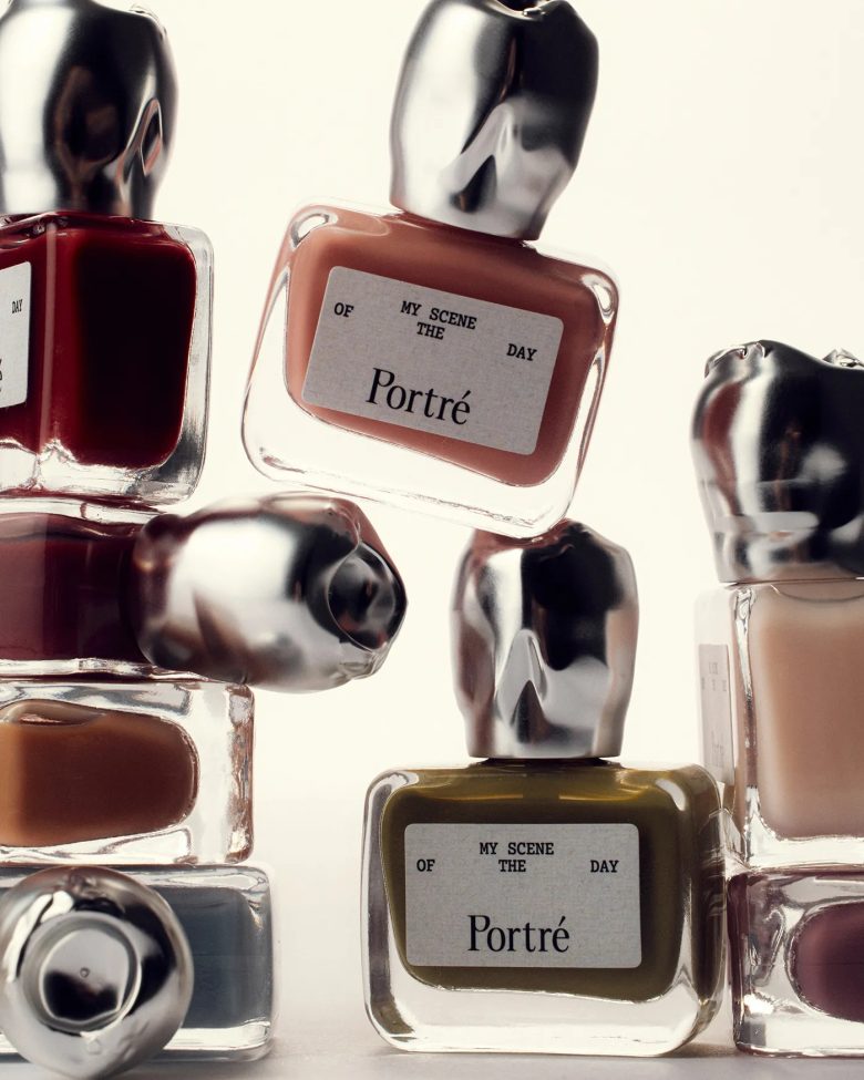
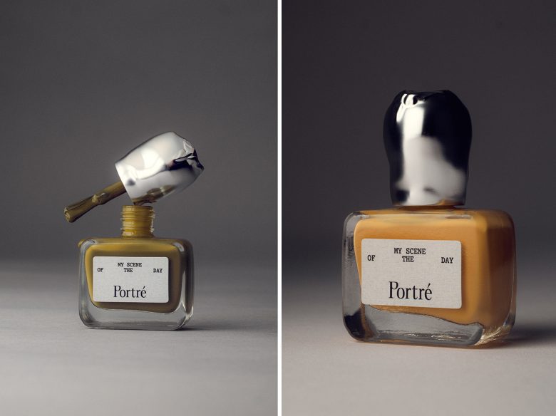
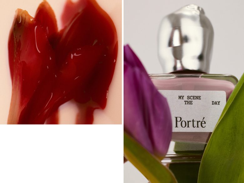
Forget the usual sleek bottles – Portré’s all about unique metal-like caps, each one shaped in a way that lets your imagination run wild.
Here’s the thing that makes them stand out: these caps are like tiny, irregular works of art. They don’t scream “flower” or “heart” – they’re more like abstract sculptures waiting to be interpreted. It’s kind of like seeing clouds and finding all sorts of shapes in them.
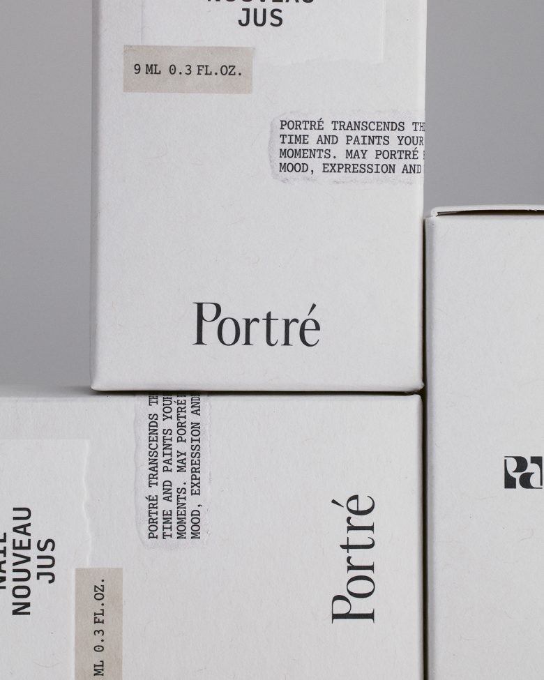
Now, this might sound a little strange, but here’s the genius part: it totally fits with Portré’s message. They believe that beauty, just like these caps, shouldn’t be defined by one standard. It’s all about what makes YOU feel beautiful, your own unique “scene of the day.”
It’s playful, it’s personal, and it lets the product itself become a blank canvas for your own story. Imagine picking a shade that makes you feel fierce and pairing it with a cap that reminds you of a shooting star – that’s Portré’s magic!
Here’s what I find super creative:
The caps are a conversation starter! People will definitely be curious about what your choice means to you.
It’s a collector’s dream! Each cap is like a little treasure, adding a personal touch to your beauty stash.
It’s a celebration of individuality! It throws out the idea of a “perfect” nail polish and lets you embrace what makes you unique.
Portré’s packaging is a breath of fresh air. It’s a playful reminder that beauty is what you make it, and that’s something we can all get behind!
Agency: TRIANGLE-STUDIO
Art Direction: Kisung Jang
Design: Eungi Min, Dajeong Lee
Assistant: Jihyeon Choi
Visual Directing: ES CONSULTANCY
Photo: KIM JAE HOON (AGENCY TEO)
