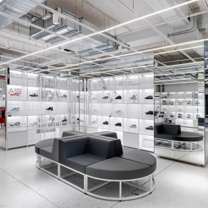

“The Shell” is born from a blend of diverse creative approaches, functional necessities, and spatial dynamics. It embodies Highsnobiety’s refined vision as more than just a traditional retail space but a dynamic platform for layered and ever-changing storytelling.
In essence, The Shell is a spatial narrative, transcending a conventional shop fit. It articulates tales of honesty, realness, and Berlin roughness, reflecting Highsnobiety’s contemporary take on a flagship. The environment is vibrant, dynamic, and full of contrasts, constantly evolving to showcase state-of-the-art brand installations. Beyond pure display and sales, The Shell aims to interact and tell stories.
Our holistic interior design approach unfolds in four layers. The first layer preserves the rough surface of the building’s skeleton, adorned with detailed artistic finishes. The second layer comprises permanent installations integrated into the first, showcasing HS core collections and accessories. The third layer introduces artistic spatial interventions serving as functional retail furniture for various scenarios, defining Highsnobiety Space’s distinctive visual aesthetic and language, blending with a more generic “under construction” layer. The fourth layer aligns with the third but inherits a visual wild card, providing brand partnerships the freedom to install visually striking temporary setups within the Highsnobiety Cosmos.
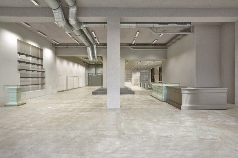
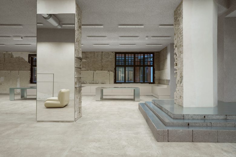
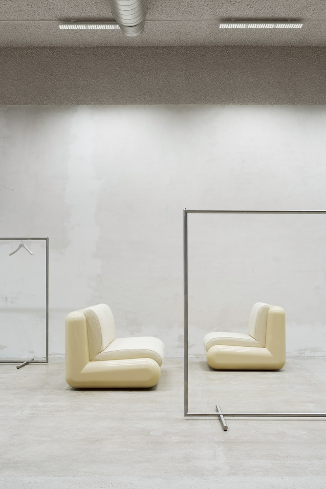
The contrast between old and new luxury is reflected in the space by exploring design themes of the opposites, such as roughness vs sleekness and heritage vs modernity. The interior design repurposes and re-imagines industrial material for the contemporary and luxury context while preserving the history of the space by keeping existing architectural elements intact.
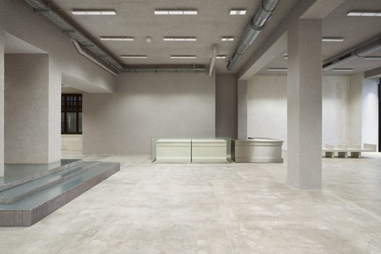
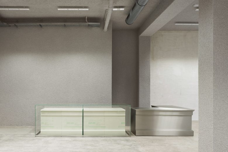
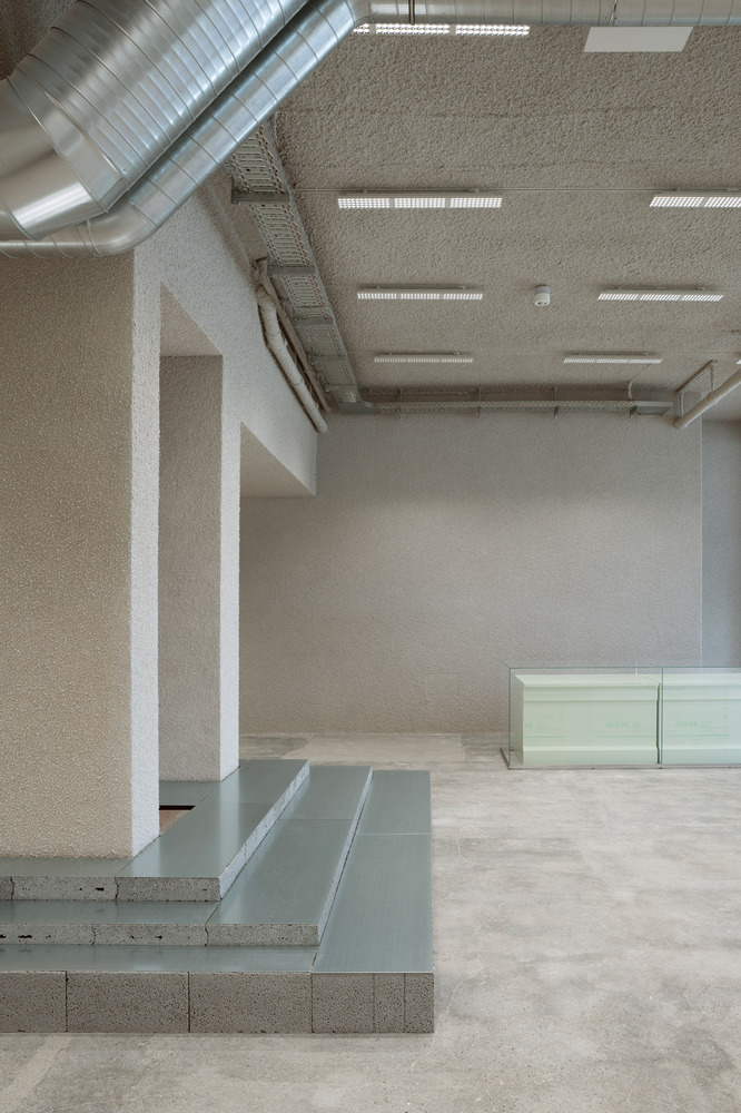
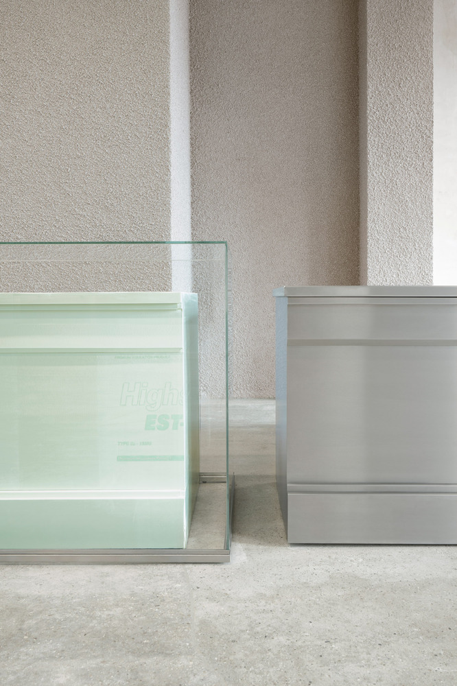
The furniture pieces in the space follow the same concept, blending classical aesthetics & contemporary materials, resulting in captivating architectural pieces. For example, the classical column moldings are applied to industrial styrofoam, creating an unexpected contrast and tension between form and material. Moreover, the design approach preserved the heritage of the existing architecture to pay homage to Berlin in the floors, walls, and raw brick columns.
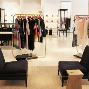
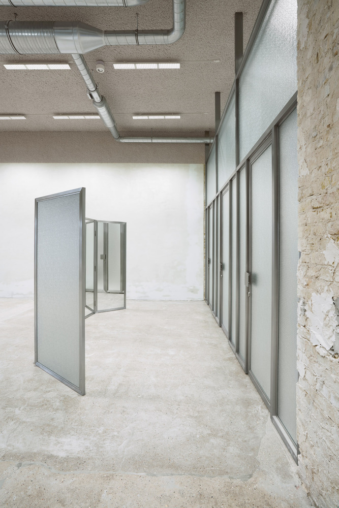
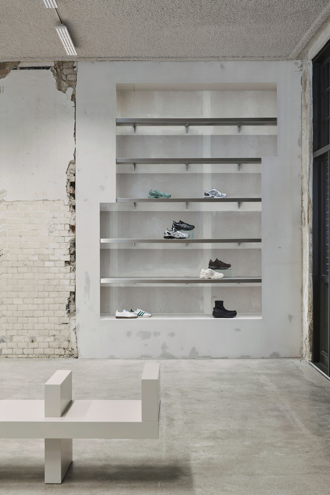
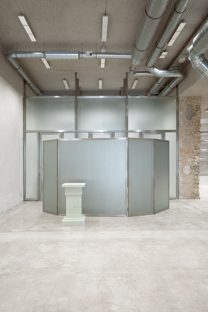
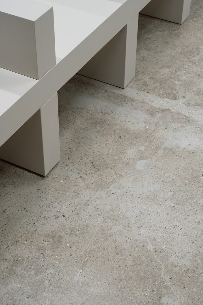
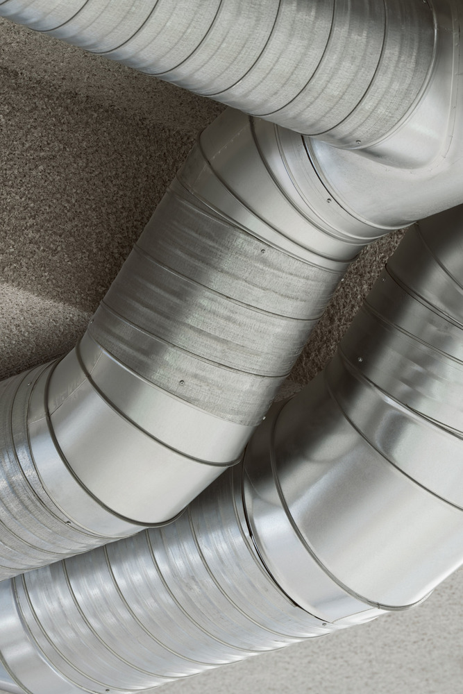
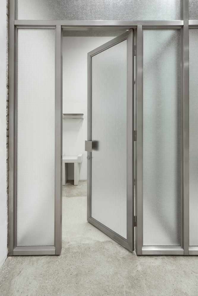
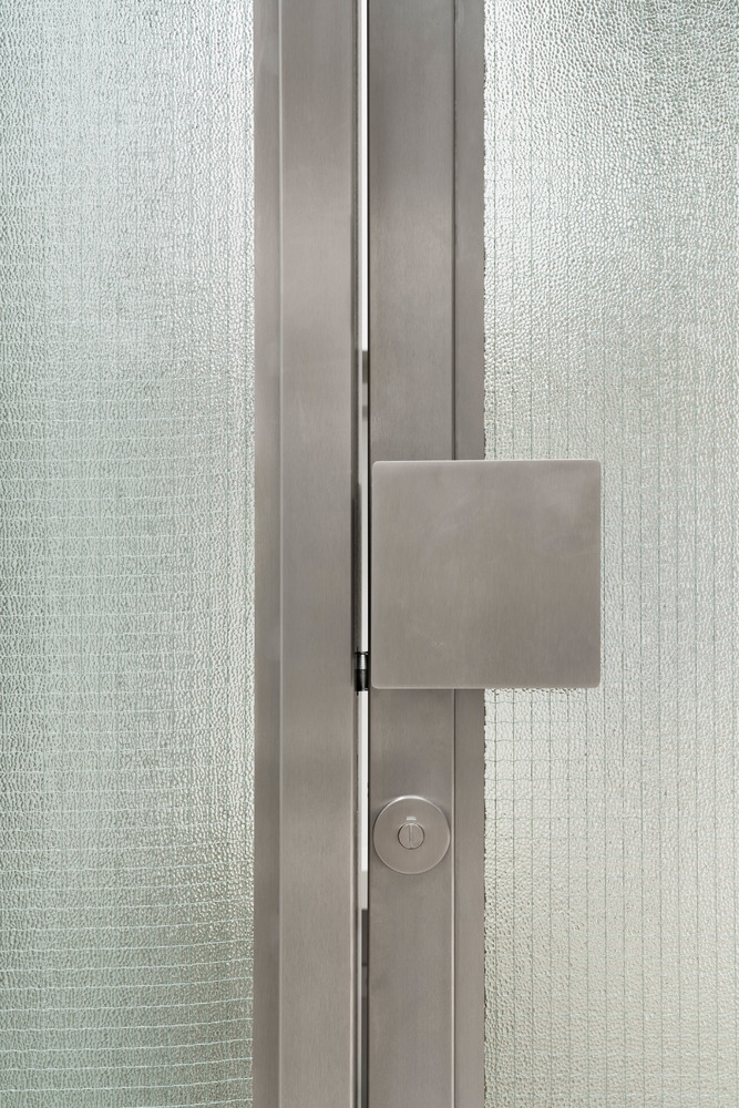
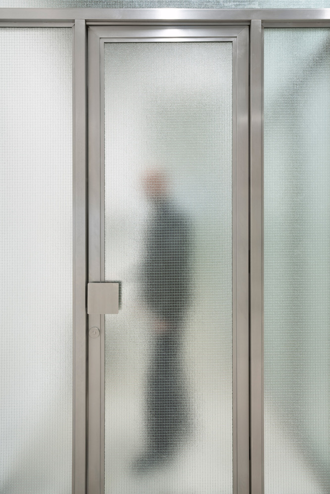
The result is a captivating atmosphere with a sanded concrete floor, warm grey sprayed ceiling and rough columns and walls that tell the story of the building. These are contrasted by sleek interventions such as stainless steel shelves embedded in the wall and metal shelves recessed into the wall. An ERCO lighting concept creates the perfect atmosphere, and the checkout interprets the building’s ornamentation with a juxtaposition of contemporary materials – wired glass, polystyrene and stainless steel. a paravent made of stainless steel, wired glass and mirrors, conceals changing rooms and offers a touch of voyeurism with wired glass partitions.
Architects: VAUST Studio
Lead Architects: Joern Scheipers, Jana Bolten
Photographs: Clemens Poloczek





Add to collection

