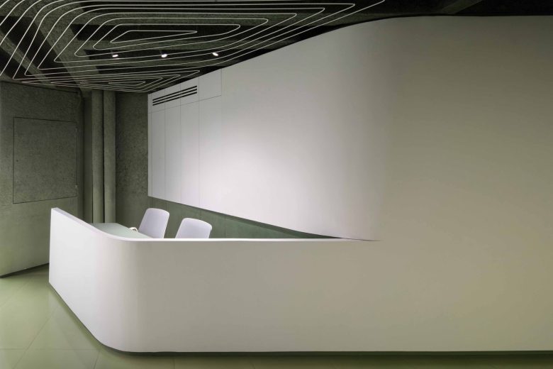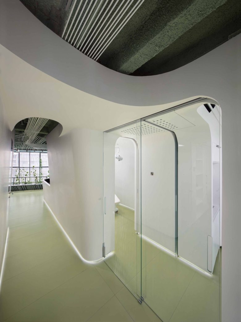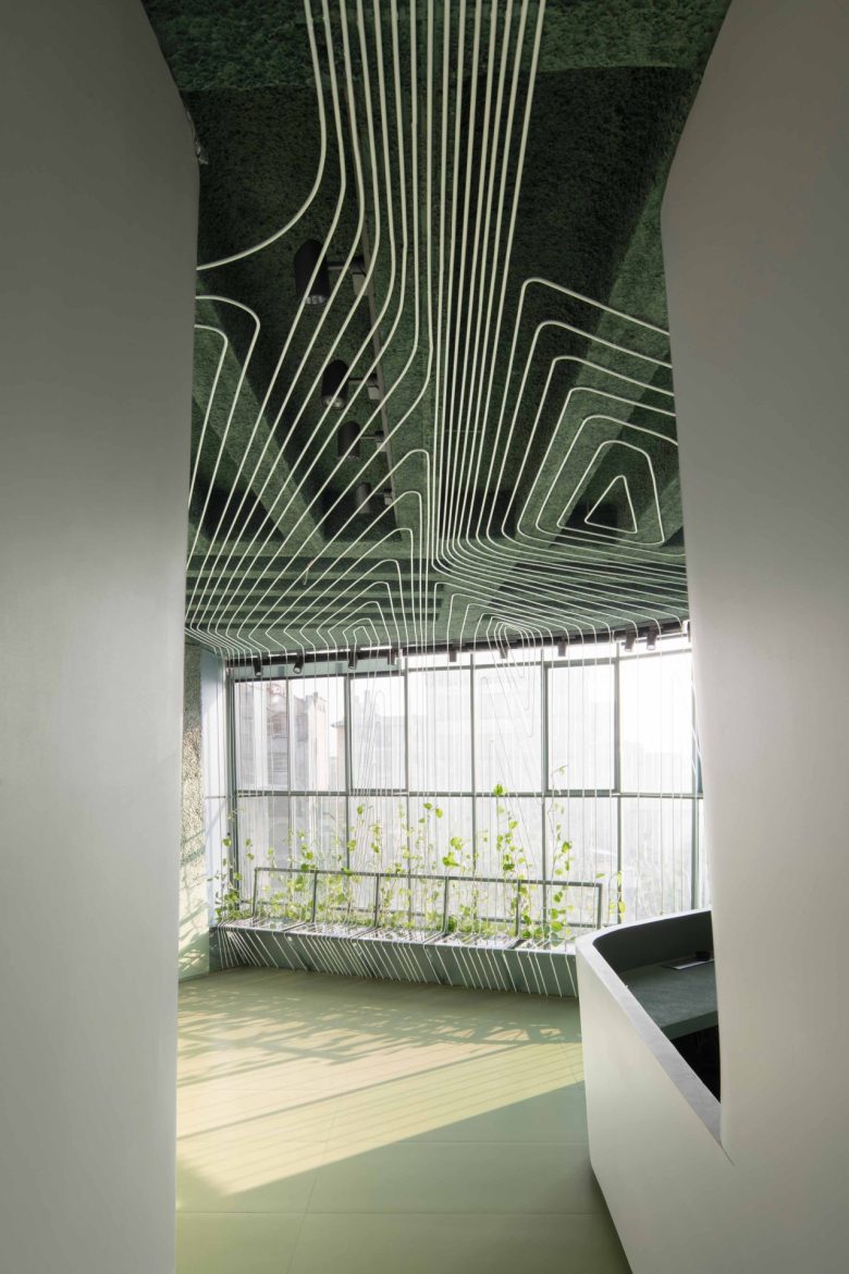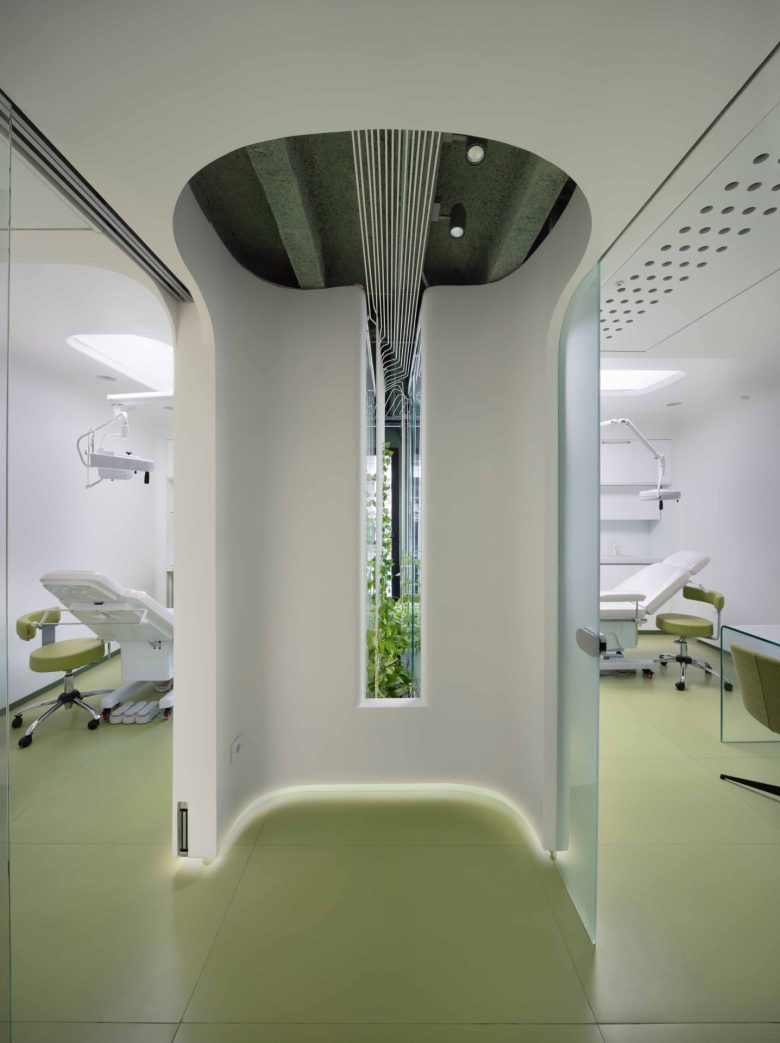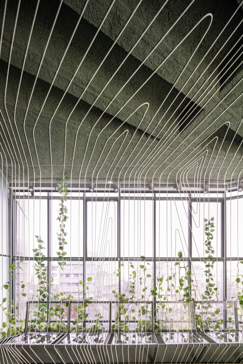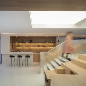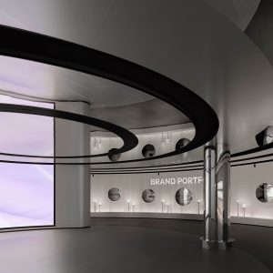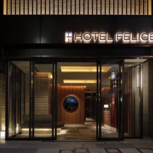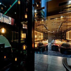
The interior design of the Parkway office project with a small area 85 square meters and an amorphous geometry was referred to us while the client was worried about meeting his quantitative and qualitative needs, looking for maximum use of the space. Apart from the small scale of the space and its irregular plan, another challenge of the project was the wide windows on the south side facing the Modares highway, which on the one hand was an opportunity to have a wide view of the city and supply natural light, and on the other hand, dazzling light and penetrating heat.
In the initial step, the space is cleared of any additional items, as much as possible. False ceilings are also dismantled due to the low height of the space. Afterward, the design of the project begins with spatial, functional, and visual separation into two parts: waiting and treatment.
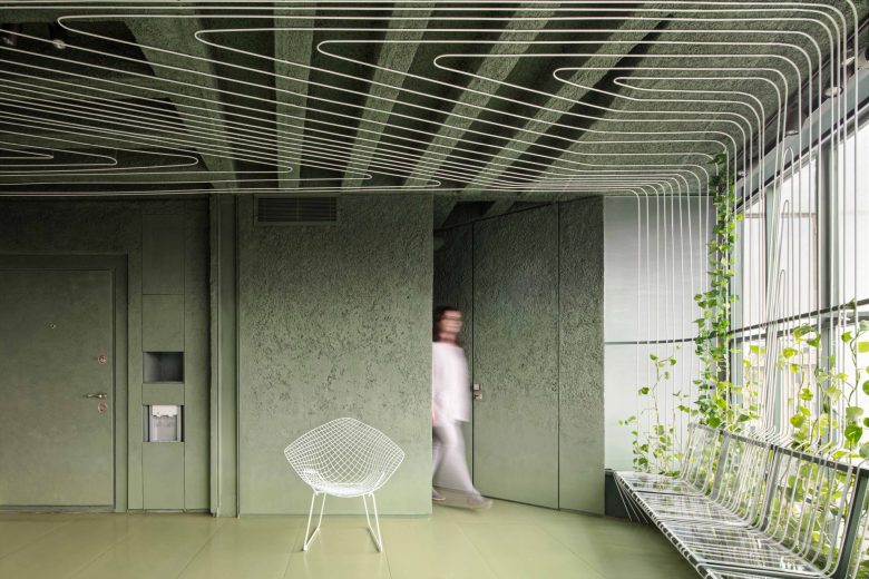
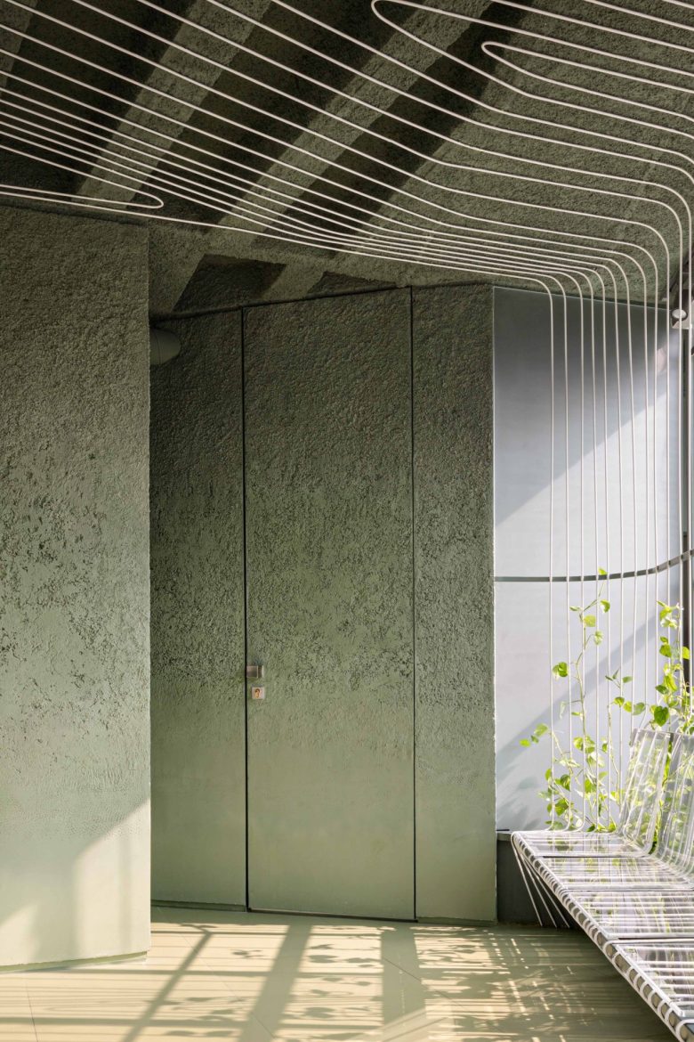
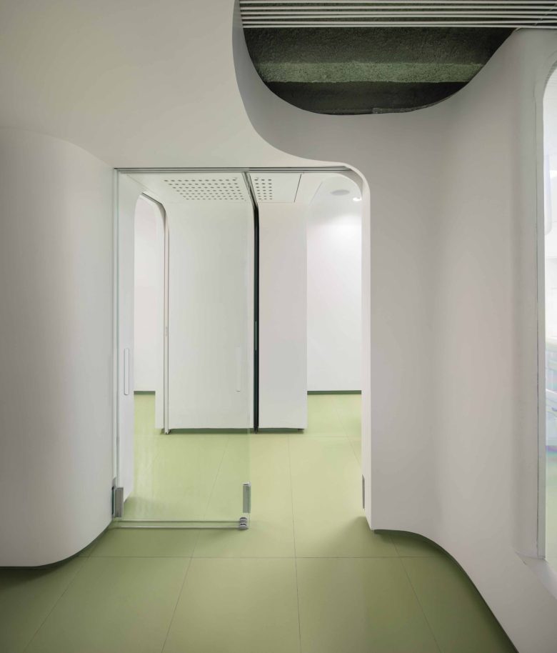
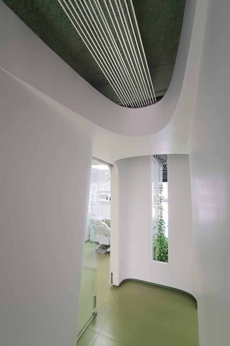
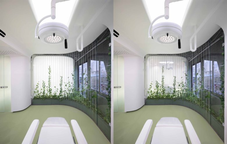
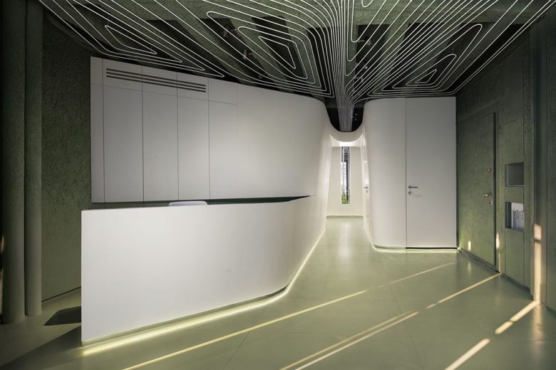
The contrast between the rough green and soft white creates a unique duality. The sculptural volume, which is white and fluid, is situated in a green and textured space that responds to the functional relationships of the plan’s irregular geometry. The form also reduces the initial sense of smallness when viewed by the Visitors. (When sharp lines are removed from corners and replaced with rounded corners, it creates ambiguity in understanding the boundaries of space).
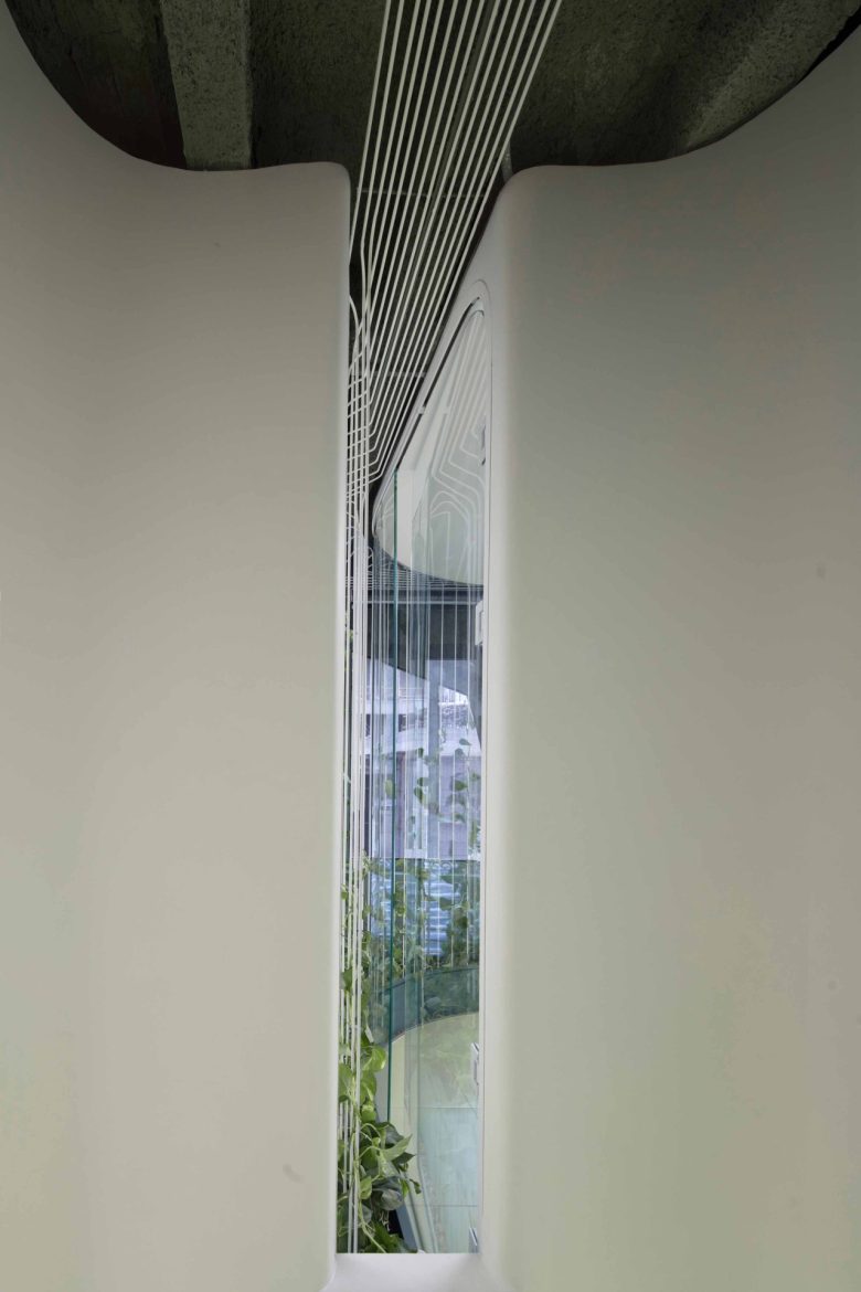
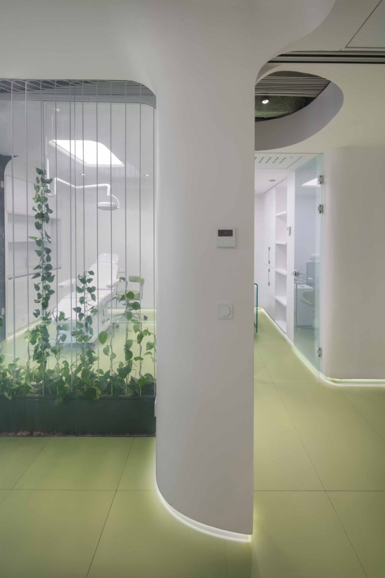
In the next stage, the public space penetrates into the treatment space, forming a functional visual axis that guides the audience to the rooms. There is a minimal gap which allows light and outside view to enter the space at the end of the path. A hole that, in addition to separating the treatment rooms, allows the audience’s eye to follow the space from the border of the south facade to the edge of the north facade.
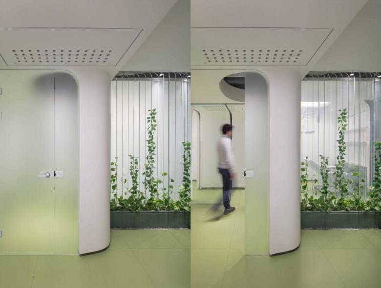
A curtain woven from delicate rods with climbing plants, in addition to emphasizing the direction of movement path, tries to create a gentle shade for the dazzling light of the windows, by growing these plants on this flexible network they give a lively spirit to the space. This grid takes shape in front of the south windows with the visitor’s seat, stretches in front of the windows, crawls on the ceiling, penetrates the gap at the end of the project, and creates a green border between the two treatment rooms (Using smart glass technology, it is possible to privatize two rooms when necessary) .
The separation of small spaces in the implementation of plans and executive details, the use of the bulky duct split installation system, and the provision of the installation infrastructure required for the treatment space were some of the executive challenges for changing the use of residential space and improving the quality of the poorly constructed building, which definitely would not be possible without a patient and enthusiastic employer.
