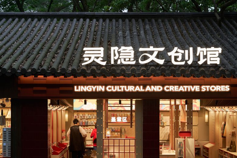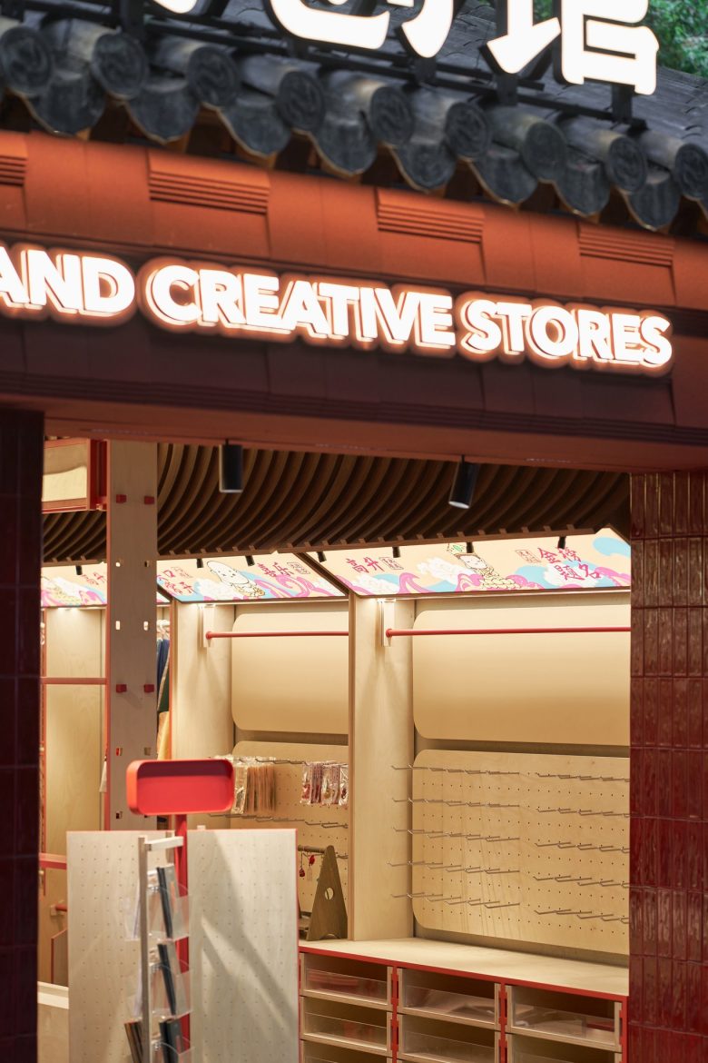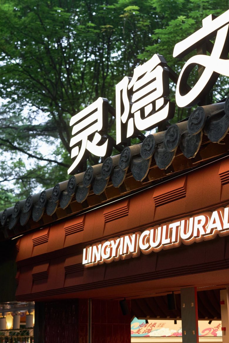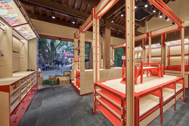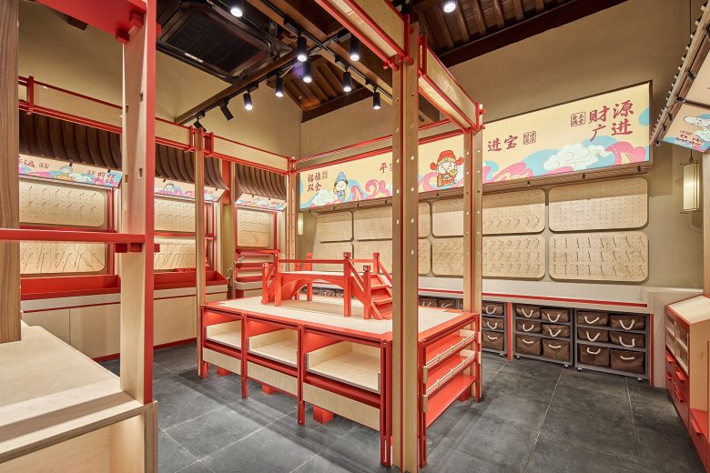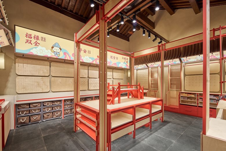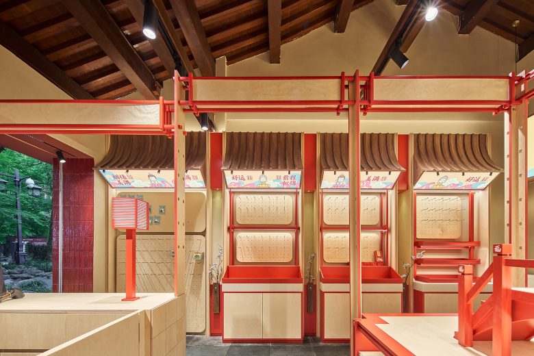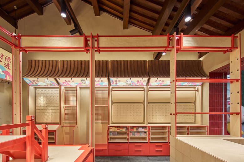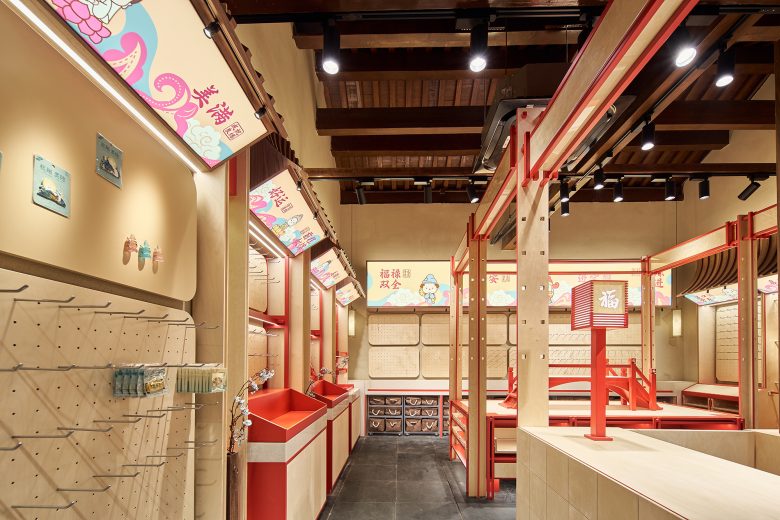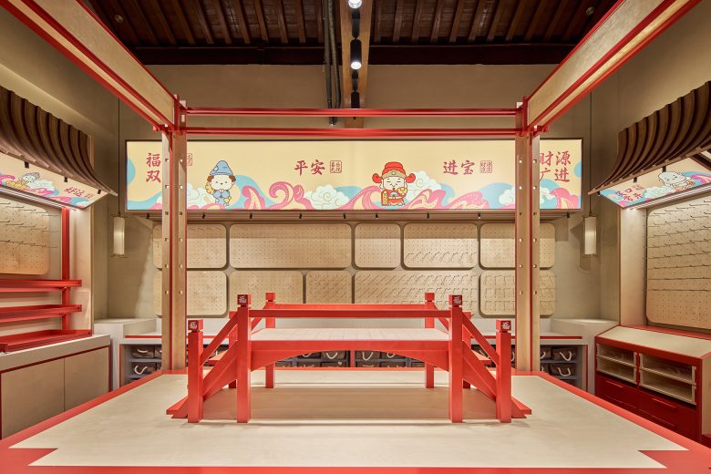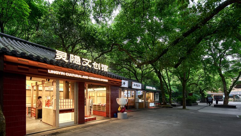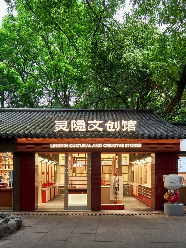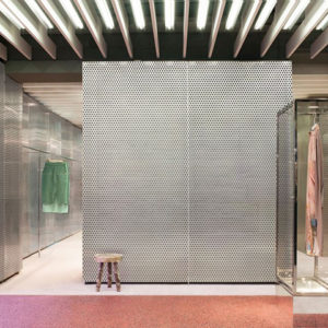
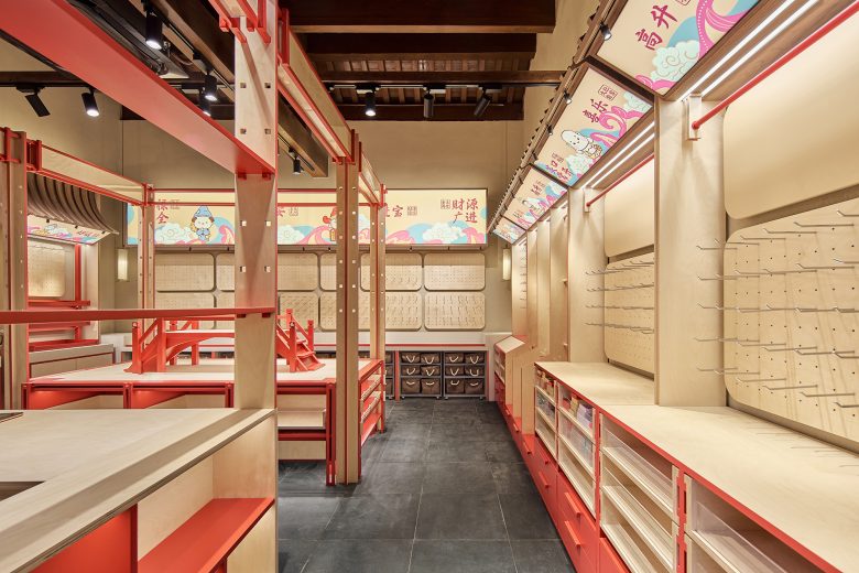
At the initial stage of design, upon seeing the original store, we were moved by the lush branches and interplay of light and shadow. We recalled that a distinctive feature of Chinese architecture is its organized order, emphasizing central axis symmetry and the spatial artistry of circular heavens and square earth. Traditional Chinese architectural space layout excels in axial symmetry. Thus, in this design, our layout follows the principle of central axis symmetry, utilizing a rectangular movement flow to perfect the spatial arrangement.
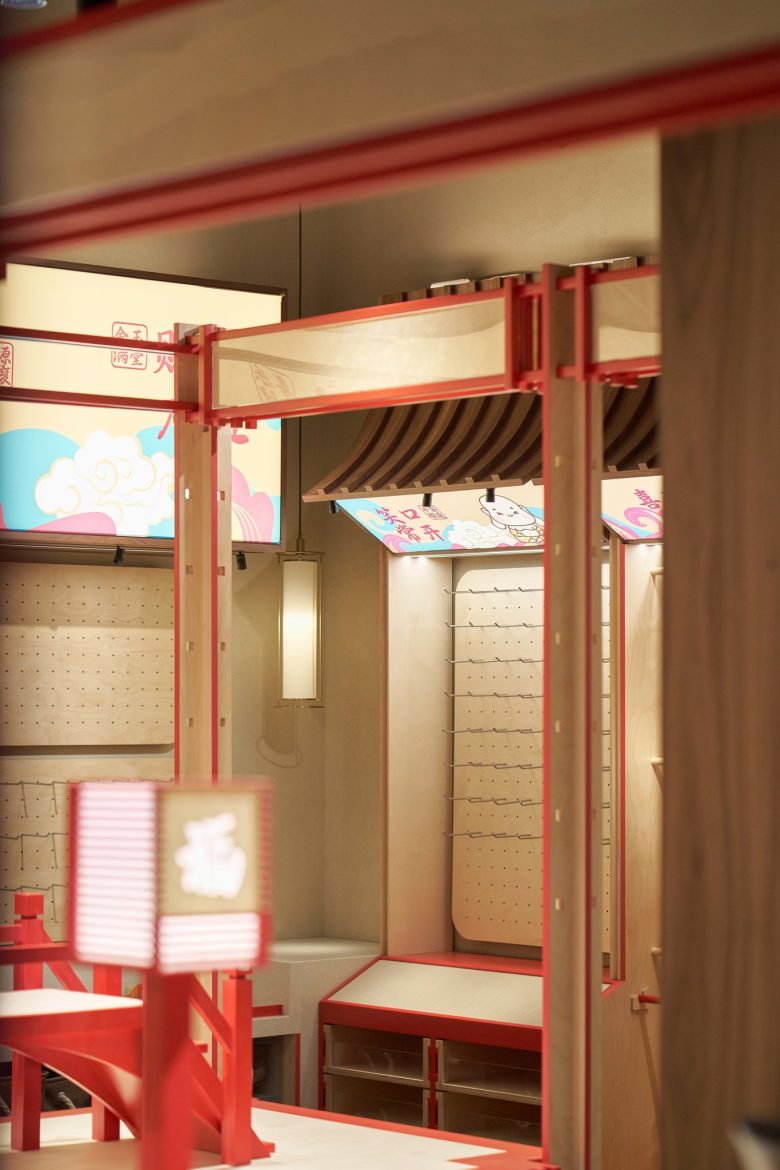
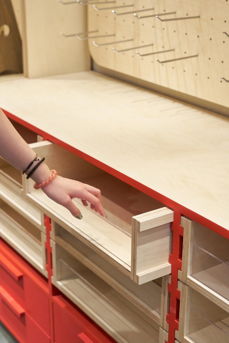
Wooden structures are the mainstream in traditional Chinese architecture, composed of main components such as columns, beams, and purlins. The joints between these components are connected with mortise and tenon, forming a flexible framework. Therefore, in our design, we utilized this concept to create a framework structure indoors, which serves the purpose of partitioning while also connecting each area. In our design, we also considered how to balance sales and storage, and from the early stages, we decided to use red as the main color theme for the store, aiming to design a cultural and creative shop that breaks conventional norms.
Design Company: Ondo Studio (https://ondostudio.cn/)
Lead Designers: Ruonan Cheng, Bingyu Wang
Detailed Design: Xinxin Hong
Photography: SZJ
