Exploring the tension between order and disorder
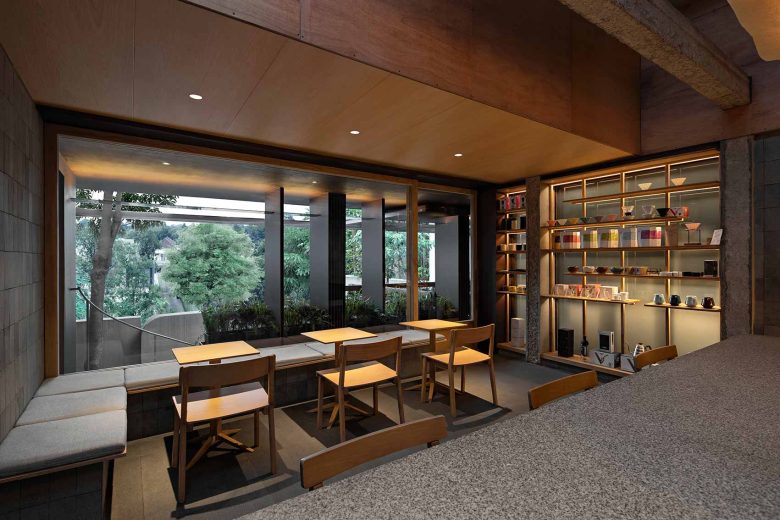
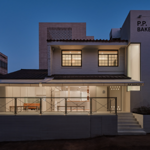
When Kurasu, the specialty coffee brand from Kyoto, entered Indonesia, its first home was decided to be a single 7×5 meter room on the second floor of a former house along the leafy street of Tulodong Bawah in South Jakarta. It is an interesting challenge designing a coffee shop in such a confined space. A coffee shop is not simply a transactional commercial space. At its best, a coffee shop is a public space, especially in cities as hectic and as dense as Jakarta. People seek in cafés shelter from the busy town, a place to catch up with friends, work, study, or just to be alone for a bit. While it is not difficult to cram all of those functions in 35 sq. meters, it is difficult to make the space comfortable.
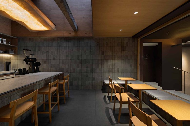
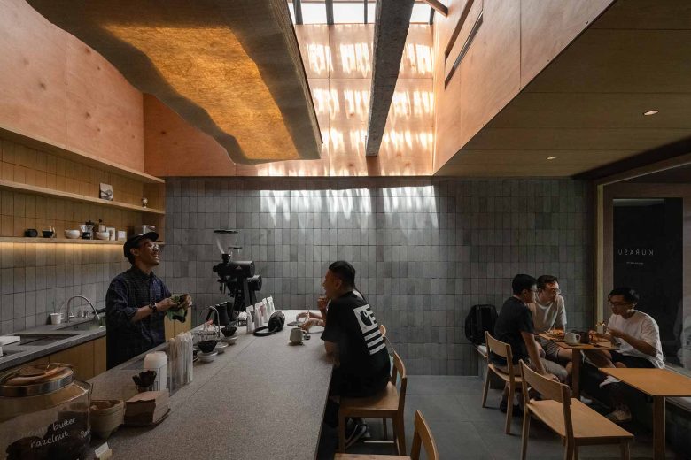
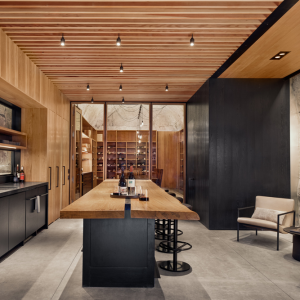
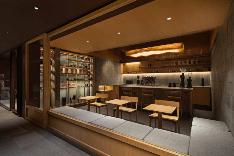
We realized early on that to make the space work we must seek the atmosphere of a home, where despite people being in close proximity, there is no discomfort. This concept was further supported by a signature piece of furniture used in the original Kyoto café which we decided to adopt – a large island bar accommodating both seating and manual brew coffee preparation. Its purpose: to encourage discussion with the barista and spark curiosity about coffee in the costumer.
This became the core of our architectural arrangement and thanks to the size of the space, it created the feeling of casually hanging out in someone‘s kitchen.
However cozy though, when particularly full, such a space can start feeling claustrophobic. Since we could not expand the space laterally we opted to do so vertically. We took advantage of being on the top floor and added a skylight. Initially conceived to be just a narrow light shaft, things changed when we uncovered the existing roof structure and the true height of the space during the demolition. The client fell in love with the newly discovered propotions of the space and decided to keep it as is.
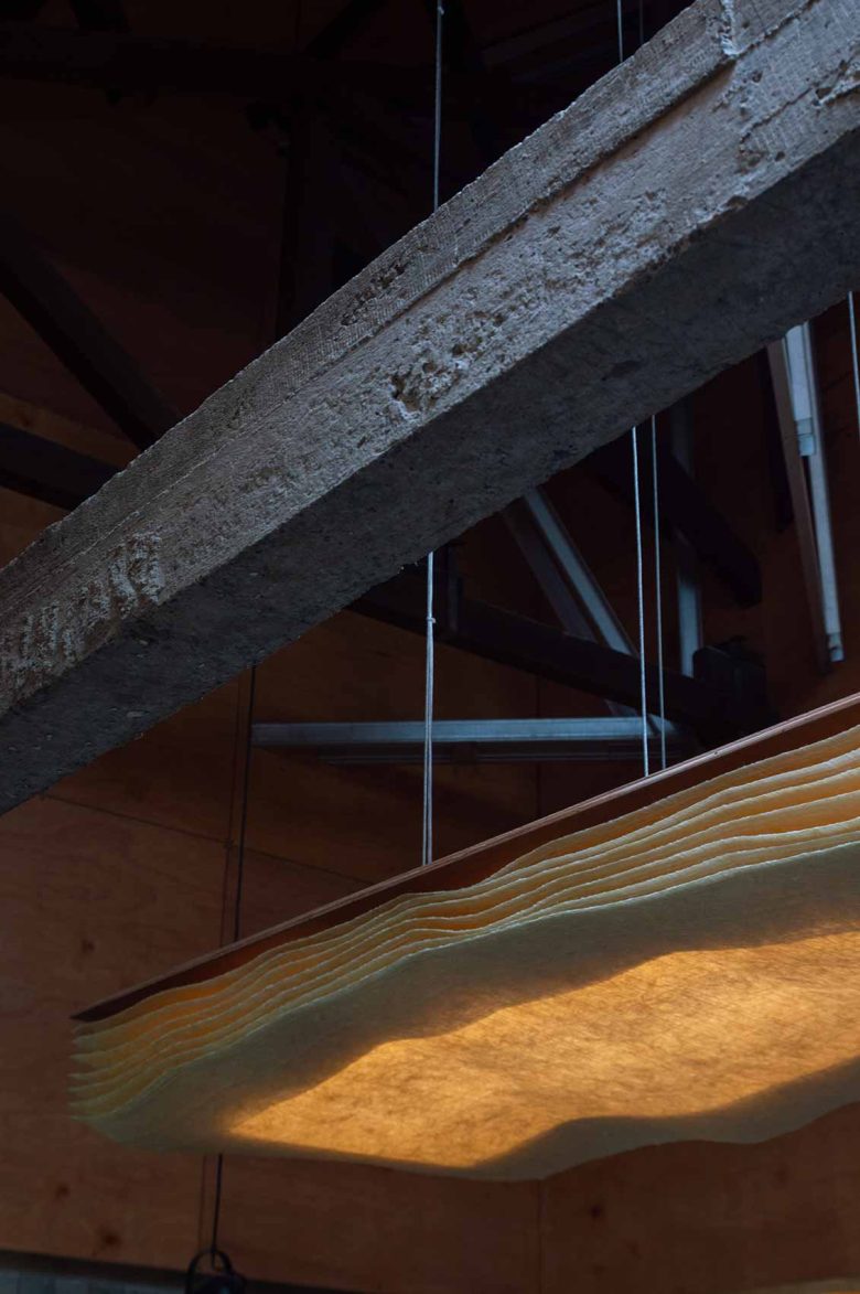
The “chaos” of the existing old wood structure and the contemporary steel reinforcement added necessary flavor in our otherwise orderly and neat design. Mid construction we decided to change our concept and instead of aiming for complete order and alignment we opted to explore the tension between the neatness of our intervention and the haphazardness of the existing condition. It gave us the idea that a comfortable home is the disorder of life moderated by the orderly frame of architecture.
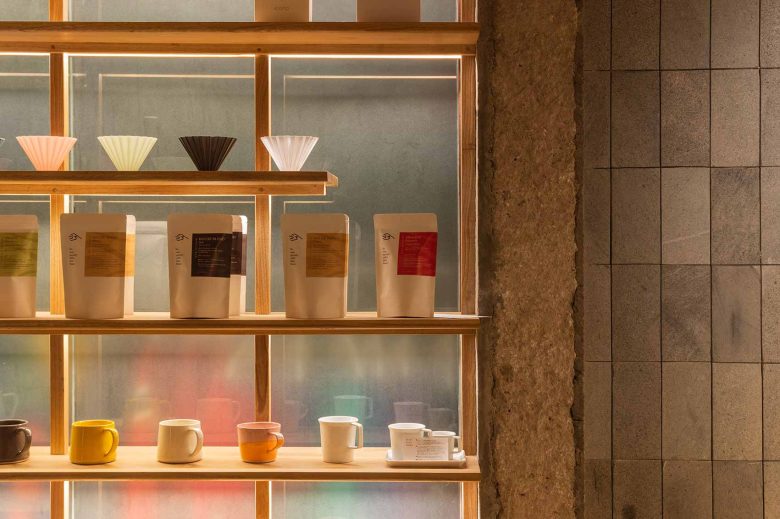
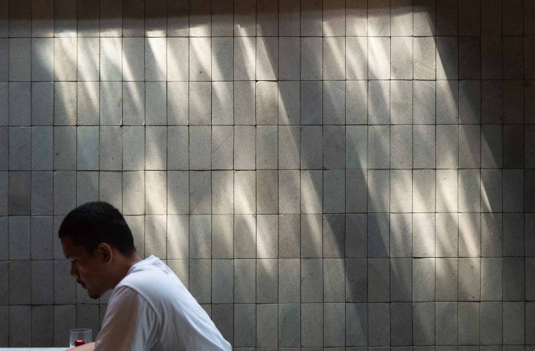
Everything which fell in the zone below 2.4 meters (where humans dwell) was supposed to be orderly and logical, balancing the randomness of human possessions and the unpredictable positions of people. Here, we introduced a 20×10 centimeter rectangular grid which all materials had to obey. While above 2.4 meters (beyond the human scale) we opted for chance meetings between old and new materials, exposed screws and the imperfections of the existing structure.
Although we were working with a single room, material-wise we wanted to give the space the feeling of weight, substance and texture. To evoke the feeling of security which we associate with architecture of solid wood and stone, we used granite, local andesite stone, sungkai and meranti plywood. Serving as the main light source and tying everything together was a washi paper lamp made of local banana trees. This design element, developed together with a Japanese-Indonesian craftsmen team from Bali, aimed to express the Japanese identity of Kurasu while acknowledging the locality.
This project was a lesson on how striving for complete coherence and perfection in a space is not necessarily what brings about the best result, and that while perfection requires effort to be achieved, imperfection requires control and sensitivity to bring about beauty.
