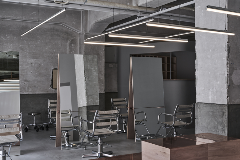
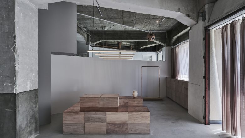
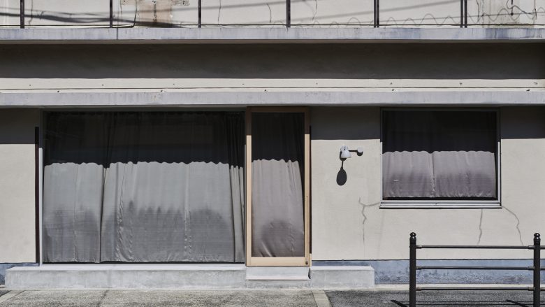
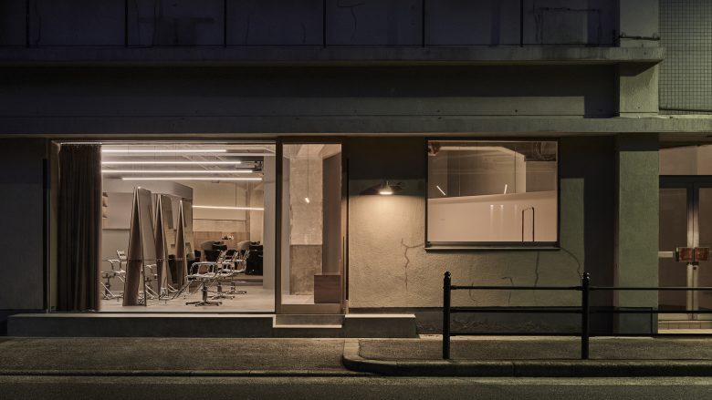
This project is the interior design of a hair salon renovated from the first floor of a Showa-era retro building near Noda Station in Osaka. The existing triangular floor plan, high ceilings, reinforced concrete columns, and beams with haunches had aged beautifully over time. Some might call it deterioration, while others may describe it as beauty cultivated by time. We shared this intrinsic beauty with the client and planned the space with minimal intervention to preserve this beautiful structure as much as possible.
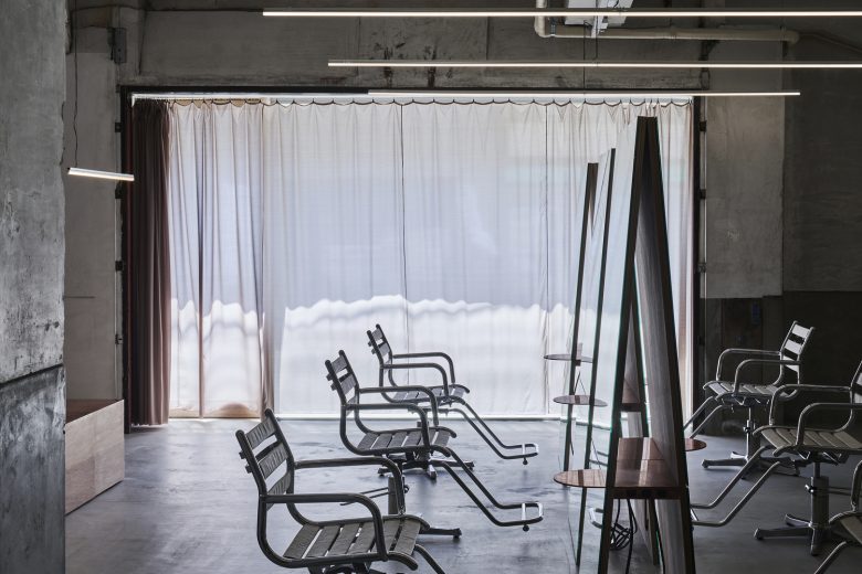
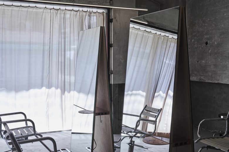
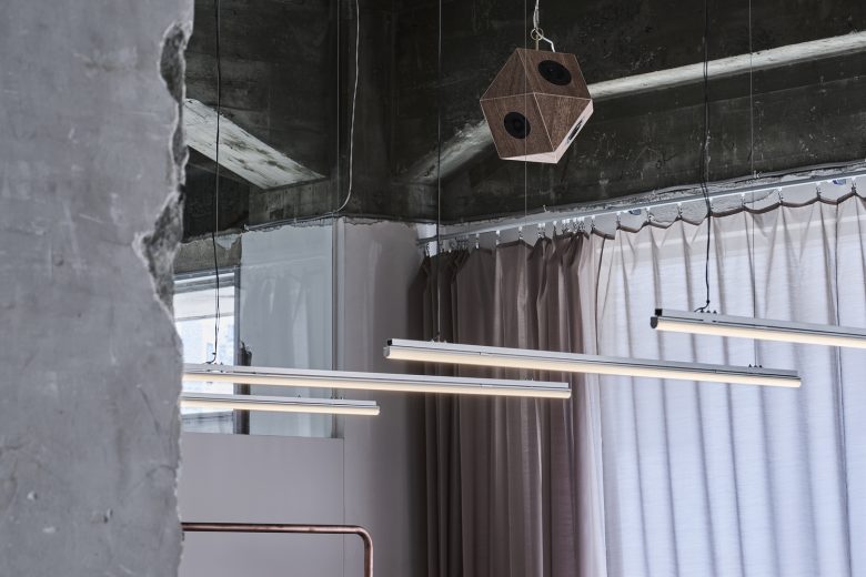
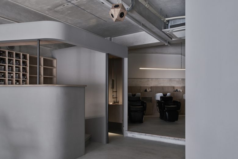
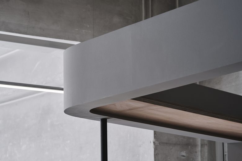
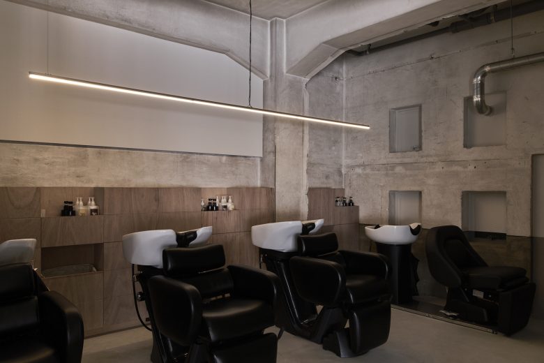
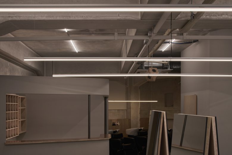
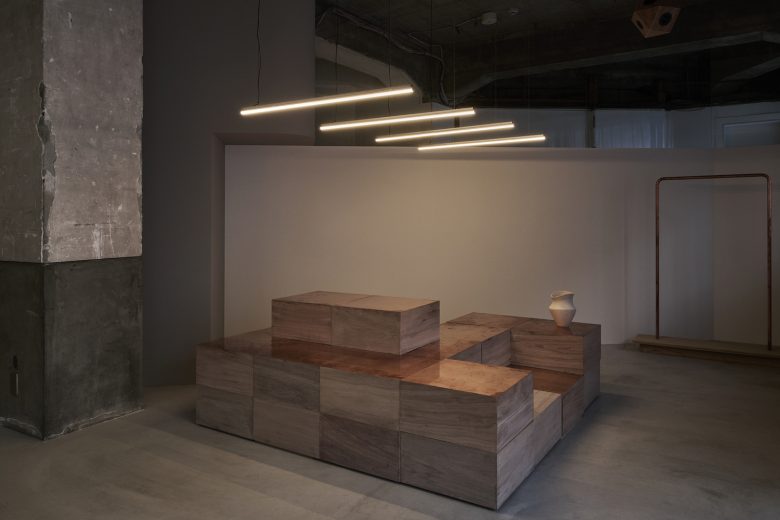
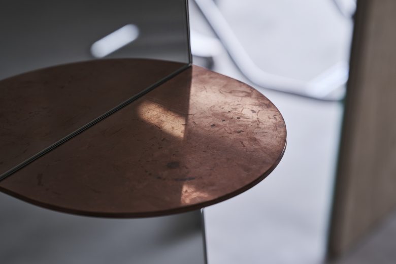
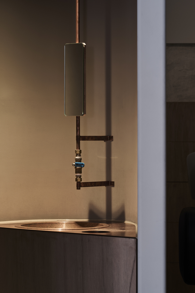
At the center of the floor plan, we introduced new volumes by dividing and positioning a color booth and a staff room with rounded walls. The remaining space was gently divided into a bright area with natural light for the cutting and waiting space and a recessed, dim, and tranquil area for the shower booth. Each area features fixtures such as plywood topped with copper sheets, mirrors simply adhered to boxed boards, bent copper pipe hanger rods, and speakers made of plywood scattered throughout according to their function.
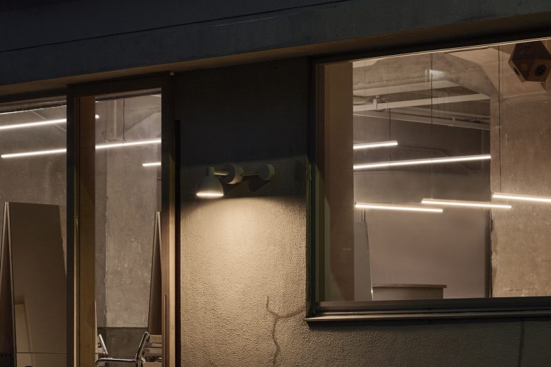
Additionally, the lighting layout further enhances the space’s characteristics. We used linear tubed LED lighting with three different color temperatures: 4000K for the existing structure, 3500K for the cutting space, and 2700K for the shampoo booth and waiting area. The lights are installed at varying heights to match the unique characteristics of each area.
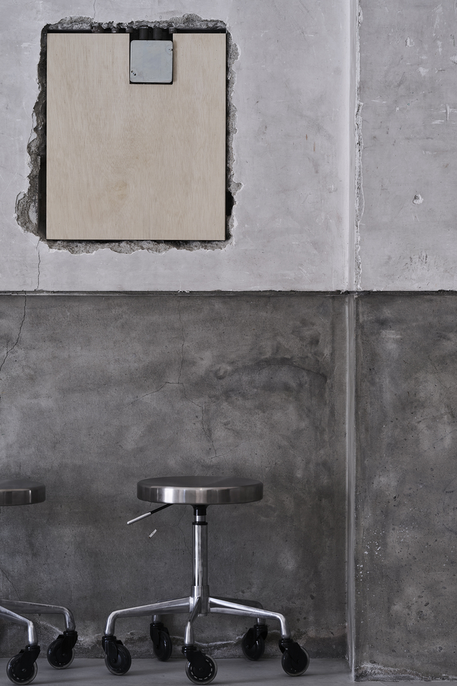
The existing building was protected by iron angles at some corners, while other unprotected corners showed wear, adding to the building’s charm over time. The existing structure teaches us that beauty lies beyond superficial design.
Following this philosophy, we designed features such as copper rods to protect the stair nosing, intentionally exposed concrete honeycombs, and installed visible yet aesthetically pleasing electrical wiring. The result is an essential space that is not decorative but both authentic and intrinsic. At first glance, it may seem like a hair salon focused on shallow design, but it resonates with the salon’s desire to genuinely engage with customers and enhance their beauty and richness from within.
Architects: Hitotomori Architects, arinco architects
Design And Supervision: Sho Tamura/arinco architects
Photographs: Hiroki Kawata
Add to collection
