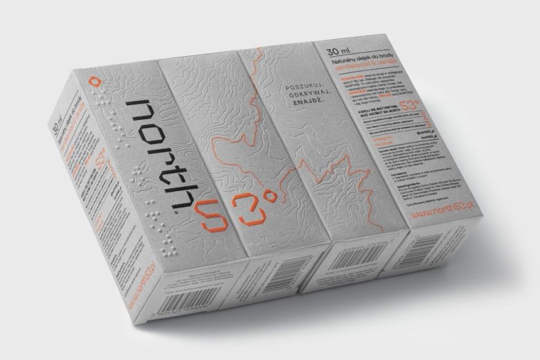
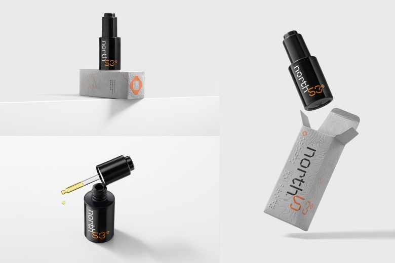
North53° is a Polish brand of natural cosmetics for men. Our studio was responsible for the complex branding and design of the first packaging for the beard oil brand.
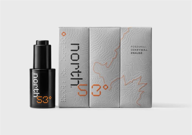
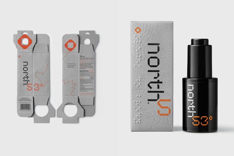
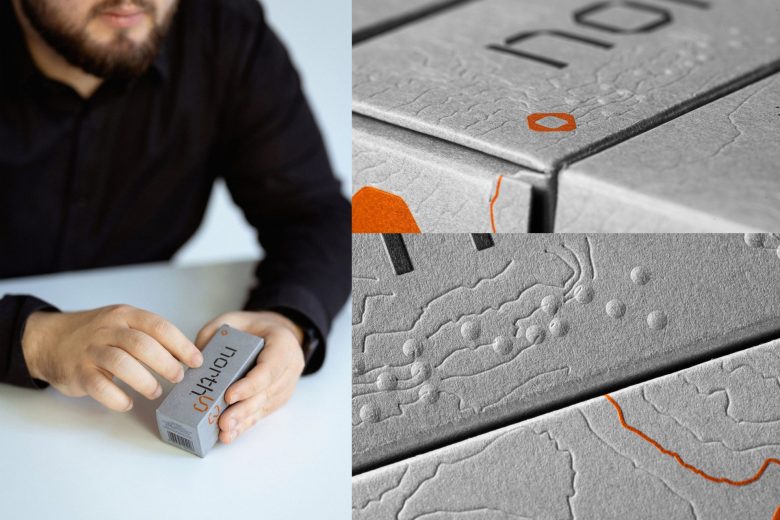
The name North53° refers to the latitude of the city of Szczecin (53°26′17″N), where the brand originated. The brand’s main slogan is “Search. Discover. Find.” This is the first cosmetic packaging in Poland to include Braille. It is important to remember that in discovering the world, despite the obstacles, there is also a group of men who are blind and want to use beard care cosmetics.
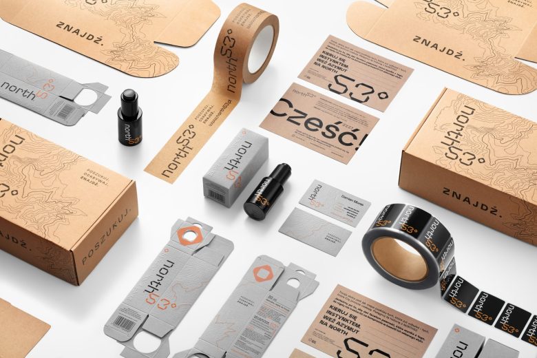
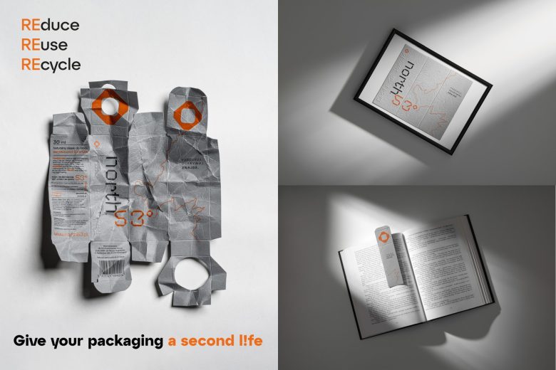
The challenge the studio faced was to design the packaging to fit with the brand strategy: REduce, REuse, REcycle. The client was very keen to the paper packaging should not be thrown away. We have taken the direction of ‘zero waste’. We designed the packaging to give it a second life. According to the REuse principle, you should reuse the product you already have.
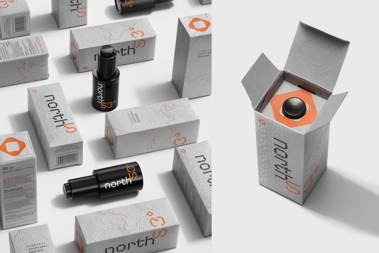
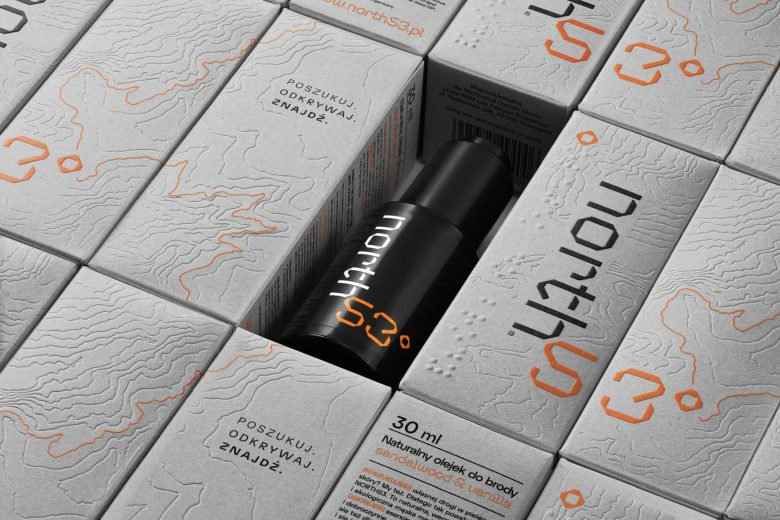
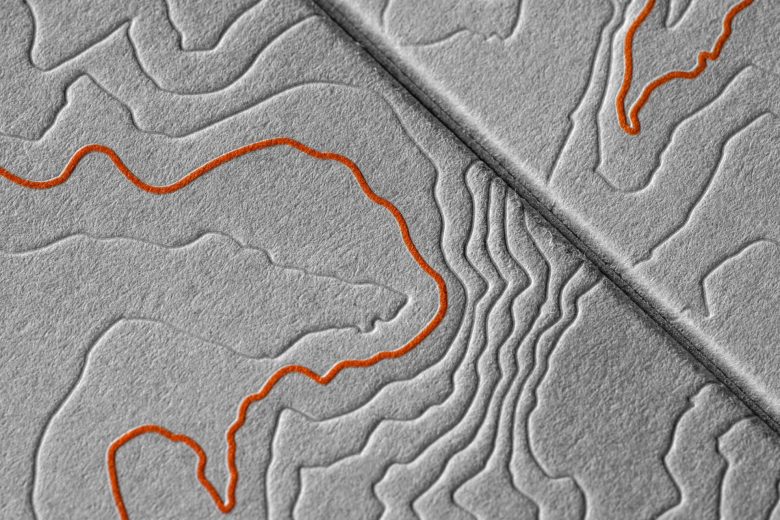
The main graphic motif of the packaging is a topographical map of the area, which captures the character of the brand. The packaging was produced on FSC-certified eco-friendly paper Mondi Pergraphica and further enhanced with embossing. The three side walls of the packaging form a single graphic and it is these walls that we can adapt for the graphic without throwing away the packaging. We can cut out the graphic and put it in a frame or use it as a bookmark. The only thing that limits us is our own imagination as to how we will use the packaging. In the face of growing environmental awareness, the packaging needed to align with the needs of sustainable development and the ‘zero waste’ philosophy. This challenge was addressed by designing with a focus on waste reduction (REduce), reuse (REuse), and recycling (REcycle).
The packaging elements as well as the branding as a whole have carefully created a visually appealing and engaging brand identity that resonates with the brand’s values and aesthetics. Follow Your Instinct. Take Azimuth to North53°.
Designed by Sparrow Design
Add to collection

