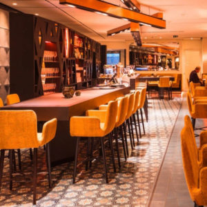

Verse Wine by OA Design
posted by retail design blog on 2025-01-20
Add to collection

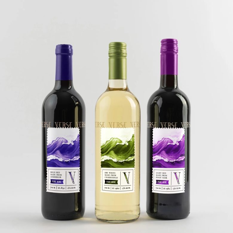
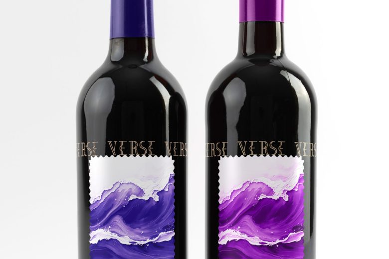
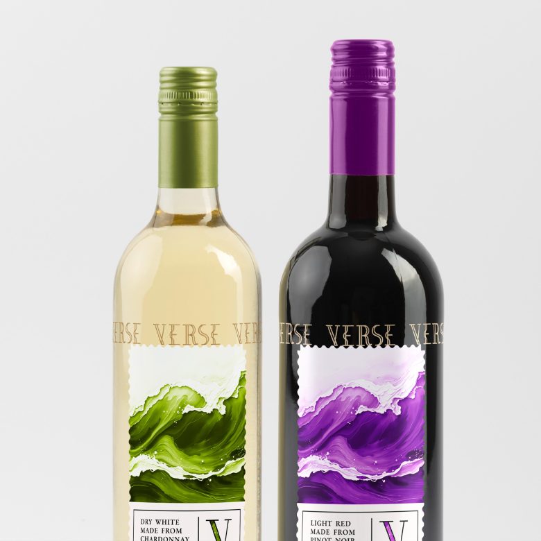
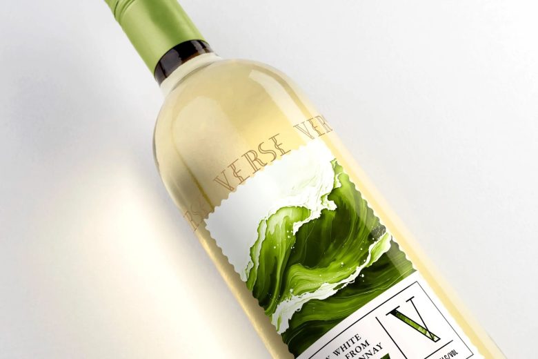
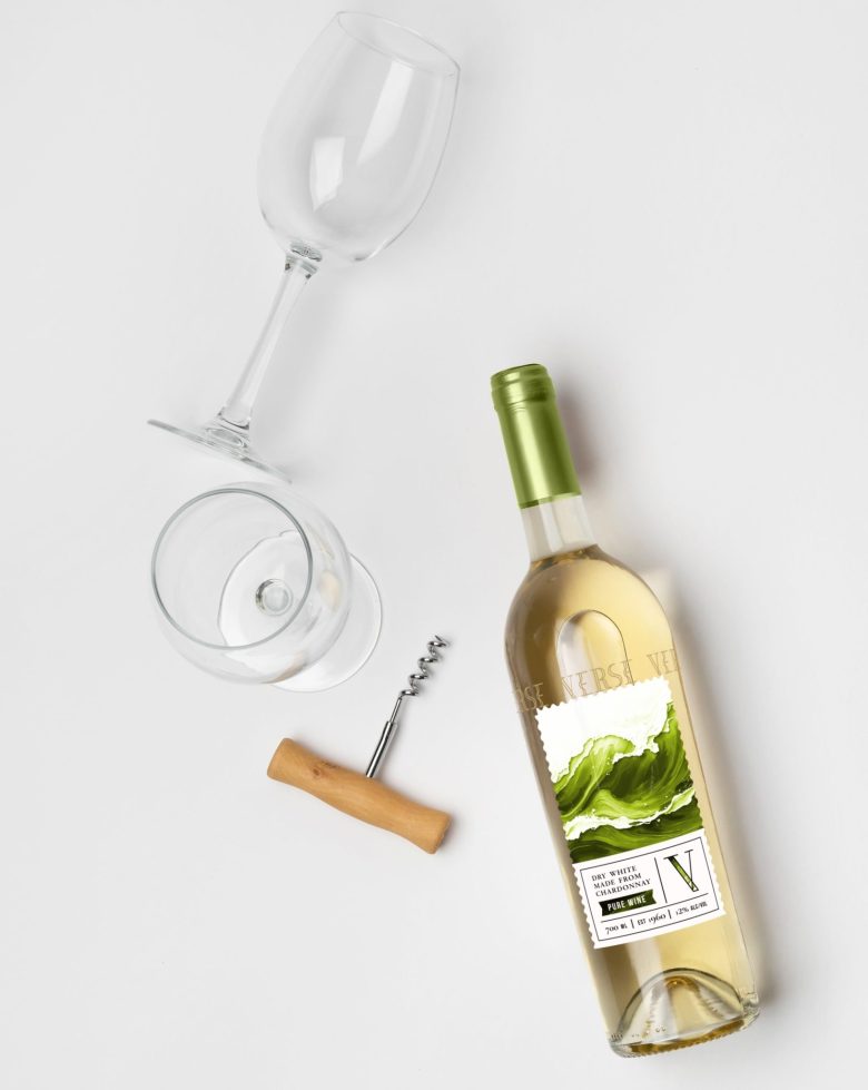
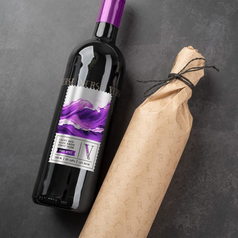
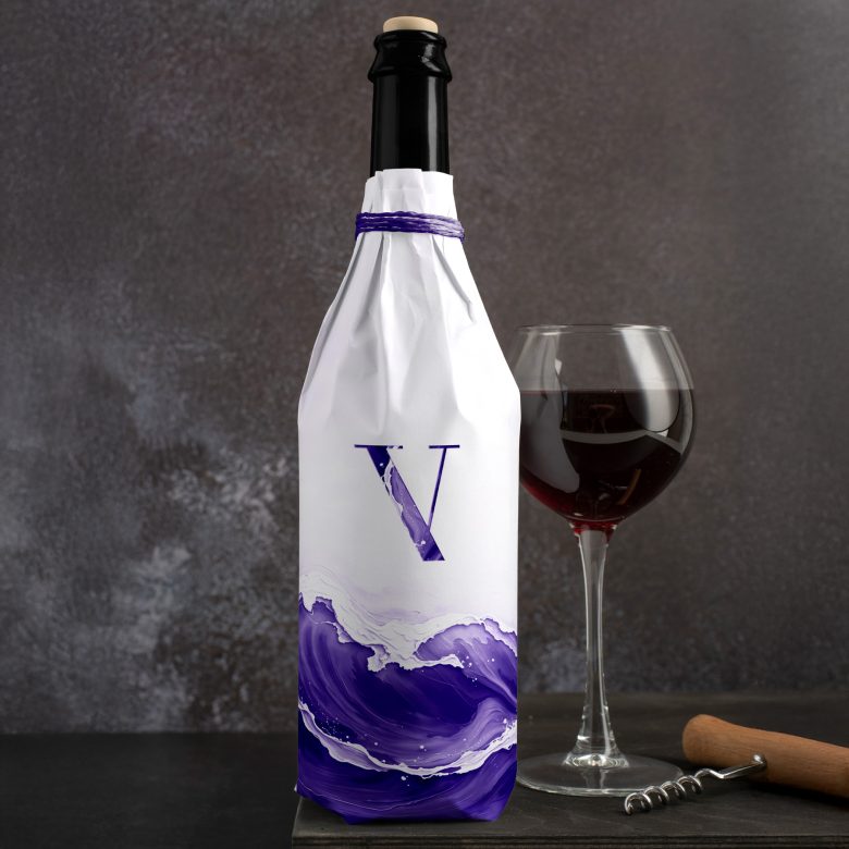
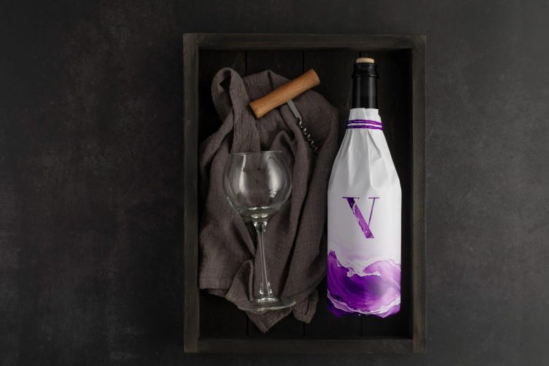
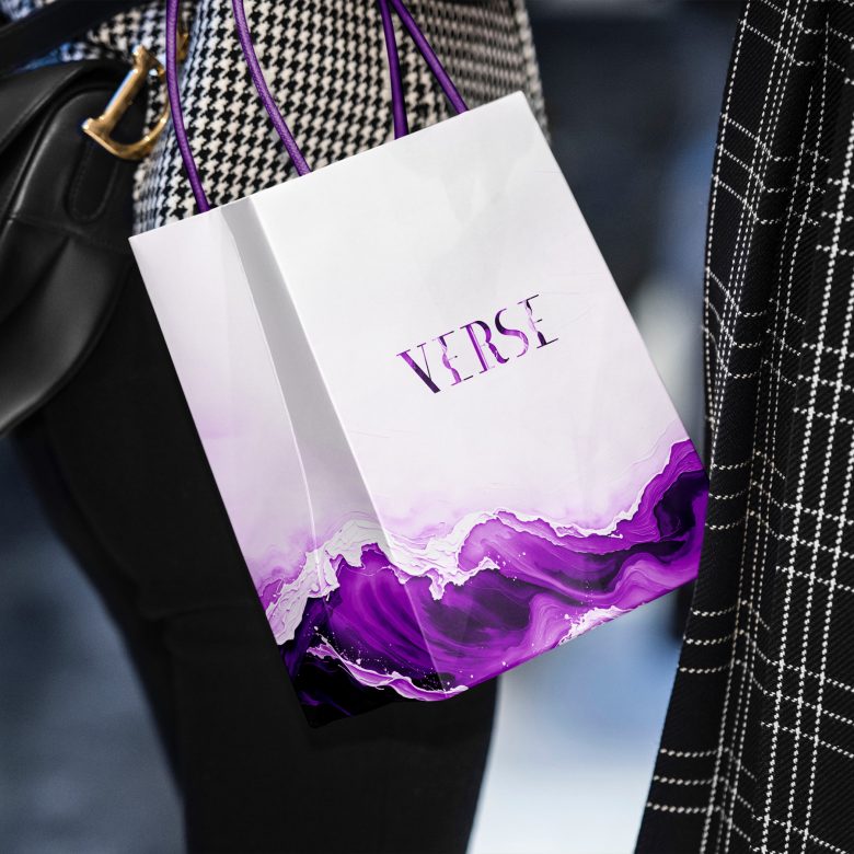
Wine can be thought of as a complex tapestry of flavors and sensations, ranging from sweet to dry, crisp to smooth, and fruity to earthy. Each sip can reveal new layers, making it a unique experience for each individual. The brand name Verse comes from the idea of flow and ease. When one drinks wine it feels like walking on the waves of life but also like a form of art, a mental painting filling in the gaps of a busy hectic day with color and texture.
The target audience are artists, select groups of people who meet up to discuss a special interest and Verse helps sew the conversation and foster inspiration. The color scheme is different to other brands as it follows the color of the grapes used to make the wine and not the wine itself. This might confuse the general public, but that is ok because Verse is catered to a more neurodivergent thinking. The fonts and label design however hint at it being connected to the past, to tradition and respecting the process of growing, harvesting, crushing, pressing, fermentation, clarification, and bottling. In the end the way the logo is used suggests that wine can be transparent, but also opaque, but it always makes an impression.
Add to collection