
Add to collection
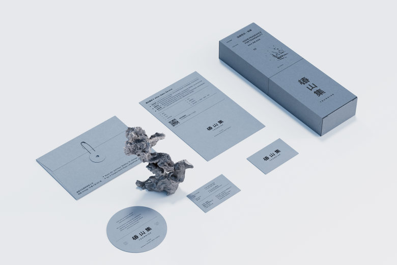
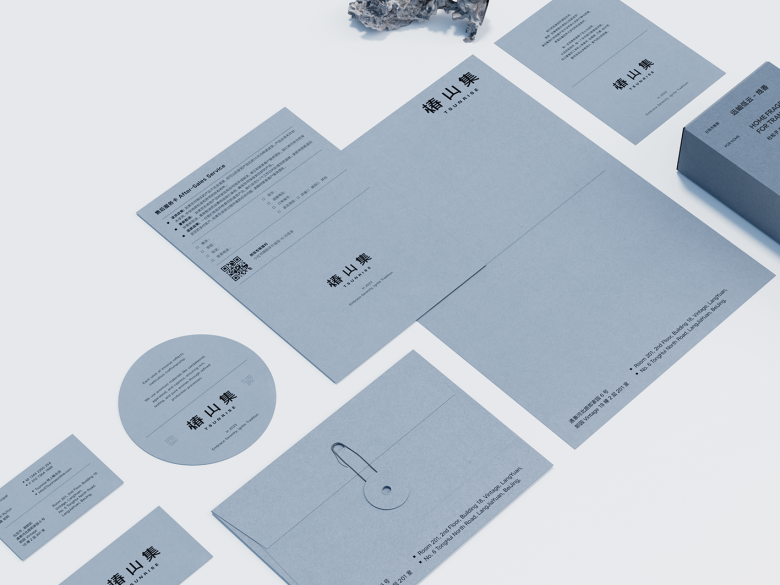
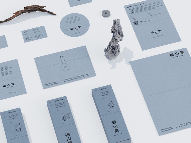
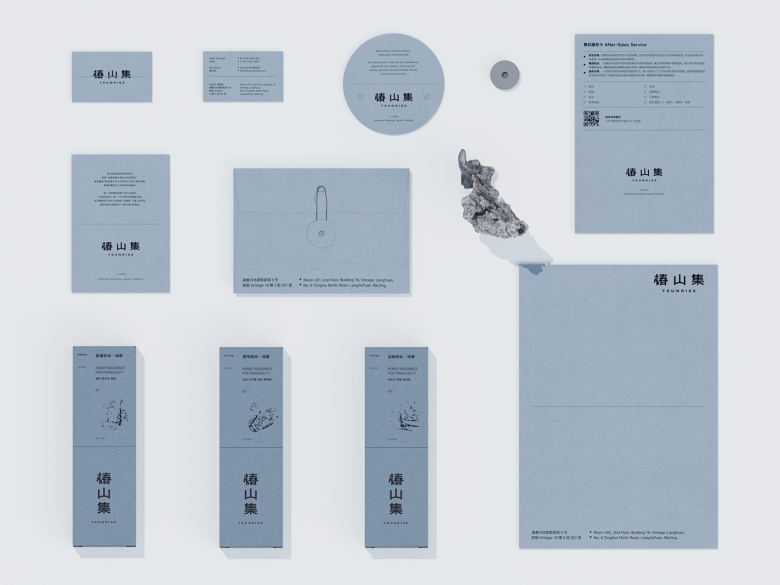
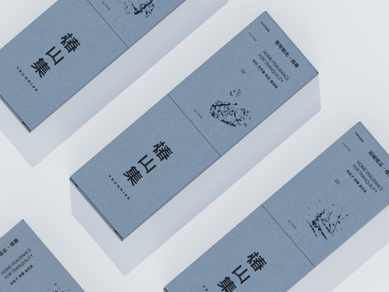
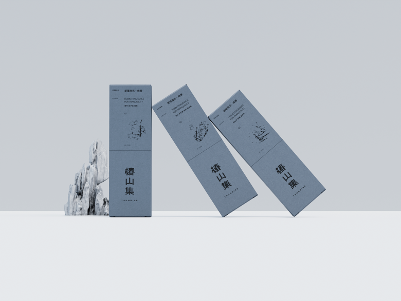
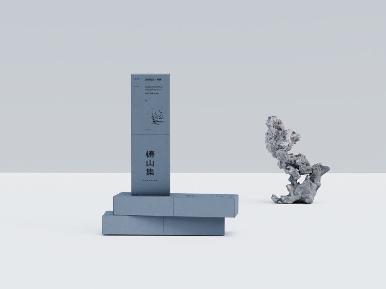
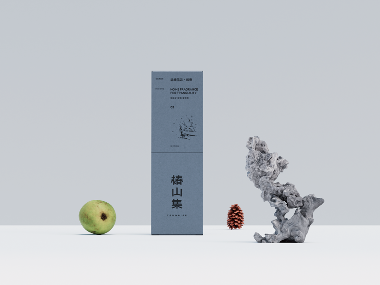
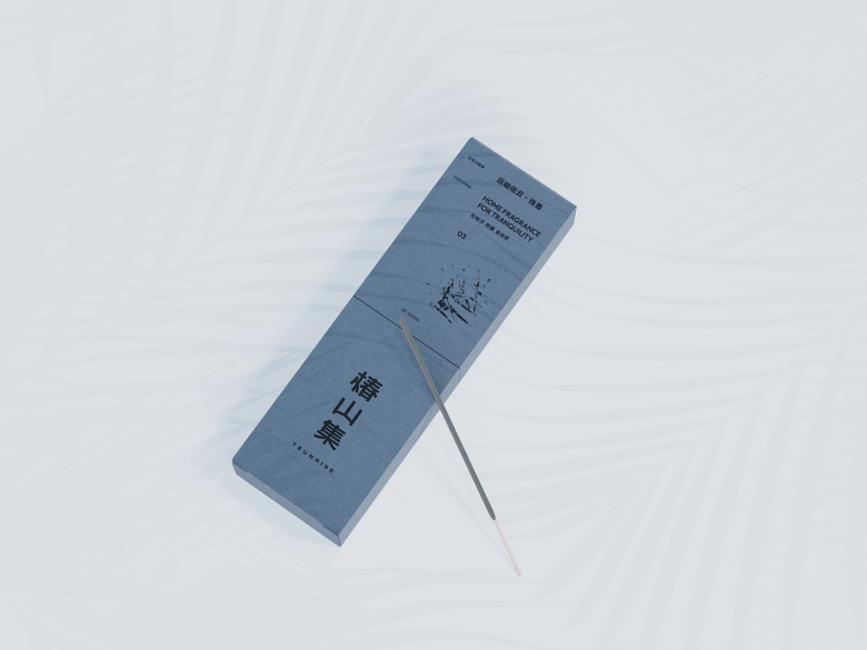
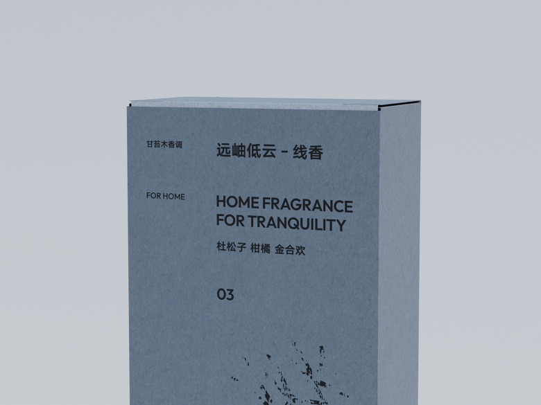
In the brand visual system of the online incense brand “TSUNRISE,” we employ a top-and-bottom zoning design approach to create a precise structural layout that evokes rich layers and a sense of spatial depth.
Each product’s design inspiration is drawn from its unique fragrance, which we artistically translate into visual symbols, seamlessly blending the scent with the visual experience.
To better convey the tranquility and lingering essence of the incense products, we carefully selected an elegant gray tone for the packaging design. This not only expresses the product’s sophistication and calmness but also fosters a serene atmosphere aligned with the brand’s temperament, allowing consumers to experience the distinctive peace and quietude of “TSUNRISE” through both sight and scent.
Designed by One Studio There
Add to collection