

Kitsi & Kitsmatsuri by Kollektiv
posted by retail design blog on 2025-12-17
Add to collection

Rooted in the visual language of Kakheti yet unapologetically contemporary, the Kitsi & Kitsmatsuri packaging project translates a deeply local philosophy into a brand system that feels instinctive, layered, and quietly confident. The wine is positioned not merely as a product, but as a cultural artefact—one that carries meaning through design rather than explanation.
From a branding perspective, the concept treats “kitsi and kitsmatsuri” as an idea of total fluency: the ability to read the room, the land, and the moment. This philosophy is reinterpreted visually through fragmentation, collage, and deliberate imperfection. The result is a system that values intuition over rigidity and adaptability over polish.
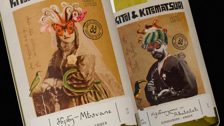
The labels are constructed as visual mosaics where disparate elements coexist without hierarchy. Archival imagery, hand-cut forms, and graphic interruptions are layered to create compositions that feel instinctive rather than overly controlled. This mirrors the amber winemaking process itself, where time, skin contact, and patience accumulate meaning slowly instead of rushing toward refinement.
Visually, the design thrives on contradiction. Classical portraiture is disrupted with surreal overlays, while refined structures are intentionally unsettled by expressive collage elements. These juxtapositions allow the brand to sit comfortably between tradition and experimentation, creating tension that feels alive and contemporary.
The central figures on each label act as visual anchors—human, recognisable, and rooted in history. Surrounding them, collage elements introduce narrative ambiguity, encouraging interpretation rather than delivering a fixed story. Typography functions more as texture than instruction, with letterforms that feel tactile, uneven, and expressive, reinforcing the idea that knowledge is layered and earned.
Material choices further ground the concept in craft. Uncoated papers are used to amplify tactility and reduce visual gloss, ensuring the labels feel handled rather than manufactured. Subtle embossing and restrained foil accents are applied sparingly, serving as quiet moments of emphasis rather than decorative excess.
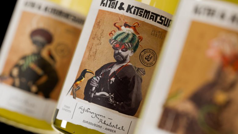
Colour is handled with warmth and restraint, allowing the amber hue of the wine to remain the silent hero. Earthy neutrals, aged paper tones, and faded inks support the narrative, while occasional vibrant elements inject energy without overwhelming the composition.
Each label is designed as a standalone piece, celebrating individuality within a cohesive system. No two designs are identical, yet all clearly belong to the same visual family. This balance between consistency and variation strengthens the brand’s identity and reinforces the idea of mastery through intuition.
On shelf, the bottles command attention through curiosity rather than volume. The designs invite closer inspection, rewarding viewers who slow down and engage with the layered storytelling. Trend-resistant and deeply human, the Kitsi & Kitsmatsuri packaging aligns seamlessly with the slow, deliberate nature of amber winemaking—proving that great design, like great wine, reveals its depth over time.
Designed by Kollektiv
Art Director: Buba Radiani
Designer: Giorgi Kalmakhelidze
3D Designer/Motion Designer: Giorgi Jananshvili


Add to collection