Add to collection
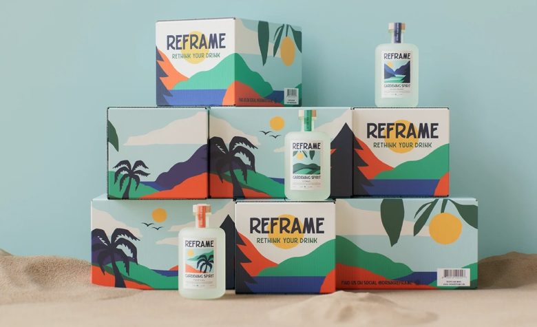
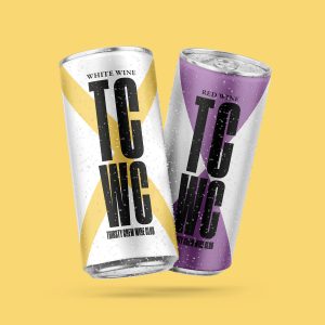
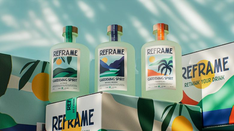
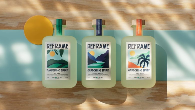
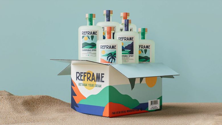
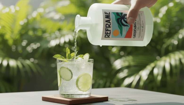
This project begins with a clear premise: to reinterpret the brand’s visual experience through packaging. HI! Estudio was responsible exclusively for the box design, adapting to the existing branding and developing a graphic system that translates the spirit of the beverage into landscape, rhythm, and color.
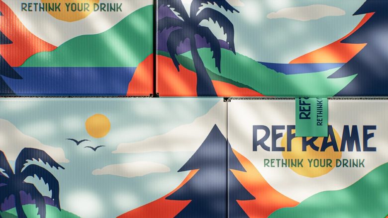
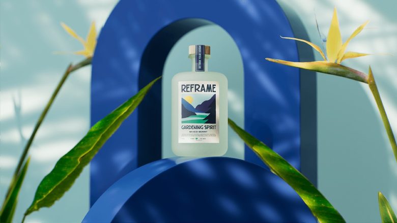
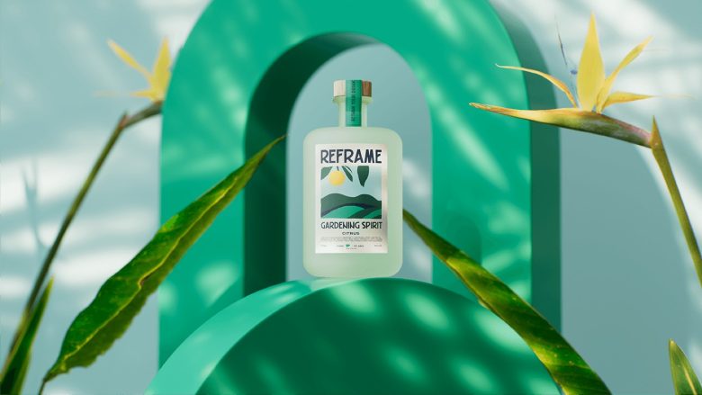
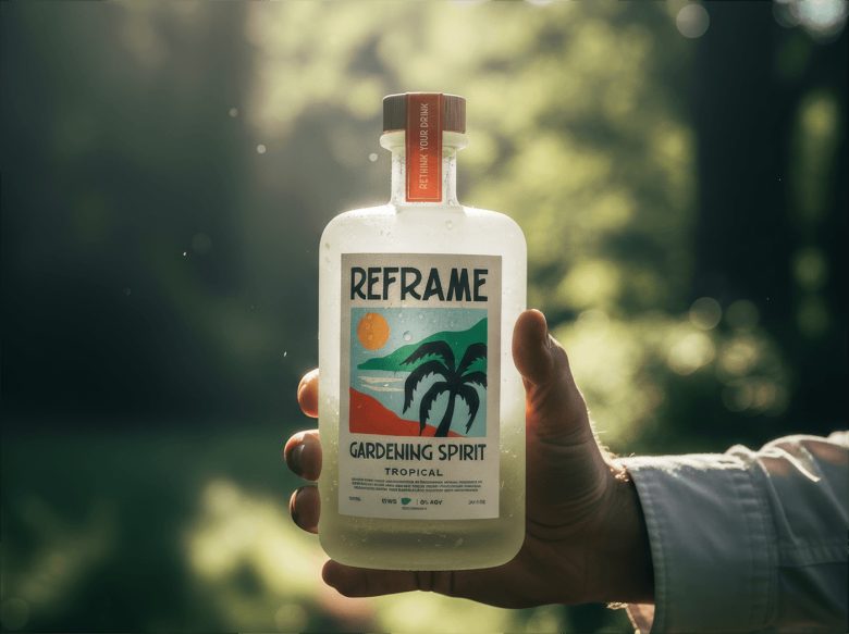
The composition is built from layered planes and synthetic shapes that evoke territory, movement, and freshness. The visual language blends natural silhouettes with simplified geometry to create a modular scene that works both as a standalone composition and as a repeatable surface system.
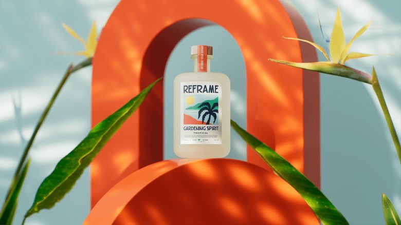
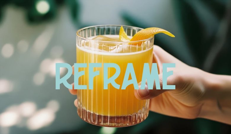
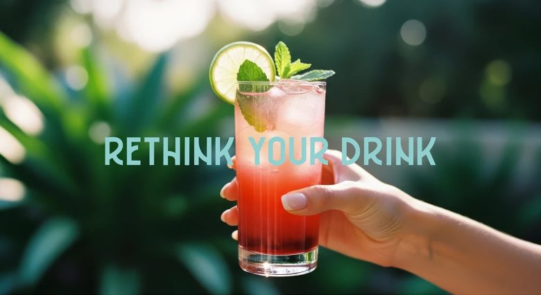
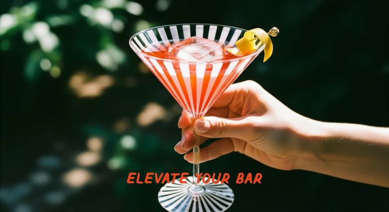
The color palette combines vibrant greens, deep blues, and warm accents in orange and yellow to generate contrast, memorability, and energy at the point of sale. The result is packaging with strong visual impact, clear readability, and a distinctive graphic identity.
Our scope focused solely on the conceptual, visual, and technical development of the box system and its graphic application.
Designed by Hi estudio
Add to collection