Add to collection
Brightland is an artisanal chocolate brand rooted in the heart of Mysore, India. Designed to evoke a sense of joy, nostalgia and warmth. This project write-up outlines the creative journey undertaken to develop Brightland’s unique identity and packaging design, capturing the essence of the brand’s vision and values.
The scope of the project was to create a distinctive brand identity that resonates with the joyous moments of childhood and the warmth of sunny days. The brand name itself, “Brightland,” evokes imagery of a world filled with light, happiness, and color. The challenge was to translate this imagery into a visual identity and packaging design that stands out in the competitive market of artisanal chocolates, not just through aesthetics but also by embodying the brand’s core values and appeal.
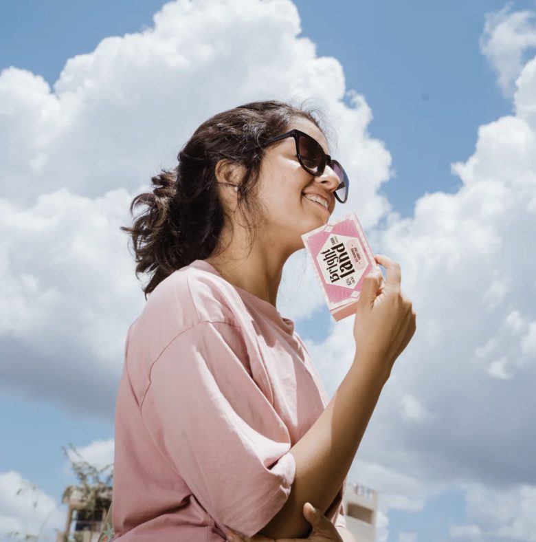
The concept for Brightland’s branding and packaging design is deeply inspired by the nostalgia of childhood pleasures—carnivals, circuses, hot air balloons, and ferris wheels. These elements represent the joy and wonder of discovery, mirroring the delight one finds in savoring artisanal chocolate. The idea was to craft a brand identity that transports customers to a bright, sunlit day filled with laughter and sweet memories, much like the experience of indulging in Brightland chocolates.
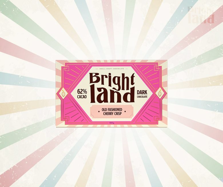
The logo and identity design for Brightland are anchored in the concept of sunshine and happiness. The logo has a stacked appearance that has a twirl in the center of typography giving it a playful twist. The use of sun rays serves as the hero element, directly representing the brand.
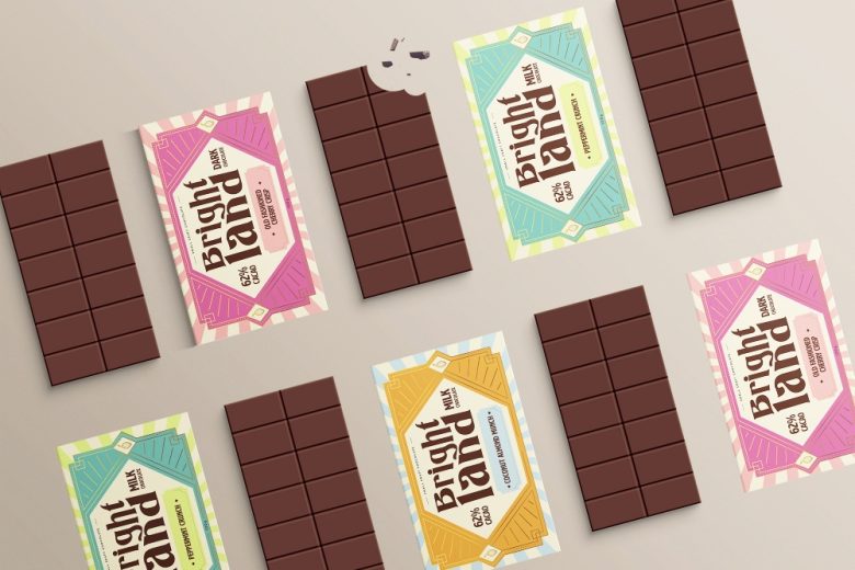
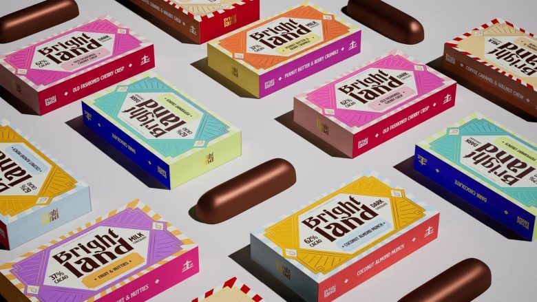
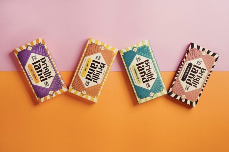
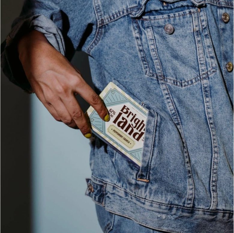
Brightland’s packaging employs horizontal packs—a distinct choice that sets the brand apart from its competitors. This design choice not only offers a unique shelf presence but also enhances the unboxing experience, making each chocolate bar feel like a gift waiting to be unveiled. The packaging features bright colors and carnival elements, further emphasizing the nostalgic vibe. The incorporation of vibrant illustrations and patterns draws on the joyous and playful themes of a carnival, creating a visual narrative that complements the brand’s story.
The color palette is a vibrant celebration, with hues that evoke a tantalizing mental image of the delicious flavors. These colors are thoughtfully chosen to reflect the brand’s personality. The typography is selected to harmonize with the overall design, ensuring readability while adding to the nostalgic feel. It balances modernity with a hint of whimsy, embodying the artisanal and crafted nature of Brightland chocolates.
Designed by Kalyani Kulkarni
Add to collection