





Coffee Hunter by FLOV® STUDIO
posted by retail design blog on 2026-08-12
Add to collection
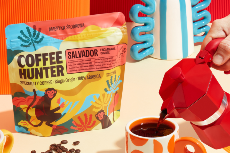
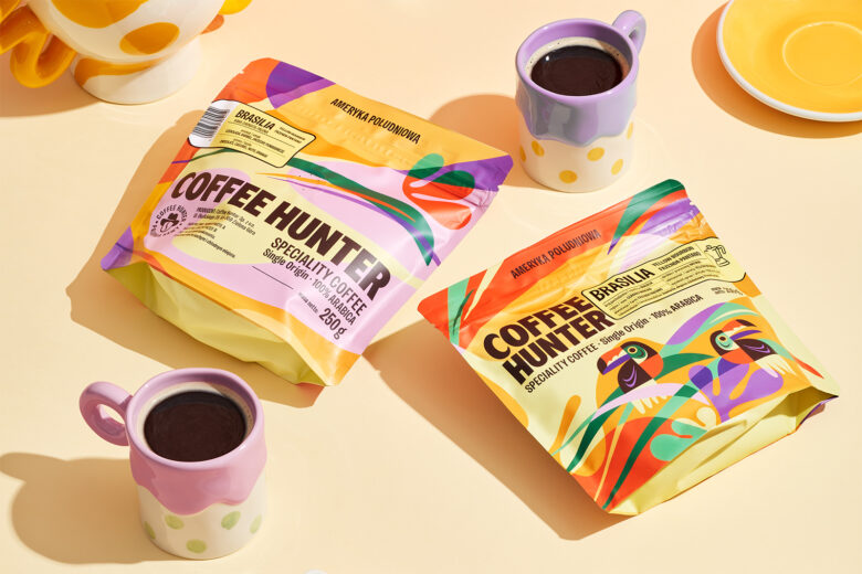
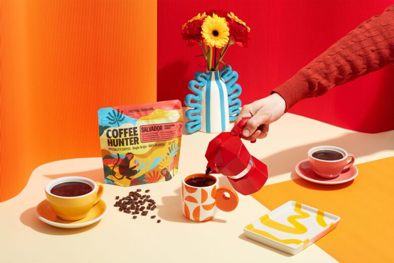
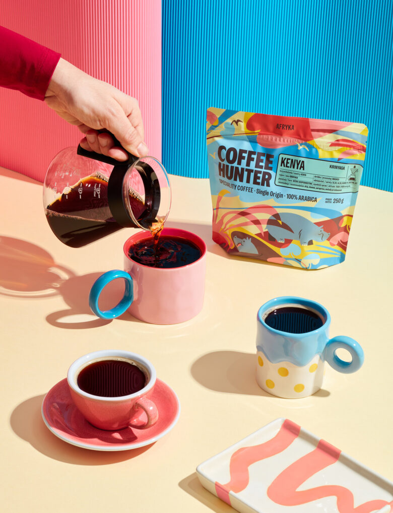
A colourful packaging system created for Coffee Hunter’s range of specialty coffees.
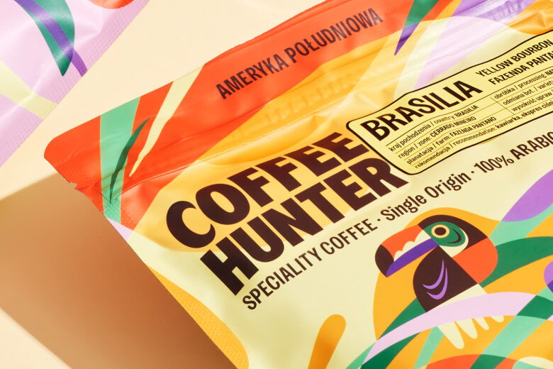
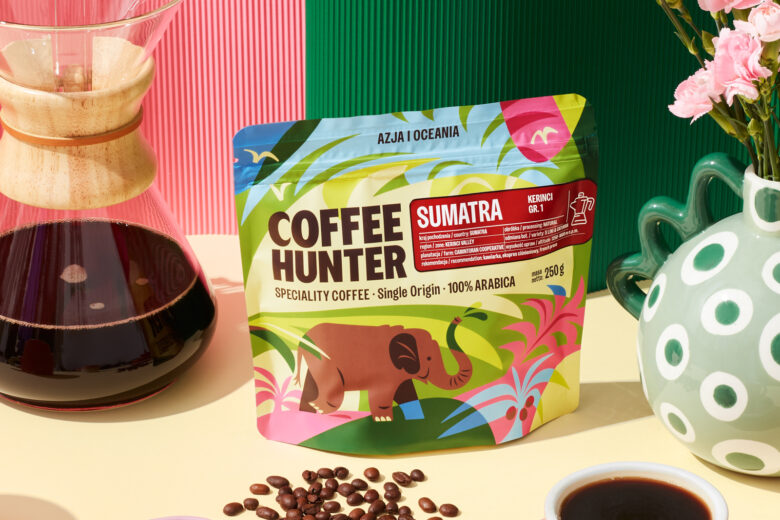
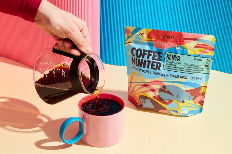
Every origin gets its own personality—expressed through a dedicated illustration, vibrant colour palette and playful references to the region it comes from. At the same time, a strong typographic system and consistent product information make the Coffee Hunter range easy to recognise at a glance.
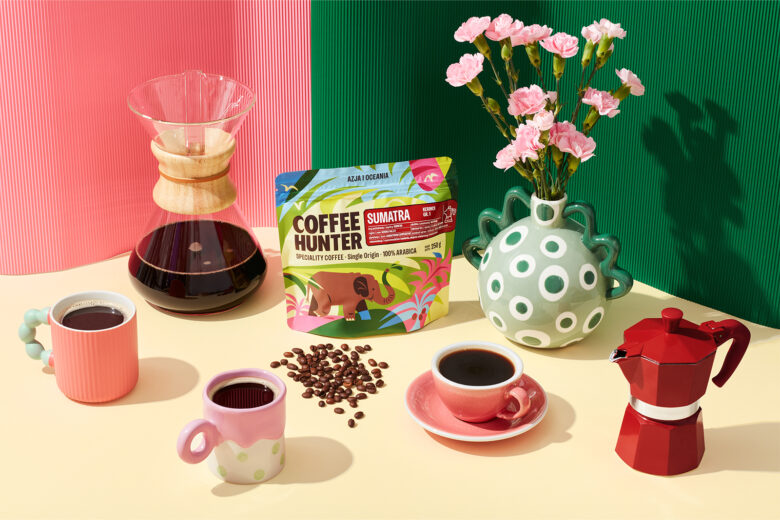
Designed to feel fresh, joyful and approachable, the packaging brings a little more colour and curiosity to the everyday coffee ritual.
Curator’s Insight
The real design challenge in a single origin coffee range is scale. A line can easily grow to a dozen or more variants, and without a firm structural anchor, character illustration tends to pull a range apart rather than hold it together. This system solves that by fixing everything except the illustration itself. The wordmark, the info panel, the recommendation icons, and the bag proportions stay locked across every origin, so the color and character work can run wild without the shelf ever losing coherence.
The regional storytelling also earns its place rather than sitting on top as decoration. Using local fauna, a hippo for Kenya, a toucan for Brazil, a monkey for Salvador, gives each pack a distinct silhouette that customers can recognize before they read a single word, which matters more on a crowded specialty shelf than most brands admit.
Designed by FLOV® STUDIO
Graphic design / Illustration: Natalia Ankowska
Add to collection