
The project stems from the need for owners to give a makeover to a consolidated business suffering a generational shift. The new managers of the local take on the successes of the previous maintainers based on a supply of affordable meals with generous portions and opt for a transformation from local to provide a more attractive environment in which you consume, while looking for a striking image to attract new customers.
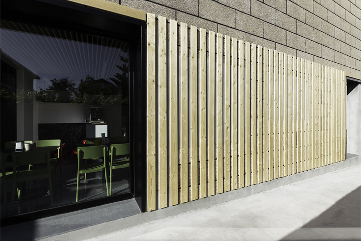
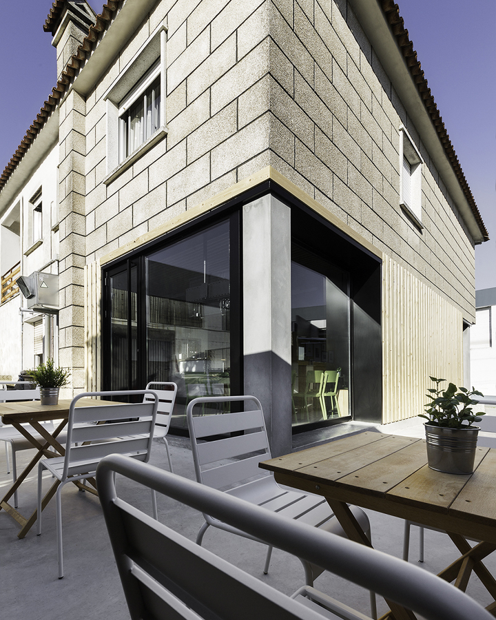
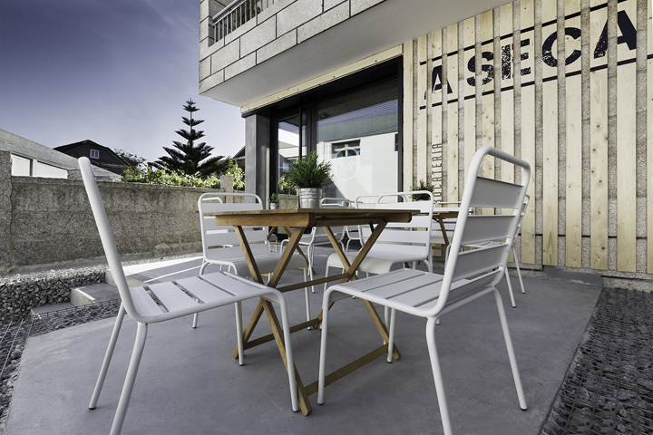
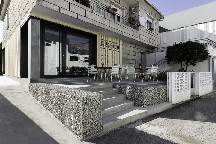
The region is dominated by a canning industry, so a move to take advantage goes through the back terrace of the plot, for private use in the previous step. By providing a congested environment of open countryside. It also seeks to differentiate the local of the dwelling unit that contains it, so the pillars are left and watched a second skin to the facade, formed by wooden planks, so that is the distinction between immediate and housing bocatería added.
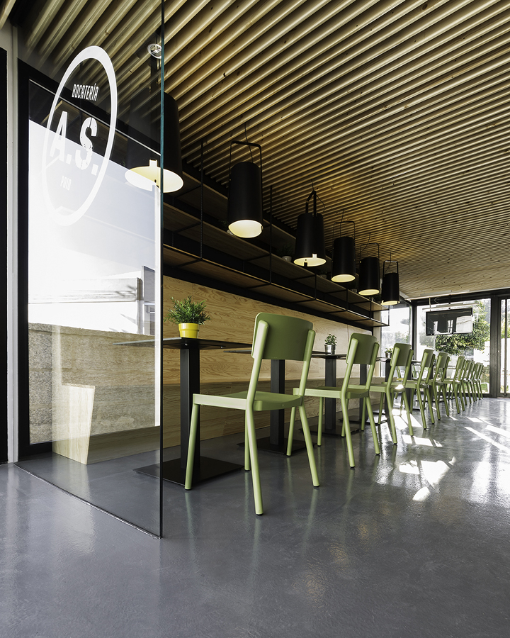
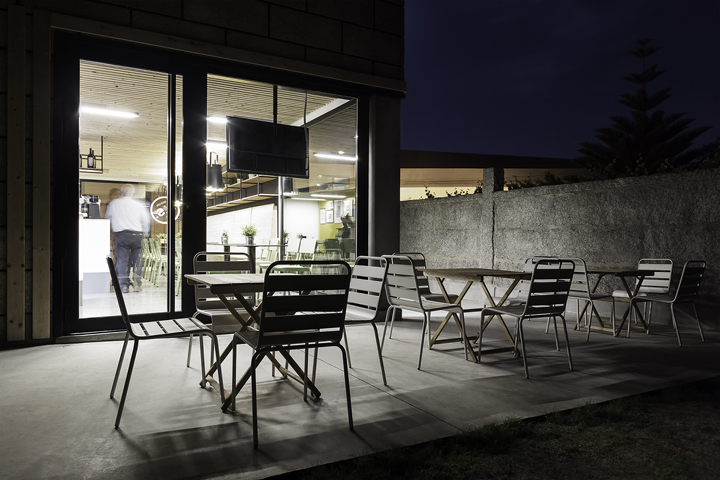
To enhance the bocatería recognizable to new customers earlier plot walls were demolished and a raised terrace bounded by gabions, winning a drinking area outside where there was an abandoned before crossing space is created. The first terrace is illuminated artificially creating a focus for when low light intensity. The entry is marked as a hole in the facade from the road and a vision that is offered through local and reaches the rear terrace, offering visitors one of the strengths of the intervention. Meet quote a lateral ramp that enhances the development of the proposed cross, allowing direct access to this terrace and provides full accessibility to the local.
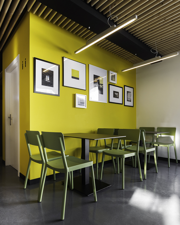
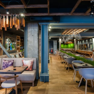
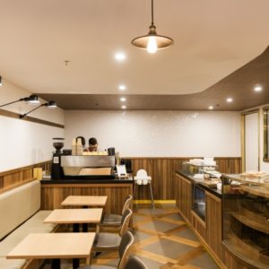
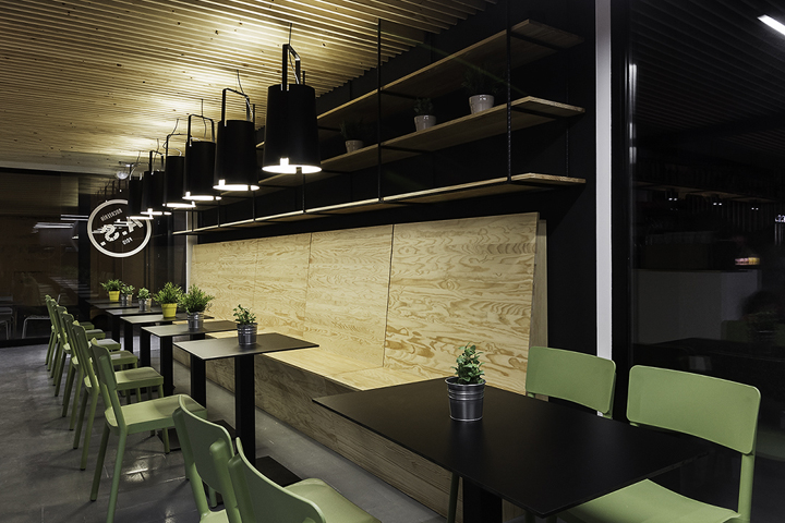
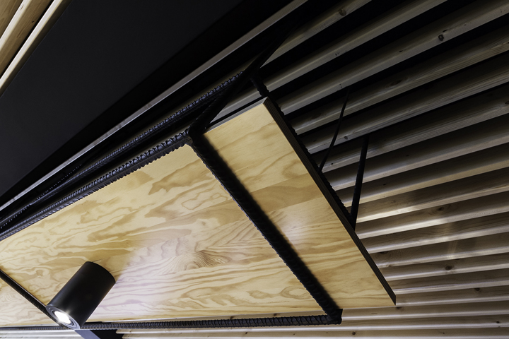
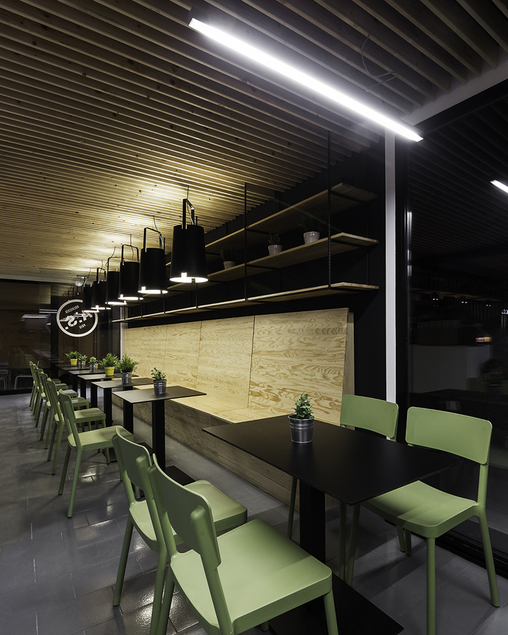
Inside the local duality of the proposal, where an austere treatment finishes shown; planed timber battens, reviewed existing floor and painted, round steel and painted partitions, offers a cozy atmosphere, with a warmth emphasized by a careful choice and distribution of lighting, which makes the arrangement of the furniture, polypropylene and steel as a counterpoint to the prevailing fixed elements where wood and accentuates the tasting area off the circulation.
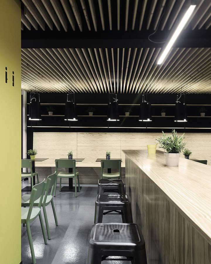
Backslash bar and follow the general language of the proposal, and two yellow RAL1023 painted walls make the space toilet. In a place where materials, furniture, lighting, space, circulation and implementation, could not miss the design of signage, corporate image, and the development of the card are defined, performed, ultimately, a global project where he has served detail.
Photography: Iván Casal Nieto
Design by NAN Architects




Add to collection
