
UNDERSTANDING CLIENT’S BRIEF
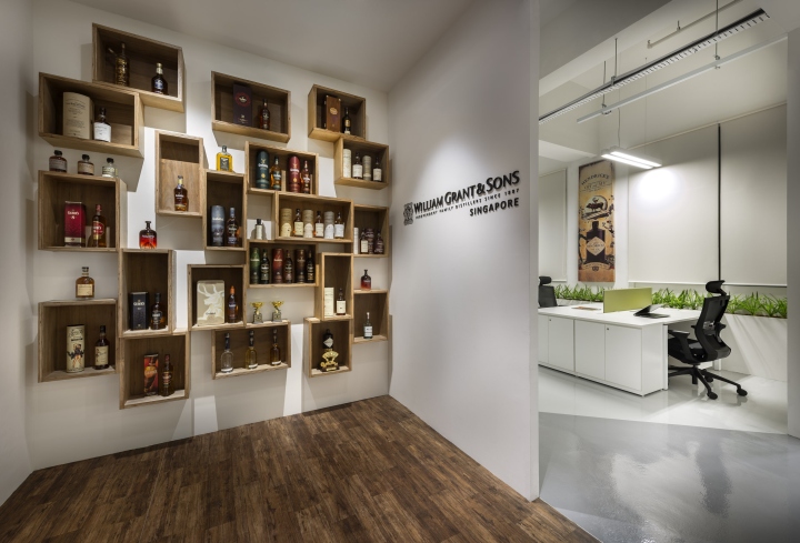
We were engaged to design the new office for William Grant & Sons. Founded in Scotland in 1887, they are a premium spirits company which distributes some of the world’s leading brands of Scotch whisky. Our design brief was to relocate the company from an existing office of 1000 ft2 to a larger space of about 3000 ft2. The office was looking forward to an expansion with potential relocation of their headquarters from Shanghai to Singapore. We drew inspiration from their premium brands of whisky, including Glenfiddich, The Balvenie, Hendrick’s Gin and Sailor Jerry Rum. These well-known brands have developed a strong global following and they are accompanied by strong branding guidelines. These guidelines were developed some quirky and iconic imagery and inspired our design for the office interior.

PLANNING CONSTRAINTS & IDEAS
The new plan for the office has an elongated rectangular form. The windows are on one of the long side of the space which are made up of rectangular and trapezium shaped windows.
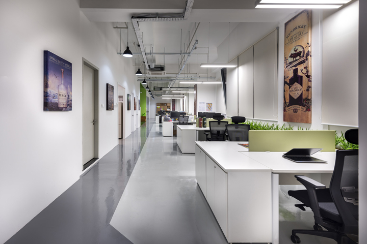
From the beginning of our planning proposal, we desired that the office be bright and well-lilted with minimal necessity for indoor lighting. The office would be a open plan office which enhanced and empowered the occupants for active and easy communication and interaction. We designed the meeting rooms to be on the opposite side of the rectangular plan so that these enclosed spaces will not occupy and dominate the natural light.

MATERIALS OF CONSTRUCTION
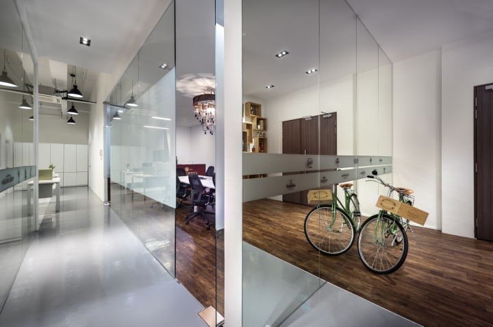
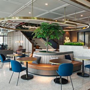
A central circulation spine permeates the office and is clearly demarcated by a strong grey tone on the floor. The path effectively connects the office from one end to the other. Therefore, it is clear that the open office plan takes the ‘bright’ side of the office, and the rooms for meeting and amenities takes the ‘light’ side. Along the side where the rooms are located, we decided to ‘ventilate’ the row of rooms with ‘green lungs’. These were spaces that we called ‘break-out’ area where spontaneous brainstorming could occur and ‘copy-break’ area when people needed to use the photocopier and filing station. These spaces were conspicuously lined with astro turf on the floor with the walls painted with a green hue. The ceiling brought down a cluster of virtual clouds to make these spaces stand out as more relaxed and interactive areas.

IMPLEMENTATION
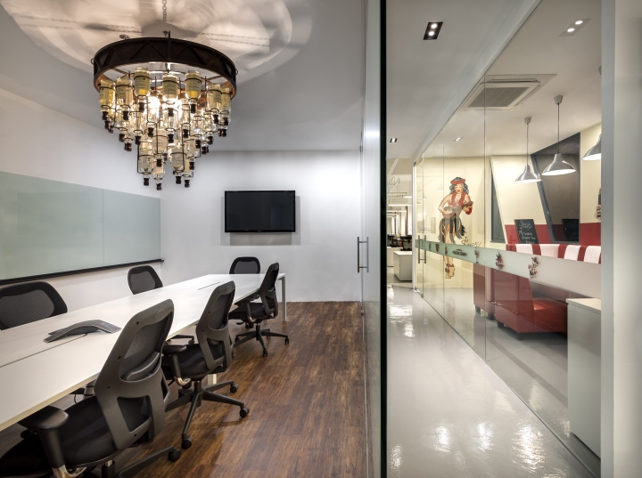
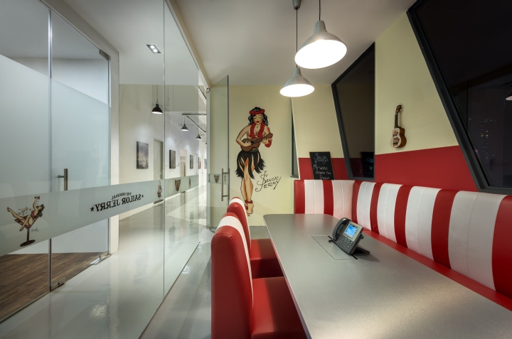
The meeting rooms were themed with reference to William Grant & Sons’ well-known spirits, viz. the Balvenie room was the main conference room, the Hendrick’s room was a cozy discussion room and the Sailor Jerry room was another meeting room. The Interiors were developed with reference to these brands’ respective branding guidelines. We included a green planter box that lined most of the open workstations to bring a touch of natural into a modern office space. Our clients were delighted with the outcome and we fulfilled their design brief for a creative and comfortable office in a modern setting.
Designed by ADX Architects
Photography by Edward Hendricks
