
In 2014, NutriCentre saw an opportunity to change the UK public’s perception of Health Retail. As the category has evolved in the past decade, and although consumer willingness to engage with vitamins, minerals and supplements has increased, no brand had challenged the old ways to bring in a new era. Looking for an agency that could disrupt this market place and create a brand and store with broad appeal whilst being vibrant and energetic, NutriCentre appointed The Yard Creative following their unique approach to projects.
“The key learning from the Research stage was that a consumers level of knowledge is the biggest potential barrier to purchase. Those with little or no knowledge were cynical of the product and found the existing market place hard to penetrate.” says Steve James-Royle, Founder of TYC. He continues, “as a result, we threw out the old market segments of consumer types and instead the offer has been designed around varying levels of knowledge.”
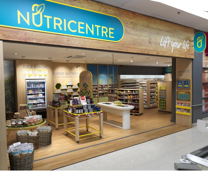
As a result the brand has been turned on its head and a new approach has been introduced. The design centres on making it easy to engage with whilst creating a sense of optimism and expertise.
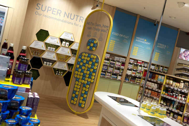
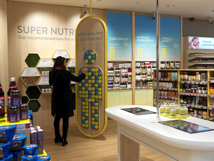
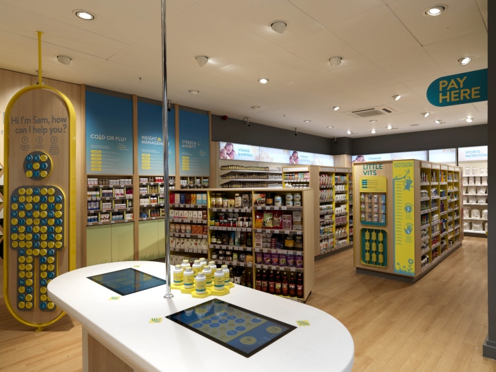
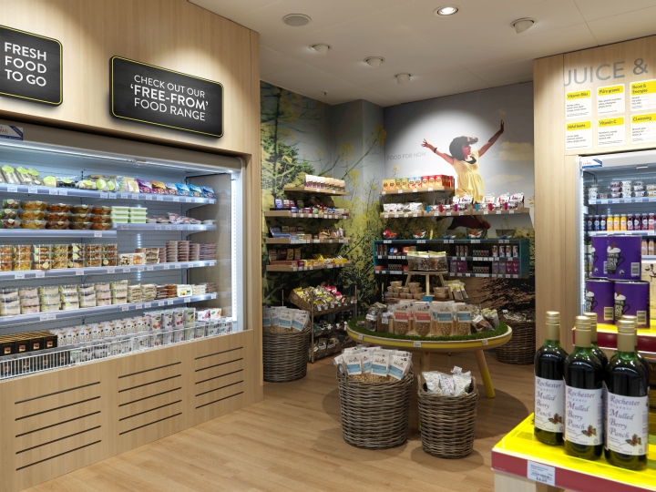
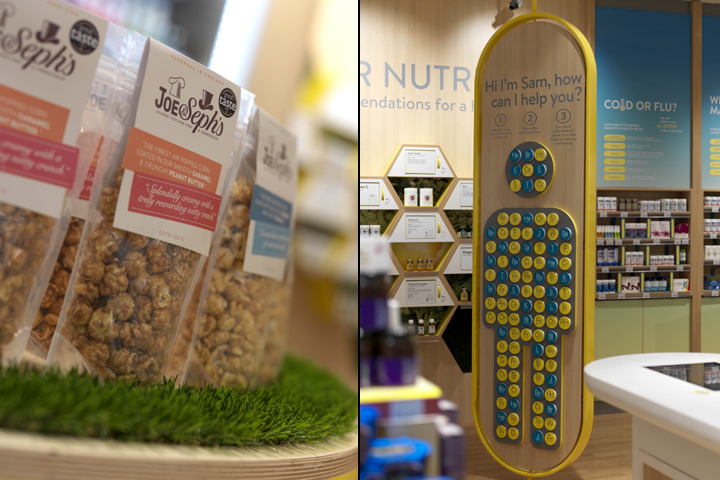
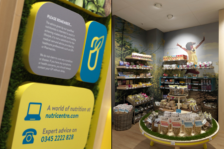
For those customers with limited or no knowledge, the front of the store is designed to be very welcoming with two key areas. The first being a deli style Food For Now area to encourage new customers to come in, regardless of their interest in health retail. The second being several platforms to help customers understand what nutrition does and how it can benefit you.
These include:
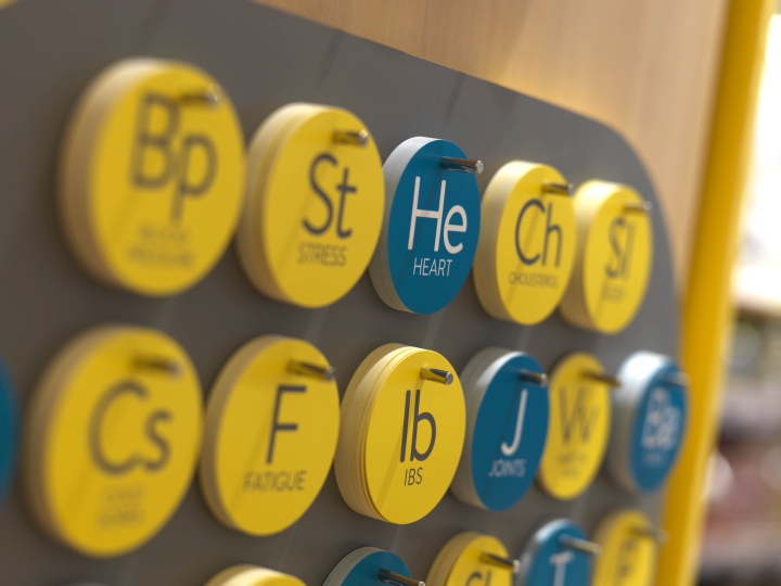
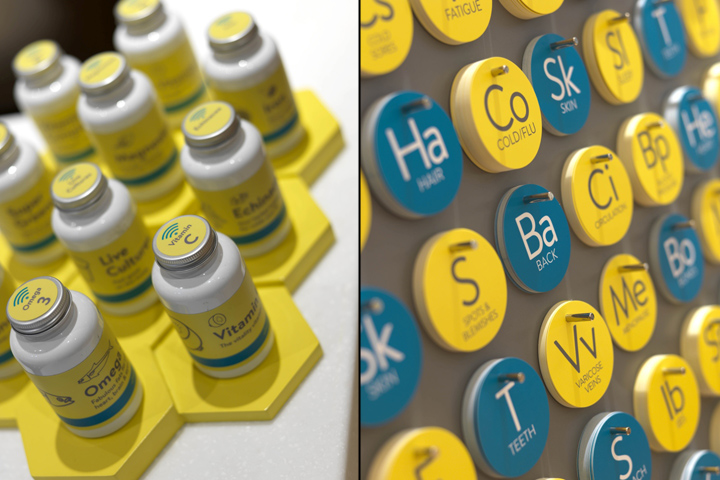
– SAM, a body with removable discs that can quickly help you see what products can help you with everything from Heart problems to Hair problems,
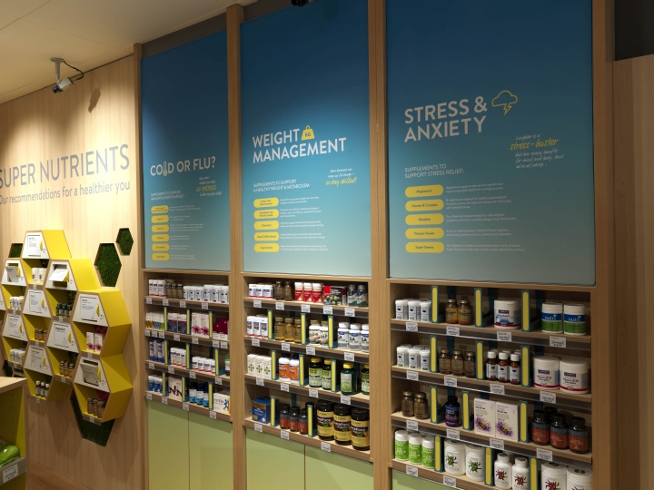
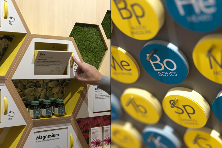
– Super Nutrients feature, just like super foods, the nutrients that help our bodies the most, what they do and pre-selected product,
– Common Conditions bays, the top 10 most commonly asked about complaints, spelt out and pre-selected product in one area
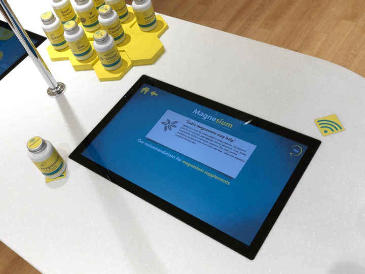
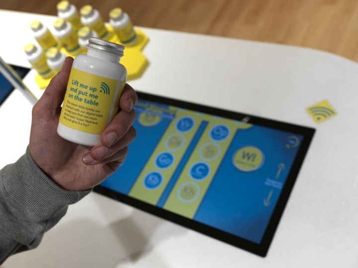
– An interactive RIFD enabled table. Customers can pick up hero products, place them on the table and the screen will tell you all you need to know.
For high knowledge customers, categorisation and navigation have been simplified with on-shelf information being written appropriately for those in the know. Payment systems have been updated along with mobile payment coming soon to help speed things up. In terms of the brand, the identity has the sense of being ‘lifted’ at its core. The strap-line, ‘Lift your Life’, captures the essence of the brand whilst making it personal to the consumer. The logo has wide appeal through the use of sharp and soft forms. The ‘U’ is used to create a pill shape with a leaf sweeping across it to reinforce the natural origins of the product. The colour palette is bright and vibrant whilst the font is credible without being too stiff. The unique script font created specially for NutriCentre leans forwards and has a confidence without feeling to childish. Tone of voice is written with varying levels of empathy, efficiency and engagement to ensure it.s appropriate for the change in knowledge across consumers.
Amee Chande, MD of NutriCentre comments “TYC have continually challenged our thinking, and stretched their own, in order to create a finished brand that is truly disruptive and that we are all very proud of.” The openness with which customers can now engage with the brand and its product offer is completely unique in the market place. NutriCentre is now in the process of pushing the boundaries of how far the brand can go to help improve the health of the UK. The complete project included Experience Mapping, Branding , Copywriting, Conceptual store design, Technical design and Brand guidelines.
NutriCentre was established in 1988 and have 14 stores across the UK.
Design: The Yard Creative
Photography: Andrew Ward


Add to collection

