

Blynn Nelson Interior Design has developed a new office design for Generations Bank located in the small town of Seneca Falls NY in upstate NY.

With a visionary CEO wanting to bring the bank into the new “generation” of baking we partnered on the renovation of a 20,000 sq.ft. old supermarket which would become their new corporate headquarters. The design is very different than any other building in the historical town of Seneca Falls home of the Women’s Rights movement …using modern materials on the exterior while still aware of the traditional roots in both the area and the banking industry. Announcing the main entrance we constructed a 21’ concrete wall with their new logo – a nod to Robert Venturi’s “ billboards of Las Vegas” I chose Alucobond panels in an aluminum finish for the exterior panels that outline the new community boardroom and Parklex panels in cherry for the exterior row of the executives combining the two materials sets up the interior design experience.

The interior architecture concept was a small town scape with 2 main corridors leading to the executive offices. Exposed ceiling painted out black with 3 varying heights of office/work/ meeting rooms 9’6”,11’,13” and exposed deck at 17’. I identified key areas to incorporate the the DIRTT glass system in keeping with the exterior glass boardroom facade. Lots of strong movement with soffits in the board room running through to the lobby/reception which can be used as both meeting and entreating space. With a cool gray color palette accents of greens, oranges and blues, cherry work surfaces and 3FORM as you enter the building you are greeted by a automated kiosk that directs to the person or department that you are looking for.

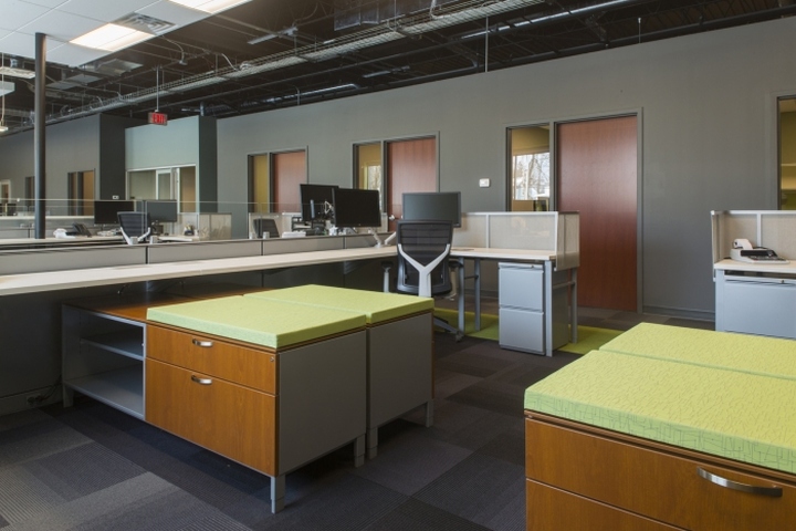
Interface carpet Urban Retreat was used to create a rambling path downy the 2 main corridors ,muted gray tone carpet planks mixed with bright green linear patterned identify the meeting areas throughout the building. 3FORM Studio Edge product is the main feature wall in the lobby in the colors of the new logo. The CEO was on a mission to go paperless the Herman Miller Canvas workstations are minimal with no overhead storage and cherry veneer accents in keeping with the traditional feel of the banking industry mixed with sleek white work surfaces for an updated look. We achieved a unique minimal modern interior that has brought banking into the next “generation“.
Design: Blynn Nelson Interior Design
Photography: Matt Wittmeyer


via Office Snapshots


