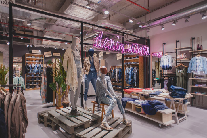

On 19 March 2015, the Zapata multi-label store opened, with new store concept, in Glacis-Galerie in Neu-Ulm (Germany).

Zapata, the fashion label from Wuerzburg, presents its new store concept on a surface of 900 square meters. The idea: The new store should provide young people and people still young at heart living in the Here and Now with a special shopping event. When creating the new concept, the interior designers were inspired by the way young people are living today – often at extraordinary locations and never at the same place for a very long time. Today’s living conditions require constant change regarding people and their living environment. This maximum flexibility was intended to be expressed by the new store concept. Good value for money, flexible and multifunctional.

Arousing curiosity
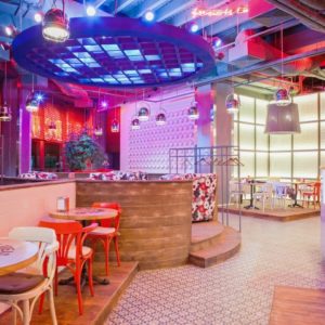
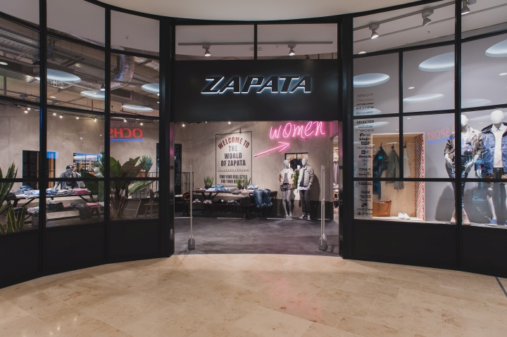
The customer’s curiosity is already piqued in the entrance area. Furthermore, the shop windows designed as lattice windows provide for tension and variety. When entering the store, it’s getting emotional: Typical Mexican scenes are deliberately imitated; the balcony with the two lovers is a great eye-catcher. Power lines, typical accessories and a rough wall design with concrete look are further stylistic elements. The wall arrangement in the entrance area is a great highlight of the new concept. It prevents the customer from looking directly into the store and therefore creates even more tension and desire for exploration. Also witty details for correct routing of customers: Fluorescent arrows and letterings – women and men – show the right way to the individual shopping worlds.
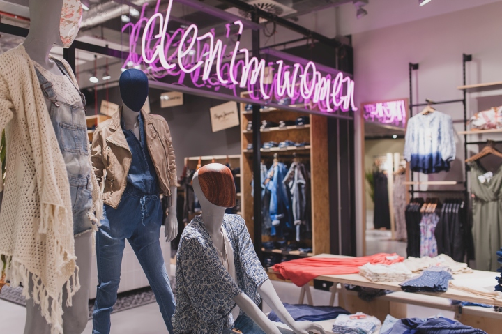
Exciting story telling
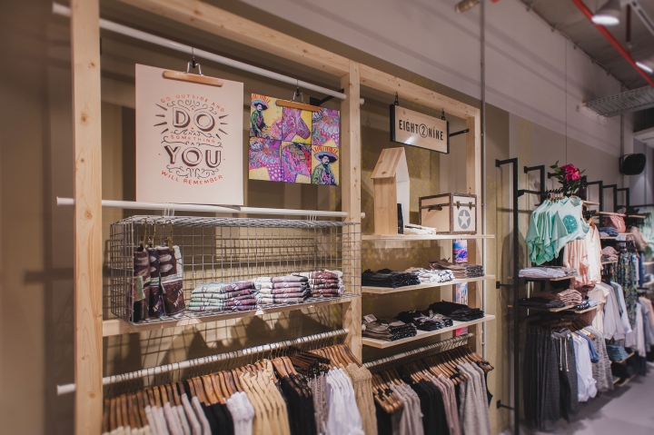
Inside the store, the story of Emiliano Zapata is continued excitingly. The entire shop design is influenced by lively colors, a lot of patterns and Mexican stylistic elements. In contrast to former Zapata realizations, the entire room is now given a brighter look. For the furniture elements, spruce wood, other bright woods and – in contrast to that – metal grids are being used. In this context, the “DIY style” is the principal idea. On the simple constructions, the raw materials and connections are visible, according to the motto “Do it yourself” inspired by the young target group and their living conditions.
Design: REAL INNENAUSBAU AG – Planning & Design
Photography: Olja Grenner





Add to collection
