
Brand brief:
An oasis of culinary delights where people can enjoy quality food surrounding by the stunning Nilgiris Mountains. From the warmth of the tiled roofs to the golden glow of the lights in the restaurant, everything about the Culinarium spells “Welcome”. The project was a new business vertical in the food business. The brief was to create the right ambience for a boutique restaurant in the Nilgiris area of Tamil Nadu. The menu was mainly baked items like croissants, muffins, pastries and cakes, but there was also going to be fine dining. Additionally there would be a specially designated area in the restaurant to sell merchandise, selected apparel and gift items. The design brief stated that the space needed to be welcoming and warm, open to nature and also ensure that everyone who came for fine dining would go back with a smile on their lips and a general feeling of goodwill for the place. Research says that people associate their favorite restaurants with happy memories and the aim at Culinarium was to create that happiness.
Design strategy:
Using the location to advantage was the key, here. With nature in abundance all around it was felt that an outdoor/terrace garden approach would be best suited. People could take in the freshness all around as they tucked into their favorite foods. It was going to be a win-win for all.
Store design:
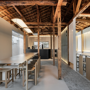
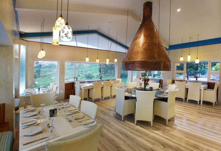
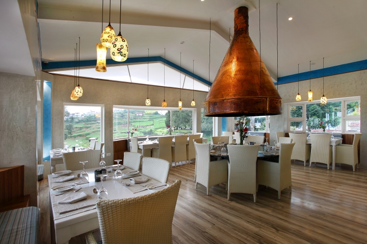
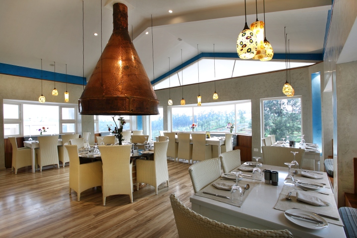
There is a fresh and light feeling about the décor for the interiors without losing any of the architectural integrity. Splashes of light colors highlight the wooden floors and bring the beauty of the outdoors, indoors. The seating clusters at the Centre are artistically held together in a loop by the copper chimney. Patterned globules of light give an intimate glow to each table. The warm tints on the flooring are contrasted with white tones in the angles of the roof, while the large windows in the hexagonal faced walls open out into the stunning landscape. And as dusk falls the Culinarium glow lights up the surrounding countryside.
Store front design:
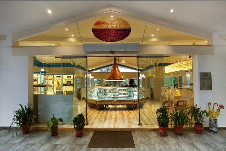
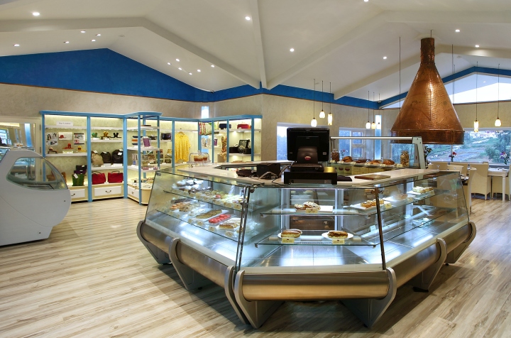
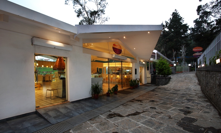
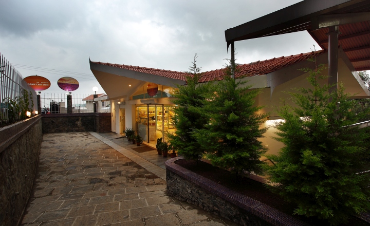
The entire entrance with its open and welcoming feel greets the customer drawing him/her into a world of fresh baked delights.
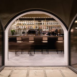
Through the clear, glazed glass of the bakery display unit the items can be seen easily. The paved stones leading to the entrance contrast delightfully with the floor length glass front of the restaurant. Potted plants and greenery add a touch of colour and homeliness. The oval shaped signage stands out vividly against the sky calling out to food lovers.
Store Interior design:
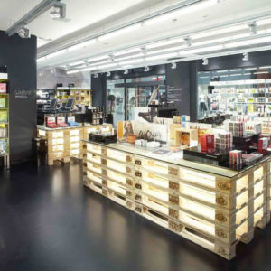
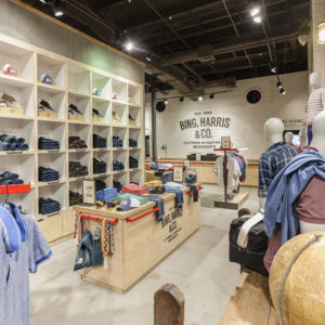
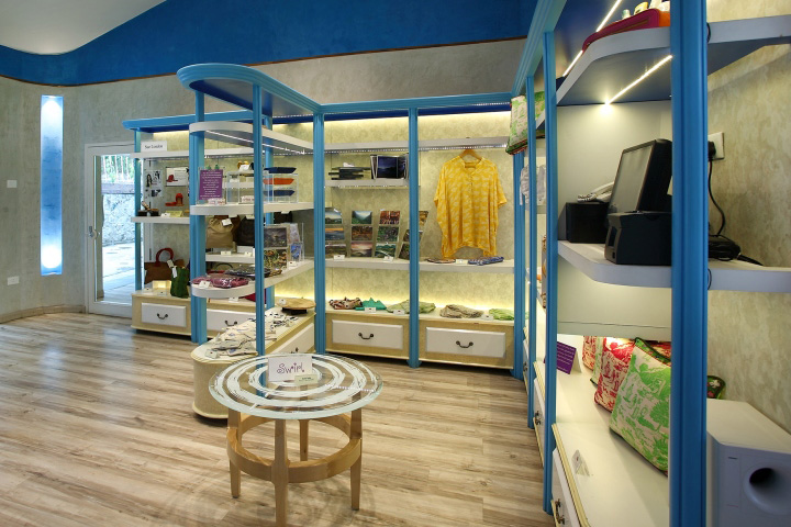
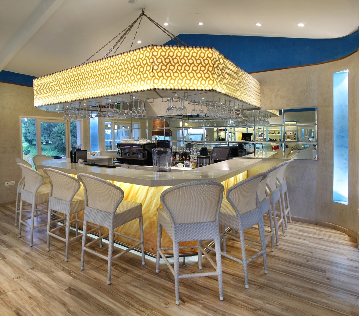
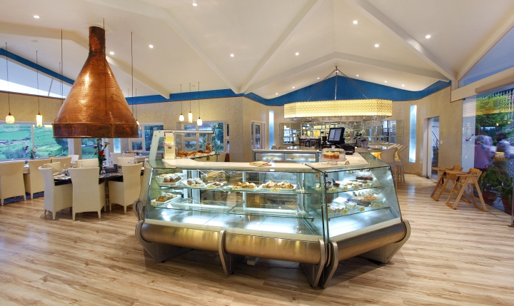
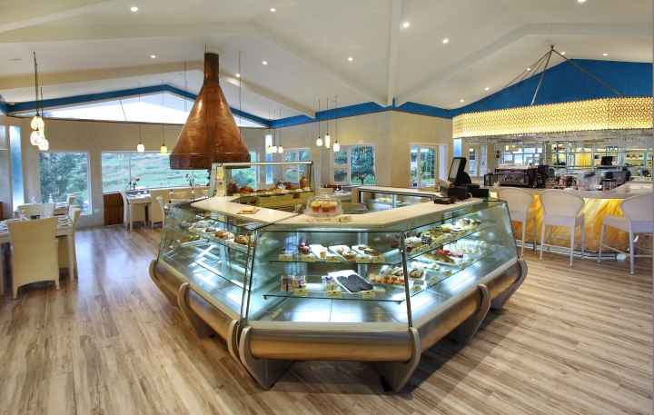
The Culinarium is not a store or just any restaurant. It is an exclusive boutique for food connoisseurs, and that was the approach taken all through the design process. Unlike a typical retail space this one integrates open windows with the walls, has a unique mirrored bar area and textured cladding. The bar-counter with its distinctive fluted blue ceiling and white wicker chairs is an irresistible draw for those looking to converse and enjoy some moments with friends. At the Centre is the bakery counter and display unit. As the eye takes it all in one can also see the carefully positioned gift boutique at the opposite end of the bar. The prominently positioned copper chimney is placed above a cluster of tables in the barbeque area. The entire restaurant has cane garden chairs which have a light airy feel. The covers lend a touch of class to the dining experience. Walnut wood textured flooring smiles up at the customers urging them to enjoy the comforts of Culinarium.
Zoning and layout:
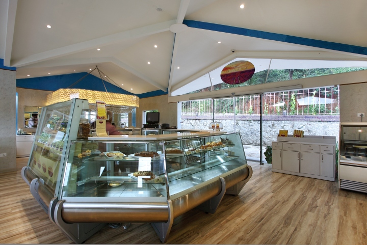
Primarily, the restaurant is divided into two, with a food area and the shopping/boutique area where selected merchandise are on display. Within the food area there is the bakery section and the bar. The bakery occupies the central space so that it has easy access to freshly baked food which is sent up from the base kitchen floor. Just adjacent is the bar and on the left is the boutique store. The copper chimney is at the back of the restaurant where it highlights the seating area for diners. All this is delightfully teamed up with a view of the Nilgiris mountain range.
Lighting and ceiling:
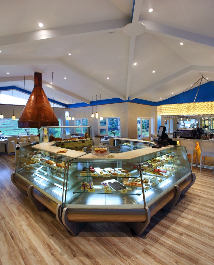
The interesting trapezoidal ceiling has a peak at the Centre and surface mounted LED light fixtures. There are two types of lighting to create the right “mood” feeling. In-built lights tucked away into corners as well as ceiling lights. The bar has lights built into the counter, so that customers do not feel a glare as they sit there and relax with friends. This indirect lighting has been built into the counter. For customers to better enjoy the food there is uniform, soothing light with a few pendants scattered to add to the ambience of calmness and tranquility. Warm light is recommended since food always appears more attractive in it hence customers enjoy and indulge in it, more.
Fittings and fixtures:
To ensure that the ambience is not disturbed fixtures are kept to simple and subtle. The furniture colors are muted except for a few highlight elements which draw attention, such as the copper chimney and the boutique.
Design: 4D


Add to collection
