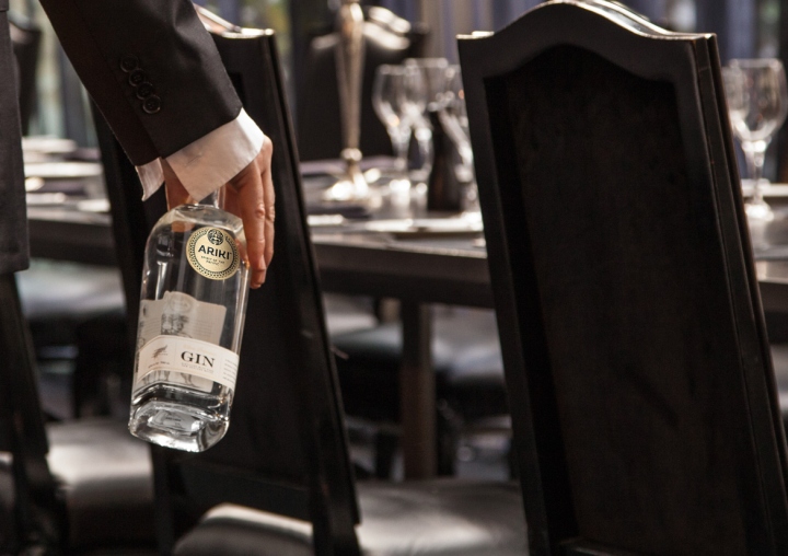

The premium Gin space is fiercely competitive. A brand must have a good point of difference to carve out a niche from the domination of global conglomerates. Enter Ariki. An ambitious and inspirational new player with a Polynesian heart, looking to reach a global audience.

Redfire Design crafted this premium spirit brand with love. We didn’t want Ariki to be a stereotypical “sun, sea, sand and palm trees” brand, but one that acknowledges its heritage while exuding the sophistication, class, taste and flavours that please discerning spirit drinkers.

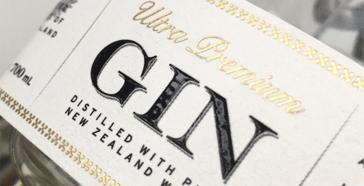
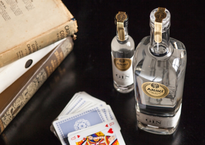
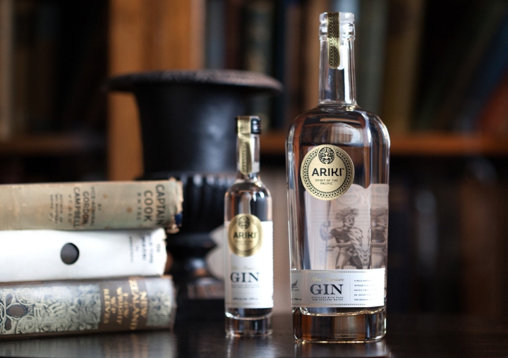
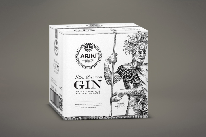
This inspired the design of the Ariki brand and packaging as a bold juxtaposition of ‘the old and the new’. These include Polynesian patterns and delicate illustrations with elegant type, rich paper textures, subtle embossing and fine foils. Together, these elements anchor the brand in the old world of the Pacific, but point the brand into the future.

Our brand strategy started after a Gin tasting with the Ariki team. We all decided to focus on the packaging design on all brand touch points, not just the bottles. This approach birthed a family of shipper packaging we’re proud of. Each item tells the brand story.

Redfire Design collaborated with award-winning illustrator Anna Crichton on the brand’s illustrations and Polynesian art. Ana Crichton was featured in the New York Times, The Wall Street Journal and Time Magazine.

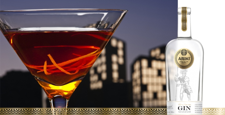
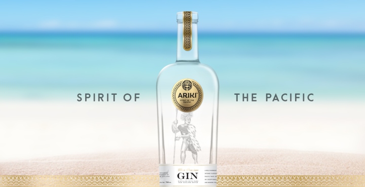
The emotional hooks of Ariki branding and packaging promise to encourage engagement with our sophisticated target audience. Ariki will be at home in an evening cocktail on the deck of a boat moored in the Caribbean, on a white sandy beach in the Pacific, in a Manhattan dining room or in a private London night club.
