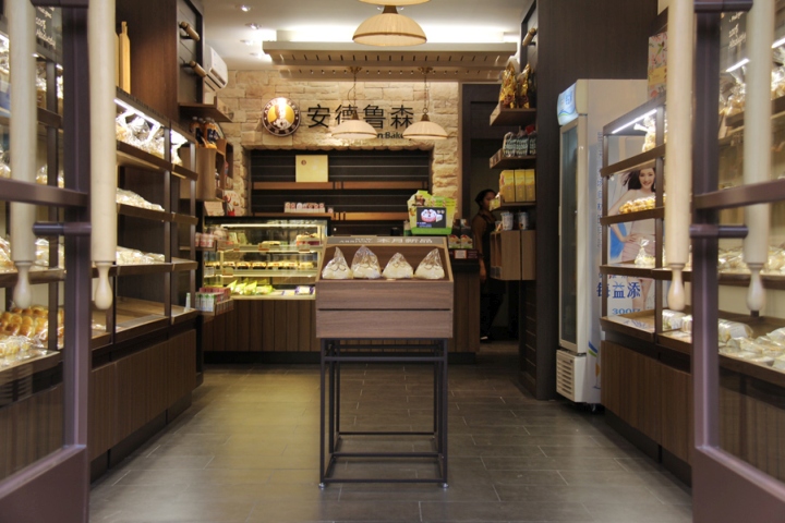
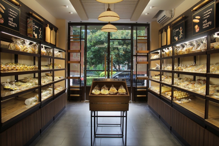

Following its history of two decades, Andersen Bakery looks to move forward through the development of a very European brand and iconography, as well as its focus on organic ingredients. What it lacks is a distinctive retail look that reflected it’s well-known brand personality and that maximized sales in what were often small spaces.

Prospace was appointed to create a new design and this was launched very successfully in China market. It also worked closely with local suppliers to provide a one-stop solution – from design to construction. Client and customer reaction has been very enthusiastic and this new design is now being rolled out to Andersen’s 400+ stores.

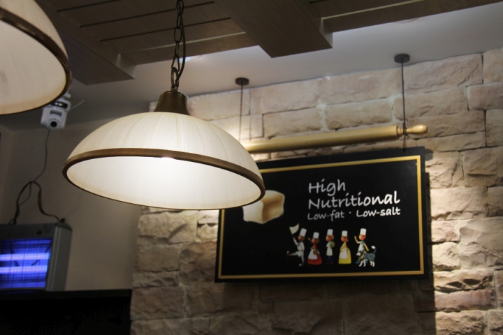
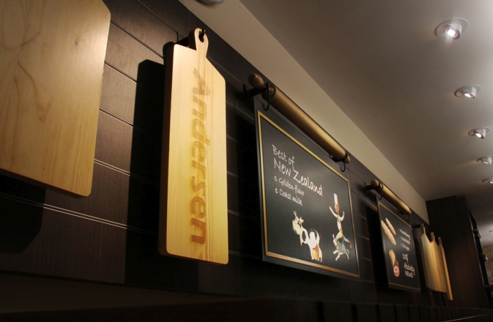
The design draws inspiration from the classic European kitchen styles, and plays homage to modern sophistication and Andersen’s bakery culture. Rolling pins, cutting boards, and classic joinery are taken as core elements that celebrate the bakery culture, while stone wall and concrete floor tiles ensure a texture of vintage kitchen comes through in the aesthetic.
Design: Prospace Asia
Photography: Anita Liu
